Everything’s coming up roses… well not necessarily yet but shall we go with the green of new beginnings ? Or maybe just – it was a long week but it all turned out all right in the end. So here are some lovely rooms for you to stroll through on this Monday morning when I, for one, am breathing a little more freely.
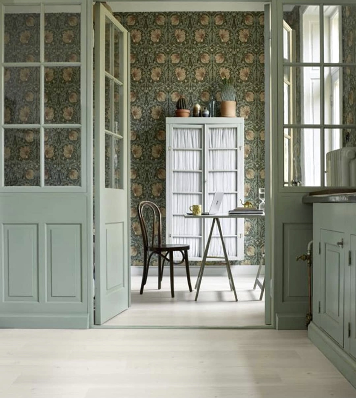
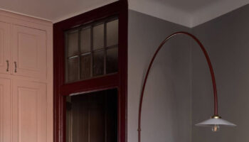
So let’s go first to this room which emphasises, once again, the importance of the view through as you walk past a room. It also shows you while it’s a good idea not to default to white paint (and I’m coming back to that tomorrow with some thoughts on feature walls…. to paraphrase CNN – which is all I have watched for a week – this is not so much a Key Race Alert as a Key Decor Alert). Sometimes, often I dare say, a colour that coordinate or tones with your wallpaper is a better choice than one that starkly contrasts. And if you do want a stark contrast then go to the colour wheel and pick a couple of opposites rather than white.
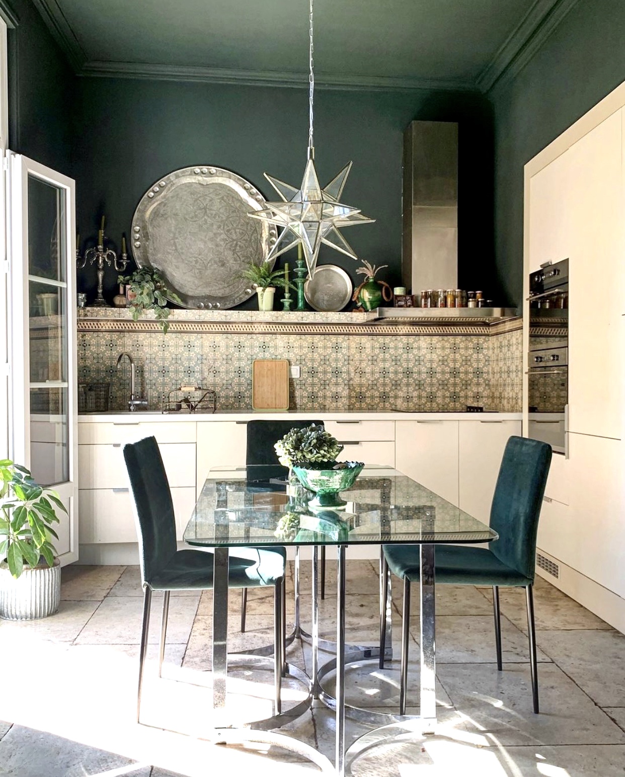
A couple more kitchens for you know and one is the gorgeous house of Lou @fig_tart and if we are ever allowed to travel again I may have to turn up and demand a tour of her French apartment. Here the green (obsidian by Little Greene) wraps over the walls and the ceiling and while the cupboards, are in stark contrast, the whole thing is brought together by the gorgeous patterned tiles that brings the whole scheme together and softens the contrast. The dark chairs also bring the ceiling colour down to eye-level and make it cohesive.
Next the kitchen of the designer Matilda Goad, whose business should be added to the small business directory I started the other day. Now we all know that pink and green is a classic combination (there’s more of it below) but Matilda has brought a fresh twist with these checked tiles and proved once and for all that it’s not what you use but how you use it.
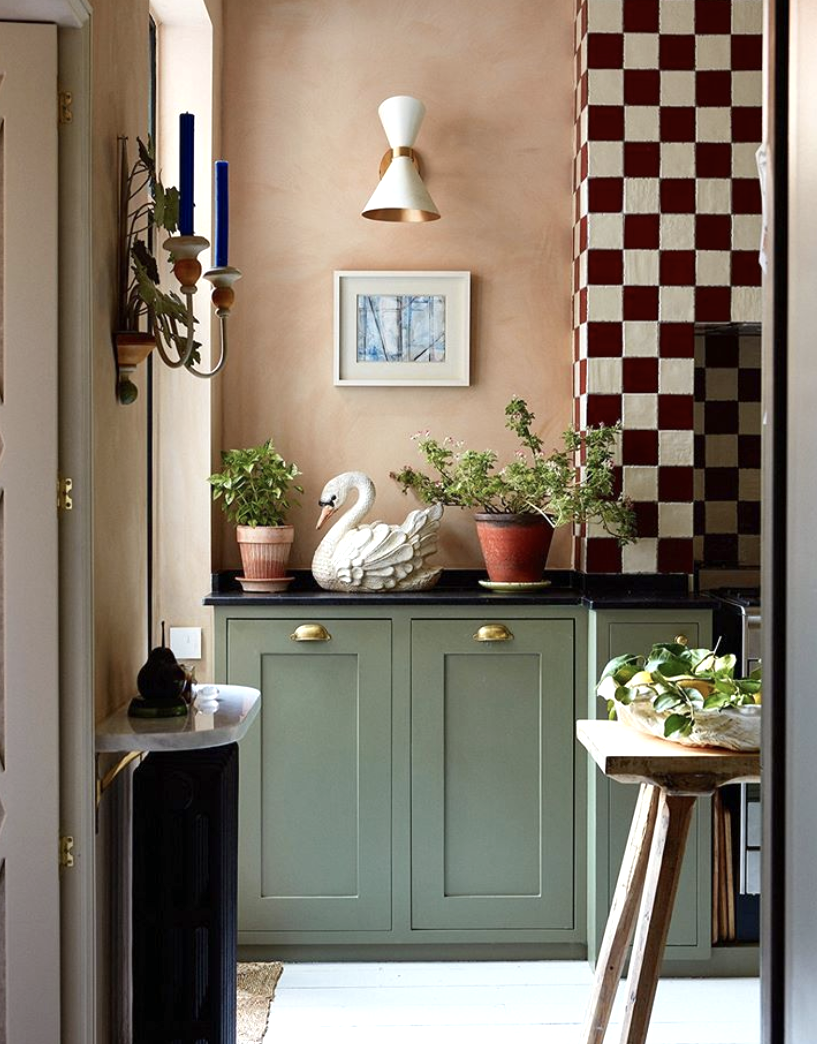
The other day I was watching an interiors makeover programme where the owners were bemoaning their poky kitchen which was covered in red and cream checked tiles. And they were right; it was small and tired and the tiles looked really old fashioned. But here, used to clad a chimney breast, with soft green cupboards and plaster pink walls, it looks pleasingly modern retro. I even got as far as looking and found these in ivory and these in burgundy but actually the entire Topps Minton range is a great place to start for kitchen tiles. Some are patterned, some are engraved and there are both square and rectangle to choose from.
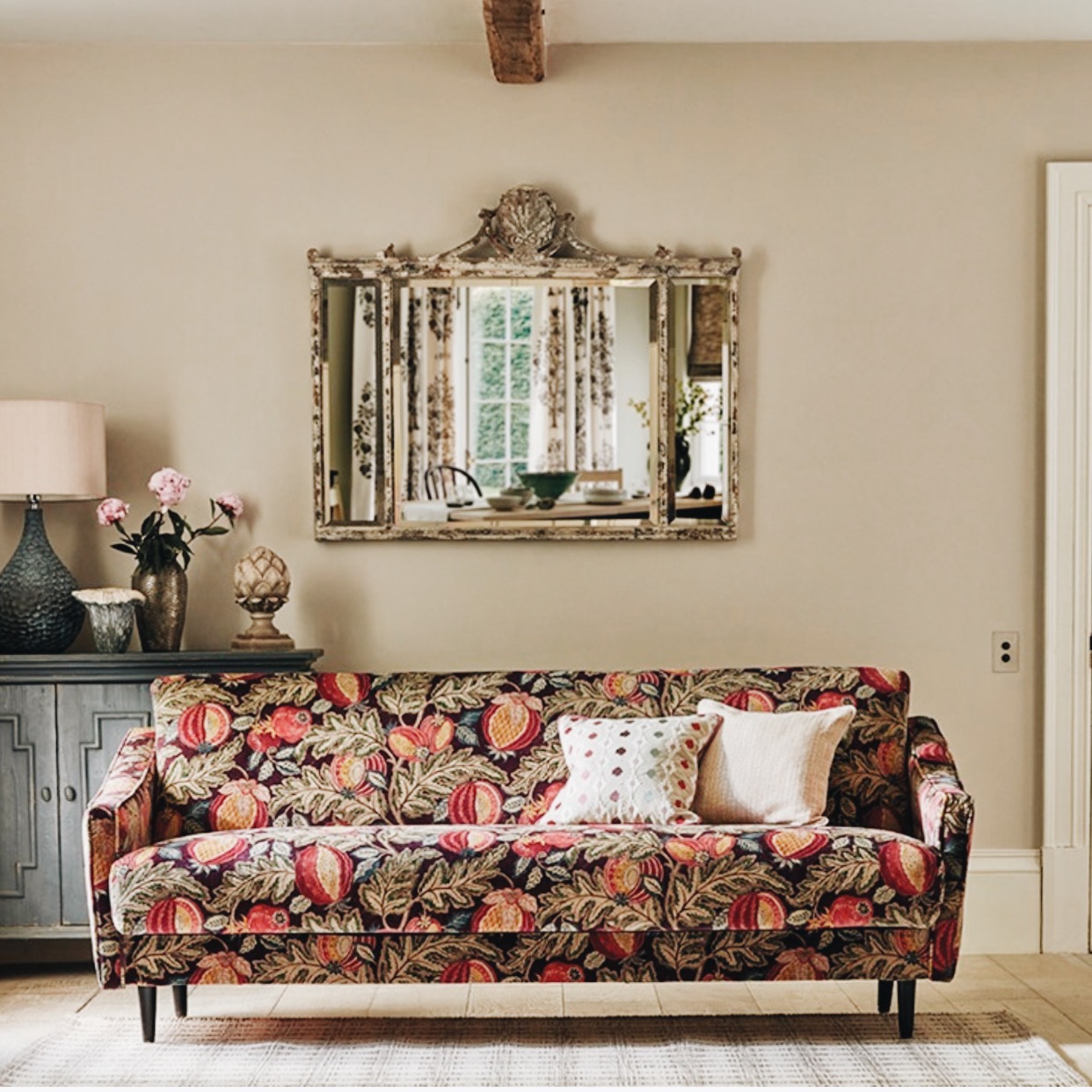
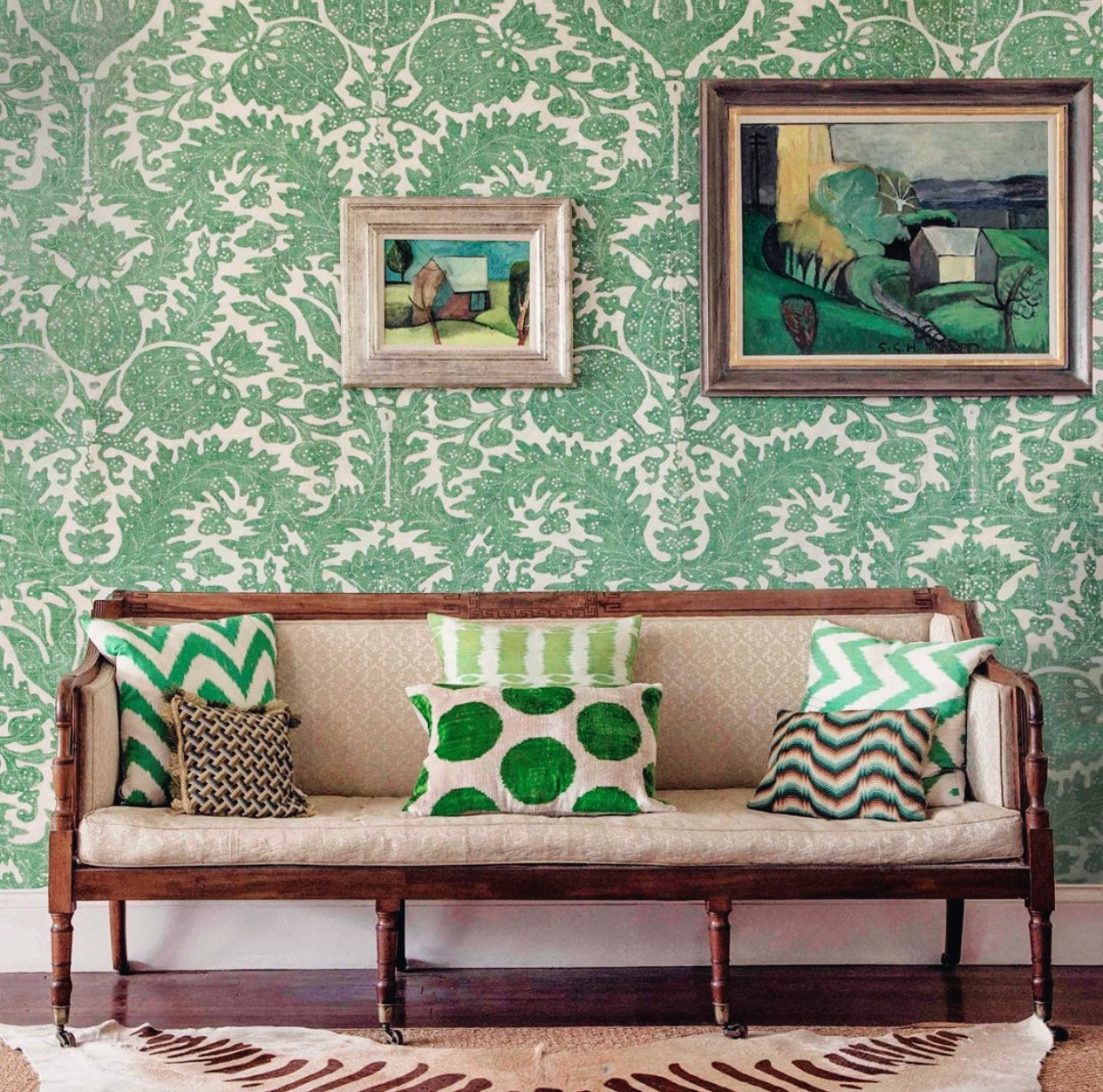
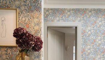
Moving away from tiles and onto more traditional florals, these next two images illustrate the power of the bold flower. Above, in a more unexpected move, the pattern is all on the sofa. This is traditional in the classic English country style where you might see it clashing and toning with several other patterns but I think the plain surroundings allow it to really stand out and be the focal point of the room. Note, to continue the point above, that while the walls are pale they aren’t white and the bone colour is found in the fabric so it’s not a contrast but more of an expansion of the theme. It feels like the walls are hugging the sofa and allowing it to stand out rather than providing a cold unwelcoming background.
Below, the sofa is plain while the walls are a riot of pomegranate design. This is by Totty Lowther, who sells paintings, antiques, lighting and rugs from a shipping container shop in Cumbria and has recently launched this wallpaper inspired by a French 18th Century Indienne block print cotton. She is also a member of The Fabric Collective. As well as this soft green it also comes in candy pink, blue, ochre and and a couple of more neutral shades. I’m a big fan but, as ever, have run out of rooms. Currently.
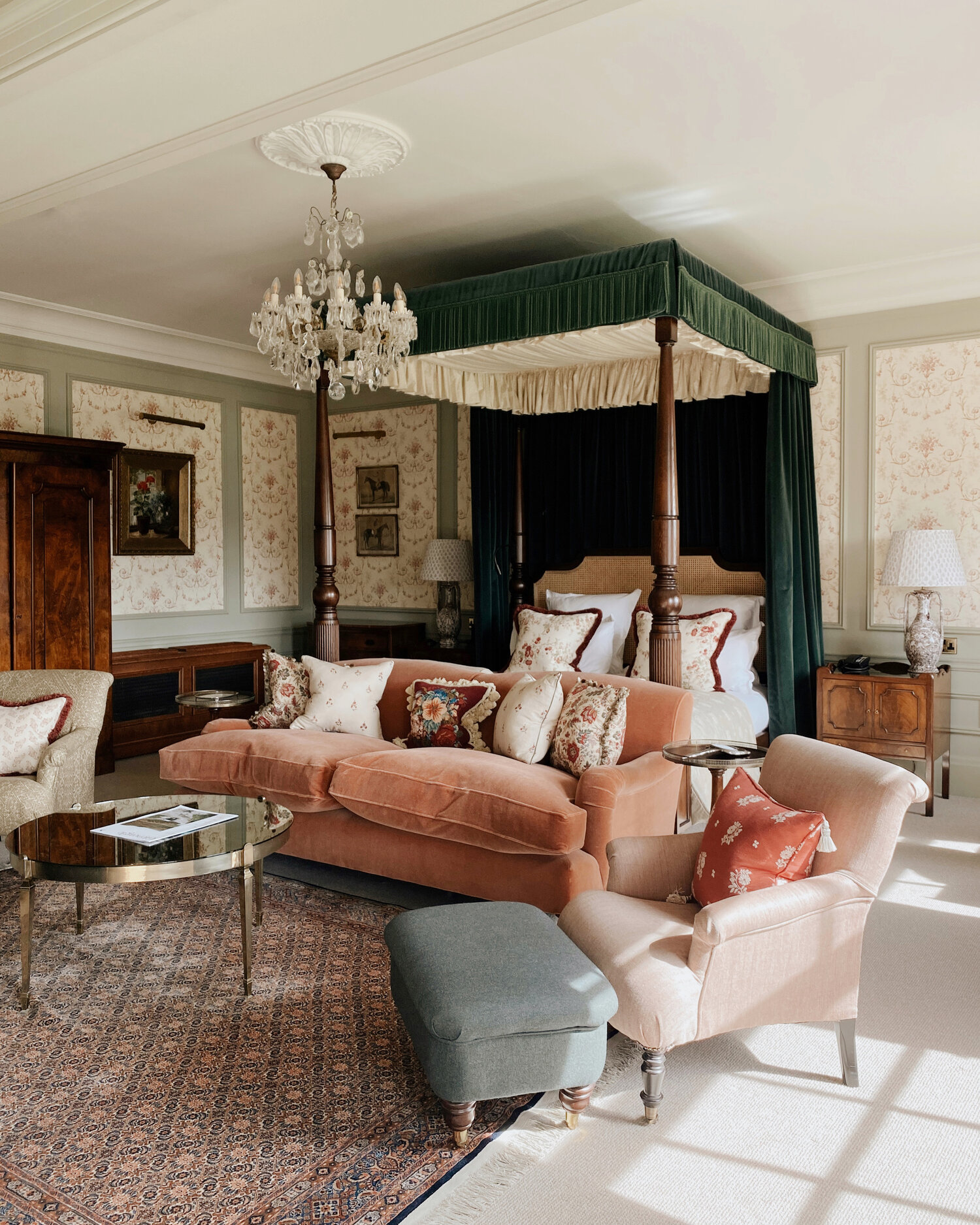
Finally, if we can’t go to the hotels we will have to bring them to us for inspiration and this week I bring you the Gleneagles Hotel as photographed by Gina of the blog Gina Goes To. Now I had thought Gleneagles was a rather stuffy old fashioned hotel that was probably full of tartan, but five years ago it was apparently acquired and made over by the Ennismore Group (who did the fabulous Hoxton Hotel group) and now, as you see it’s a stylish and luxurious mix of warm tones and luxurious fabrics. I was going to say homely and while my home clearly doesn’t look anything like this, it has a homely feel to it. You want to sink into that sofa or lie on that bed with a book. And yet, if you were to count all the patterns from the rug, to the wallpaper and each cushion you would find at least eight different designs as well as a mix of antique furniture and modern (the glass coffee table) and yet it doesn’t feel overwheming or busy. Thats partly because it’s a big room (ok so we can’t all have that) but also because there are two large blocks of plain colour which dominate and the rest is background. You might not have a four poster or even a sofa in your bedroom but this is a masterclass on how to mix patterns and styles and, I can’t quite believe this, use grey as the disrupter colour. The mass of pink and green might be too much but the grey footstool just throws in an urban edge to this bucolic space. It could have been yellow. If you hate grey it could have been a zebra print – black and white stripes always work but sometimes they can be too regular and geometric for an antique room so try the irregular lines of a zebra instead.
Hopefully that has given you all some food for happy thoughts. Don’t forget to check back tomorrow for my key decor alert.
What glorious images! I adore them all (Matilda Goad’s whole house is amazing), and there is little boring white to be seen. I notice that sage/mint green and salmon pink is a common theme in today’s interiors, which has me wondering how I might add them to my own space. Those Minton tiles from Topp’s are fab, and we wanted them for our recent kitchen renovation, but the delivery delays were such that we couldn’t feasibly use them. Anyone considering them might want to check that out, although hopefully the delivery times have improved somewhat since our reno, which admittedly happened at the height of the first lockdown (so much fun to be without a kitchen during this period!).
It is so very nice to enjoy something absolutely beautiful. (Big sigh of relief).
Well similar chairs can be bought from Calligaris in pairs. Hunt the web for the best price. We have them in a sludge grey colour and they are VERY comfortable.
Fig Tart’s kitchen makes me feel quite emotional. I can’t say why, and I keep looking at it to see if there’s anything in particular, but it’s just everything. Favourite kitchen ever.
Thats the loveliest comment thank you lou @figtart