I never start this post with a theme in mind. It is a collection of pictures that have caught my eye over the week from various sources – usually Instagram – and I prefer to let the eye wander and see where we end up. This has the, hopefully, added advantage of appealing to more of you. The reader who hates green can skip past that and perhaps find something she/he/they prefers in the next shot.
However, time and again I find I have subconsciously saved pictures with a theme as the week goes on. The saving itself is random. I might save a room, a pair of shoes, a recipe and a meme before I come across another room that appeals. But invariably, on a Sunday when I come to write this post (I long ago gave up trying to take Sundays off after I realised I have evolved to take Friday afternoons off which feels much more like an unexpected and illicit treat albeit one I have to pay for on a Sunday) I find the images seem to blend together.
And so it is this week, that there is a floral element to this week’s offering. Not because I planned it but because my subconscious did. And maybe that’s to do with the snow and the emerging snowdrops, the prospect of Spring and a vaccine and the pink heather in my window box which has emerged from its icy blanket still alive and growing, if a little bedraggled. Much like many of us I suspect.
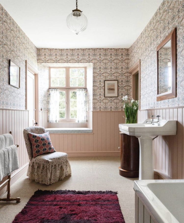
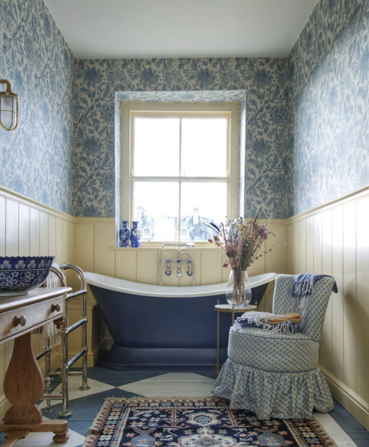
So the top bathroom caught my eye as a pink bathroom is always flattering to any skin tone and this belongs to the designer Carlos Garcia Sanchez who might just have the prettiest account on instagram. A mix of panelling and wallpaper is always lovely as seen in a very similar take below which belongs to Greg Penn and was designed by Francesca Rowan Plowden, who, firstly, did up Leeds Castle, which is absolutely my favourite castle (if one had such a thing) and who also founded Design Haven for Heroes, for which I am an ambassador but I am aware that most of that action happens on Instagram.
He has continued with the wallpaper theme in the room above and the point I wanted to make there was that the soft brown woodwork really compliments the paper and while white would have gone perfectly well, this shade really brings out the colours and warms the room, but it’s not so dark and statementy as to be terrifying to those who would usually default to white.
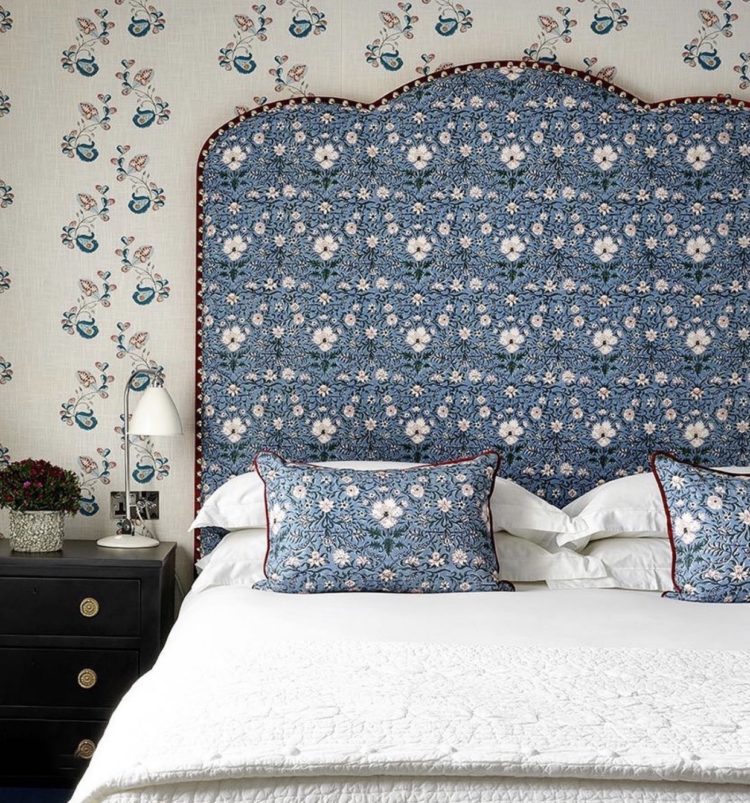
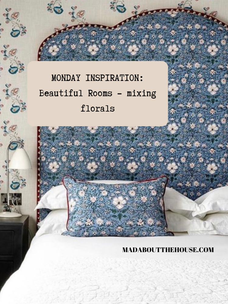
Mixing floral patterns is often pretty and tricky to pull off so here’s a little masterclass from Kit Kemp, at the Dorset Square Hotel. The wallpaper is very delicate but totally compliments the much stronger headboard even though the colours are exactly the same in different ratios. Again, white, or cream, walls would have been fine. This paper really makes the room sing. But, because the flowers and the pattern are small, it’s not a bold terrifying thing like a House of Hackney scheme might be. This is easier to pull off, especially in a smaller room. She also says, in the original caption, that her favourite part of the room is the blue skirting board – which obviously you can’t see in this picture so you’ll have to take her word for for it (and mine) that it’s the perfect finishing touch.
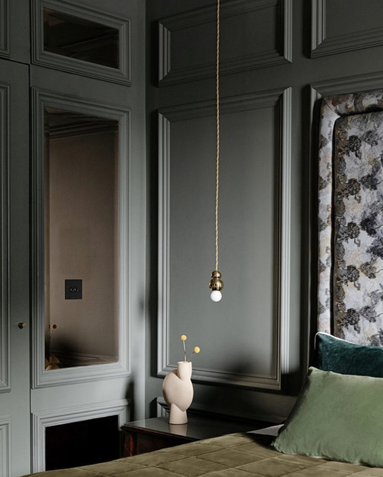
Another patterned headboard, this time in a design by Roisin Lafferty, a formidable designer, who I first met at the Milan Trade Fair and who walked around 25,000 steps in one day in prodigiously high heels without shedding a single tear. I was in trainers and had to sit down for a full 24 hours when I got home. A woman with a talent like that is a woman you should listen to. She says Farrow & Ball Green Smoke is a stunning colour. I wouldn’t disagree (with or without the heels). She has painted all the walls, panelling and woodwork in this wonderful cocooning shade which makes the floral headboard even more of a standout feature.

Moving into the kitchen and not a place we tend to see either wallpaper or flowers (unless they are in vases) but this paper by Divine Savages (cranes and leaves if we’re being picky) works brilliantly against the restrained charcoal of the kitchen cupboards. Wallpaper in a kitchen is fine as long as you really make sure the edges are stuck firm so they don’t peel away with steam, and you can also cover with a layer of matt decorator’s varnish to seal it.
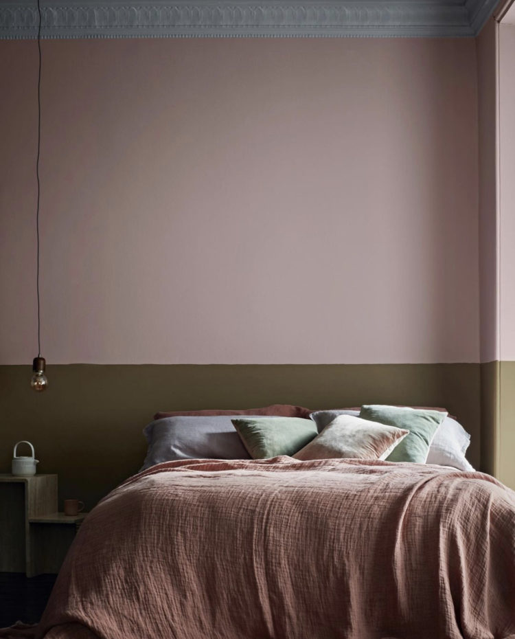
Lastly, in case that was all a little too much, here’s a mash up of the colour palettes from above but this time in plain paint. A soft chalky blue, or pale grey, ceiling, pink walls and a sludgey green (technical term) behind the bed. The pink is strengthened by the deeper shade of the bedspread and the terracotta pillow, while the mint and lavender cushions reflect the ceiling. Now that’s a masterclass in toning colour right there and not a flower in sight.
Right I’m off to look for tile inspiration for the boys’ leaking shower room. I’m thinking terrazzo…


Yes Yes Yes!!!
Thank you! Thank You! Thank You!
The last photo with the smudgy green half wall is inspirational in a tricky bedroom layout. The room is yet to be painted but comes with a high ceiling (12′); one tall window (8′) and both exposed and hidden HVAC duct work at opposite ends of the room. My bed frame was custom made, a low platform type (13″ high) and no headboard. I think the half wall painted in a darker colour from that of the ceiling, the duct work and the remaining wall area would frame the bed introducing an interesting, unexpected contrast element into the room. Thanks!
Original ideas… In this job creativity is really important and those pictures are obviously match with that.
Your green-hating reader ALWAYS finds inspiration and joy in all your posts! These florals are uplifting and that first bathroom looks so very inviting. I’ve recently done a bathroom in (blue – what else?) terrazzo! Utter heaven!
These are beautiful. I spent the weekend eyeing floral wallpapers and this has given me more food for thought. A question about tongue and groove in the bathroom – it looks so beautiful but is it practical as the only wall covering around a bath and basin? I keep coming back to it and then talking myself out of it with the prospect of bathing a possible future child in a bath surrounded by wood!
Listened to your podcast last week for the first time and really enjoyed it Kate. Hoping to move this year and have really got thinking about floral wallpaper, haven’t papered anything since the 1970’s so it has taken awhile!
Oh I’m so glad you liked it. I’m feeling the wallpaper too…
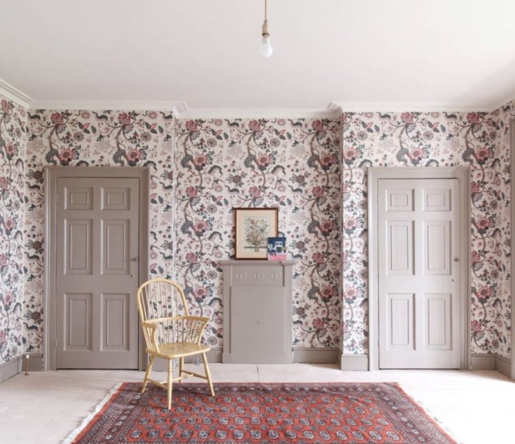
Thank goodness wallpaper has come back. And there is nothing an oriental rug can’t cure. I love the little upholstered chairs with skirts. My grandmother had them in every bedroom, and she called them ‘slipper’ chairs. Is it because one would sit there and put slippers on? Cheers from Canada!