By many accounts last week was a tricky one, not just because of events in America which will have touched some of you personally, but also the first week of a new year which was, for many us, spent in another lockdown with dire news reports coming in from every direction. So, as usual, I offer you these rooms as nothing more than a little respite. Come in, pour yourself a cup of coffee and look at these havens of relaxation and see if that helps you to draw a deep breath and drop your shoulders.
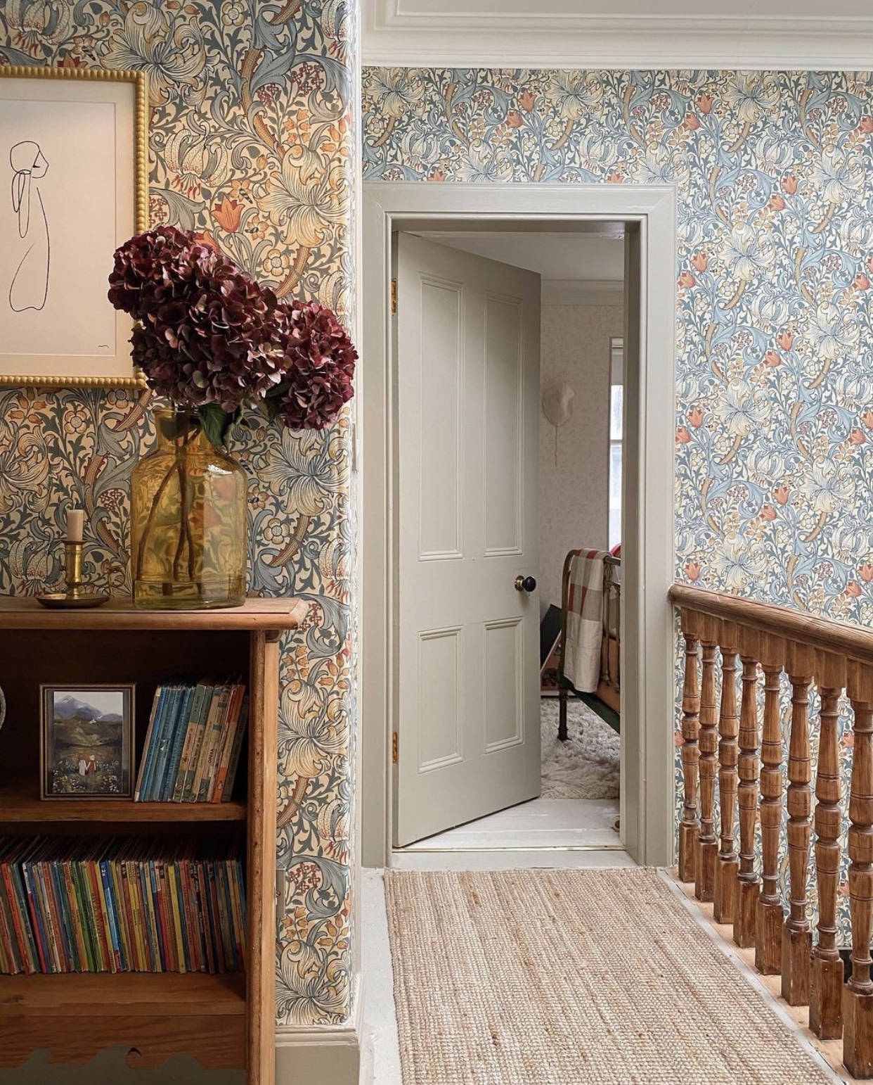
First up is this heavenly wallpapered landing by Siobhan McFadden. It’s still rare that we see fully wallpapered spaces in real homes and this is a lovely example of a William Morris paper in soft colours that doesn’t dominate the space. Note the woodwork (skirtings and door) in a soft greige colour that tones (rather than a more traditional and contrasting white) and the way the stripped wooden banister and bookcase echo the darker tones in the paper. It’s not often that you would describe a strongly patterned wallpaper as restful but I find this is exactly the case and would be trying to squeeze a little chair up here if there was space beyond this camera angle.
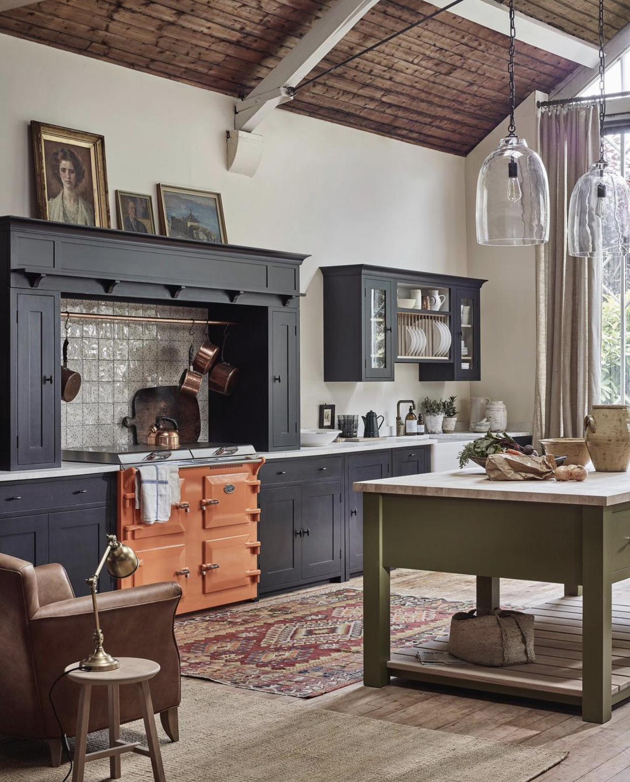
I have spoken before about the joy of something unexpected and in this Neptune kitchen it’s that tangerine cooker which just pulls out the faded colours of Persian rug and really adds a dramatic punch to the room. I am reminded of a quote by Diana Vreeland, a former Vogue editor, who said: “A little bad taste is like a nice splash of paprika. We all need a splash of bad taste – it’s hearty, it’s healthy, it’s physical. I think we could use more of it. No taste is what I’m against.”
Now, of course I’m not saying this orange cooker is bad taste – quite the contrary – but it IS unexpected and some people might find it controversial. Not least because, take a breath here, it’s the thick end of £10,000 which means you could be forgiven for sticking to a safer colour for fear of going off it. On the other hand you might love it for ever and change the kitchen cupboards around it – a much cheaper refresh option – thus changing the look of your kitchen as often as you please/can be bothered to get the paint out.
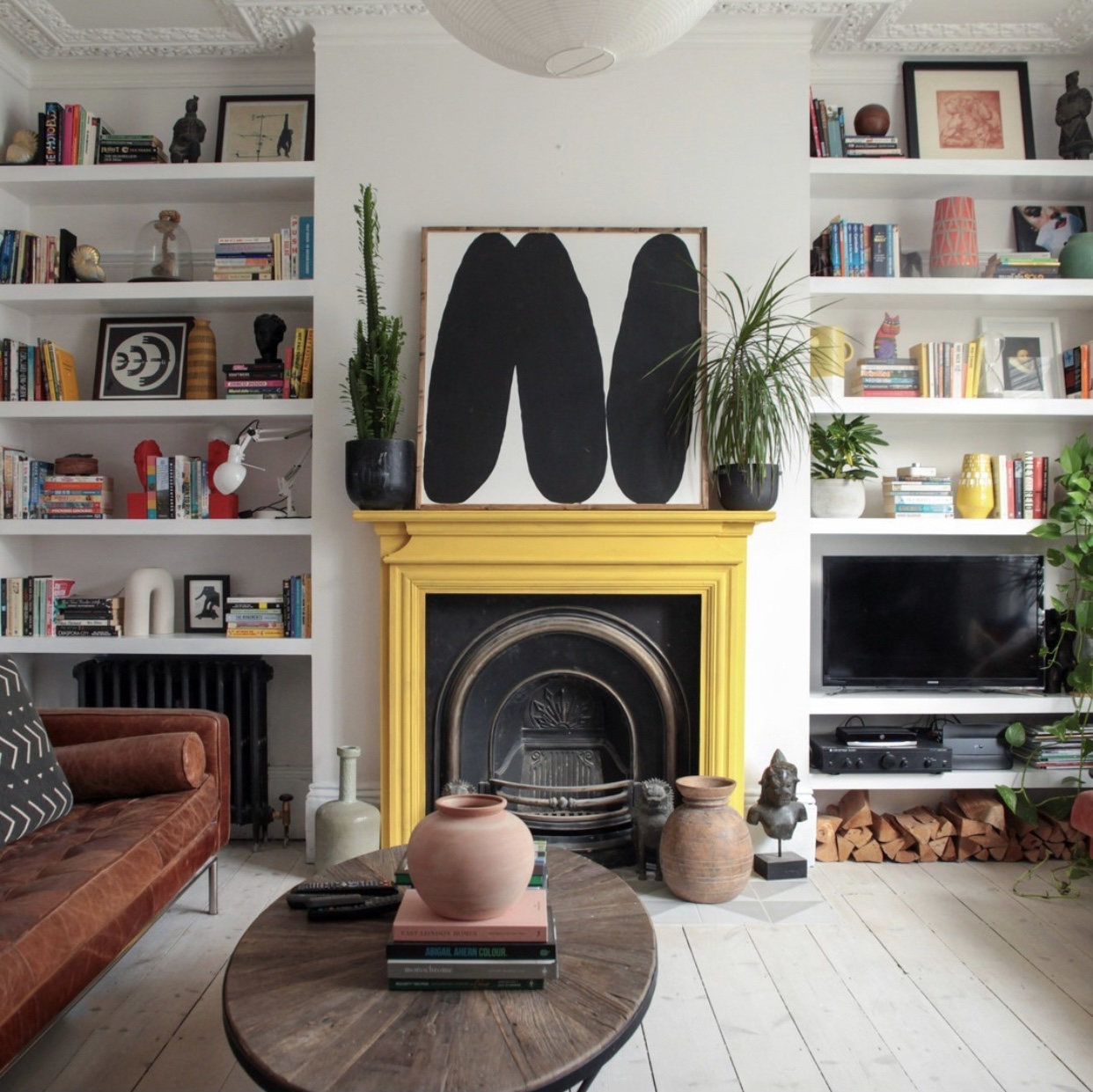
This yellow fireplace does the same thing (for the cost of a single tin of paint). I spoke last week about the joy of painting a window frame yellow and this fireplace by has the same joyous effect. If you follow Trish on instagram you will see that a splash of yellow is very much her red thread and turns up on a door and also in her artwork through her home which featured on Homemilk recently
Moving to green now – I fell down a bit of a rainbow rabbit hole when I realised we had orange, yellow, green and blue (took the dried flowers from the top as red) although it all fell apart when it came to indigo and violet…
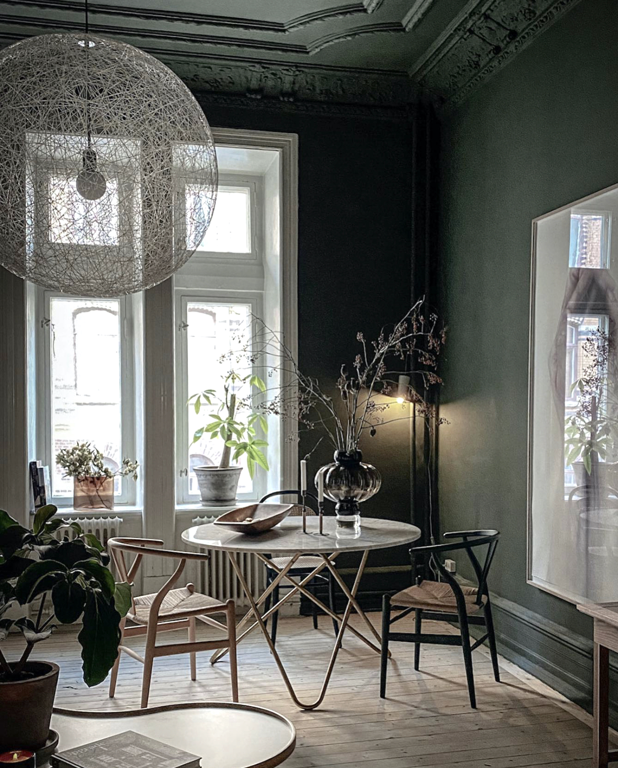
We have seen the other end of this room before – and I apologise to my green-hating reader – skip this and look at the blue bathroom below which I included just for you (!). I know the ceilings are aspirationally high which is why the designer Sofie has been able to take that deep dark green up from the walls and over the ceiling too. However, the thinking behind that is that will will make the ceiling recede and appear even higher. One of those things you can only know if you try in your own space is my guess.
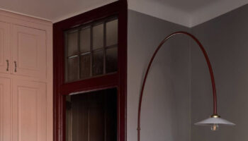
The other great touch in here is that huge light which is a real showstopper but, by virtue of the fact that it’s transparent, it doesn’t block the window or appear heavy. It’s more like a giant bubble floating in the room. And who doesn’t like that as an idea?

This is a great example of how you can mix patterns in a room to great effect. If you break down all the elements there’s a lot going on here – chequerboard floor in black and white, high gloss metro tiles, wallpaper, brass accents, those ornate claw feet on the bath… and yet it all works. The colour palette is limited to three shades, one of which matches the bath, there is one metallic colour and even though the eye starts at diamonds, moves to rectangles and finishes with organic shapes in a repeating pattern, it doesn’t come across as hectic. If you wanted to mix patterns and weren’t sure how then take this as a template and use your own colours and designs. And a burst of one other colour for the towel wouldn’t hurt either.
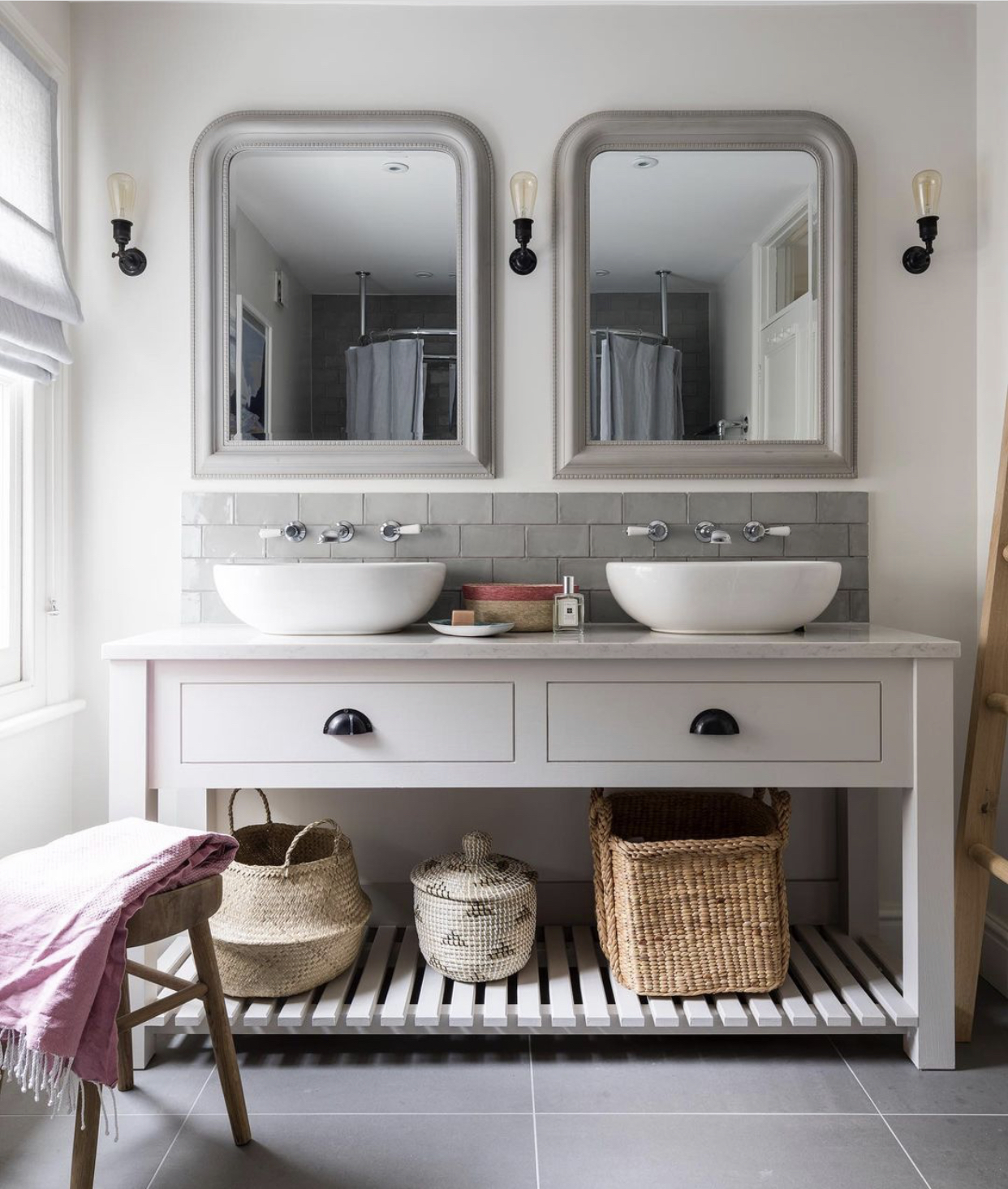
By contrast, this two basin bathroom by Beth Dadswell of Imperfect Interiors feels very calming. That’s partly the colours but it’s also the symmetry. Interior stylists will often tell you about the power of three (or five) when it comes to arranging items on a shelf for display but perhaps less well known, is the contrasting power of symmetry which can make you feel relaxed and calm. Now I appreciate we can’t all suddenly rush out and install a second basin but if you are feeling stressy (and who isn’t) see if you can arrange your mantlepiece with matching candlesticks at either end, or pair up a couple of lamps on a sideboard. Basically change your view and see if it helps.
You can let me know what you do as the week goes on and if it makes a difference.
Love every one of these; the kitchen with an orangey cooker is especially fabulous…which is rather wonderful, since i loathe orange. You always find the most interesting rooms to brighten our days, thank you!
Thanks so much for this – I am not generally a wallpaper person, but that first picture is incredibly restful and welcome today! I really like the kitchen with the tangerine Everhot but am not convinced about the combination of the charcoal cabinets, tangerine oven, green island, and rusty leather chair with wood side table all together. For me, I think it would be amazing if only the island were more harmonious with one of the other elements (wood or cabinetry). The green, for me, takes away from the tangerine pop. Thanks again for a lovely diversion during a stressful day!
I’m not a fan of blue rooms, I tend to find them cold, but there’s something about that blue bathroom…
I love that black & white floor; some might find checkerboard floors too much, but I think of them as the Little Black Dress of design, because they work in just about any space.
Oh gosh Kate, this is just what I needed today. The Kitchen…the colours are exactly what I have and want!?! Cupboards and wall colouring are the same in new installation (going on for months now due to lockdowns) with stained oak butcher block waterfall return counter – my alternative to an island as kitchen a little too narrow and I’m not overly fond of islands anyway. But trying to convince OH that green and orange (I don’t do coral!) are perfect compliment is another chore (Haha)! So thinking of window and french door dressing in green (lighter hue than picture and it will bring the garden in which is my other love!) and darker shade of ‘coral’ – so rusty/orange. Very undecided about doors, architrave and skirting!! Would love to see more of that kitchen!!
Also glad to see you mention symmetry – think it’s my personality default!! So much is written about the “power of 3” and I do like this arrangement for accessories but more often than not revert back to a symmetrical setting.
Thank you for continuing your blog, you’re still my coffee go-to – you’re a tonic and I love your writing style! I’m off to test paint colours…sometimes overwhelming but fun.
Keep well and safe,
Mary xx
All very interesting and thought provoking. I love the wallpaper at the top, it is restful and interesting. The blue bathroom works well too. Thank you for your posts. 👍
I am very touched to be mentioned today! I did indeed scroll very quickly past that green room, but then I had no choice but to go back to look at that astonishing over-sized light fitting. I have just moved (in December!) into a home with high ceilings and have been looking at large lights, but had not come across that one, so will investigate. Thank you for including the blue bathroom and I LOVE the wallpaper, it has my name on it! I realise that symmetry is important to me and I agree that is a very calming bathroom that Beth created.
LOVE the tangerine Everhot and doesn’t it look fab with the Persian rug?
Thank you to Elaine for the info about the smallpox documentary – will look at it.
The Green-Hating Reader!
I’m not an orange lover but I love that kitchen! Brilliant pop of colour.
My wardrobe is full of dark blue, dark green and purple to match my orange sweaters, skirts and scarves. Orange (and terracota) is the most beautiful colour for me, but I do find it tricky to use at home decor. It’s beautifully done here!
As I’m drawn to orange and terracotta for its warmth, I have found one of the key things [in non-modern/retro settings] is to avoid incorporating white in the scheme – use creams or dirty ivory, pale or pastel yellows and ochres, café au lait, and so on. Makes a huge difference to blending and incorporating the colours. And then add the beautiful contrasts and colour bombs that you have discovered for your wardrobe !
I just wanted you to know that you have been a huge inspiration to me right through the pandemic. My husband and I have been using this time to re-create our home and we have incorporated so many of your ideas into the things we are doing, notably the idea of a “red thread” that connects spaces and leads the eye to the next space. Thank you for what you do.
Kate – you are officially appointed my counsellor – love your writing and your photos too. Keep on keeping on please 😘
This is so inspiring and Relaxing. Thank You For Sharing
Thanks Kate What a great post! I love every single inspiring shot and also
“Basically change your view and see if it helps” should be the mantra for all of us. As the weeks go on I remind myself that nothing lasts forever and try to count my blessings. There is also a terrific BBC Horizon documentary you can google about how the world eradicated smallpox. Highly recommend.
Thanks so much for featuring my clients bathroom Kate- we had it made by a local joinery company so that all 3 children could use the bathroom at the same time!
Beth x