Now I’m well aware that most of the internet has gone Christmas-mad already. Well, there’ll be none of that in this corner. Firstly, there’s clearly enough of it everywhere else and, secondly, not everyone likes or celebrates this time of year and I feel there should be respite. Also, and this is maybe not everyone, but for me the raising of the tree signifies holiday mode and I just feel that I can’t have a house full of decorations and lights when I’ve still got work to do. So, for that reason (change from Sex and the City voice to Dragons’ Den voice) I’m out… by which I mean there will be gift guides aplenty (starting with the sitting room tomorrow) but there will be precious little tinsel till, probably, the week before.
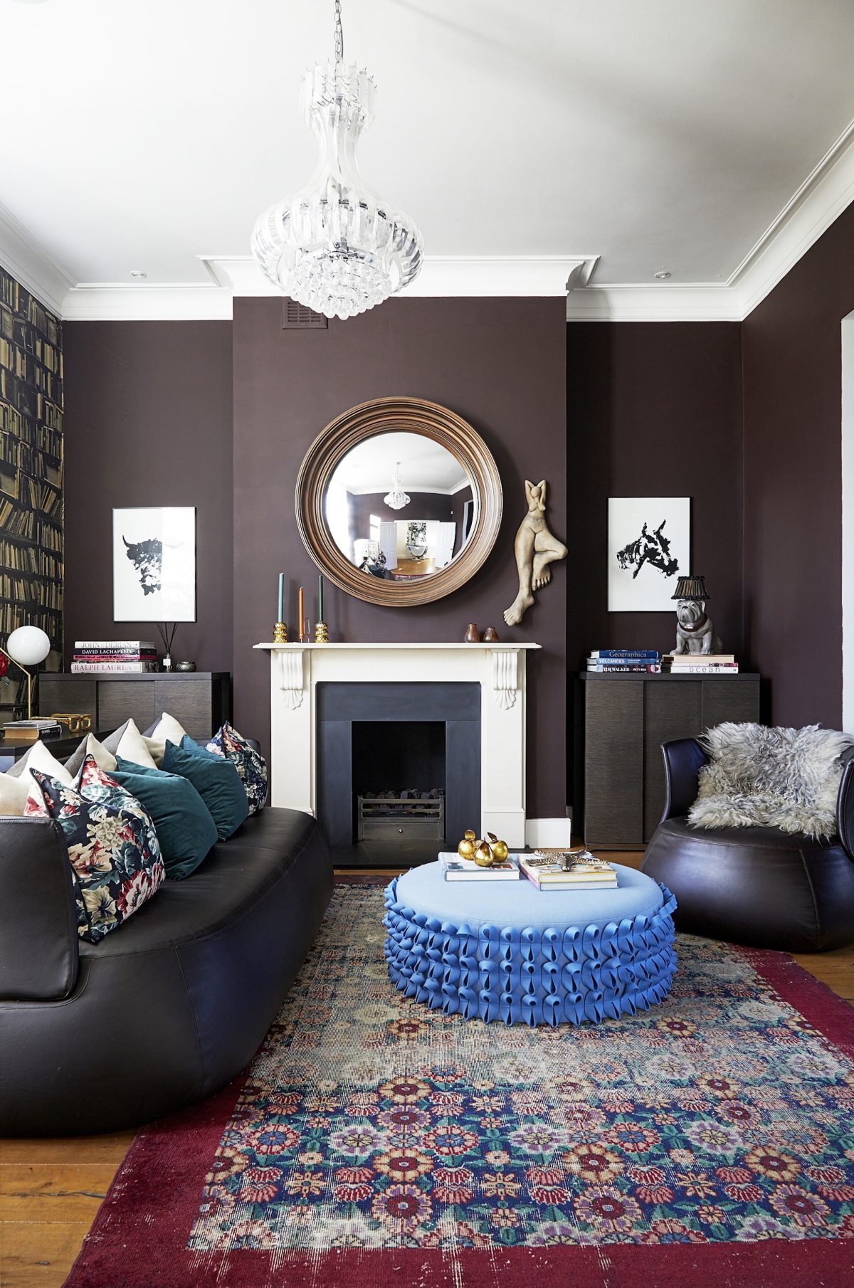
So today we are looking at more gorgeous room with that unexpected splash of colour – mostly of paint – but here, in this first room, the furnishings. This sitting room, via location agency Shoot Factory, is a gorgous chocolate brown, much like The Mad House sitting room with a Persian rug, much like… well you get the gist. But look at that fabulous coffee table/pouffe in the middle. Totally unexpected and yet so perfect. It takes the more sedate blue from the rug and runs with it. I would have, and, actually, have done, added any shade of pink to this scheme although one of my Persian rugs does have navy blue in it, but this is much bolder and more daring. And once you notice that blue in the rug you start to notice the books on the shelf and the candles on the mantelpiece. This is how to create a red thread.
And, just for a minute, imagine it the other way round. Imagine that the owners were given this blue pouffe. Or it was the last one in the shop, or it came from their previous house and was too expensive to get rid of (not that I’m assuming they would want to I’m just painting a picture that might, perhaps, bear some resemblance to something some of you might be up against) so they had to make it work. This is how to do it. The three candlesticks in different colours are all part of the whole colour scheme. The books – and look to the left of the image for the pinky ones – are also reflected in the rug and the cushions. In a previous post I spoke about deliberating introducing a disrupter colour, but it’s also about making that disruptive colour work with what you have or want to do in the rest of the room.
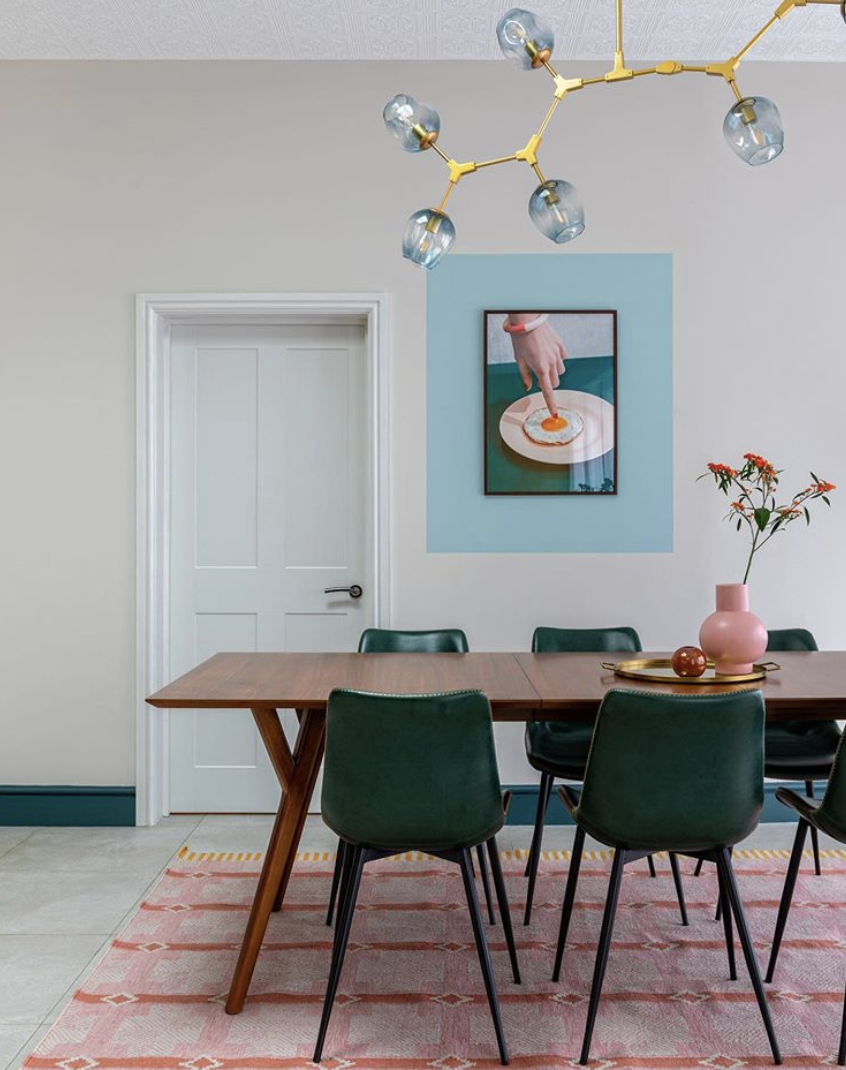
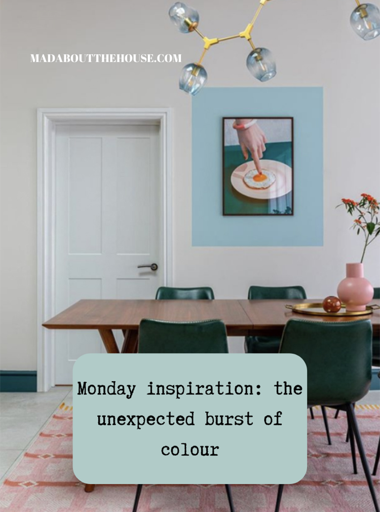
So above, imagine you have a picture that you adore which is too small for the space. There are various solutions, one of which is buying more to create a gallery wall but the budget might not allow for that. So the first thing to do, rather than hang a small painting in the middle of a wall where it will get lost is to hang it low and to one side. That will look deliberate and like you meant it – which is often the key – and then, if you’re still not sure you can paint around it as the interior designer Em Gurner has done here.
Now this idea has been floating around on Instagram for a while and I’m going to lay the credit at Bianca Hall’s door, who says it was suggested to her by a friend. Lots of people are now running with this idea – and why not it’s brilliant and I fully intend to have a go myself – but it’s a bit of credit where credit’s due.
Before we leave this room though, note that Em hasn’t matched the painted square to the obvious green either in the painting or on the chairs. She has picked a contrasting, but toning colour, that is echoed in the lights, or vice versa. That just stops it being too co-ordinated and brings another element to the room. She could also have used the orange of the rug to make the egg yolk pop out.
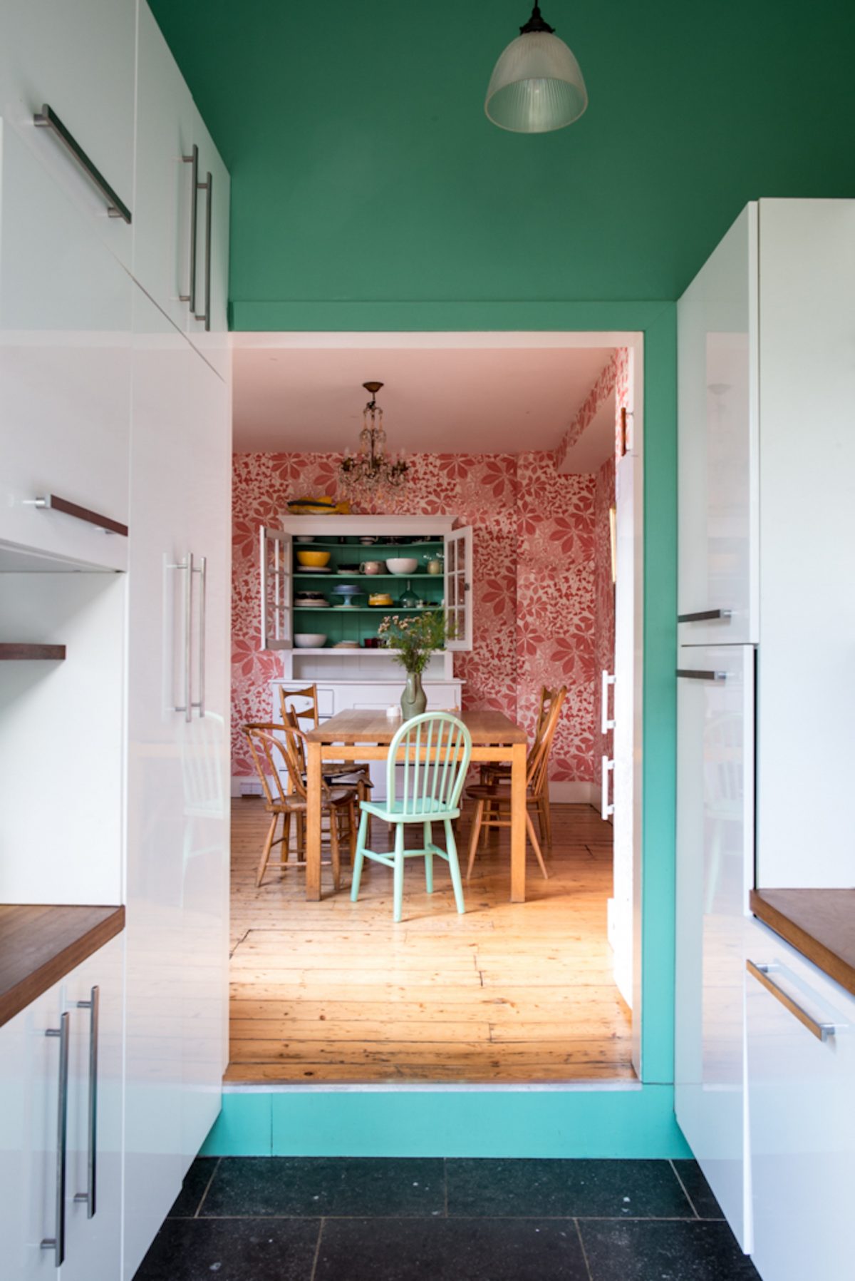
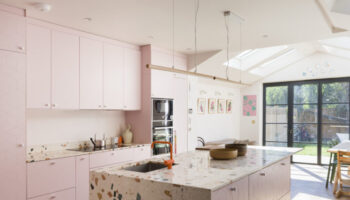
Staying with the pink and green, you can see here how the mint green chair – a paler version of the walls in the foreground, works to link the two spaces together and draw the eye through to the space beyond. And then the shelves at the very back are the same as the kitchen walls in the front. I know that it can feel enough to choose the paint for one room but you do need to spare a thought for the views to and from that space to what lies beyond so the house will feel cohesive.
This is one of the things I am asked more than any other – how to make the rooms flow and to create a joined up feeling and while it is about colours and the red thread it is also about remembering to look at the spaces and how they interlink and, therefore, about how you can make them interlink visually as well as physically. This room above is a really good example. You don’t have to be that bold, or that obvious, but it’s a perfect illustration of why it’s important. Like cooking, you just need to adjust to taste.
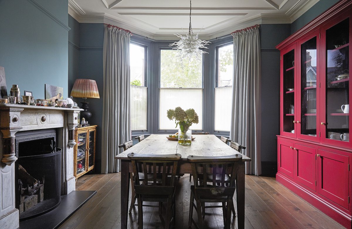
These next two rooms have fully embraced the pink accent the one above is just stunning. Sometimes you can just be a bit random with a colour. In this case this dining room is dark and imposing and quite formal. And then you spot the bright pink dresser which brings a sense of irreverence and fun to the space. And you know that the people who live here are probably similar. For a similar colour try Leather by Little Greene but if pink isn’t your thing then pick another. The point is if you feel that you are that person in real life then bring it to your interiors.
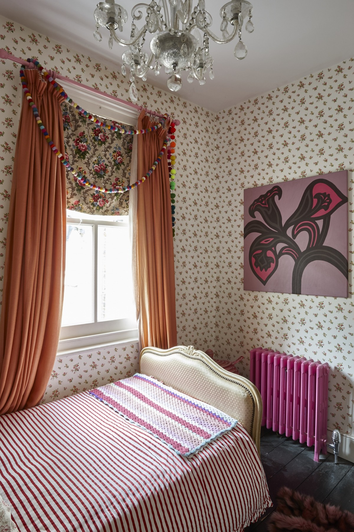
Below, the radiator has been painted in pink and made into a feature. Regular readers will know that I usually suggest matching the radiator to the wall – mandatory if it’s a modern ugly white thing – but if it’s a bit more of a stylish version then you have more choices. After all, old school style rads are expensive so why try and hide them. It can also be tricky when you have wallpaper as you have to pick one of the colours therein to highlight and if the background is white – as it is here – then it can look like you just left it white because you didn’t know what else to do (and we all know how I feel about that). Instead, the owners have gone for a pink in the paper and highlighted that colour elsewhere. They could also have chosen green in contrast to the pink and orange soft furnishing or changed the look of the room to a greener version.
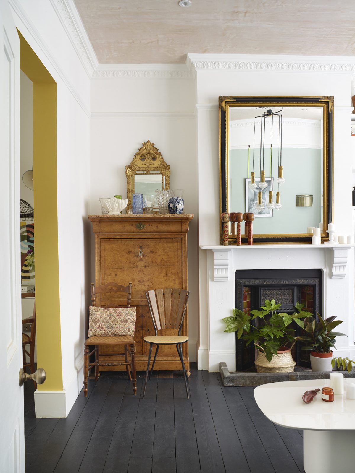
Finally, this alcove. Why leave it white? Why NOT add in another colour. This is a large open plan space it clearly functions as two rooms. This painted alcove serves to draw your eye to the second space while highlighting that it’s different at the same time. This will work in any alcove with any colour. Either co-ordinate to one of the rooms (to be safe) or pick a minority colour from one side or the other. In my sitting room I could go safe with chocolate. Or I could find a pale pink that is a little bit darker than the pinks of the sofa and chairs but a bit lighter than the burgundy cushions. Or I could contrast completely with an orange. All would work. Some are more adventurous than others. I will have to run my colour choices past The Mad Husband, you might not. In which case who’s got a similar opening and who’s painting it what colour? Answers below.
And on that note I’ll be back tomorrow with the second of my Christmas gift guides. Last week was the kitchen and tomorrow is the sitting room followed on Thursday with the bedroom. And, actually here’s a link to last year’s guides although not all the items will still be available of course.
All images credited to Shoot Factory are location houses that can be rented out for photography and filming. There are many other gorgeous houses on their books and they get many more applications than they can use.

Hi Kate, great post. I am wondering if you can tell me the colour of your lounge walls please? I absolutely love the chocolate colour in the first photo (lounge) and am thinking of using this in a spare bedroom whick has a large persian rug with pinks, blues and deep red. I think it would look stunning!
Love that last picture – painting the inside of an arch is a great way of introducing a bright colour without going too far.
I’m with you on the Christmas content. We’ve no sooner had Halloween ( which I do not like) and Thanksgiving ( which we do not celebrate) than the Christmas content starts. IG is basically mad from October through to January. Baa Humbug!
Love the post today Kate.
Well I for one am glad that the blog isn’t Christmas themed yet. I love Christmas and have my own tree up now but still want to look at actual interiors content. I get a bit fed up of it all being smothered in baubles.
Some really interesting colour choices here. I considering going for a pink and coral colour scheme in my bedroom which is way out of my comfort zone, but I’m happy to experiment in a private space. I am hoping for a wes Anderson vibe. Whether I can pull it off remains to be seen!