From the candy pink of stylist Siouxsie Dickens to the pale pink of this week’s Victorian terrace I think we can safely say that pink is gaining ground as the new neutral of choice. Of course, there will always be those who default to a safe grey (and a dark grey will warm and enhance while pale can be very tricky to get right), but a soft, very pale pink can be warm and, as we saw earlier in the week, flattering to the skin tone as well as mixed with tough colours – orange, black and dark wood – to create something altogether tougher and not remotely girly. Have a look at this and see what you think…
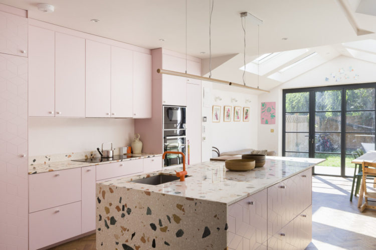
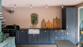
It’s a five bedroom 1,800 sq ft Victorian terrace in Acton, west London, that is on with The Modern House for £1,250,000 and, as you can see from this picture, the downstairs has been extened into the side return and back to create this lovely light-filled kitchen.
I keep seeing pink kitchens (often because I put them here!) but have yet to meet one in real life. That said, this is a really good example of how you can stop it feeling too overwhelmingly pink.
Firstly, the terrazzo island. Now I would have said I’m not a huge fan of this finish unless it’s on an ancient Italian pavement but this large pattern goes to show what is ofen truism in interiors – go as big as you can a) afford b) fit in the space.
This is both unusual and luxurious looking as it wraps down one side of the island so you get a view of it from the sitting room but not at the other end where it extends out to provide a seating area while giving you easy access to the storage on the far side from the kitchen. And, writing as someone whose seating area extends out over the cupboards I can vouch that this way is better.
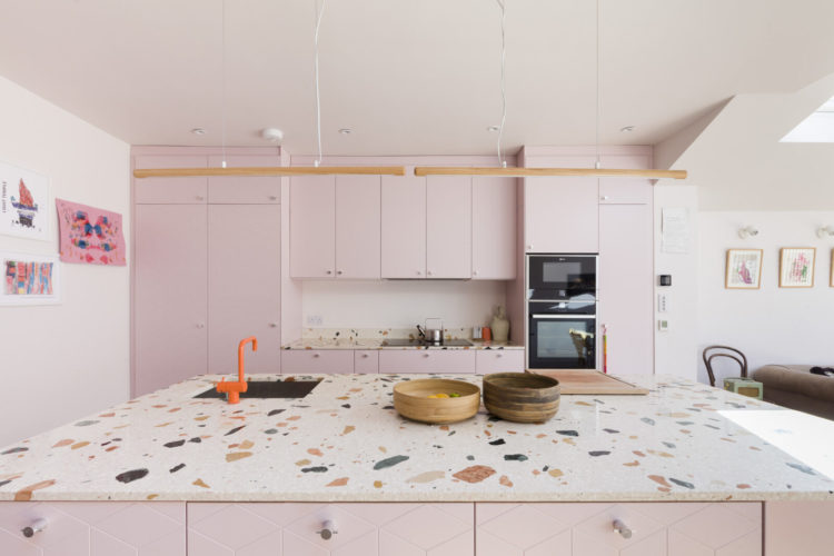
Secondly, note how the vintage dark wood really adds character and gives the space so much more depth than modern oak wood. But never mind that worrabout that orange tap? It’s a small detail but it MAKES it. Go forth and buy coloured kitchen taps. It’s warmer than standard chrome, more modern than classic brass and more unusual than black which would work but orange is better.
In short it’s usually the bigger the better except for when the zinger is in the smallest details. Clear? Mud? OK. moving on…
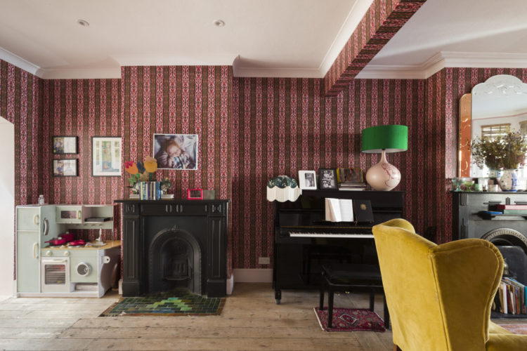
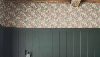
The sitting room is papered in a darker pink/burgundy to provide a link between the two spaces and here the green lampshade does the work of the orange tap next door. Another small detail – the papering of the beam. It’s a really nice touch and actually, if you have an open plan knock through with two distinct halves of a room that might be a used for different purposes, you could try painting or papering the arch or opening to zone the space.
You can see here the owners have two fireplaces and have really opened it up but in my own knock through there is more of an opening (mostly to give the overhead beam something to rest on) so the papered beam is decorative here but it’s an idea to tuck in your decorating back pocket as it were.
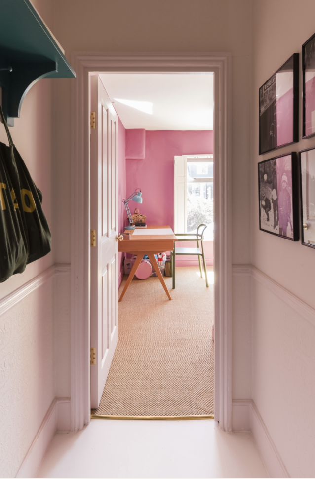
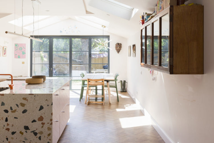
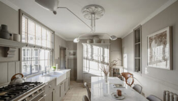
Now, come upstairs and the pink continues but this is a perfect example of why you should always consider the view into and from each room and decorate as a whole rather than taking each room in isolation. I love how the pale pink deepens into the explosion of colour at the end of the corridor.
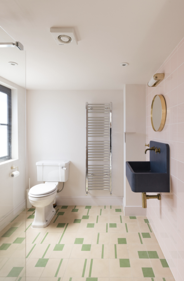
Finally the bathroom, as always I urge you to explore the rest on your own via the link above and, as Cilla would always say – if anyone buys it let me know and I’ll get my hat (Blind Date references for UK readers over a certain age).
I know this is mainly a picture of a loo but look at the basin which is one of these beauties from Kast (the dream) and again, the contrasting colour really removes any saccharine from the pink while the Bert & May tiles are very Wes Anderson when teamed with the pink.
Right is anyone moving to west London or does anyone feel inspired to paint their kitchen pink.
I love the pink of the kitchen, especially that terrazzo tile on the island. It leans just enough towards sophisticated to me. However I am not liking the wallpaper in the sitting room, especially across the beam. It has a Victorian look to it that just doesn’t go with the rest of the rooms. I do really notice the black fireplace and love that green tile inlay. It would have been nice if they had taken their decorating cue from that inlay. Also the bathroom is a bit lacking in warmth but it looks like there is plenty of space to get creative there.
What is the manufacturer for the terrazzo countertop material? Wonder if it is available in the US. Love it!
Had a bad pink experience in my first apartment that I owned. Pink walls in the living room and it was not supposed to be pink. Classic too small paint swatches and inexperience situation. I lived with it for too many years before painting it white.
Anyway. It totally put me off the pink train and for many years now I have shunned pink in any shape or form.
But I must say I kind of like the wallpaper. The combo of that rich brown with the pink. Perhaps a pillow. I could do a pink pillow. Perhaps.
A job I am looking forward to over the Christmas break is to find the perfect shade of oh-so-pale blush pinkto paint the whole of my box room/home office. Its only me that uses it for work and art/craft projects so an injection of a colour that I love (and the other half not so much) will be great. I also have alot of artwork (from limited editions prints to framed car boot and charity shop buys, photos, textile artwork and greetings cards) so I plan to use the pink as a backdrop for a great gallery wall/salon-style hanging too
Hi Longdenlife. I’m going to be painting my box room/home office pink as well. I’m going going for two tones, as I have a recessed area where I sit to plot. Pink Ground for the majority of the room and Cinder Rose for the recessed area. 🙂
Mine is pink, hankering after an orange tap!
I painted my kitchen pink about 3 years ago (RSG Bohemia on walls, ceiling and wall cupboards, F&B Off Black on lower cupboards) and I truly never stopped admiring its wondrousness. Have now moved to a tiny basement kitchn with beige gloss units but am determined to get back to pink somehow.