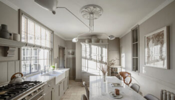
Surely the dream first time buy is a two bedroom flat with a south-facing garden, although this isn’t really first time buyer prices, but, be that as it may, it’s a great example of open plan living and squeezing a lot into a small space. Coming in?
It’s in Brackenbury Village, in west London (explains the price a bit) and is on with The Modern House for £925,000. But, as we say every week, and repeating for those at the back, it’s Fantasy Friday and we’re not here to debate the woes of the London housing market but simply for the love of poking around other people’s houses and hoping for a bit of interior inspiration for our own (other, cheaper houses are available that also aren’t in London).
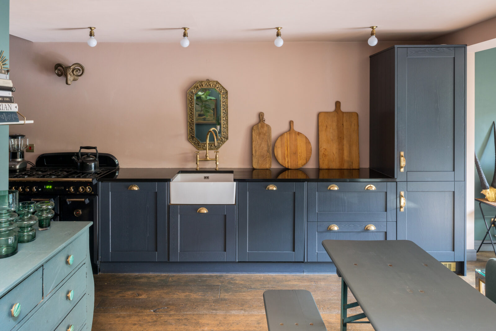
One of the first things that struck me was that for all we say don’t follow trends, this is one of several pale pink houses I have featured this year. Two years ago I could have searched for weeks to find one and now this soft plaster pink really has gained a place as a proper warm neutral. The question is: is that because it’s a trend or because it’s a great neutral base for a house in the rain-soaked climate of the northern hemisphere… answers below in the comment box.
In this ground floor flat, which might, given the size of the full width extension (basically the whole sitting room part) have a tendency to be dark, wrapping the soft pink round the walls and ceilings brings a warmth to the space that white, without lots of natural light to bounce off, just wouldn’t do.
Also the ceiling is not that high and painting it the same as the walls blurs it all together and means you don’t focus on that but rather on the view out to the garden or the furniture in the room. Outlining the ceiling in traditional white would have drawn attention to the architecture of the room – especially when contrasted with the walls. So for those of you who don’t want pink (or another colour) use white (off white/milk is kinder) but use it on the walls, woodwork and ceiling for the same effect.
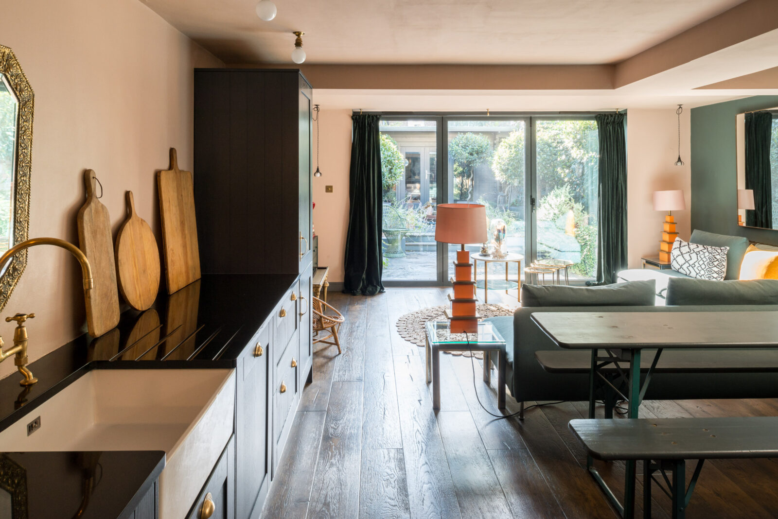
So you can see that it’s all one large space and I love how the back wall and ceiling are one colour which match the kitchen wall over the units while the blue of the units is picked up on the living room walls and the darker dining room end. If it’s dark it’s dark – there’s a limit to how far you can fight that so sometimes you just have to embrace it.
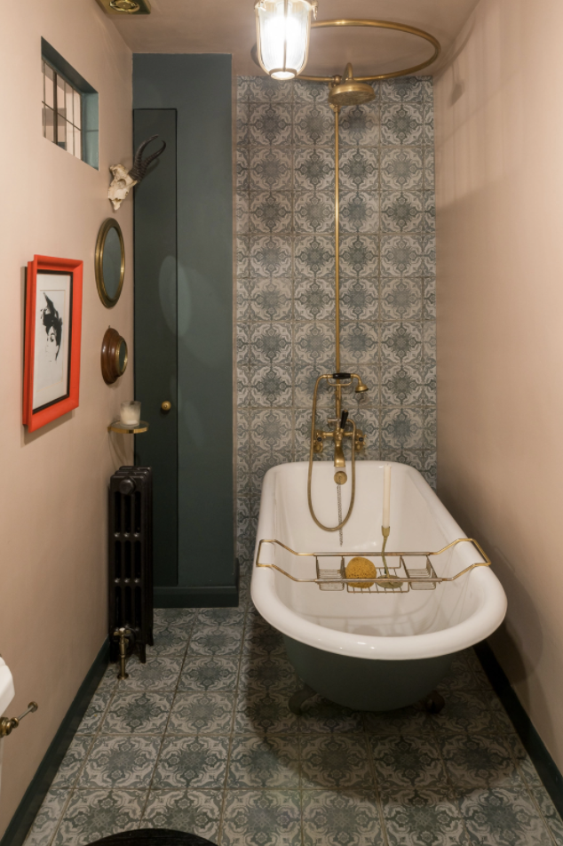
The same plaster and navy colour palette continues through the flat as you can see in the bathroom above and the main bedroom below. This is a small bathroom with no window and yet there’s been no compromise on style. The bath feels luxurious, the tiles bring personality and the neon red artwork brings that important disruption to this muted colour palette. If you like baths and you have a small bathroom, don’t feel you can’t have a statement bath. I can see the shower curtain has either been removed for the picture or isn’t there – perhaps the owner doesn’t splash much – but you get the idea. It doesn’t have to be all sleek and white and fitted just because it’s small. If you look at the floorplan you will see there is a space-saving corner basin and that’s a tiny cupboard at the back. I’m also going to guess that,with a radiator that size, it’s lovely and warm.
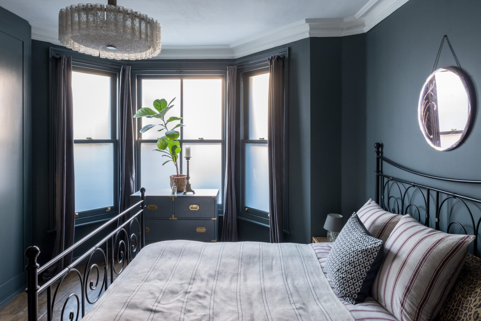
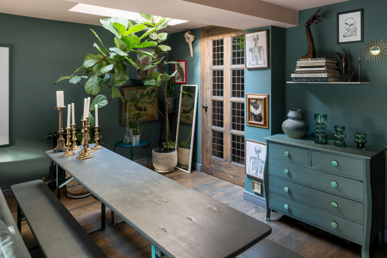
Now into the bedroom (the second one is small and painted in the pale pink by the way with dark blue skirting boards keeping to the theme and you access it via those wooden doors at the back of the dining room, which makes sense if you look at the floorplan – otherwise you would be stepping out of bed and practically into the oven).
Period flat conversions depend so much on their design and who puts which walls where. This has been done well and the only thing I might change in a similar arrangement is the addition of sliding doors which take up less space and in small flats, every inch counts.
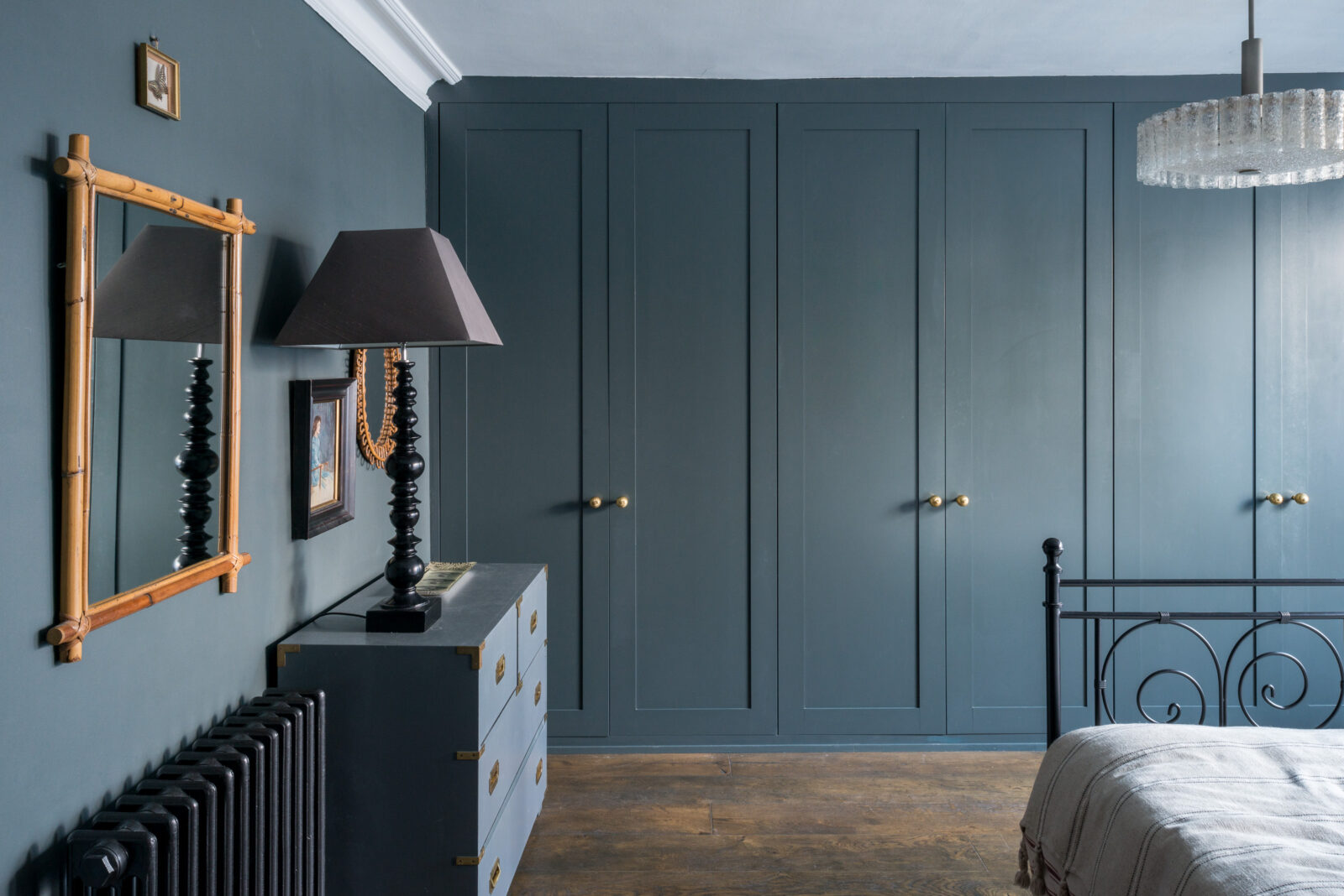
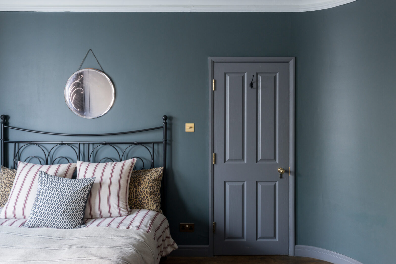
Anyway, this bedroom, a unifying blue throughout. The ceiling is lighter and in bedrooms it’s a preference thing. I love dark colours but need a pale bedroom to get me up in the morning. When I once painted the ceiling dark The Mad Husband said he couldn’t sleep for feeling like it was bearing down on him. Others will prefer the cocooning effect. Whatever works for you. That said, this pale ceiling also echoes the pale bedding and lightens the whole room.
However, the woodwork, while not matching the walls, has been done in a toning shade rather than a high contrast white and that looks modern and restful. The wardrobes have also been painted to match the walls and while this is a good sized room, that does make them recede into the walls and not dominate the space as a wall of cupboards in a contrasting colour might do.
Finally, the real bonus of this flat, and other reason why it is priced high, there’s a whole extra room at the end of the garden in the form of this shed office (I’m going to acknowledge that people are calling them shoffices but will never do so again after this. Maybe). Isn’t it great? It’s 12ft x 8.11 or 3.7m x 2.7m which is plenty big enough to work – perhaps even fit two desks, or a seating area or just a lot of storage.
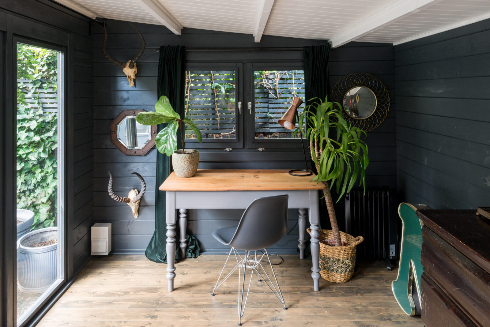
I’d very happily work in there a short commute from the kitchen. What do you think? Anyone contemplating building an office in their garden?
Does the second bedroom have no window? I have to say I’m glad I live in the north when I see this described as a dream first property. Very beautiful but so tiny and three times the price of our 4 bed!
This looks very restful, and like Juanita, I’m in Ontario, Canada, and just a lotto win away from my UK dream escape (maybe not this year 🙄). With regard to the colours used, they are lovely, but I’d be afraid I would tire of everything looking so much the same.
A big NO to pale pink…. reminds me of chicken breast fillet… :O
That made me laugh!
From Toronto, Canada, and I love your blog! I look forward to this feature as it allows me to dream about moving to England for a bit. I’m still not sure I could do pink, although you are gradually convincing me, Kate. I grew up in the 1980s, and I painted my tiny bedroom candy pink. I think I’m still in recovery!
Would love to work in a shoffice (lol!) like that in Toronto, but might be a little tough plowing through snow to get my coffee in the kitchen.
I am ready to pack my bags to move into this house when I win the lotto!
Kitchen very similar to my own but I have half a wall and band above hob done in eating room red ( Farrow and Ball?) so the walls and ceiling were painted a cool white who’s name I’ve forgotten but I find it too cold and now wish I had done a pink. But then dont think pink walls /ceiling with a bit of red would work?
Love all the rooms except the bathroom.The bath itself works for me but I’m not a fan of the tiles and paint colours – it feels less restful to my eye than the other rooms somehow.
We are planning a garden room but problem is we want different things from it. I have struggled with my lovely home that I have taken years to get just right being turned into an office/gym space for the menfolk mostly. I’m keen on gardening but also love to just sit in the garden space undisturbed. Others have very different ideas ( gym equipment, steam room /sauna) thankfully the budget will put paid to their dreams
I think a plaster pink would look fantastic with eating room red! You’d have to be careful to pick pale with peachy undertones, not grey, for it to work I think.
I really like the bathroom design in this house. The brass fittings compliment the patterned tiles and the two colour wall palette.
The striking feature in this room, apart from the red framed print, is the cut out opening in the wall to permit borrowed light into the room. It is high enough to respect privacy, and interesting enough to want to have one at home. If all of the blue were to stay, I think a terracotta palette would work well in this house. Cinnabar or ochre.
Perhaps it was Beth Dadswell with her Grand Designs Courtyard House that introduced us to “plaster pink”?
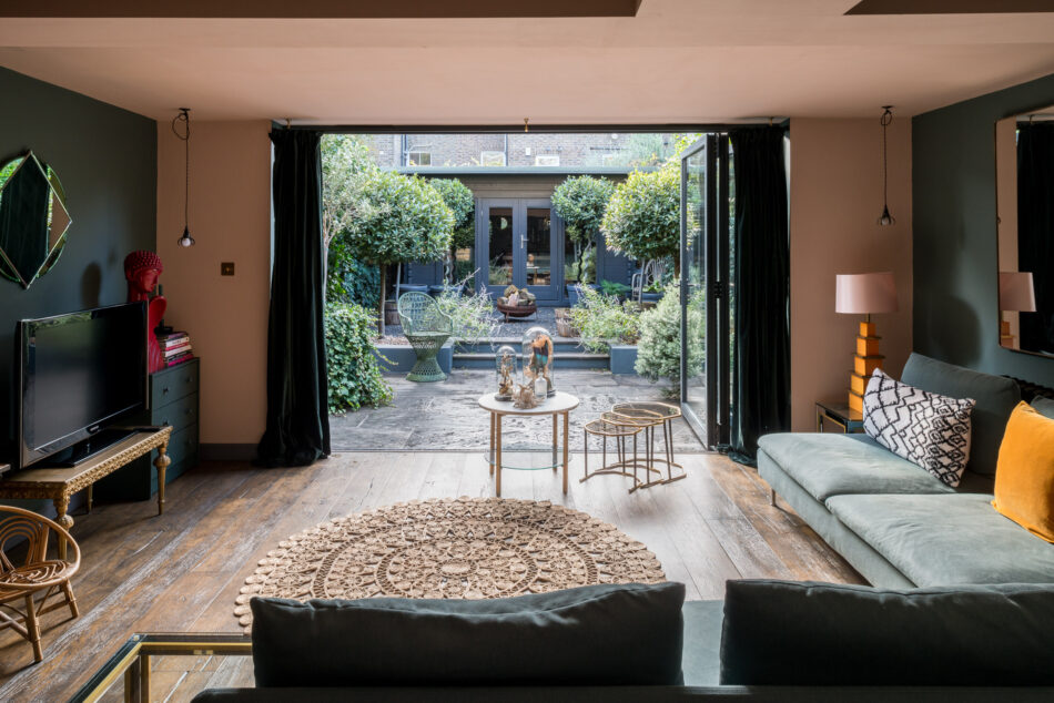
In this flat I think it was a great pity that they did not insert a ceiling track at the garden windows end so that the curtains could be pulled right back to the wall. They do look so unappealing as they are.
I built a 3m x 4m garden room over 10 years ago and it has been amazing – playroom, computer games room, office, sleepover den, teenage hangout space. Of all the changes we have made to our London terraced house this was the cheapest, quickest and most impactful.
Just saved a few of these pics – the kitchen saved for the colour scheme I have in mind for my boxroom/home office makeover (soft pink and navy/black) and the bedroom as this is very similar to the colour I have in mind (and I also have a black iron bed too!).
I really like it. So well thought-out although if I lived there I would have just a little bit more of the disruptive elements if you see what I mean? I like that they resisted the lure of a kitchen island, and also that they haven’t pretended that tv-watching doesn’t happen. On the sliding doors – I had a Georgian conversion flat and we removed the wardrobe sliding doors and replaced them with a curtain as the building was always gently moving with the seasons (hello London clay 🙄) and the doors were always coming off their bearings.
I’m a big fan of the pink – wish I knew how they achieved it!
Hi, you mention the floorplan a couple of times but I can’t see it?
click on the estate agent’s link and find it there
Ah Kate, you always manage to make me laugh on a grey morning. “Stepping out of bed and practically into the oven”. Priceless. I’d love to paint some walls in this shade of pink but I’m terrified that it would turn out to be marshmallow or candy pink. Which tasteful plastery pink do you think this one might be?
It’s lovely. My only issue is the price. This is an almost million pound property! (I know, I know it’s London, but hearing about potential public sector pay freezes and all the incredible work frontline essential workers have done throughout this pandemic, none of them could afford a London property like this).
I love it! I would just need something to rest my back while I’m eating. These benches look great but are probably for very young people 🙂
there is absolutely nothing I dislike about this house. The only change I would make is to put a cushion with some colour on the bed