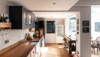
Oh I had such a good house for you this week. A real mix of yesterday’s post actually so I know you would have loved it. It was all dark and rustic with lots of William Morris velvets… anyway it’s been taken off the market so you can’t see it but just consider a floral velvet sofa with a couple of battered leather armchairs next time you’re redecorating. Instead we are going calming and neutral in this Georgian house. Because this week, what with one thing and another, I need a bit of calm.
And the thing about Georgian houses is that the proportions are always so lovely and the detailing so pretty that you can do anything you like to them and they still look good. It’s the old Kate Moss in a bin bag scenario.
So while here the vendors have opted for a palette of warm neutrals and classic shapes you could totally fill it with mid-century or ultra modern pieces. Or, more likely, a mix of both. This is a Georgian townhouse in Ledbury, Herefordshire, 15 minutes from the train station which goes direct to London, Paddington.
This is the perfect example of a growing post lockdown phenomenon of people wanting to move out of cities to have more space in the country. This is on the market with The Modern House for £575,000 and has three bedrooms, three bathrooms and an office studio space in the loft.
While the garden is small – courtyard town – you are in walking distance of shops, transport links and open countryside. And it’s very pretty with a high street of butchers and bakers. According to Tom Dyckhoff, writing in The Guardian, there’s no candlestick maker but there is a traditional gunmaker…
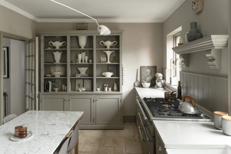
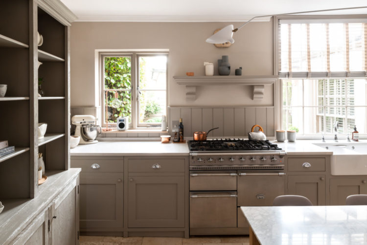
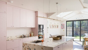
One thing that’s also good about examining this house is that you will get an understanding of how important it is to assess how colours make you feel before you decorate. You might be desperate for an emerald green sitting room but you need to stop and think about how you feel when surrounded by that colour. It’s something we have talked about a lot but I also think it’s quite instinctive if we take the time to stop and listen to ourselves.
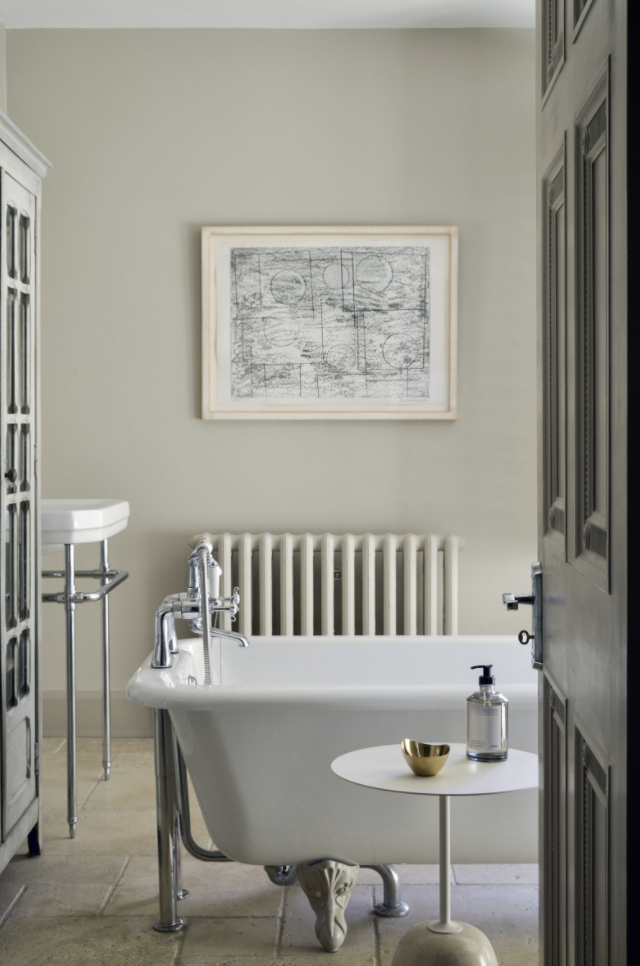
Some of you will look at these rooms and breathe a sigh of relief. Others will feel miserable and drained by the palette and it’s key to know which you are. There are no right or wrong answers here – well it’s only wrong if you ignore your gut. And it’s as important to know what you don’t like as what you do.
The other point to note – if you fall into the category not liking this is what would it need to work for you? A few brighter cushions or a full on repaint? Does a neutral background filled with colour work for you or would you rather strong walls and calmer furniture?
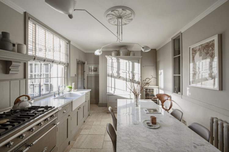
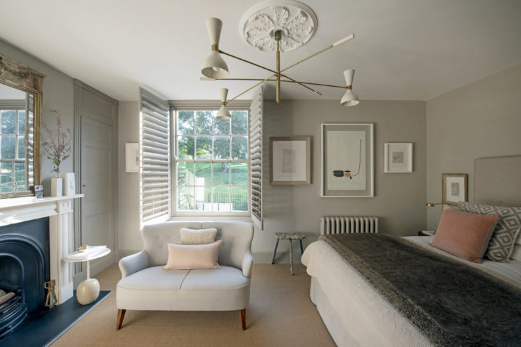
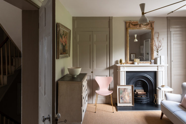
Work it all out and make a note of it so that you can begin to compile a list somewhere (lookout next March I have just thing coming for you) of what your personal style is and how to achieve it. So for me that top image of the sun pouring through the shuttered window is just heavenly and I’m immediately thinking that’s where I’d have my morning coffee.
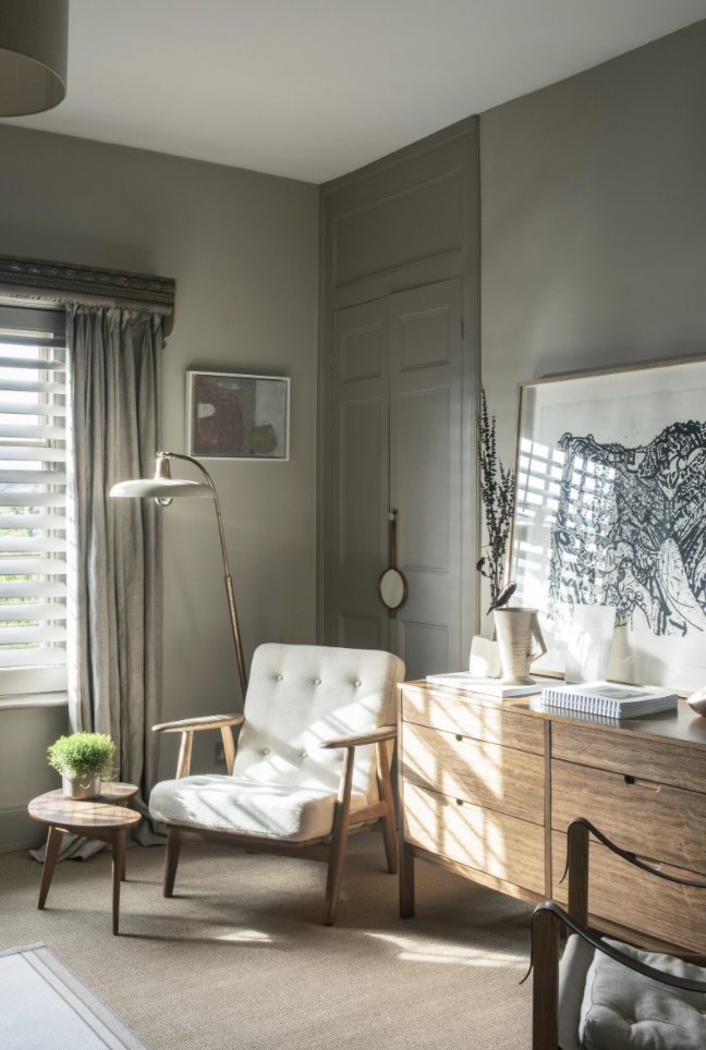
But the image below that (perhaps the sun hits there later in the day) is another lovely spot and is perfectly styled. This house is a master of styling. The chair isn’t solid so the light passes under and through the arms and stops it blocking the corner. The floor lamp brings height and encourages the idea of sitting down with a book while the coffee can sit on the table. It’s all neutral but warmed by the natural wood and different textures of the curtain and the chair.
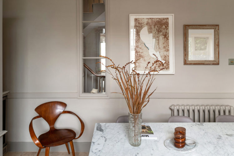
Sticking with styling and can you see how the rich wood of the Norman Cherner chair (they’re lovely. Classic and very expensive) links to the grasses in the vase and the glass candlstick on the marble. All those elements warm the wall behind which, if the chair was black and the vases black would be much cooler and stark.
You never use a colour in isolation it always forms part of the whole of a room and in that way you can warm a cool grey or cool a rich pink depending on the tones you put with it.

Absolutely beautiful house, Kate – and I love the Cherner chairs and the tactile ceramics and great art. But for me it’s let down by feeling too designed – it doesn’t feel like a home but like a stylist’s vision of a home. And that’s not simply down to the restrained colours. Though personally I need colour – I was recently decorating a house for some clients who insisted they wanted it kept white as it was a rental. By Week 2 I was pinning colour charts to the gleaming walls as it felt like an asylum …
Lovely. However, I also miss colours. Saturated, bright pops of colours 🙂
The comments here illustrate your point perfectly. Personally I think the house is lovely – I could move in and not change a thing. I find colour stresses me and the calm colour palate ( including the stone floors – because you can change paint but floors are harder) would be a big selling point for me. If I want colour I’ll buy some flowers – by the time they are dying I’ll be craving a return to monochrome!
This house has been done up impeccably. So easy to live with the restrained palette if you were to buy it or add colour as you wish. Personally I love lots of colour and clash, but I still find this house very serene. I feel like it would make me a calmer person!! 😅 Do I need to rethink my decor?! 😬
Greige…on a greige day. Depressing. 🙁
I think houses are like people in that they tend to suit either gold or silver better depending on their undertones. I don’t like the gold accents (or the orangey wood) with that cool grey wall colour. Something about it is jarring. Look at the steel and chrome in the kitchen and bathroom – a silver tone is far more harmonious.
I think the reason why you are getting so much ‘bang’ for your bucks is because of the Ledbury location. It’s a stunner but all the grey is a tad depressing – but easily resolved.
I’m no Sophie Robinson when it comes to colours, but boy this is boring!!! Bring out those WM velvets, Kate 😉
Great house, but sadly nowhere to park the campervan or car!
Love this house , it’s a styling masterpiece for me . Kate could you breakdown the colours ( nearest equivalent etc ) .I have been looking for reasonably priced armchairs with oak arms for ages …any ideas where I would get similar to those seen here ? . Target have similar but don’t ship to Ireland .
I don’t understand, why is this only £575, 000? Where’s the catch. This is a good buy!
I like this house but would def decorate to add some colour and warmth. I recently had a colour consultation for our home and def we need colour, it really lifts our mood. Yes please to the Norman Cherner chair💓