I went out on a job last week. A proper get up early to be on set, fill the cab with props sort of job. It was styling two room sets for a brand (more of which I can tell you about next week) but one of the key elements of the rooms were the colours they had been decorated in. There were three of us taking part in the campaign which was led by the colour expert Karen Haller, whose work I have featured on these pages before and who interviewed me about my colour preferences at the start of the year.
The main thing I remember during that interview is telling her how much I dislike yellow. And then, or course as regular readers will know, I spent most of the last lockdown fantasising about painting my kitchen that very colour. Well it doesn’t take Freud (although Karen is a colour psychologist) to work out why I might have been drawn to the colour of the sun after six months indoors.
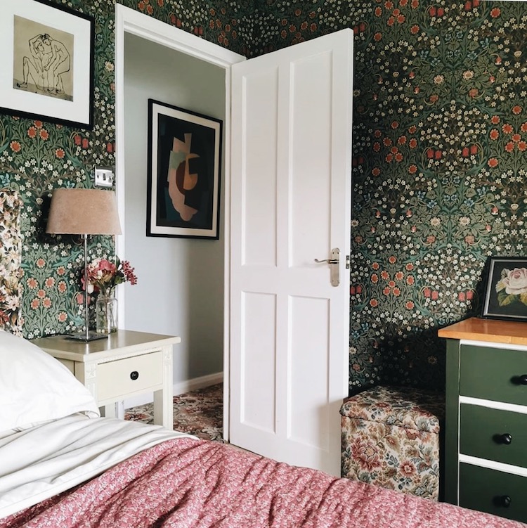
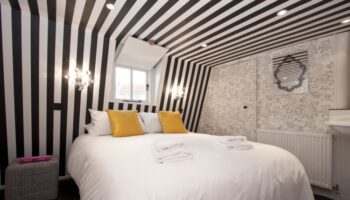
But the colours and motifs of nature are behind today’s post as well. My current favourite is green and I wonder if months inside have led to the resurgence in popularity of the designs of William Morris. His work was already coming back into prominence but it feels so right for now I wonder if it has been speeded up? Above is his classic blackthorn in the home of Laura @nofeaturewalls who has used it wrap her bedroom.
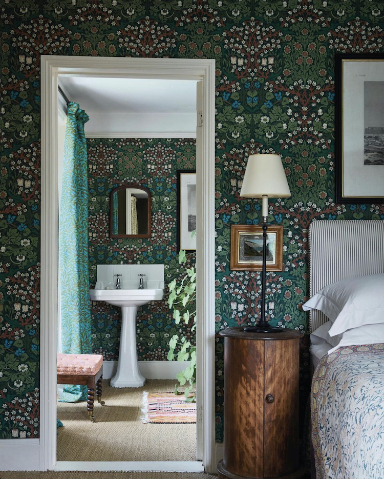
The designer Ben Pentreath has worked with Morris & Co (early signers of the Design for Diversity pledge) to recolour some of the Arts & Crafts designs for 2020. Blackthorn, seen above, was designed in 1892 by J.H. Dearle and you can see Ben’s new colour on the Willow Bough Curtain above. He first saw this colourway on a friend’s sofa in Italy and discovered that it had once been created as fabric but never as wallpaper. He has now brought back the fabric and added the wallpaper to the range.
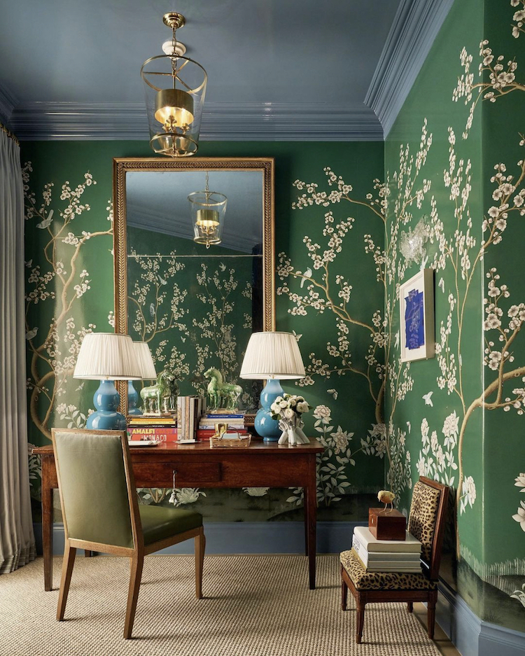
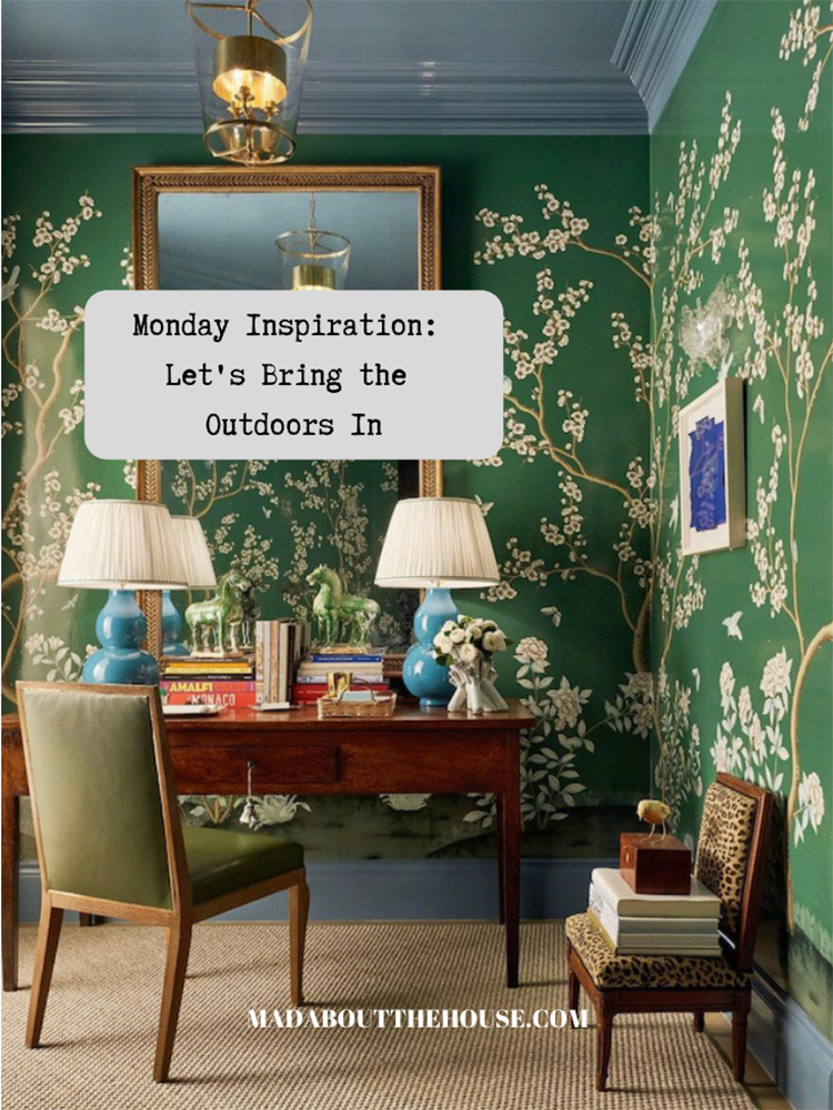
Or what about this gorgeous desk area by M Interiors for the Kips Bay Dallas showhouse. This is probably the closest you can get to working in a garden and studies have found that looking at plants calms the mind, although I don’t know if it’s the same for pictures of plants. What I love here too, is the matching ceiling and skirting board. You know I would always say don’t use white, but a more conventional choice might have been to use a soft cream – like the lampshades – instead she has used a soft blue that both tones and contrasts.
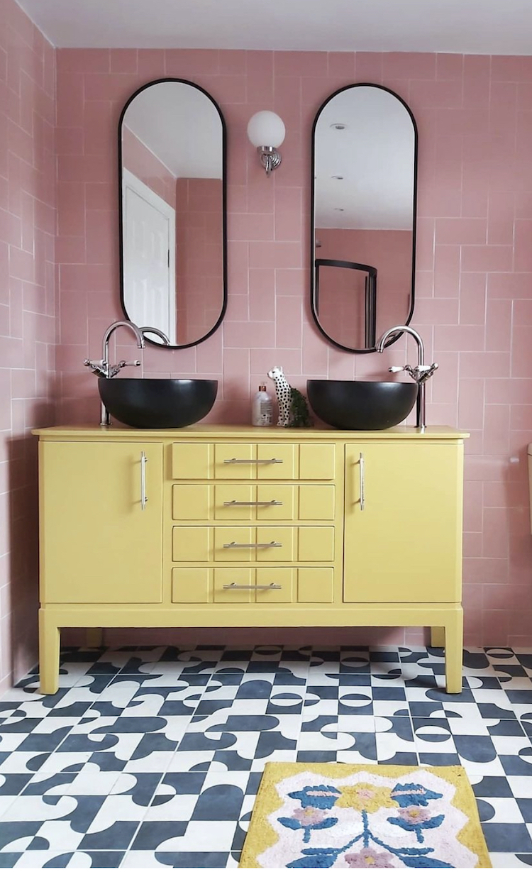
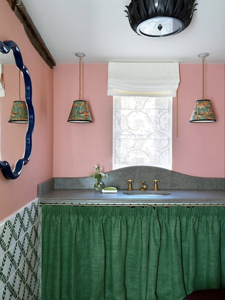
Bookending these collections of wallpapers are two rooms with bold block colours. The top a bathroom by Beata Heuman who has contrasted her candy pink walls with a rich emerald green sink skirt (they’re coming) and above Karen Anita who has upcycled a cabinet in a bold yellow in her pink bathroom. It’s a tough call if I prefer pink and yellow or pink and green. I have the latter in my house (albeit significantly less bold) and love it although part of me adores the pink and yellow but feels it might be too much. Another few months of lockdown and I may be back to loving all things yellow.
What do you think? Have your colour preferences changed over the last few months? Has there been a gradual pull towards more floral or outdoorsy themes?

I wanted to think a bit on the photos of colour in your recent posts. I love greens, those with a hint of grey. The yellow lamp in a previous post is delightful to the eye. My own interior aesthetic is mostly Scandinavian. Lots of natural materials, wood, wool, sisal etc. Perhaps our northern winters have something to do with this. However, I love the yellow lamp! It’s design is minimalist (all for this), the colour striking, and well the price tag suggests this is limited edition run, I can visualize it even inside a Victorian parlour where the illuminating wallpaper designs of William Morris served to remind Victorians to return to Nature, and to see colour beyond black and white. Enjoy your posts, look forward to seeing them.
Interesting to hear your thoughts on the colour yellow, Kate. I’m just refitting a north-facing bathroom and wanted to use yellow with my white and grey tiles.
Such a difficult colour to get right! Love a saffron but many were too dark, many yellows too acid or custard. In the end I’ve chosen a PPL paint in ‘Aeoli’, which is a perfect soft yellow.
Absolutely despise “skirts” Kate 😂😂 I’d actually leave a gap in the kitchen before I would put one in!!! I do love the yellow cabinet in the bathroom tho.
Absolutely despise “skirts” Kate 😂😂 I’d actually leave a gap in the kitchen before I word out one in!!! I do love the yellow cabinet in the bathroom tho.
Those are some really fun wallpapers! Bold choice but they turn out pretty harmonious with other elements of the room. I like the idea of bringing green and nature inside – exactly what we all need during this time.
Apologies for this but I really dislike all the rooms above and on the whole find them stuffy and depressing even. Give me a room with a table or a shelf artfully displaying lovely fresh REAL green plants and the outdoor connection is instant and uplifting. During my months of shielding I feel this even more, so bright and fresh for me every time. Sorry xx
No need to apologise – I think we all like real greenery when we can get it. Maybe it was the wrong title – it was more about using those colours and florals as motifs.
Green, green, green…
I’ve just finished painting the inside of a glass fronted cabinet in my kitchen in an emerald green.
Love green! Love all types of green. And green botanical wallpaper is the best! And botanical fabrics! Lovely!
So I don’t know if I my preferences for interior have changed exactly in that sense. But I have noticed that I have less patience with clutter and want less stuff. I guess i get more bored with my stuff now when I see them all the time?