I mentioned on Monday that I recently visited the Farrow & Ball factory to see their new colours. This is always an event as they only release new colours every three years but, of course the pandemic threw everything off and these are the first new shades since 2018. In addition to these 11 new shades, Paint and Paper Library have launched a massive 32 new shades and, of course, it’s the annual Colour of the Year from Dulux.
And then into this sea of warm neutrals and Autumnal colours – these colours really are all very me, comes Mylands. And talk about bucking a trend. This hot pink is from their Film, Television and Theatre range (FTT006 to be exact) which long term readers will remember I used for the gold ceiling in my office at the old Mad House (FTT002).
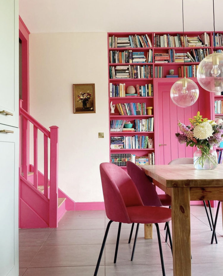
Dominic Myland said: “FTT-006™ is an unfailingly cheerful and bold pink that’s proving not only to be incredibly popular, but also more enduring than just another trend or fad. It’s a confident shade with the power to completely transform a space, and its intensity makes it hard to forget. Hot pink is playful and eye-catching, and though it’s the colour of the moment, it’s a stylish shade you won’t get tired of any time soon.”
That remains to be seen but I bet it woke you up didn’t it! Let’s return to the stronger trend of Autumnal colours and I wonder if they would have been different if released in high summer because while this is very much my palette there’s no doubt that it fits the changing season perfectly.
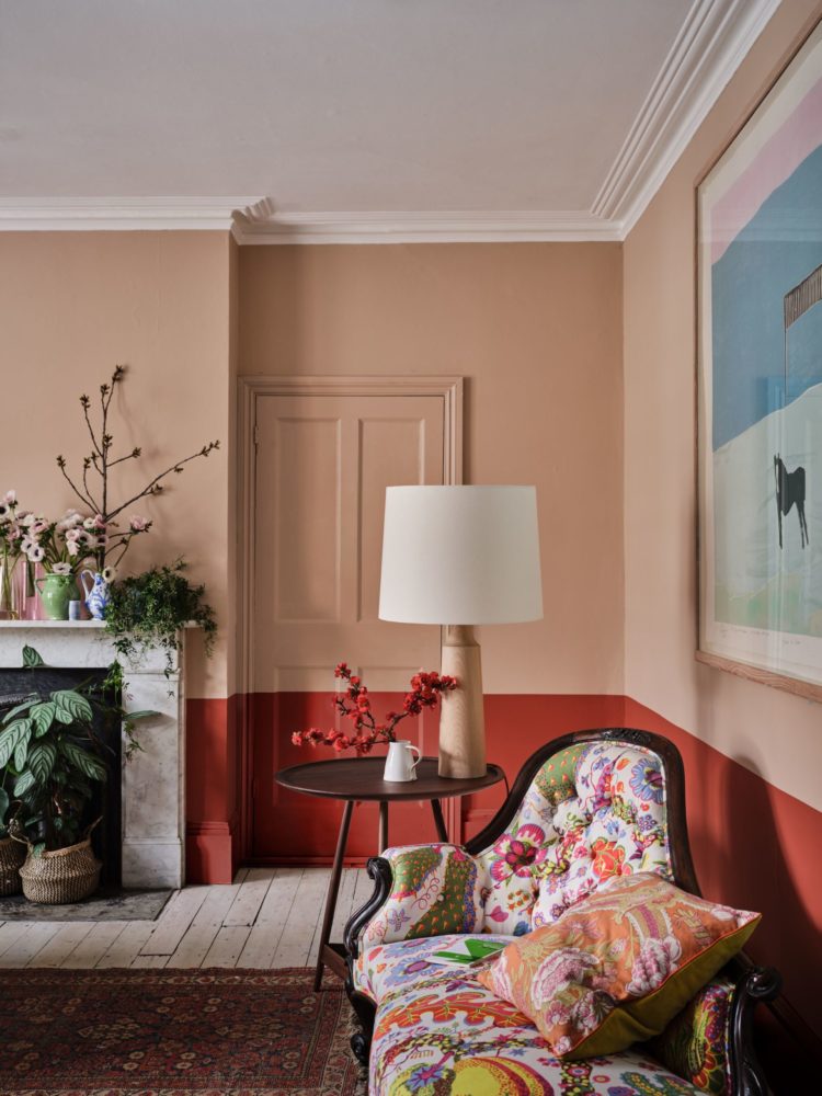
At the Farrow & Ball launch, Joa Studholme, the creative director, spoke of how the way we use our homes has changed during the pandemic and the new earthy warm colours reflect that. Stirabout, a lovely warm oatmeal inspired by Irish porridge, joins their range of neutrals but it’s one of those colours that’s very hard to photograph so do get a tester if you’re interested.
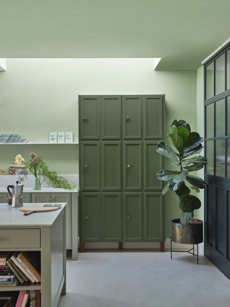
The other new shades include Tailor Tack and Templeton Pink with Beverley and Whirlybird greens and three new blues – Wine Dark, Selvedge and Kittiwake. And they’re not done with grey yet either as Hopper Head sits between Downpipe and Railings. The 21yo, who has been angling for a terracotta for his new bedroom and has flatly refused everything I show him that I would call terracotta has decided that the dark orange of Bamboozle is the one for him. I’m fully on board -it will sit on the lower half of the walls with, we think, Stirabout above and Hopper Head on the window. I will, of course, keep you posted.
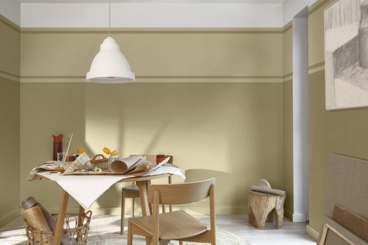
Onto Dulux and this year the colour is Wild Wonder, a sort of pale straw-like yellow. I rather like it although whether I would have the courage to actually use it is another matter. It’s not a million miles away from the Devol kitchen I posted on Monday. You might have to trust me on the colour though as I’m not sure this picture does it justice.
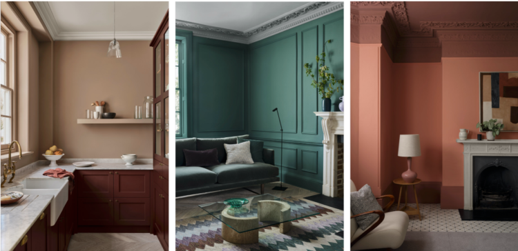
Finally, Paint and Paper Library with a massive 32 new colours and I’ve put them all together here because, for me, everyone’s a winner (baby). At the moment we have decided only on the colours for the 21yo’s bedroom so the sitting room and our bedroom (and everything else) is up for debate.

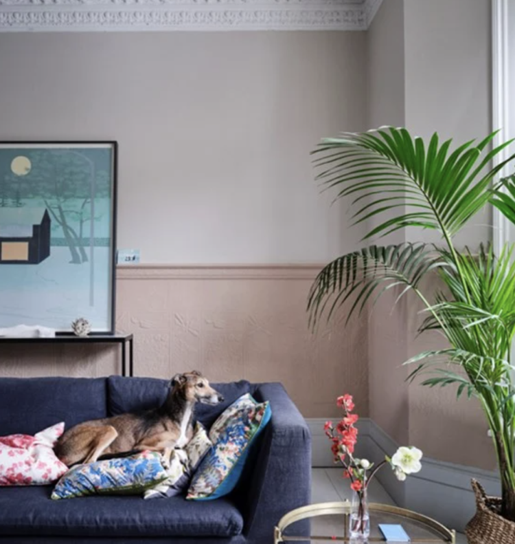
All I know, at the moment, is that this house doesn’t feel like it wants to go dark. The old house was bigger and we tended to only use the sitting room in the evenings. Here the back half is to be my office so I will be in here for much of the daylight and I think warm neutrals is where we will be focused. Watch this plan change!
Now, if you want to know more about these colours and my thoughts along with Sophie’s we will be discussing them at length on the podcast. You can be sure we will disagree so let me know your thoughts either on the colours as you see them here or when you have listened.


The Mylands pink feels almost already passe to me – Valentino pink was so aggressively everywhere earlier in the year that it feels almost like that colour has been and gone. It’ll be interesting to see if it holds!
I’m painting our (dark) sitting room in a few weeks and am currently dithering between a terracota Lick Red 03 (maybe too orange tone…) Farrow and Ball Crimson, and Little Greene Blush. There are warm wood floors, door frames and doors which I don’t have it in me to paint, and a weird warm beige marble fireplace and ledge thing (which I don’t have the budget to tear out). We went dark green in the very dark living room and LOVE it but I think a red/pink tone might be really nice and cozy for the sitting room, but who knows…
We’ve removed all the wallpaper (including two layers on the ceiling?!!?) and the plasterer comes on Monday which might help the decision. The colour of wet plaster is decently terracotta-ish so I’ll be able to see how I feel about it.
Have you considered a blue? Like Oval Room? I think that is a lovely colour with warm wood and beige.
Hot pink, yes please! It’s so cheerful and we could all use a lot more cheer in the world.
I like the mylands pink, I’ve used strong pinks as a disruptor colour in a couple of rooms and they are joyful.
Otherwise I’m loving the F&B Kittiwake, I grew up on an island and it is so evocative of the sea. A perfect blue.
I liked the colors Beverly No.310 and Whirlybird No.309 the most.
Very helpful item and did remark the De Vol kitchen colour, very nice. I think the Dulux colour of the year is beautiful, but prefer F&B quality paint over Dulux. Do you think F&B Gervase Yellow could be something similar? Unfortunately it’s not possible to order a sample pot, as this is an archive colour.
Mylands’ hot pink: over my dead body. Just looking at it gives me a headache. Although I did love the vibrant pink you used on your library fireplace back in the day, Kate. Love the look of the Beverley green. Can imagine that on kitchen cupboards: strong but not as black-undertoned as many of the dark greens I see.
I agree that softer, muted, lighter chimes with me at present.
Thanks for this Kate! Not sure I agree with mylands that you wouldn’t tire of their bubblegum pink!
Love the look of the Paint and Paper range – are they now part of the Little Greene company?
Am I the only one who finds the F&B new colours just a bit meh? As a long time fan and user of their paint, I found some of the colours a bit too like the 1980s Dulux ‘apple white’, ‘barley white’ etc: https://m.youtube.com/watch?v=_Kd42tWHVoM
I think I’d need to see them in the flesh and Patrick O’Donnell of F&B has used them in a classical gatehouse and some of the spaces look stunning: https://www.houseandgarden.co.uk/gallery/fonthill-arch. Esp love the lobby in Beverley and the use of Stirabout with stronger colours in the kitchen.