Maybe it’s a week of living in grey walls, maybe a week of being surrounded by cardboard boxes, the piles of which don’t seem to be getting any smaller, or maybe it’s the fact that the carpenter is coming next week to build shelves, wardrobes and storage and I need to pick all the paint colours that has drawn me to this joyful riot of colour in East London.
Now let’s be clear, I couldn’t live with this much colour in my own house but I’d like to visit and there is definitely inspiration to be gleaned from these walls. That said, it’s Georgian and Georgian houses are the most elegant and adaptable of all the periods – high ceilings, square rooms and detailed plasterwork means they will take the minimal clean lines of mid-century just as well as more ornate colours and patterns which is what we see here.
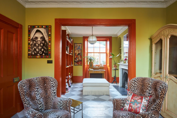
It’s on with Inigo for £1,195,000 and has three bedrooms, one with a tiny en suite, and lots of living space. The owners collaborated with the designer Benedict Foley who has used colour in a brilliant way to highlight the features of this period property.
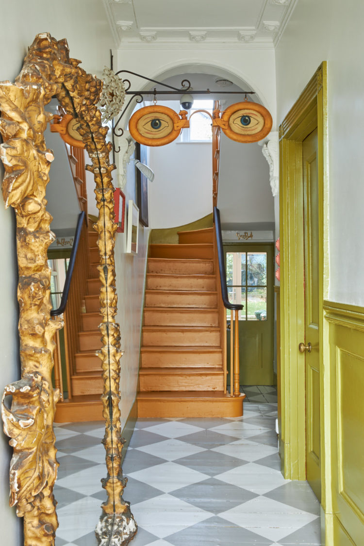
Coming into the hall with this painted checkerboard floor. It’s much softer than the more traditional checkerboard tiles (which I currently have in my hall and which are GOING as they make a small space busy and cluttered and they are not original). This floor is grey rather than black (it’s not your eyes) and the key is using tough enough paint to withstand daily life. The Mad Husband could not countenance this (I have checked) but in this colour it provides a calming counterpoint to the acid yellow walls. And yes I have spent some time hunting for a vintage optician sign like this one to hang in my hall. I found one on Etsy and it costs £2,600 so there it will stay sadly.
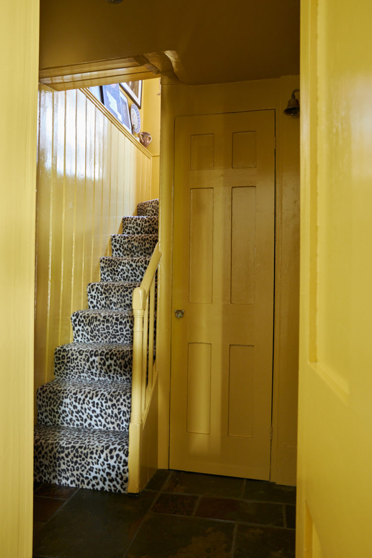
Now I think we all know I’m not going to do a yellow staircase with leopard print carpet, but the sheer joy and exuberance of that shot thrills me and maybe it will inspire you. If those are your colours- if you wear leopard or secretly wished you did – then you should make that link between your wardrobe and your walls. Perhaps you know you will never wear the leopard yourself so why not dress your stairs in it? You are always moving on stairs so you will never have to sit and look at it for hours on end (sitting rooms need more care for this reason) and maybe it will give you a burst of joy when you come down in the morning and climb up at night. This house is all about encouraging you to find your joy in the things you choose to surround yourself with. And let me tell you that moving into a house that is painted in 50 shades of cold blue grey (I love a dark charcoal, on the other hand) has not brought the joy. If I had moved in here, even though I would tone down and decorate, I think it would bring more happiness on a temporary basis than the cool neutral tones of a pale grey.
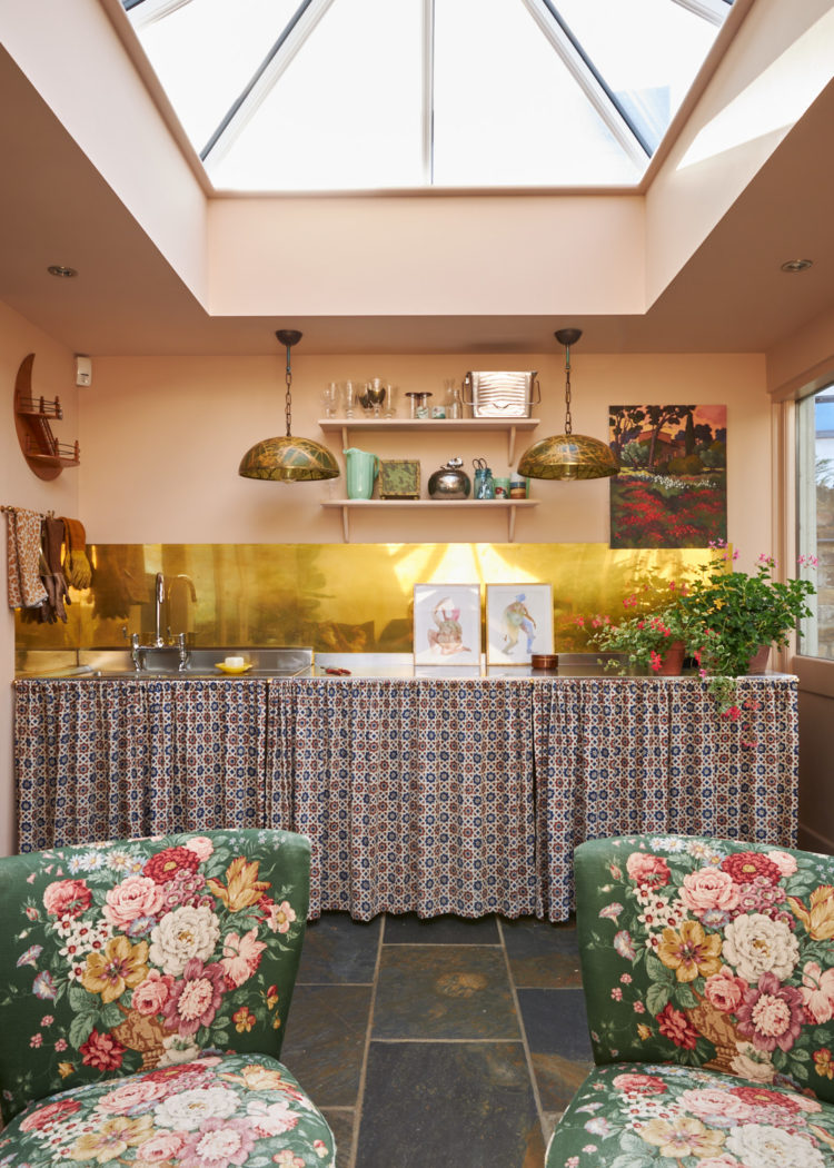
Now this is the garden room so a little more relaxed than a kitchen which is why this expanse of curtains works. The Mad Husband puts his foot down about few things, but cupboard curtains is one of them. If you have a lot of glazing though – as this does – front and back and roof, then it can be hard to add softness as there’s no place for curtains. Adding richly pattered floral chairs – in a vintage style to contrast with the modernity of the room design – helps with that as does the run of under-counter curtains. The brass splashback says fun and bar and let’s have a party in this room but make sure someone can do the washing up if they feel like it.
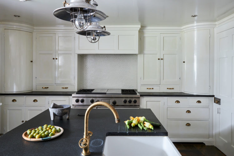
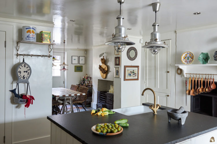
The kitchen, on the other hand, is in complete contrast to the rest of the house. It’s a bold move to completely change styles from one room to another and you run the risk of the house looking like it belongs to two different people but, then again, maybe it’s a good idea to have a respite from all the colour and pattern. I worry it feels like they were panicking a bit and wanted to have one room that was a little calmer.
The dining room provides a link between the two styles though with its checked table and leopard print chairs both recalling the zing of the floor above.
While we’re in here a couple of design points to note for your own places. A gloss, or slightly shiny, ceiling will bounce the light around as you can see from the pictures. Yes it will highlight any lumps and bumps in the plaster but if you live in an old house chances are you will never get rid of those anyway so you might as well opt for the light reflecting qualities of a shiny paint over a matt smooth finish. And the lights over the table – we have seen a lot of chandeliers over tables in recent years but if you don’t like that, or your budget doesn’t stretch, then buying a group of simpler lights and hanging them in a set at different heights creates a more individual and modern version of a chandelier.

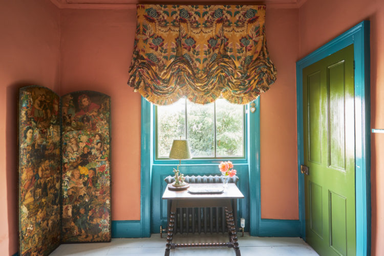
Back to the colour. Now this is might be too much for some of you but it shows you the versatility of decorating with a bold print. Firstly all the colours in the blind are used on the walls and woodwork. Secondly you could redecorate this room about 18 times in 18 different combinations before you needed to shell out on new window dressings – and they are fearsomely expensive. So the takeaway here is rather than spending a lot of money on a plain blind that won’t make your heart sing but feels sensible, spent the same on a pattern you love and change the paint. This room could also have all blue walls and woodwork, or all terracotta, or fewer combinations of the above. If you really wanted to knock it back you could have cream or pale yellow walls and just paint the woodwork in one of the stronger colours, which would be much more subtle but still very effective. The point being that the bold print which might, at first seem an indulgence and not the sensible choice turns out to be the most versatile and will give you many more looks for your money than the plain one.
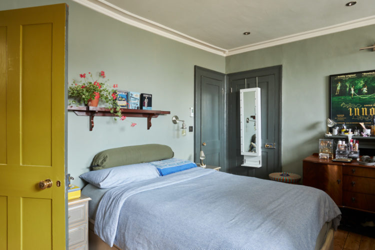
The bedroom below is much more muted in tone but if you ever doubted the point of a door as a decorative tool then doubt no more. I appreciate you can’t see that burst of yellow when you’re in bed but seen from this angle it’s a wonderful splash of colour. As I say, you may not want this shade, but do think carefully if you really want plain white. I can also tell you as I sit here looking at the once white woodwork of the new house, which is now all a rather unattractive shade of nicotine, that white paint yellows over time and stronger colours are more stable so you can probably decorate less often.
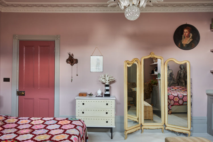
The room below also shows off the joy of the door as a place to bring colour. It’s painted in Little Greene Ashes of Roses with the walls in Peachblossom and the architrave in French Grey. Again, these may not be your colours but imagine, at least, how much less this room would be with a plain white door. And you could repeat this idea with any colours you like in variations of light and dark.
Now I don’t know about you but I feel all the better for looking at these rooms and now I will go back to my paint charts as we have planned the 21yo’s bedroom but are still to decide on colours for our own bedroom. The only fixed point is that the bedhead is dark green and the last bedroom was pink and green so we should change things this time round.


The kitchen is an interesting situation. I appreciate the pressure to go with something that feels more generally appealing because it is such a huge investment. However, they could have pulled it into the rest of the house with a slightly more colorful countertop choice. Anything with some color – deep blue, forest green, a dark brown-red – could have played off the slate and pulled it into the rest of the house without being impossible to play more conservatively by a future owner.
Thank you for the entertaining bulletins! With the bedroom photo, I notice that the door is painted one colour on the bedroom side and another on the other side. What is the consensus about painting doors different colours to work for the spaces they border? Is it messy or perfectly fine? And which side takes the edge of the door for its colour — which ever is the bigger space or more used one? Can someone let me know if the two colour door is a mistake or no!
The stairs: Bet Lynch or Lily Savage? Each to their own I say. 🫣
I would love to hear your thoughts on shelves, wardrobes and storage as they are going into your new house right now. There is so little organized storage in a vintage house it’s a struggle to solve it.
This is a good subject and once the builder has started and I have some ideas and plans to show you we can return to this subject
I pinned that photo of the hallway only a couple of days ago, so it’s definitely doing the rounds! The rooms have too much going on for me – 2 or 3 things max are ok but not everything at once like here. Could probably make one of those option signs – cut out the shape from mdd, paint the eyes and buy a nice rod to hang it from somewhere like Jim Lawrence… if you are really desperate! 😆
It does feel like there has been two really strong personalities on the opposite end of the minimalist/maximalist colour spectrum had tried and failed to agree and decided to take rooms each instead of agreeing. I think that it would have been a better home if they would have tried more to agree. Injected some colour in the kitchen and extracted some of the colour in the room with the grandma window shade. Or perhaps the reason that they could not agree is the reason why they are selling?
Very good bones. Cheers from Canada!
Even though the curtains are not my style, your point about pattern is so insightful and well explained. Every room needs pattern IMO! Also I’m sure a few years ago you hated cupboard curtains too 😅
It’s a bit too “busy” for me!!! More likely “Sophie’s Choice” 😂
I like the Dining room lights idea but I’d have put them a little closer together, more “clustered”
I’m totally with the Mad Husband. I can not abide cupboard curtains!!
Those stairs. Two words: Bet Lynch.
And not in a good way…
This is screaming out for a slot on “Through the Keyhole”. No seriously, WHO lives in a house like this? Definitely some individual/very personal style choices going on there. Happy Friday to everyone.
Well, what can I say? I like the kitchen. Let’s leave it at that.
Sophie Robinson probably loves it.