And here it is. Episode 6 is up and ready to download and here’s a summary of what we discussed. In this show, the last of the series, we spoke about how to plan the hallway, whether expensive paint is worth the money, and three interiors books that would make great Christmas presents.
Is Expensive Paint Worth It?
Paint is completely transformative and is the single most dramatic change you can make to a room. So you need to decide what you can, or want, to pay for that. Prices vary enormously. Not just for colour but for performance as well.
Sophie points out the advantage of an edit of colours – designer paints keep it around 100 shades, whereas Dulux boasts some 3,000 colours which makes finding the right one very hard.
Designer paint manufacturers create British paint for British climates which is one of the reasons for the huge success of Farrow & Ball; their colours work in our rain-washed palette.
We live in the cool blue light of the northern hemisphere and the quality of light is different from the hard bright light of of the southern hemisphere. Colours will change accordingly when they are on the wall.
Aside from the actual colour in the tin, you have to consider the hidden elements that go into making it. I spoke to Mylands, whose Threadneedle is on my bedroom walls, who said that designer paints use natural pigments not synthetic colours or plastic bulking agents.
Natural pigments come from rocks and minerals so the colours will change in the light and appear more “alive”. Take grey, for example – grey isn’t just grey. Look at a pavement. It will have pink and green and blue and yellow in it. High end paints claim to use more pigment and create more layers of colour. Of course this makes it harder to find the right one because they will change according to the light and time of day.
Little Greene have a colour called Gauze – which is pure black and white and nothing else – and it doesn’t sell well because it’s too stark. But the other greys are made up of lots of different colours which makes them softer and warmer and easier to live with.
You also need to consider the finish. Expensive paints are renowned for their flat chalky finish but it marks all the time and it doesn’t wipe clean. Sophie’s gorgeous blue hall – Lazuli by Zoffany – is chalky and it’s marked already – although it looks beautiful. Consider, instead, paint with a slight shine for high traffic areas. Mylands Marble Matt has a slight sheen and contains Carrara marble dust which makes it tough and scrubbable. But a standard modern emulsion paint can also be wiped clean.
When it comes to performance, these paints vary. Many decorators say they will need an extra coat with Farrow & Ball and they will price for that. Everyone is usually happy with Dulux coverage.
But what about colour matching? It’s hard to get it right. Farrow & Ball is particularly hard to copy. Dulux will find you the closest match to their existing 3000 colours, so they are not mixing a new match for you but are picking the nearest one from their existing, and vast, range. Valspar claim to colour match according to the molecule but you won’t get the depth of pigment that you will find in expensive brands. Sophie felt that she needed a designer paint for her hall to get that deep saturated colour.
So, in summary, we felt that if the colour is the focal point – not the sofa or the bed – then a designer paint is worth considering, but if it’s about coverage, and you have a different focal point, then choose a cheaper version. Watch out for chalky finishes in high traffic areas or rooms where there are lots of sticky fingers. Be wary of colour matching it might be false economy.
Book Reviews
We discussed three of the current crop of interiors books which might make gorgeous last minute presents. These are the books – have a listen to see what we thought.
Anna Starmer: Love Colour: Choosing Colours To Live With
This is the book Sophie wishes she’d written. It’s inspiration rather than instruction. She likes to flick and I like to read.
Emily Henson: Be Bold: Interiors For The Brave of Heart
I loved this and I didn’t expect to. It’s a stunning book full of great ideas. It’s visual page turner. But it’s a reader as well as flicker.
Philippa Stanton (@5ftinf) Conscious Creativity
Fascinating book – does being poor make you more creative? Are rich people less inventive? There is chapter on boredom and how good it is for the creative mind. I liked this book and at £10 as it’s a paperback it’s a great little stocking filler.
How to Plan the Hallway
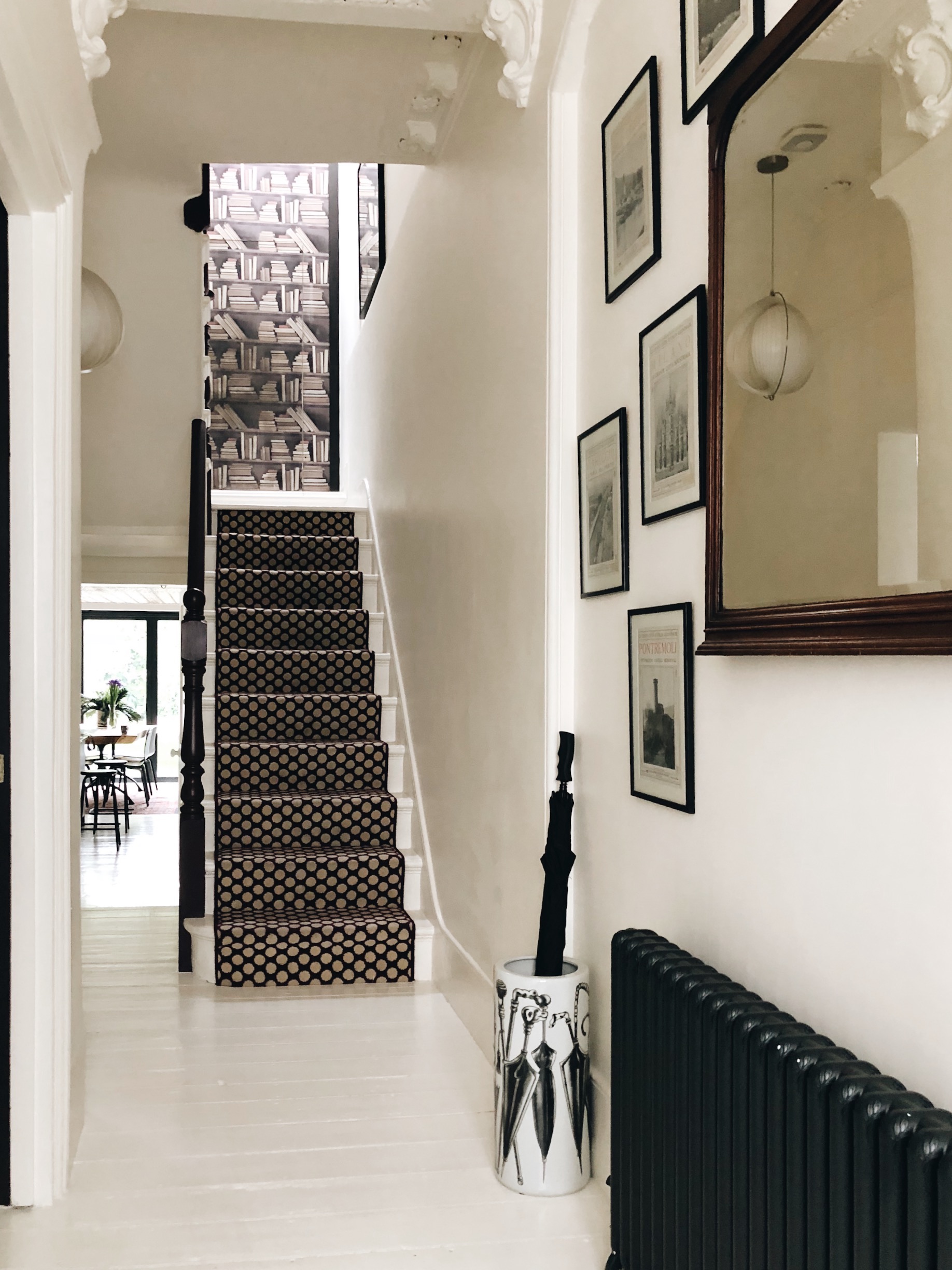
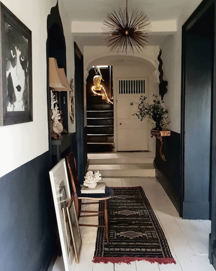
Hallways are often neglected dumping grounds but it’s the first thing you see when you come in so it’s a key part of the whole house. It needs to welcome you and make you feel at home. You can make a big statement here and, as you only pass through, you can go bold with colour or wallpaper because you don’t see it all the time, so push the decorative boat out.
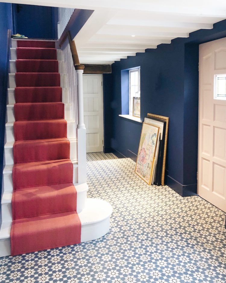
My hall is all about the carpet as I have a pale hall with strong colours in the rooms leading off it. The rest of it is quite understated. Sophie has saturated the walls and the floor and the stairs in her hall and has paler rooms leading off.
But the hall colour must connect with all the other colours in the nearby rooms, so it’s crucial to think about what colour you want to use here. Sophie spent a long time thinking about it. I chose a chalky white – wimborne by Farrow & Ball – so didn’t to ponder for as long.
The hall can anchor the whole scheme. Sophie’s favourite colour is that rich blue and it will be used in the other rooms of the house making it the perfect linking colour for her. I have accents of dark pink and burgundy in every room as announced by the stairs. Make the hall announce the connecting colour for the rest of the house.
Add a large mirror to a dark hall. Wall lights can also be more practical as it can be hard to have a dramatic pendant light as it will get in the way when you come down the stairs and you might not have enough height on the ground floor.
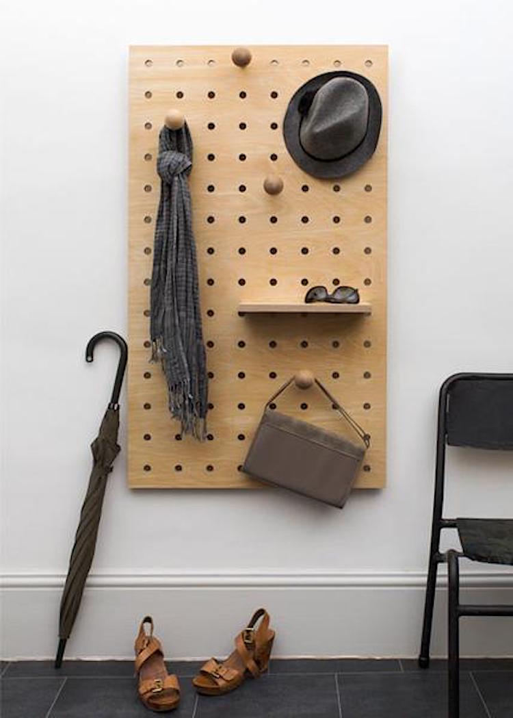
But it’s not just about looks; this room must also be practical. You have to be disciplined about how much you store in there. Create shoe storage by making a long shelf at sitting height with a narrower shelf underneath. Put the shoes on the bottom and you can sit on the top and put your shoes on which live underneath.
Consider hanging a basket for each child for their hat and bag and homework – give it a label and tell them it’s up to them.
Finally think about the flooring related to where you live. White floorboards are no good for country dwellers and carpet is no good for anyone. Patterned tiles are good or floorboards you can mop. Consider tiling halfway up the walls so scooters won’t ruin the paint.
And don’t forget to paint the inside of the front door in a strong contrasting colour.
Those are the key points we made but I hope you will enjoy listening too. There’s a balance between reminding you what we spoke about and giving you all the information.
This is the last episode in the current series but we will be back on 10 January do subscribe so you don’t miss it and a rating and a review is always helpful so other people can find us. Thank you and thank you also to DFS for sponsoring us so we can continue to make this podcast.


I’m just loving the spotty hall carpet! Where is that from please?
It’s from Alternative Flooring and its the Dotty in Damson from the Quirky B range.
You’re absolutely right about the paint colors against Northern or Southern light. There’s just a huge difference and it makes it really hard to nail the right hue under Southern light. The palette that works is very limited and that’s partly why it’s hard to find deep saturated colors in Greek homes. Another big reason why we choose what we choose is dictated by our lifestyle, so again you’re spot on that one too. The only thing I kind of disagree is the half-tiled corridor. I don’t like discontinuities in the middle of a corridor and so I would prefer a completely tiled corridor with a runner rug over it as opposed to two different finishes tiles against carpet (can’t call a rug material, now can I)?! I mean tiles is a building material but a rug/carpet is a textile – a whole different ballgame of its own! Anyway, I totally enjoyed this. xx
Deep, deep navy walls in our hall – originally painted with Valspar paint which smelled like cat wee and stressed the cat out so much she groomed herself half bald. That was over a year ago and she hasn’t managed to kick the habit, though I’ve since repainted (staimblocked first) with Dulux. Anyway, bald cat notwithstanding, the hall is stunning, adorned with circular vintatge mirrors. I’ve also got bright pink on my inside door, which was called Raspberry I think, but was brighter than expected so is now called Effing Pink by t’other half.
I have absolutely loved the podcast, which I binge-listened while sanding, priming, sanding (again!) and painting my new study shelves. Why isn’t there another one for me to listen to while I do my second coat?! Grumble…!
I did feel like your target audience today because I am using a Valspar paint colour-matched to black IKEA bookcases which I have built in, to paint the new skirting and trim I have put on them. However it will be F&B on the walls. I think after listening it will be the modern emulsion finish, though!
I’ve been having this same thought myself lately. I’ve been convinced that I’m going to paint the hallway pink, but I’m just not so sure anymore. I wanted a chalky finish paint, but my hall is already so scuffed. My eldest often brings bikes and outdoor toys and lots of boys with muddy shoes through the house. We have a fired Earth paint in the smallest room which is beautiful and chalky (and the coverage was better than dulux) but it does scuff so quickly. I’m now thinking of just going for an extremely hard wearing and washable white paint and getting my pink hit in the blinds and artwork instead since it is higher up and won’t be ruined. Or at least won’t be ruined so quickly.
Tiling halfway up the walls sounds great, especially when you have young children. It reminds me of one time when my children were little. We were running late for the nursery and school drop offs and my daughter had a juice container in her hand. My son decided to squeeze it and the purple juice went all over the white walls of my halfway. I asked him why he did it and he told me he just felt an overwhelming urge to do it. Or what about the time, his older brother who was 2 at the time decided to drag a filled rubbish bag through the hallway and the living room leaving wine stains all over the hallway carpet and the living room rug. Of course, we should have not left that bag in the kitchen unattended for even a minute but during those years, there were times, I wished my entire house was tiled, including the furniture!
I love your ‘overwhelming urge’ story, and I imagine it was the best response he could have made since we all know the feeling. But tiles sometimes just don’t hit the spot. My dog sneaks her bones from the tiled kitchen out to the hall and chews them on the most expensive rug in the house. I’ve given her a washable bathmat in the kitchen but nothing can beat the pile of a nice Persian.