As predicted we had a weekend to enjoy the newly finished sitting room until we had to bring the kitchen into the back half of it. The bedrooms are once again full of boxes and work continues apace. The upstairs bathroom is nearly finished and work can start downstairs.
I had hoped to have more to show you of the upstairs this week but the terracotta floor tiles needed sealing which slowed things down a little. The decorator is now here though and paint is going on walls. The boiler will be fitted at the end of the week which removes a certain element of jeopardy from our lives and the kitchen walls should come down next week to make way for the new French doors.
In anticipation of that I can show you the plan for the downstairs shower room. This is about 2.5 long and 1m wide. There’s a shower at one end, a basin opposite the door and a loo at the far end by a window. So it has natural light which is already a bonus.
The door, which opens outwards will replaced by a pocket door to save space in the pantry next door and the fittings are by Burlington, whose retro aesthetic perfectly suits this house. I have chosen the high level loo and the Edwardian basin on a washstand.
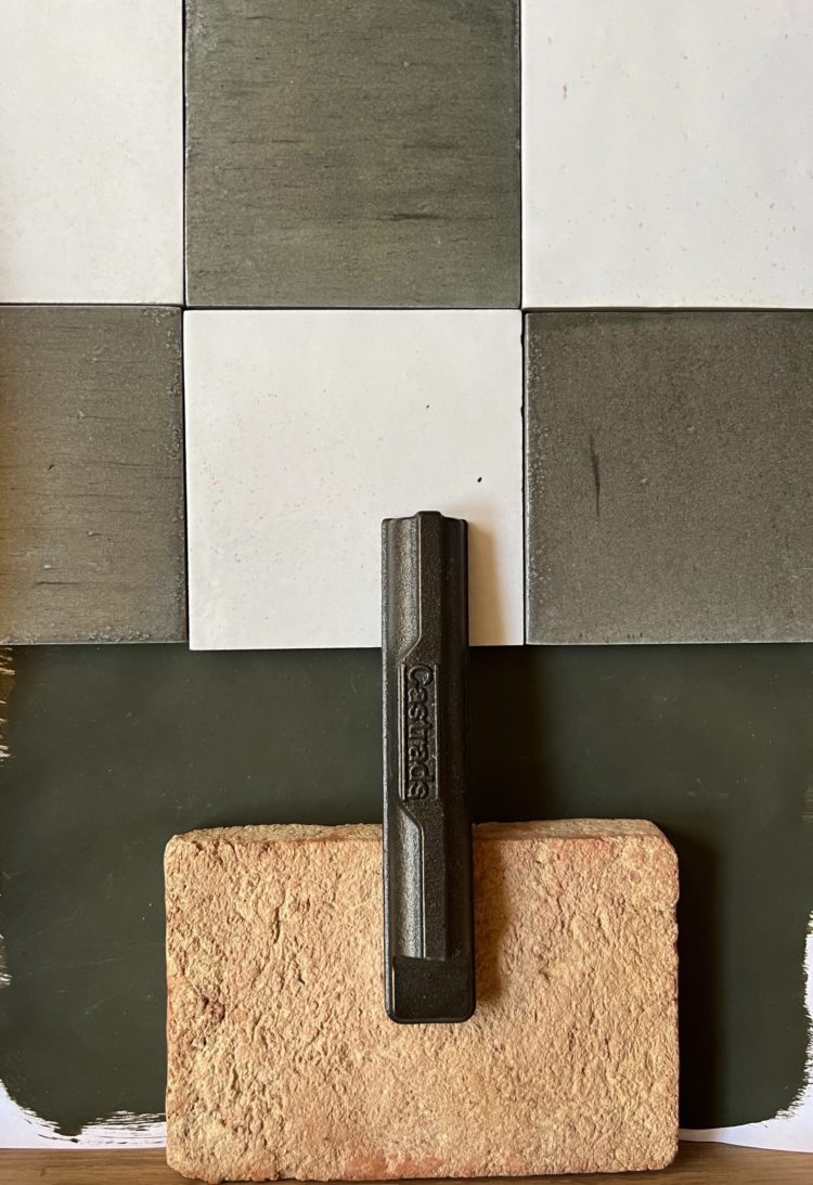
The key in here was finding the right wall tiles. I really really (really) wanted to do a check and I was also very aware that the basin will be the main view whenever the door is open so that sightline was key.
The floor will be terracotta tiles (more sealing don’t tell the builders) so it also needed to go with that. I bought so many samples in shades of cream, pink, orange and even blue. But in the end I found these (it’s possible these weren’t even available when I started looking).
They are the Pottery Porcelain in Khaki Smoke square with the Natural Cotton. The plan, at this stage, is go dark in here. It’s a downstairs loo effectively and it has a large window (1m by 1m) so I think it can take it. Currently on the list is Invisible Green by Little Greene. This may also end up on the kitchen cupboards but we’re still deciding on that.
That’s all from this week’s renovating front line. Fingers crossed there will be more pretty and less panic to show you next week.


I really like choosing a dark bathroom color and such a white tub will highlight the luxury and elegance of this relaxation area.
I love this tool so much, I wish I had one like it in my kitchen.
I considered Invisible Green, which I’ve used a lot outside, but in the end I painted my kitchen cupboards in Pompeian Ash by Little Greene. I love the colour – it is green not grey. I do wish it had a different name however, unpleasant!
so good! I am looking forward to see kitchen cabinets in that colour. Fabulous.
I love Invisible Green — it is very similar to the Donald Kaufman paint I have in our living room: DKC-65. It is lovely to live with, and never appears grey, just different greens and greenish browns. One of my favourite colours ever — it just makes you feel good.
All sounding as if going to plan. We’ve also got a high level loo and wouldn’t go back. So much easier on you as you age.
I have used paint and paper library ‘hornblende” in my downstairs loo..it’s fabulous
I really like the tiles though would probably stick to all khaki in the rectangle option on the walls without the checkerboard in such a small space.
When I read Invisible Green I thought you meant the Edward Bulmer one and I was like, “nooooooo that would look bad!” But the LG one is perfect. 😃
For you kitchen cupboards, try Pullman Green by Craig and rose. It’s green perfection.
I love the mix of colours and materials that you are using in your new home.