OK this is it. I know I’ve said it before (every week) but we’re off to Devon. And since there are 10 bedrooms I’m either going to have to open a hotel or you’re coming with me…. It’s Grade II listed, with private gardens and in walking distance of the “wild remote” beaches below. It’s on with Inigo for £2,500,000 and I was going to divide that per bedroom to come up with a way of making it seem less expensive, but that’s a lot for a bedroom so I’ve shelved that ,although it has got a reading room, a games room, a boot room, a drawing room, a breakfast room and a dining room.
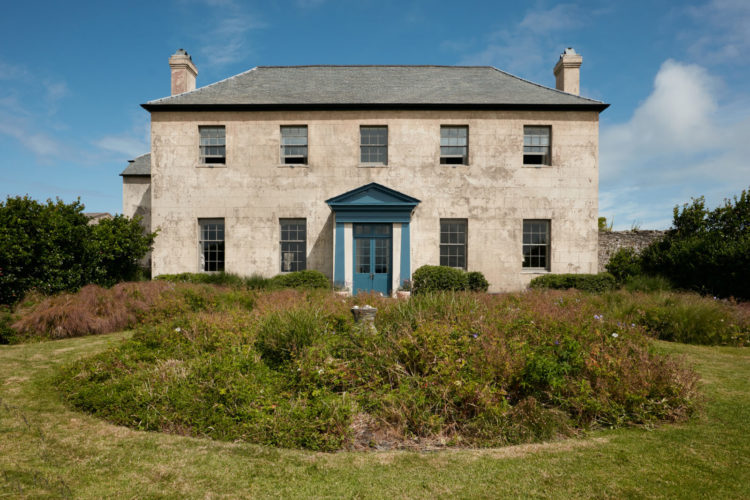
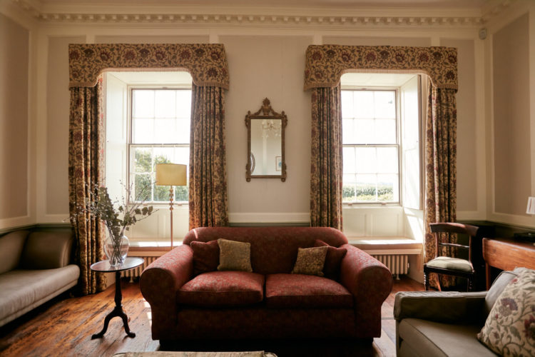
Anyway, never mind that it’s Fantasy Friday and Let’s Pretend We Won The Lottery time so let’s go on in. And firstly, when you’ve finished admiring the glorious symmetry of this building, I want you to look at the colour of the front door (remembering it’s a coastal location) and then see how it repeatedly turns up inside as a red thread.
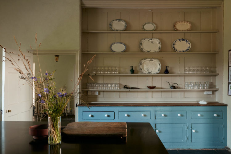
Firstly the kitchen, which has been modernised, but retains a period feel. If you like open shelves then creating something like this will give you the look of a vintage dresser and if you put tongue and groove cladding at the back it will look as if it has been there forever (assuming you live in a period property to begin with). This also proves the point that you don’t have to match top to bottom. These shelves tone with the walls and allow this soft blue to really stand out.
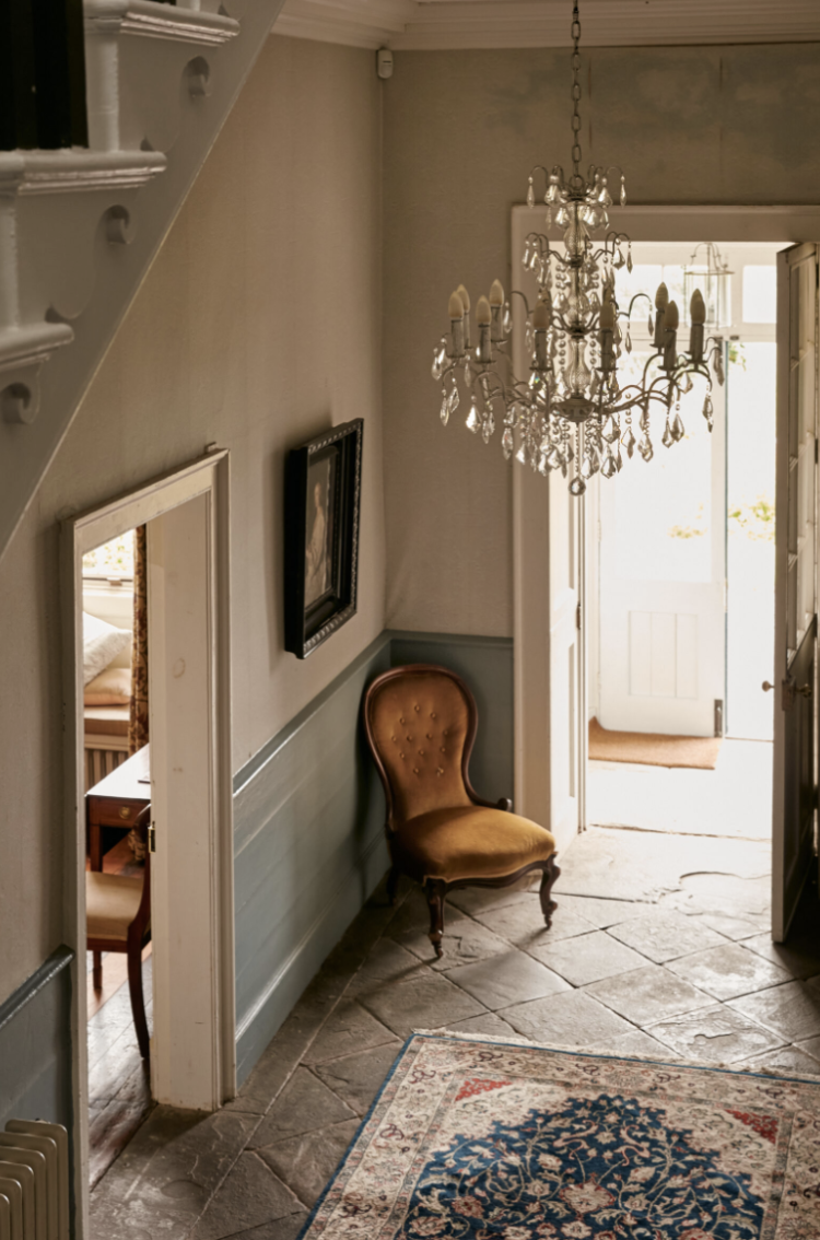
Back out into the hall and the walls have been painted in a paler blue green which allows the rug its own space and who doesn’t love a flagstone floor? Don’t answer that. I do anyway. Elsewhere the blue fades further (try Farrow & Ball Theresa’s Green or Mizzle) which just links to the view through the windows and what must be an ever-changing display of trees, sky and landscapes.
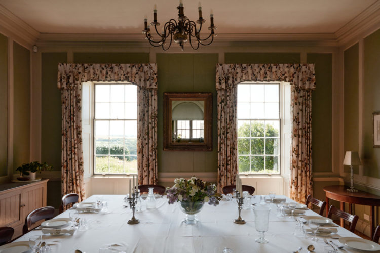
In the drawing room the blue has gone, to be replaced with an earthier shade of terracotta in the furnishings and a soft cream on the walls. Psychologists will tell you that symmetry is relaxing so you can look at the picture below and see if you find it so – a pair of windows, a sofa in the middle with symmetrical cushions. Would you find it more so if there was a matching table at the other end of the sofa or do you yearn to muddle up those cushions and break it up a bit?
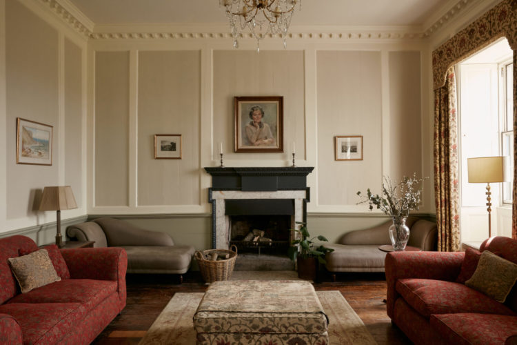
Sometimes interior design is less about colour and more about feelings that arise when you look at a series of rooms, so when you’re strolling through these take a moment to analyse your reaction and see if you can pinpoint what causes it – both good and bad. That way you can carry ideas through into your own homes and match the emotion to the space.
For example, I know I find these muted, tonal colours relaxing and elegant so I’m immediately on board. Others might find them draining, or even dark and depressing, and want to liven and lighten it all up. I will always want to add books and actually I find too much symmetry very UNrelaxing. Those pictures centred in the panels below make me want to run in and tilt them all. You might feel this brings a sense of order to a room.
Strangely I am unbothered by the matching chaise either side of the fireplace but would insist on a scattering of mismatched cushions and books to make this room feel comfortable for me. The point being that there is no right or wrong you just need to take the time to work out what you need and how to achieve it.
We’ll finish up in a couple of the bedrooms. I know most of us don’t have panelling to paint in between, but if you do this can look pretty. Note also that a soft shade of pink is not only flattering whatever your skin colour, but it also casts a pretty glow so this ceiling may well be white or cream but it looks like a paler version of the walls. Bear this in mind when you are choosing your shade as a south-facing room will turn a warm pink peachy under the golden light of the sun -if you don’t want that try a pink with blue undertones and likewise a north-facing room will turn a blueish pink hard and cooler so you might want to swap and put a warm pink in a cool room and vice versa.
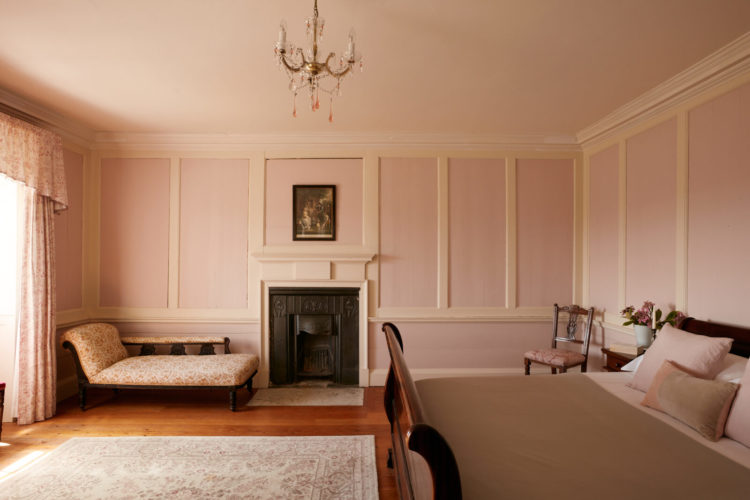
This is the other side of the room in case you want the full picture and you can see that the wooden floor also loves the pink walls. Another common question is when is there too much wood? As I have said before a well-placed rug (and this isn’t) will break up a fight between a wooden floor and a piece of wooden furniture. But if you don’t have/want a rug then make sure the tones of the wood go together. In this case both are warm and slightly pink so it works. Pink also loves dark wood. For my money modern oak is going out of fashion and I’m not unhappy about it.
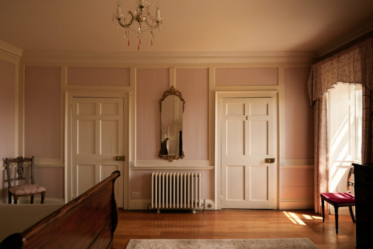
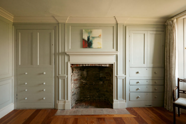
Finally back to the green with this pretty bedroom. I wonder if one of the cupboards is original as it has keyholes and the other was built to match. It was quite common to built a cupboard in one side of a fireplace and leave the other empty so that makes sense.
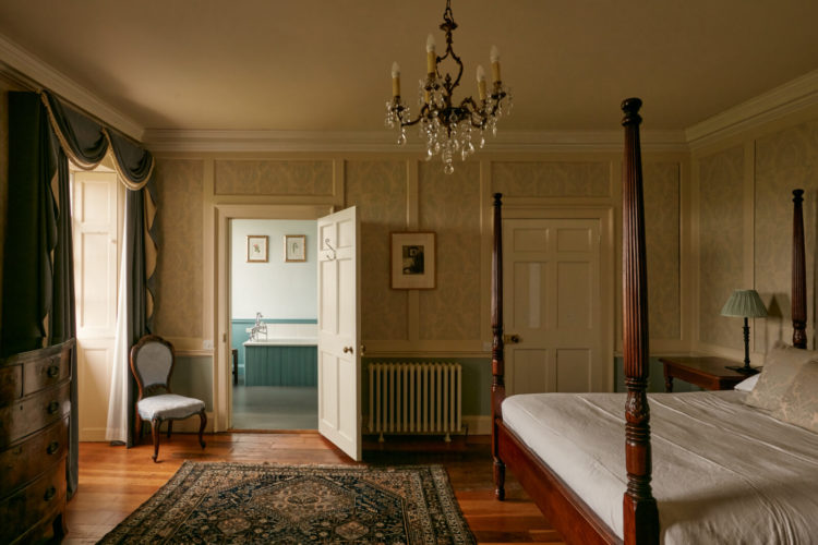
We finish in this bedroom with its fabulous bed and a return to a version of the blue from downstairs. You can see also how the bath ties in with the half-painted walls in the bedroom and brings the two spaces together. Then your eye travels to the bedside lampshade and it all looks considered without being matchy and this is because there are different things in the same colour. So it’s not a set of cushions but rather some wood here, a bit of wall there and some fabric. Those rather fabulous curtains (we would NOT have said that in the 90s) are also a darker version of the same shade so once again you move from matching to detailed. It’s a fine line but doable.


Love this house and it’s symmetry! No to the pelmets ( dust collectors) but I think curtains in really good weight of fabric double lined etc are on their way back. So many colour/pattern possibilities but also stop draughts and last forever if really well made – a good investment and eco friendly at a time when we should all be turning down the thermostat a notch.
I did spot the red thread which in my day was probably more about having paint left and trying to make use of throughout the house another eco friendly idea!
Totally agree with the idea of the ‘feeling’ a room or house gives and with your posts getting better at working out why somethings do/dont appeal to me .
I have never lived in any home with flagstones, wish I had, as I love the organic texture and colour. There are many fine furnishings in this house, quality made to last, and so they have. I see scale as being the issue with the decor. The framed prints are too small for the size of the rooms, and are in need of companions, mirrors or more prints. The sofas in general would be statement pieces in other room settings. Here they are too many. The sofa situated in the sitting room between the two lantern type windows is unsettling, in the sense that its bulk obscures the view to the windows. One of the chaise lounges would suit this view better, being lower, longer, and less of a block. The oval table might then be positioned under the wall mirror, between the pelmets and curtains which seem right for this room and this house. The floor lamp is easily relocated. Still, it a grand house in which equally grand events have taken place.
Oh – I could definitely make this work! That entry (I love flagstones) with that spectacular chandelier is stunning. Such good bones. Such wonderful quirks. The window treatments …. well … they are abysmal and would have to come down immediately. But those recessed window seats? Be still my heart!
I’m not sure about this house at all. To me, it looks like it’s been staged and not very well, by unsympathetic persons perhaps. But as always a great Friday fantasy | best from dreay Dublin
I must be an estate agents dream because this house looks great to me, I’m ready to move straight in, no work required. Perhaps my standards are lower, my Georgian property is much less grand but equally ‘quirky’ and it doesn’t bother me. Finding the £2.5m would be more of problem! But those curtains would have to go I’m afraid, I was glad to see the back of the frilly knickers window dressings the first time around!
Reply for Jodie.
Try F&B Light Blue with white ceiling and white wood work in a north facing room. It isn’t light blue at all.
This house needs more light and is, I feel, over priced for the state it’s in.
It looks like the cupboard to the left is a door made to look like the one to the right. You can tell by the hinges on the top and bottom. It is not necessarily the symmtery that bothers but choice of pictures/paintings all together. AND the curtains are just horrible. But tose things can easily be changed. So alltogether a great house especially the flagstone.
FabFriday morning read as the rain hammers down outside!
Regarding the cupboards either side of the fireplace. It’s even more interesting- the one of the left with the keyhole actually looks like a full door made to look like drawers with door above – note hinge on lower left and very fake looking drawers. Whereas the one on the right – with no keyhole – appears to be real drawers with cupboard above. I do love an old house full of these quirks!
Dear Kate,
I adore your blog and eagerly await new posts. Living in very small one-bedroom apartment some of the ideas are a bit too grand for my home but I do greatly appreciate unerring eye and sage advice. Having said that, it appears that an occasional word is missing from some of the write-ups, requiring some creative guessing. If you’ll forgive my impertinence, perhaps someone in the Mad Household could proofread before posting?
Oh I’m sorry – it’s trying to do too much at once and I know how irritating it is believe me. Sadly the Mad team comprises only moi and the cat cat as everyone else is too busy with their own things but point noted and edits made x
What a lovely house! Your comments about symmetry were interesting. I find too obvious symmetry un-relaxing as it looks very formal. But some interiors seem to pull off a secret symmetry – balancing mis-matched pieces rather than identical ones, which looks good. Good spot on the lack of keyholes in one cupboard – I wouldn’t have noticed, but I know some people would be driven mad by it!
I’m packed, when do we move in? There’s a lot of work to do behind those clever photos but I’m up for it. I’ll take a bedroom with a sea view please! Thanks for the advice regarding the North facing rooms. I really haven’t found the right shade yet!
have a great weekend