To Sweden this week and a three bedroom apartment built in 1953 with a “large, light and sunny balcony” in Gothenburg, a city (according to Wiki) that is known for its Dutch style canals and leafy avenues. Certainly my half-Swedish friend is always telling me we should visit and, were it not for the pandemic we would have been by now. So, in the meantime, let’s a take a virtual stroll around.
It’s on with Stadshem if you want to see more details and while I thought I was searching for sales, I may have ended up in rentals as it appears to cost 4,366 SEK a month (about £350) which, if I’m right, and don’t write in as I’m frequently wrong about numbers, is the first good reason for wanting to move there.
Anyway, moving on (it’s Fantasy Friday who cares about the price) I wanted to show you this as, once again, I think it has lots of useful pointers that will be relevant to many and, while it may not have the wow factor of last week’s London home, many of our own places don’t either so let’s see if there are some ideas and inspiration we can take away.
At the top, the kitchen, which we’ll come to later, but let’s start in the hall and the first point to note is the red thread of colour that extends from the hall and into the kitchen (and, as we shall see, the sitting room too). It’s a sort of greenish grey that, like many of the colours in this palette will change throughout the day and according to the natural light.
It’s an unusual base colour but more interesting than white and one that goes with lots of other colours too so it’s more versatile than you might think at first glance. Look at Little Greene Windmill Lane, or Farrow & Ball Pigeon . Grey 07 by Lick might also work. As we said in yesterday’s podcast, the colour will vary enormously according to the natural light – cool constant blue in north-facing and warm, yellow for south-facing. In short (for anyone new to these pages) a cool grey in a north room might become cold, a warm grey in a south room might go beige. So you need to reverse the shade you are looking for to counteract the light.
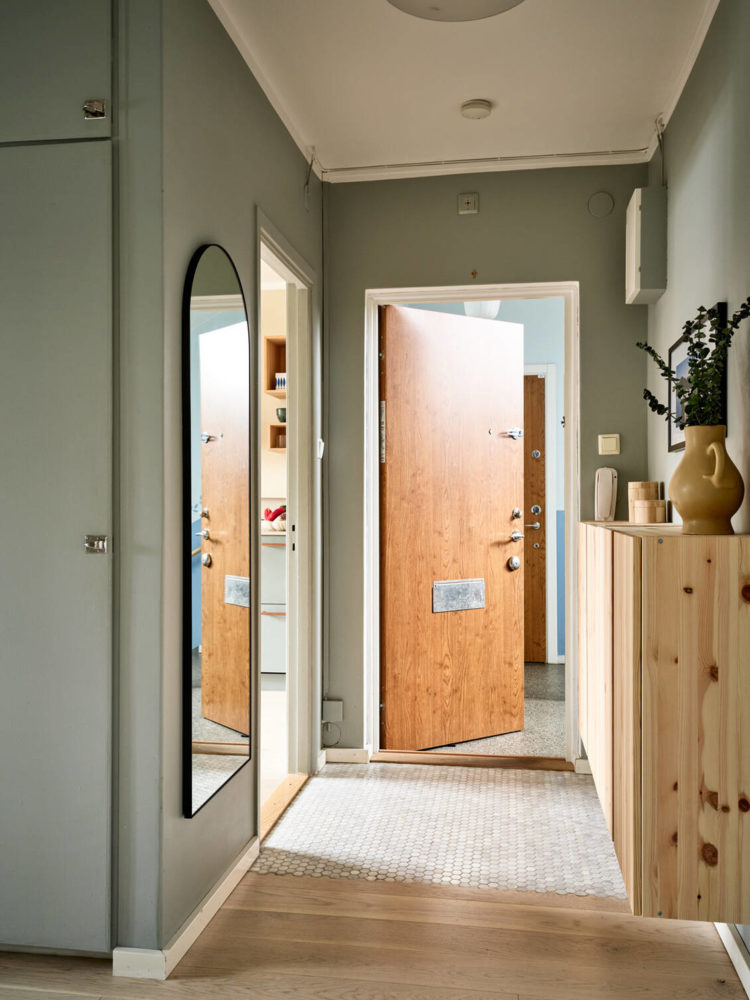
Back to the hall – in flats there are often lots of doors leading off a small space and if you paint them all traditional white, along with white skirting boards it’s all going to look messy and busy and you won’t even notice a great painting or lovely piece of furniture. So first rule – paint the doors to match the walls if you want a more streamlined and tidier look – especially if you have to hang coats and store shoes in this space. If you don’t want to match try going a few shades darker, or lighter than the walls, for an elegant, more tonal feel. And if you like the contrast and the busyness then pick a colour other than white which will make a statement and be fun – so burnt orange against this grey for example. We cater for all tastes here we are just trying to help you make the most of what you have in a way that feels right for you.
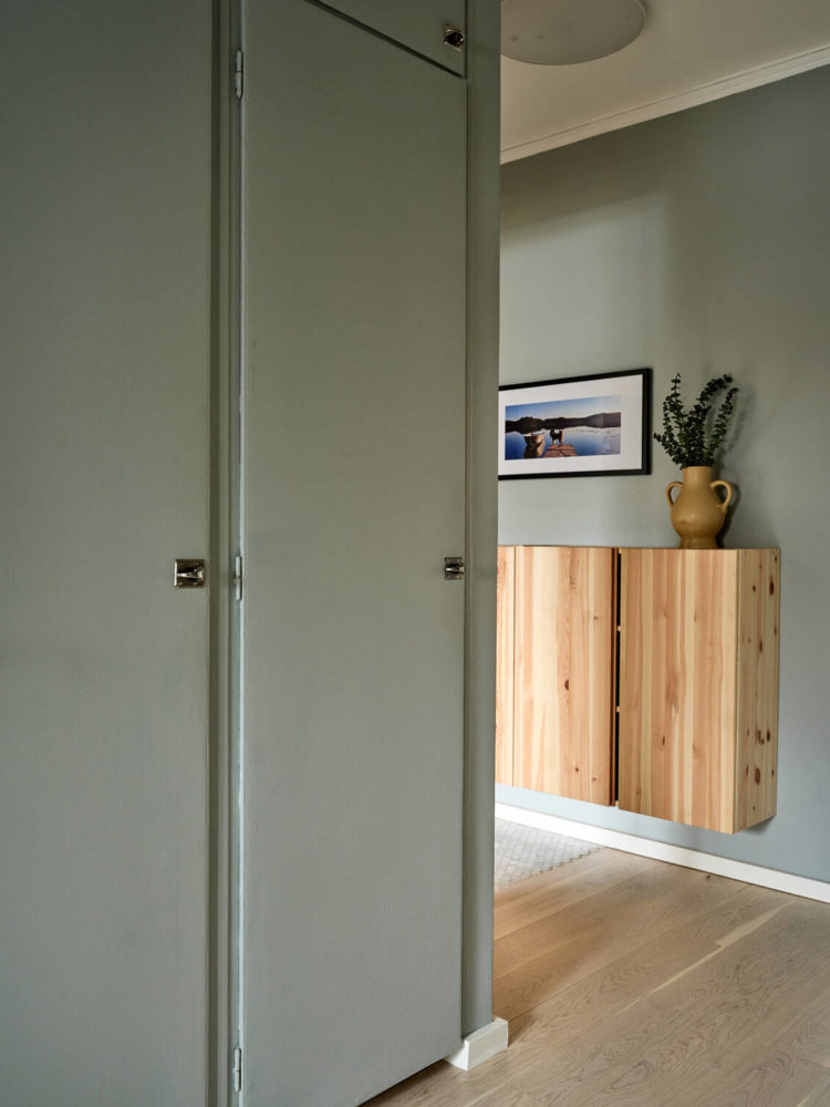
Above you can see how these cupboard doors have been matched to the walls (and yes I would have done the skirting boards too) which makes the wooden cupboards really stand out. Second tip for small spaces – wall-mounted is best – true for halls and bathrooms and, in kitchens, think about reflective, or mirrored, kickboards or legs so you can see the maximum amount of floor.
These are probably the Ikea Ivar, subject of many a hack, but basically made from plain pine so you can paint or stain or leave as they are. So you could leave them as they are to add natural warming wood, or paint to match the wall so they disappear or even wallpaper to make a feature in an otherwise plain space.
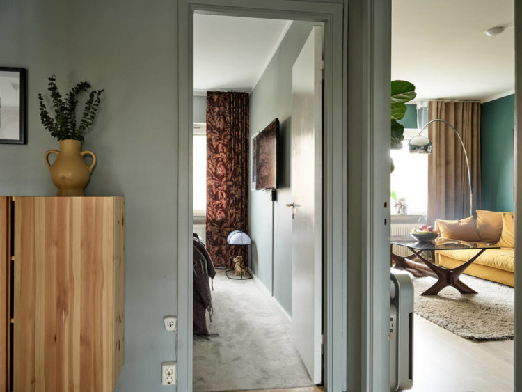
The picture above is a good way to remind you that you must always consider the view into rooms as you walk past and this is essentially a moodboard of colours that is taken throughout – a green/grey base that becomes greener in the sitting room, the dark wood of the coffee chimes with the bedroom curtains, the hall cupboard and sofa and don’t forget the little mustard vase on top of the cupboard.
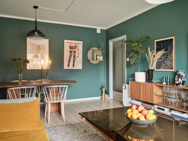
I have included the picture above so you can see how the central ceiling light has been moved from its traditional spot in the middle of the ceiling to over the table where it is of more use. This is also a really good example of how the white door frame and skirting boards outline the space and, in my eyes, draw attention to the exit rather than keeping your attention in the room and looking at the art or the furniture.
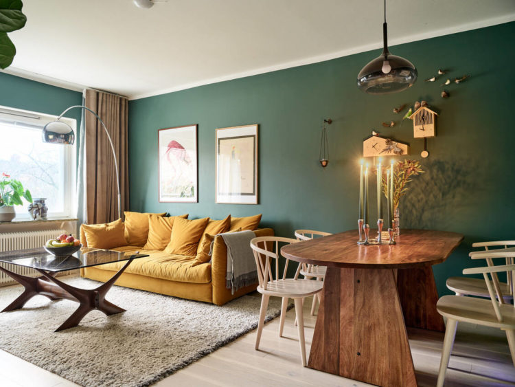
You will note how the ceiling isn’t particularly high but there are no spotlights in here. Instead, as I said above, the pendant or “big light” has been moved to the table where it won’t be in the way but will allows for a general light that can be turned on by the door. Anywhere else in the room and it would have to be so high that the proportions would be wrong. Extra light has been added in the form of the curving floor lamp at the end of the sofa. These can be expensive but are a great way of being able to tuck a light base into a corner but bring the illumination further into the room. In a similar room you could add wall or more table lamps depending on your needs.
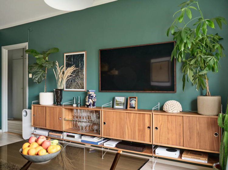
If you want wall lights they tend to work better (unlike many things) if they are symmetrical. So on the wall at either end of the sofa or at either end of the sideboard for example. Below the symmetry has been created with plants, which are, at the same time mismatched. I would suggest a matching pair of wall lights or two table lamps with matching shades of different bases or tonal shades and matching bases.
Last point in this room and that is the oft-neglected rule that shapes are as important as colours and textures. This is a fairly characterless room architecturally. There are lots of straight lines – walls (obvs), sofa, tv, sideboard, artwork. But the owners have worked hard to balance this; the plants bring softness, the dining table is oval and echoes the shape of the coffee table legs. The dining chairs are curved, as is the floor lamp. It all works together and takes just a little time in the planning.
To the bedroom and you can see the continuation of this same neutral green/grey base colour which keeps this flat (measuring around 67sqm or 721 sq ft) feeling cohesive. And don’t forget in flats, and some houses, where the hall has no natural light, you will probably have the doors to the rooms open all the time to “borrow” light and bring it into this dark space which means a cohesive colour palette is even more important. This doesn’t have to be tonal but it does have to be one where you are happy to be able to see all the colours at the same time and feel happy.
This has a very square floor plan but I have seen long and thin apartments where the colour starts dark at the front and fades in each room towards the back. I have also seen a house where the basement colour was the same as the loft but each floor was a degree or two paler. Paint is inherently playful and you should play around to find the combinations that work for you. It’s easy enough to change if you get bored/get it wrong. As long as you have the layout and furniture right you won’t go far wrong.
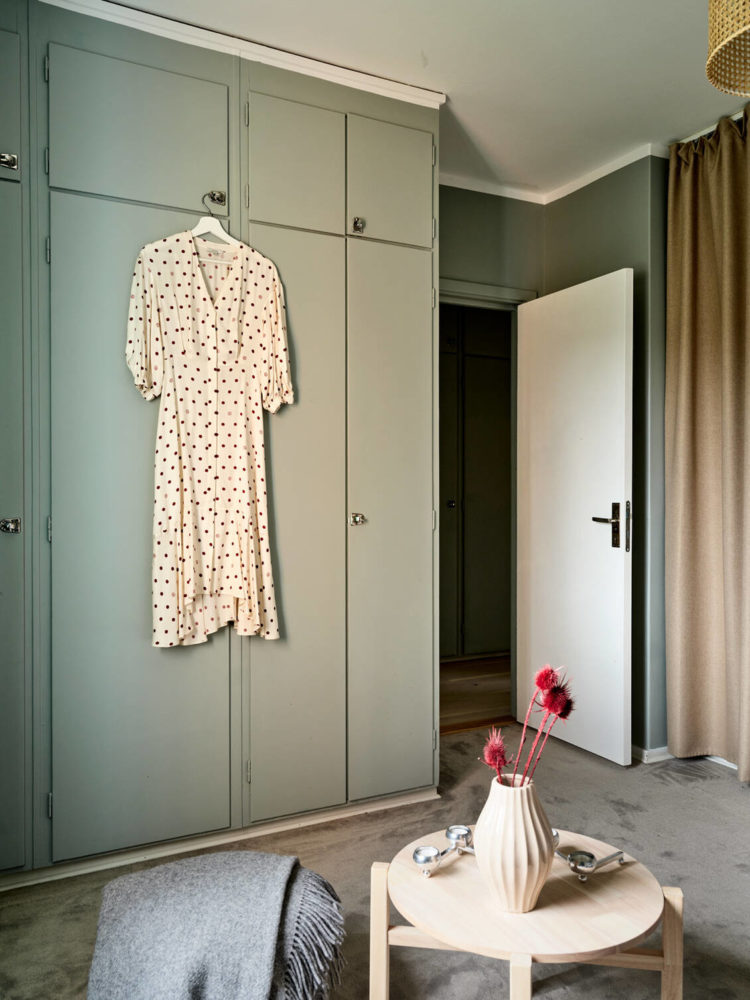
In this room above you can see the wardrobes have been take up to the ceiling which not only provides more storage but also makes the walls feel taller and therefore the ceiling higher. Cutting them off at door height not only leaves a gap that will be dusty (or filled with stuff you couldn’t fit into the cupboards) but also draws attention the lower ceiling. Note also that they are flat fronted with minimal handles so they match the walls and recede. A contrasting colour would immediately make the room feel smaller.
If you have built-in wardrobes and hate the doors then this is another option. A ceiling-mounted curtain track and a wall of fabric can be both soft and decorative and works brilliantly in a bedroom. You can either pick a pattern you love and use it as a way to bring in more colour and pattern or keep it plain and simply add more texture to the room.
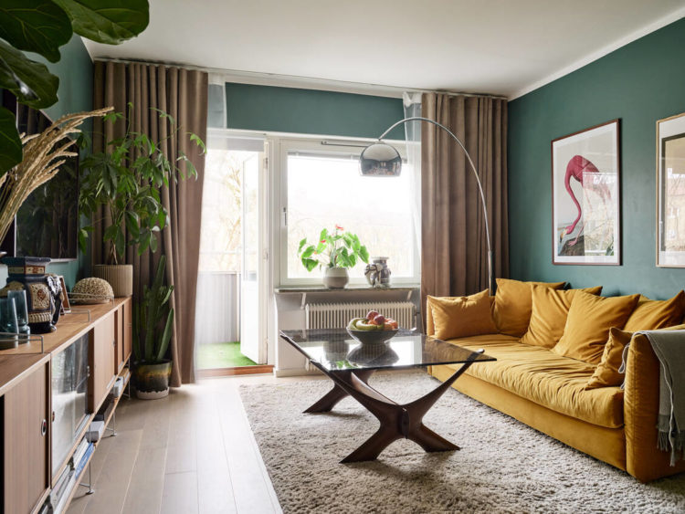
And, talking of curtains, you will see that they have all been hung as high above the window as possible. Again, when closed this makes the window look as if it would be larger and draws the eye up.

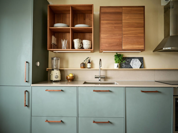
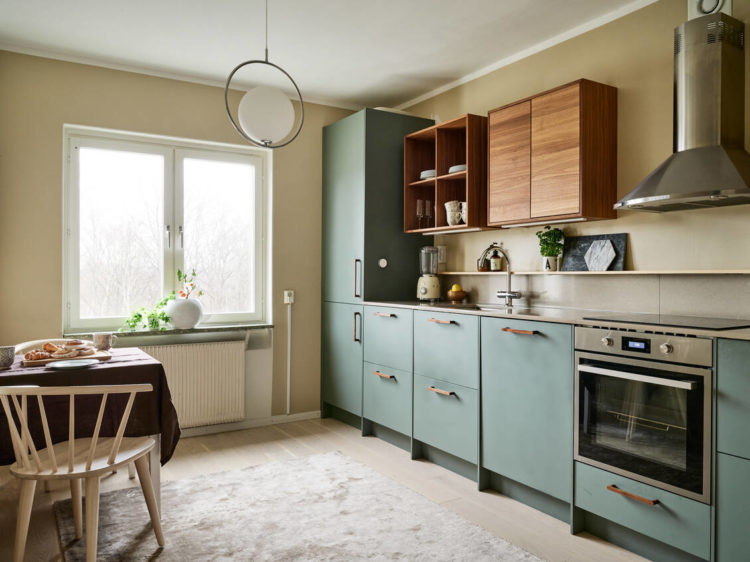
Finally, to the kitchen. Here the wall colour has been transferred to the cupboards while the hall cupboards are echoed in the wall-mounted cabinets. Can you also see how the kickboards under the cupboards are recessed so you see a tiny bit more floor but the cupboards also look more like they are floating above the floor rather than sitting lumpishly on it ( as mine do). It’s a tiny detail but it makes a huge difference to the overall space.
Removing wall cabinets will always make a small kitchen feel more open and lighter. Here there is a single shelf as well. You could also do the same lighting trick in here as in the dining room and move it over the table so it’s not in the way. That said there are no spotlights in here so I imagine this isn’t an ideal space for cooking as there’s a strong chance you will be in front of the light and casting your own shadow over the worktop. Kitchens are one room which really benefit from good task lighting – usually in the ceiling. Another, more rustic, option is to have long arm wall lights that extend out over the wall cabinets that shine down onto the counter.
I rather love the soft muted palette of this apartment and how it carries round all the rooms. What do you think? Anyone moving to Gothenburg?


Small comment on the lighting in the kitchen. There are lighting under the cupboards in there so there are task lights.
And about the “rent” cost. There is this thing called “bostadsrätt” in Sweden. So you pay for your flat ant then you have a monthly fee to the “house group”. That takes care of the building as a whole. Like outside communal areas, cleaning of communal areas, ports and locks to the building, windows, plumbing to the building, roofs, garage etc… Everyone has to pay. I know that they do it quite differently in for example Spain but that is how we do it 🙂
Ooh thanks for this breakdown. We have oak doors (and skirting) in our 1980s semi-detached and just cannot figure out what to do with them. There are 5 coming off the entry hallway and I wonder if painting the hallway a colour and the doors the same might help?
I’m sure it would – that’s a lot of doors!
We have just removed a central ceiling light and replaced it with ceiling task lighting and it has transformed the room. Cooking and baking are so much easier so I totally agree with you on that point.
Perfect post for the modest, concrete-ceiling’d flat-dwellers (me), thank you! I note the deliberately designed way the big light electrics have been cabled towards the dining table.
Couple of things I’d tweak if this were myyy Gothenburg pad: add another small cupboard section above the bedroom door and make that a pocket slider, then add mirror into the created deep door surround, to both bounce more light into the hallway and check outfits in. Paint or wallpaper the inside of that curtained cupboard.. maybe a deep blue-green. And I’d allow myself a shot of graphic tile between the counter and the lower shelf. Done!
Oh yes, and those skirting boards! Meep!
Thank you for showing this. I have a standard straight-edged 1960s flat and am in the process of renovating and decorating it. I have gone all Sophie Robinson for most of the flat which I like but the kitchen needs a total revamp in a slightly more muted scheme. I like the grey green of the cupboards you show here and think that it would be a nice contrast to the red, blue, orange and purple of the rest of the flat. Also the straight lines. And the clever use of cupboard-shelving. There’s lot of inspiration in these pics.