Well to be honest it’s an apartment not a house and it’s expensive but following the call to look at properties further afield one very kind reader sent me this and I thought it was a good one to look at as it’s narrow (like many UK properties) and modern (1988) so not full of period characteristics.
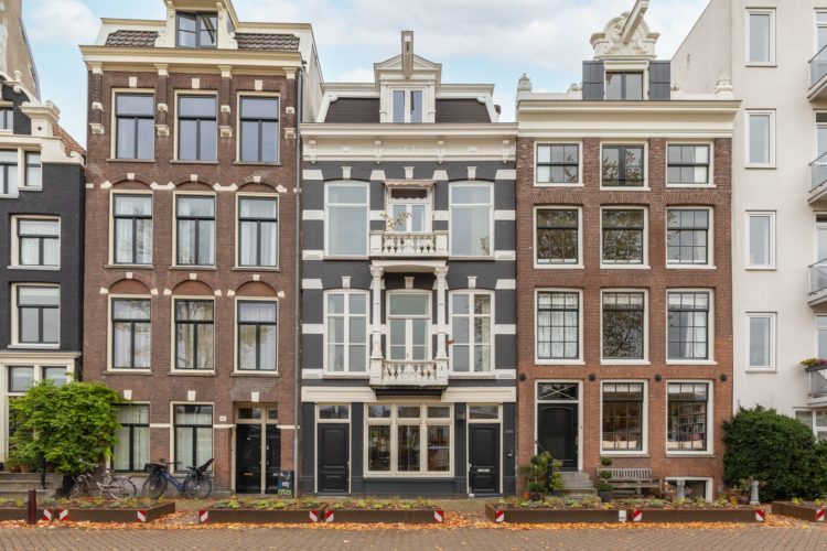
It’s a two bedroom apartment on the ground floor and basement right in the centre of Amsterdam and it’s on with Funda.nl for €1.5m and has views over the river. Now it has, oddly, two entrances – one communal and one that takes you directly into the sitting room. Now given that one of the joys of owning a house over a flat is the notion of one’s own front door I’m not sure if you would ever use the communal one, but it’s there and it looks symmetrical from the outside so there’s that.
Either way you come in at this dining end and if you really want to get a sense of the space go and play with the floorplan – it comes in 2D and 3D (any Dutch readers who can tell us what estate agents fees are in Holland because this is fancy!) and it really gives you a sense of how the space works.
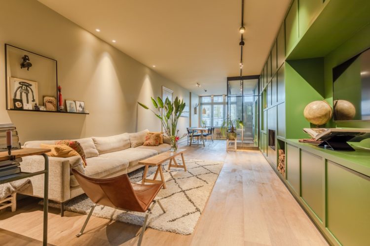
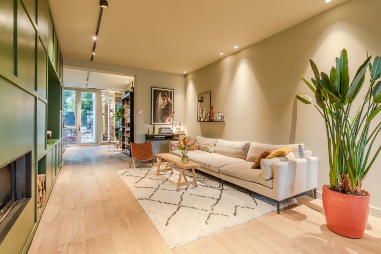
As you can see the space is long and narrow – a problem shared in many city terraces so let’s look at what the owners have done with the space to mitigate that. Firstly you can see that it has good light at both back and front from the doors and windows but that natural light has a long way to travel into the middle of the building so the sitting room has been put there.
This makes sense as a sitting room is often the evening space. You might want to work and or/eat at the table during the day and the kitchen is an all day space as well so putting the night space in the darkest part of the house makes sense. Now you would have to balance this against a certain compromise ( all houses are compromise in some ways though) as it’s a long way to carry hot plates of food from kitchen to dining room which is why many people would put the table in the middle and move the sitting room to the front.
This is why I so often say that you mustn’t necessarily accept a layout as it comes. Ask yourself my Six Questions (link to my Mad About The House Planner for those who want to make notes) to work out how you live and how you can make the available space work best for you. Because if you too don’t really sit on a sofa until the evening then don’t position it by the best source of natural light and spend the day working at the dining table under electric light.
Of course kitchens and bathrooms are expensive to move but this decision is just about furniture.
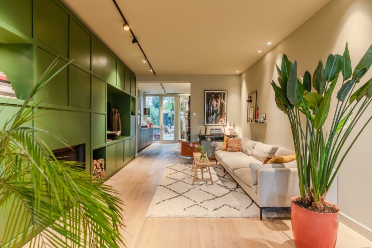
Room layout determined, a couple of other points to note – the downlights are round the edge of the room so they give ambient lighting and don’t create a runway strip from front to back. Note also behind the sofa how they have been grouped in pairs and wash light gently down the wall which will also reflect more gently back into the room. A central runway would just spotlight the floor and leave the rest in darkness. The other ceiling lights – on the black runner – are adjustable so you can angle where you to change the mood as it suits you. There isn’t much by way of ambient lighting but you could easily add a floor lamp by the plant or in the far corner or put table lamps at either end of the sofa. The great thing here would be a large Arco lamp that could sit on the edge of the rug and arch into the middle of the sitting area.
Now one issue is the sitting room is, by its very position, a passage from front to back. So the owners have used a large rug to zone the space. The bare floorboard at the side becomes the path and the rug acts instead of walls to create a cosier space. The chair at the far end is angled across to stop it looking like a railway carriage and the large plant further breaks up the space.
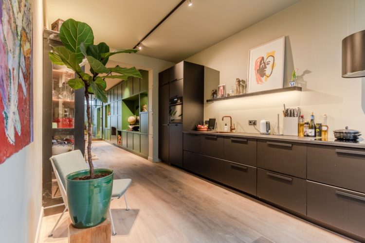
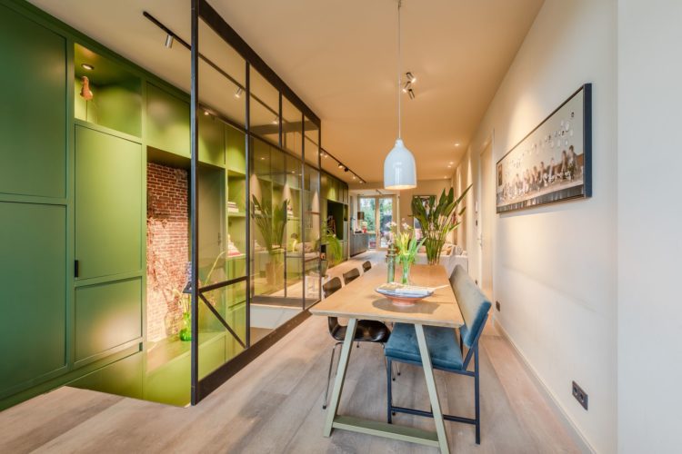
Now before we move into the kitchen let’s discuss the long green wall. It’s not so much a feature wall as a way of bringing colour and interest to what might otherwise be a long (and admittedly wide) corridor. There aren’t many other walls to paint so it adds visual interest and also helps to zone the living area from the working kitchen area. It’s also clearly full of storage. The glass walls around the bannister also allow the light to flow while separating the two spaces.
If you have a similar long thin space you can also try and paint a wall (or part of) going across the space to visually foreshorten it and make it appear shorter and wider. In this case – and you’re going to have to scroll back up – the wall behind the leather chair with the picture on it. So you would wrap the green from the cupboards and across the wall dividing the kitchen from the sitting room. It’s an optical illusion but one that works in any long narrow space.
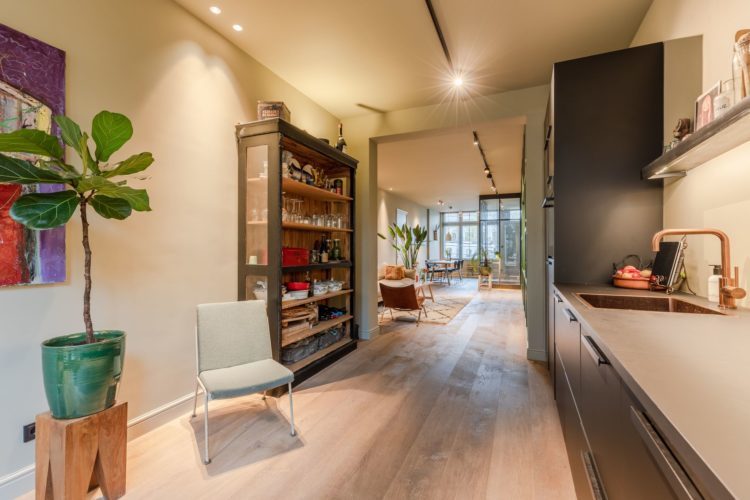
Into the kitchen and a colour change but the tall black cupboard links with the tall green cupboards on either side of the divide to help your eye over the change before it drops down to worktop level. Clearly having cupboards on both sides would have been possible – the classic galley kitchen – but the space feels more open with them all on one side. This means more steps between area but, and you must ask yourself how you live and cook, it feels less cramped and has allowed for a storage cupboard that is also decorative as well as a chair. I’m not sure how often that chair would be sat in but you could buy one of those tall bar tables with two stools and put that in there which would allow for chatting and cooking.
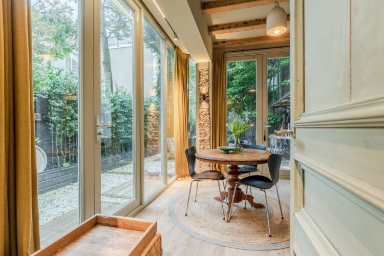
Although there is also this little space off the back of the kitchen which has been dressed as a breakfast area but is one I would definitely turn into the home office. It has a loo leading off it too and could, say the particulars be turned into a third bedroom although I’m not sure I’d want all that glass in a northern European city centre. Either way it doesn’t change how I would use the rest of the space and reinforces the importance of asking the six questions.
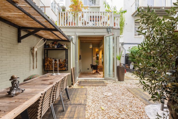
Below is the very pretty garden – adding that shade/roof is a great idea to add to the sense of outdoor dining room and while that is a wall mounted log store you could also create a herb garden wall or even use it for pots of plants and outdoor kitchen tools. This is definitely an outdoor space for the pinterest board.
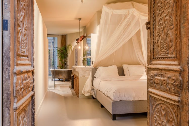
Finally, back inside and down to the basement where the bedrooms are. Now there is some light at the front so the bathroom has been placed there – not, presumably so you can have a bath in front of the neighbours – but because natural light is great in the morning if you can get it. And it makes sense to have the bed in the dark bit as you are presumably mostly there with your eyes shut. The decorative doors make no sense periodwise but I imagine they are a much loved piece and, in a building with few natural features why not add them to a place where their presence might bring you joy. It can be tricky to mix different periods and styles and, for what it’s worth, I think it was the right decision not to use them upstairs where the style is clean and modern and character has been achieved with colour and art. Down here the bedroom clearly has a more romantic feel with these carved doors, the canopy over the bed and the freestanding bath.
So perhaps not a typical Dutch house (I don’t know?) but one that is still relevant to many of readers with its lack of natural light, shape and design. Where shall we go next week?


This is the epitome of city living. The apartment is lovely, but the garden is what would make me want to move in.
Thanks for sharing this apartment Kate – beautiful home and great learning around making long rooms appear less like corridors, so many of us deal with narrow rooms in the UK. I loved how they used the rug in the living room to zone the cozy sofa area. I keep thinking about the size of that rug, would you not take it even wider, i.e. closer to the green storage unit on the left? Grappling with this at home – whether to create a ‘corridor’ or take close to the other side of the room where the fireplace is. Thank you!
Lovely home, thank you for including it. The listing states it is 3 bedrooms but I could not find the third. Perhaps they count the back ground level solarium as a bedroom.
I would have to disagree with most, that one could relocate the sitting room or the kitchen. The front space is too narrow for either the sitting room or kitchen and using that space as a pass-through from downstairs would be a problem. In order to leave the blinds open during the day the sitting room is well placed in the middle with sufficient wall space for the TV and fireplace. The larger dining space is certainly far from the kitchen but so are many other formal dining rooms. Perhaps a rolling cart in the kitchen could be used to transport plates when there are guests.
I lived in The Netherlands for a year and this layout is not unusual. The family most likely has meals at the back in the breakfast area to take advantage of the light.
I like it. Lots. Would probs want to square off the lonesome breakfast room and kitchen area by extending the room out to that little bit of garden space at the side and turn the yonder lonesome dining area at the front to book room/wfh office space but it would probs end up as boot room/ coat dumping/bicycle area.
That dining room would be wasted so far from the kitchen around my gang. They would end up taking a plate and eating on the couch in front of the tv. I would swap the living room and dining room. Cheers from Canada!
Your are right to suggest a small table in the kitchen Kate. I feel it’s absolutely necessary, particularly at breakfast. Otherwise you’d stand up eating in the kitchen which isn’t the best way to enjoy food.
This is city living at its best. The apartment is lovely but it is the garden that would sell me on it.
Glad you featured this Kate, as it has a lot in common with tricky house in the UK (especially cities) and your thoughts on living space placement are so helpful. I am a bit surprised to see all the love for it though as while I think they have made a decent job of fitting it out, to me there is nothing particularly nice or inspired about the choices made and the building is really awkward, dim, and claustrophobic. Don’t think I could ever feel restful here, and you make a very good point about the long walk from the kitchen through the corridor living room to the table. And the spotlights! And the door coming straight in from a busy street!
Lovely house, thank you Kate, but no fence between it and the neighbours?? I know the Northern Europeans are a bit less hung up on their privacy than us but this is a step too far (or maybe not enough steps far enough) for me!
This is one of my favorite houses of all time , featured here over the years . So clever, so many “different ” design details -I love it all .The garden has given me extra inspiration ……..Thank you Kate for featuring this .
Love your course by the way , got a present for Christmas .
Thanks again .
I really love this house and also the location and outside style – typical of central Amsterdam. Here is a website about buying in the Netherlands :
https://mijnverkoopmakelaar.nl/selling-house/costs-and-fees
I think the Dutch could teach other estate agents a lesson or two – particularly in France where the fees are 5% if you do a good deal in advance.
Very interesting article for those of us who have long, narrow spaces. Will adopt the idea of painting the top of the wall going across the space to visually foreshorten it and make it appear shorter and wider. Noticed there was a fireplace in the built-ins. Good idea too. Thank-you.