Regular visitors to these pages may recognise some of these rooms which are the work of one of my favourite interior designers, Emilie Fournet, who worked on this three bedroom maisonette which is now for sale via Savills. I know – two interior designed properties in as many weeks and this one should definitely provide plenty of inspiration.
So, first the details; Emilie has made clever use of the space so while it’s technically three bedrooms, two receptions and two bathrooms, it can also be viewed as having an office and utility room on the lower ground floor (see the last picture) and a dining room off the kitchen, which is currently used as an informal sitting room. There is a family bathroom, and two shower rooms. The asking price is £1,525,000 by the way.
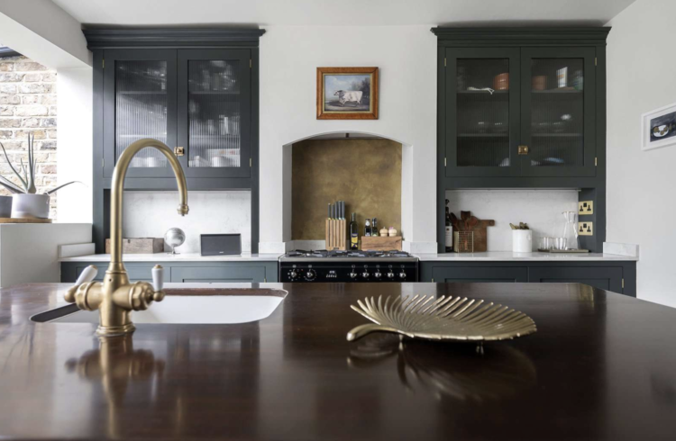
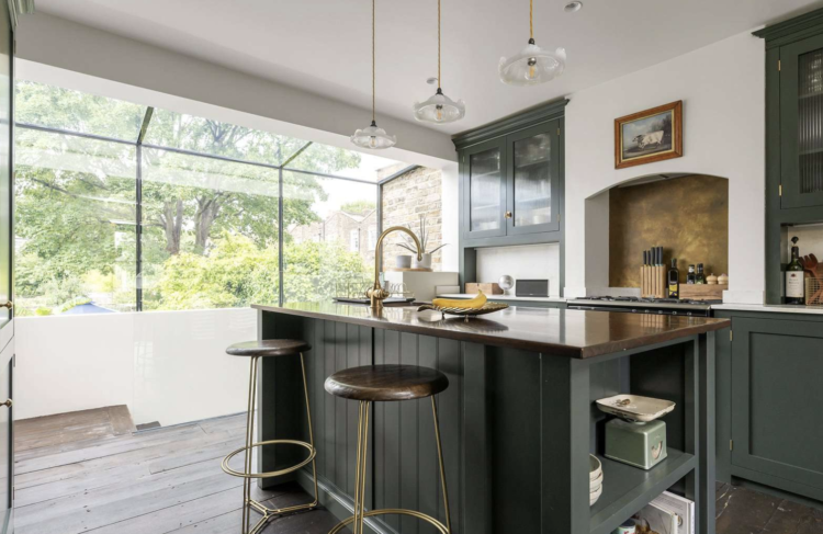
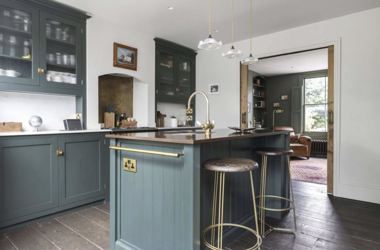
But the main thing, for me at least, is Emilie’s great marriage of colour and original features. This kitchen has a glass extension that floods it with light, but the brass and bronze accessories pair brilliantly with the dark kitchen units and retain that period feel. The splashback behind the oven is a particularly good touch (try Metal Sheets for similar) but the bronze bar stools are also lovely as it’s a little softer than brass and again stops it being too modern and new.
Before we leave this room I should also point out the plug sockets with a USB port on the end of the island. I first saw these at Rachel Khoo’s house and it’s such a good idea. I can’t quite face replacing all our sockets (particularly as I have done it once to move from white plastic to black metal) but if you are doing it then it’s worth considering. And I have been trying to persuade The Mad Husband to add a towel rail at the end of the island for years and for some baffling reason he is against it.
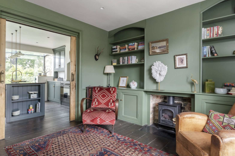
Moving out from the kitchen into this raised ground floor reception which could be a dining room but, if I lived here it would be my office. After all an office next to a kitchen with a ready supply of coffee is a good thing I find. Plus you could have your desk by the window and it’s the raised ground floor so you could happily spy on passers by.
The walls are painted in an archive Farrow & Ball colour called 9819 (bear in mind with archive colours you cannot order a sample or return it if you don’t like it so you need to be sure it’s the right one). You can try Calke Green, which is lovely, or Little Greene have a whole green colour card.
Of course the key point to note is the woodwork and shutters are all painted in the same colour. The ceiling is white to bring in more light and it also links to the white walls in the kitchen. And there are sliding doors between the two spaces, so you could close the view of the fridge if it was calling to you too persistently during the working day.
This lovely reception room is on the other side of the hall and runs front to back so while it is one room, you could use it as two separate spaces – even putting a partition across if you needed more space to work from home. This room has been painted in Drakensburg by Paint & Paper Library, with the shutters in Yesterday’s Flower and the ceiling and coving in Salts II and I.
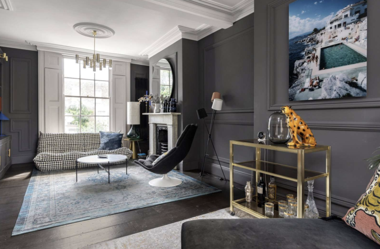
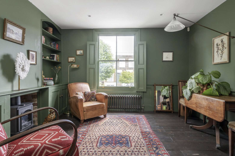
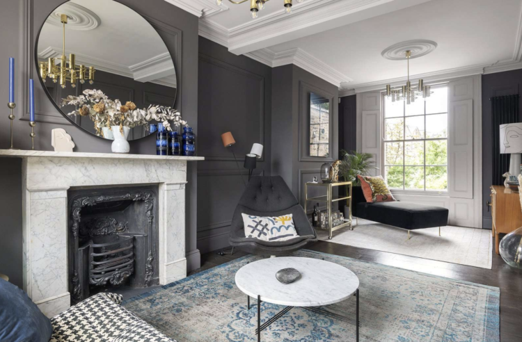
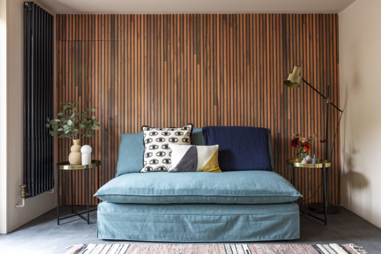
While grey has been pushed aside by the influx of warm neutrals recently, I still think a dark grey is a gorgeous warm colour – it often changes with the light and can have a green or blue tint to it which can be lovely under electric light and, of course, the brass bar cart (not forgetting the orange cat/cheetah/leopard) and natural wood all bring some warmth. The blue of the rug is just faintly echoed in the candlesticks on the mantelpiece but you could, of course, change the rug to a warmer pink or orange and swap the candlesticks to match. That’s another reason why dark grey is clever – it really is friends with all the other colours in the playground/spectrum.
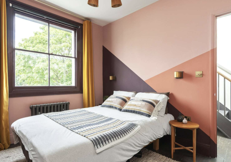
Moving upstairs to the two bedrooms and this is where the layout might be an issue. There is a tiny shower room on the floor above or you need to go down a floor to the beautiful bathroom. But we’re not here for the practicalities, let’s have a look at this bedroom. It’s mostly painted in Little Greene Blush and the colours behind the bed are Cordoba and Tuscan Red.
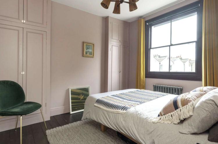
If you don’t have a bedhead then painting the wall behind is a really great way to add interest to the wall. Emilie has matched the window frame to the aubergine Cordoba shade and the gold curtains (which tie in with the wall lamps) stop it feeling too coordinated. Yellow by the window is also a proven way of making you feel like the sun is shining so you can either paint the frames or use curtains. Either way, I reckon this will be a cheery space in the depths of January.
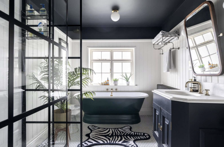
This is the bathroom, which has definitely been on these pages before. I love a tongue and groove bathroom instead of tiles and the luggage rack shelving is a great idea. The dark ceiling might feel scary to do but because it matches the bath and the basin unit it all ties together. The plant softens it all and the zebra rug brings the fun.
And here is the basement bedroom with its wooden clad walls. This also has its own bathroom as well as a utility area and has a corridor leading to the garden. So what do we think? Anyone moving to North London? Or just going to be bolder with paint colours?


Kate, do you happen to have a source for the gorgeous photograph in the stunning dark grey reception room? It looks like Bondi Icebergs is the location but I could be wrong! Many thanks.
I love your blog and have been reading it for awhile. I remember reading an article you wrote regarding painting baseboards the same color of the wall. Can you direct meto that article? I am remodeling and would like to follow that principle.
I have referred to it many times as it’s a decorating principle that I strongly believe in. If you search either skirting boards or woodwork you should find things that help.
Do you know where the bar stools are from?
So I do but Emilie, the designer, said it was a company with substandard customer service and she would never order from them again so I am reluctant to pass on the details. You can look at Cox & Cox, who have a large selection of stools that you might like or try made.com have lots to look at. .