Back to the UK this week and yes it’s a narrow period terrace house (plenty of those about) but it’s also full of gorgeous tonal colour and, while regular readers will know that I don’t impose (that many) decor rules and firmly believe that everyone should know the tools to be able to find their own style, I am a big fan (huge) of tonal colour schemes as, in my view, they allow you to work with rich saturated colour but in a calming and restful way.
Come on in and see what I mean…. This is a five bedroom, four bathroom terrace in Brixton, south London, and is on the market with Inigo for £1,500,000. But, as usual, we are not here to discuss London house prices, this is strictly for the decor.
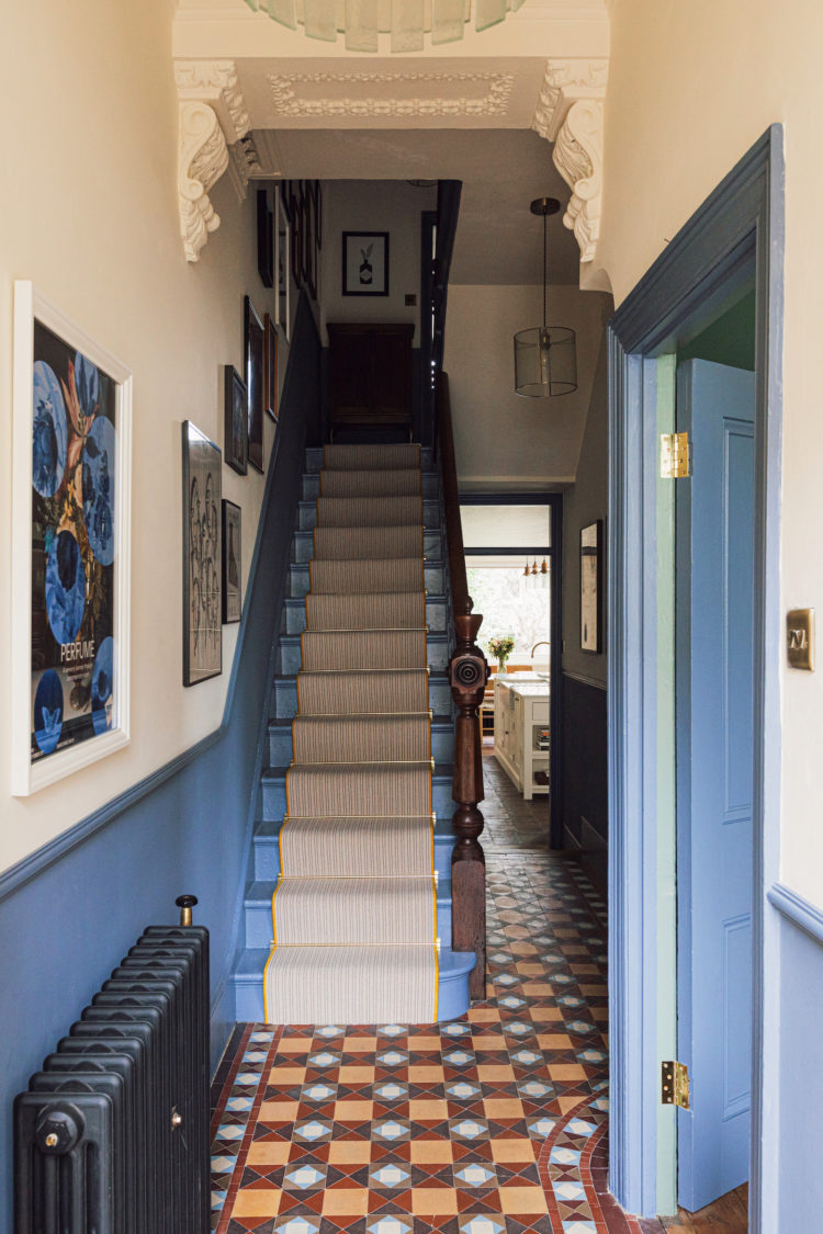
This fabulous entrance hall is a case in point. In all my books and online course I am always talking about the importance of the hall. It’s the first place you see – either you, when you come home, or guests. It sets the mood and yet so often is an under-painted and cluttered space that is not saying “Welcome in” but rather “Ugh not you again”.
This, in common with most city terraces, is narrow so the owners have made sure that coats and shoes are stored elsewhere – perhaps under the stairs in the loo/cloakroom. They have kept (or replaced) the original Minton tiles and I know, from my own interiors consultancy, that these can be tricky as many of you don’t like the colour. But there are options and, if you go tonal, those options increase; from very pale terracotta- you could take it to a warm cream with a red ochre base – to a deep red, navy blue or, as has been done here pulling out the paler blue.
And what works so well is that this colour has been used on the sides of the stairs and bannisters as well as the lower half of the wall and the woodwork and doors. It’s making a statement but it’s not half a sentence with no verb as can often be the case when bold colours are used. Choose it, own it and do it with conviction rather than trying a bit and panicking.
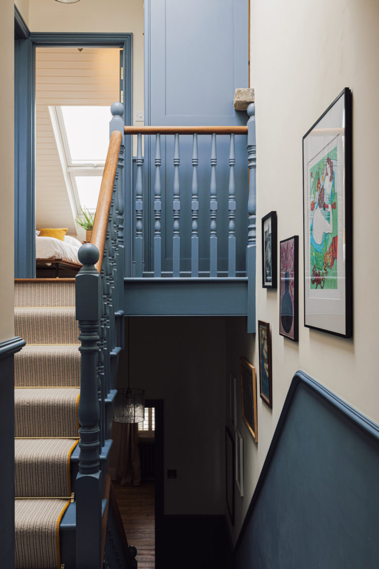
It needs to be a colour that you want to drink in with your eyes and then you will be happy to see it leading up the stairs and through the house. For me that shade isn’t blue, but it could be one of the terracottas. And, for another take on the same idea, you could use, for example, the darker rust or navy, on the ground floor and stairs and then make it paler floor by floor. That’s the very definition of tonal decor – it’s the same colour but it just gets lighter as you move on up through the house. If you were methodical about it (and kept a note) you could buy a large tin of the dark colour and mix it some of it – in a separate pot – with some white. Just be sure to write down – ground floor 100 per cent, first floor add two cups of white per 1L, second floor four cups and so on.
And if the tiles really aren’t for you then you can always replace them but maybe create a modern twist on the original by choosing patterned tiles (great for mopping clean and hiding muddy foot and paw prints) and take your colour scheme from there.
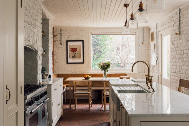
Into the kitchen which, unusually for many houses like this, hasn’t had the side return knocked out to make a wider room. The effect, of course, is that the dark room in the middle becomes even darker and the garden becomes smaller. Also, if the kitchen is then large enough for a sofa, the front room and middle room are hardly ever used. So, while you may curse your narrow kitchen, it’s always worth thinking if you would really get more usable space from an expensive extension (and research shows that you are unlikely to make back the full cost in a sale) or if you would create more usable space in one part of the house against a trade off of not using the space that you already had.
Devil’s advocate: if I were in this position I might extend in the side return to create the most fabulous walk-in larder, pantry, utility room rather than a space for a bigger island and a sofa. You could have an internal glass window so you could see your shelves of lovely things, units below (on the kitchen side) and washing machine etc in units in the extension part. This would give you lots more storage (and whoever complained about that) as well as ensuring you still used the rooms you already had. Imagine then painting the main kitchen in a pale green (for example) and the pantry in a darker version of the same thing.
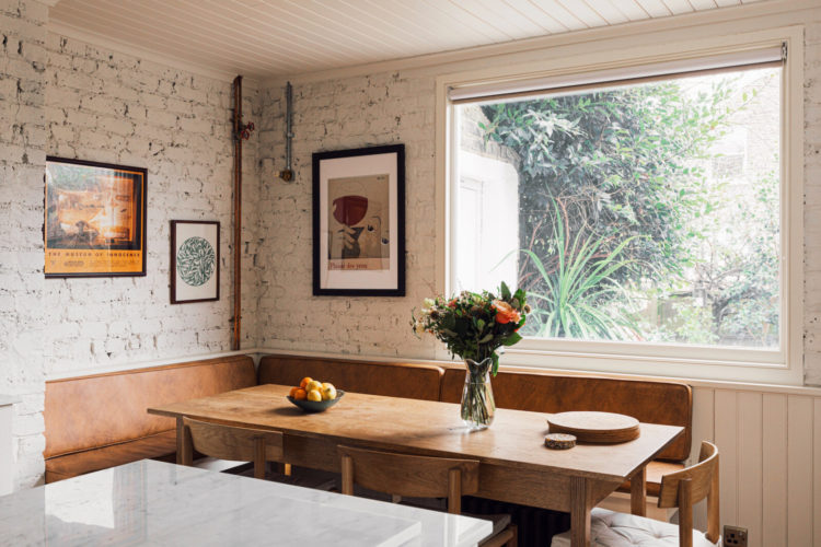
Exposed bricks aren’t for everyone. If this is a little too rustic for you consider taking the tongue and groove panelling (seen here under the window) all the way up the wall to meet it again on the ceiling. And a built-in banquette is a great space saver in a small kitchen. You can include storage under the seat and upholster it in leather (which improves with age) vegan or faux leather (for a wipe clean solution) or try outdoor weather resistant fabric for a softer, but still tough, option. If you don’t fancy your chances at upholstery then you can buy ready-made headboards and fix those to the wall – as long as you can make the measurements work in your space.
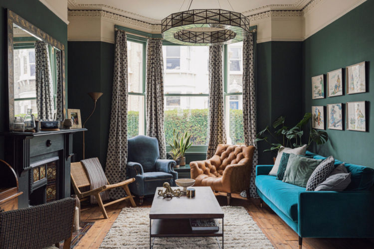
Popping into the sitting room and if yours is a room that you only use in the evening, then this is the place to experiment with dark colours. However a pale ceiling (don’t go brilliant white as the contrast will be too much) and a light rug together with a large mirror to bounce the light back in from the window will all offset the dark paint. Even the pictures over the sofa are pale.
Below is the back half of the sitting room as the two spaces have been mostly knocked into one and you can see that if there was a side return extension this room would have little or no natural light as it would be relying on the light from the front bay window. Again, your options are to embrace the dark, or find a purpose for this room that doesn’t rely on bright light. So it’s probably not the ideal home office but would make a good dining room.
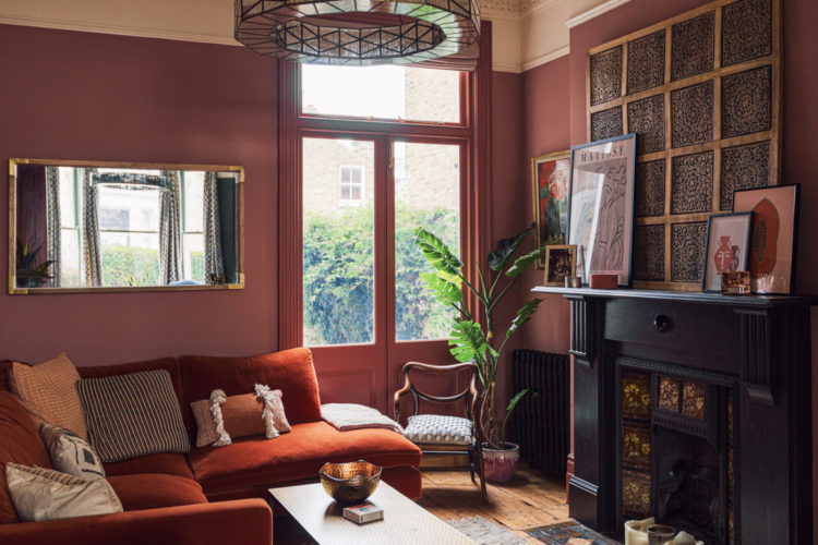
In period houses of this type, this is by far the trickiest room in the house. And yes I could absolutely do a whole post on this – I think I might as there are, actually, lots of options that just require a little thought and planning.
This one has been set up as a second, cosy sitting room and I love the bold choice of colour which contrasts so strongly with the colour at the front. This helps to differentiate between the two spaces and gives them a different feel even though there is no division between them.
But the key point I wanted to make here about tonal decor is how the big pieces of furniture – sofas in both case, are the same tone as the walls. This can make the large pieces recede into the wall and give the impression that the space is larger and emptier than it actually is (a good tip for small rooms) as well as creating a cosy enveloping feel to the room. It’s instantly more relaxing than lots of high contrast colours and there’s no limit to the amount of patterns and textures you can bring in so it’s still luxurious in feel. And there’s no judgement from me if high contrast is your thing – just be sure to match the mood they put you in with the room they are going in.
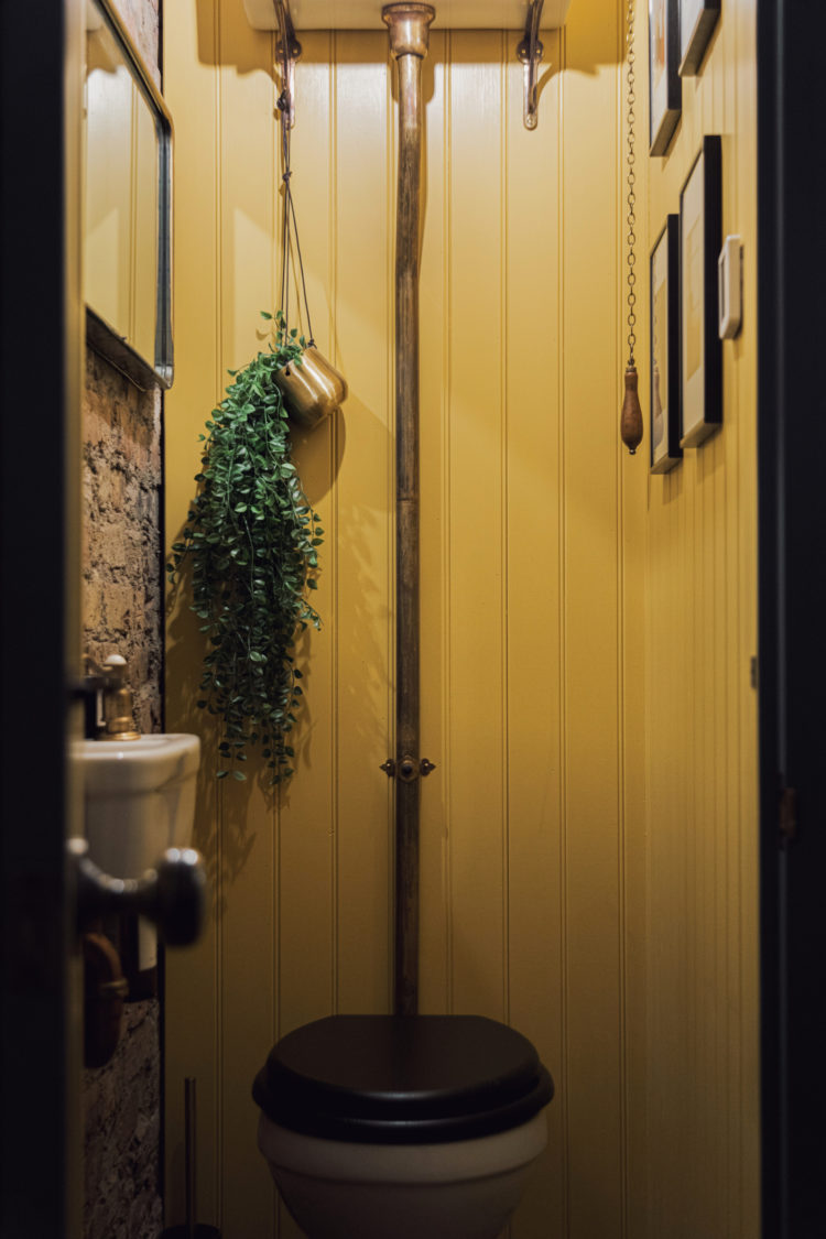
Pausing to stop by this glorious bright loo – and, it’s been said before but let’s go again – you can, and should, experiment with bold decor in rooms that you aren’t in for long and, even more so, in small rooms. Take this as an opportunity to use a bold wallpaper or a bright colour that you like but are scared you would tire of if you had to look at it for several hours a day but which, when seen for five minutes once or twice a day, is like a hit of dopamine that causes you to breathe deep, reset those shoulders and carry on.
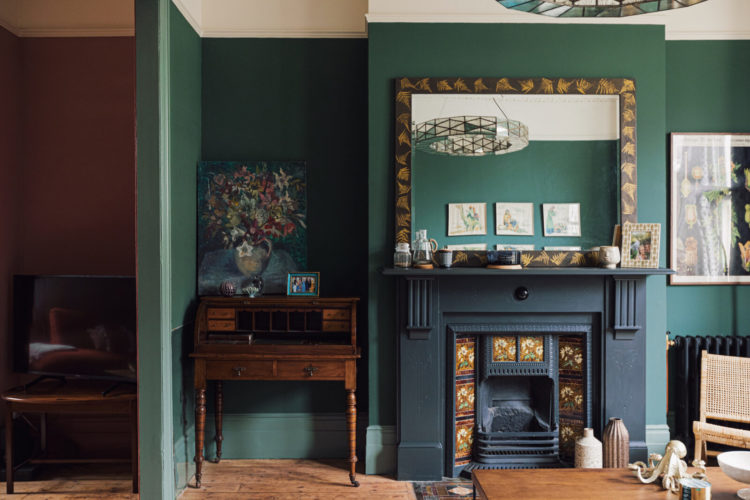
Mind you the other bathrooms, of which if you remember there are four, all have their own micro red thread. The yellow from downstairs is picked up in the painting over the fireplace. Those familiar with The Mad House will know that I too have a dark bathroom with a big gilt frame over the fireplace. It’s not a bathroom that everyone will have, but the owners have, as we did, taken out a bedroom to create a large and luxurious bathroom.
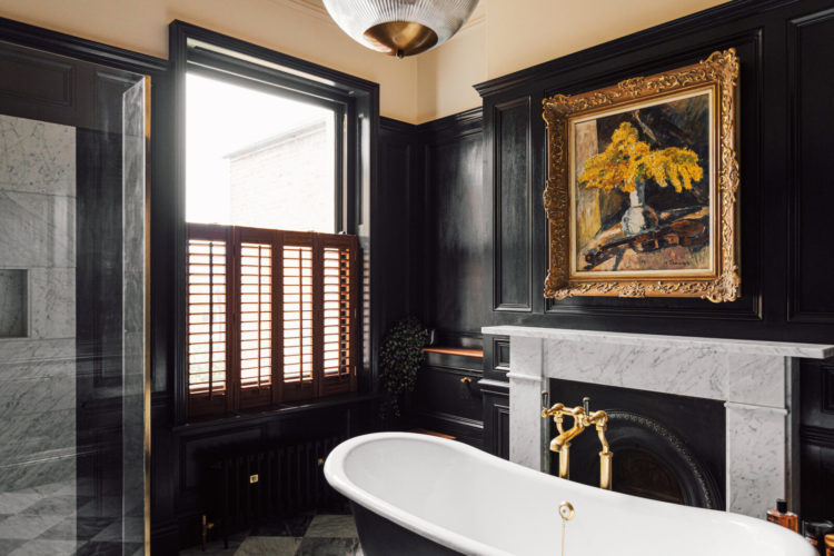
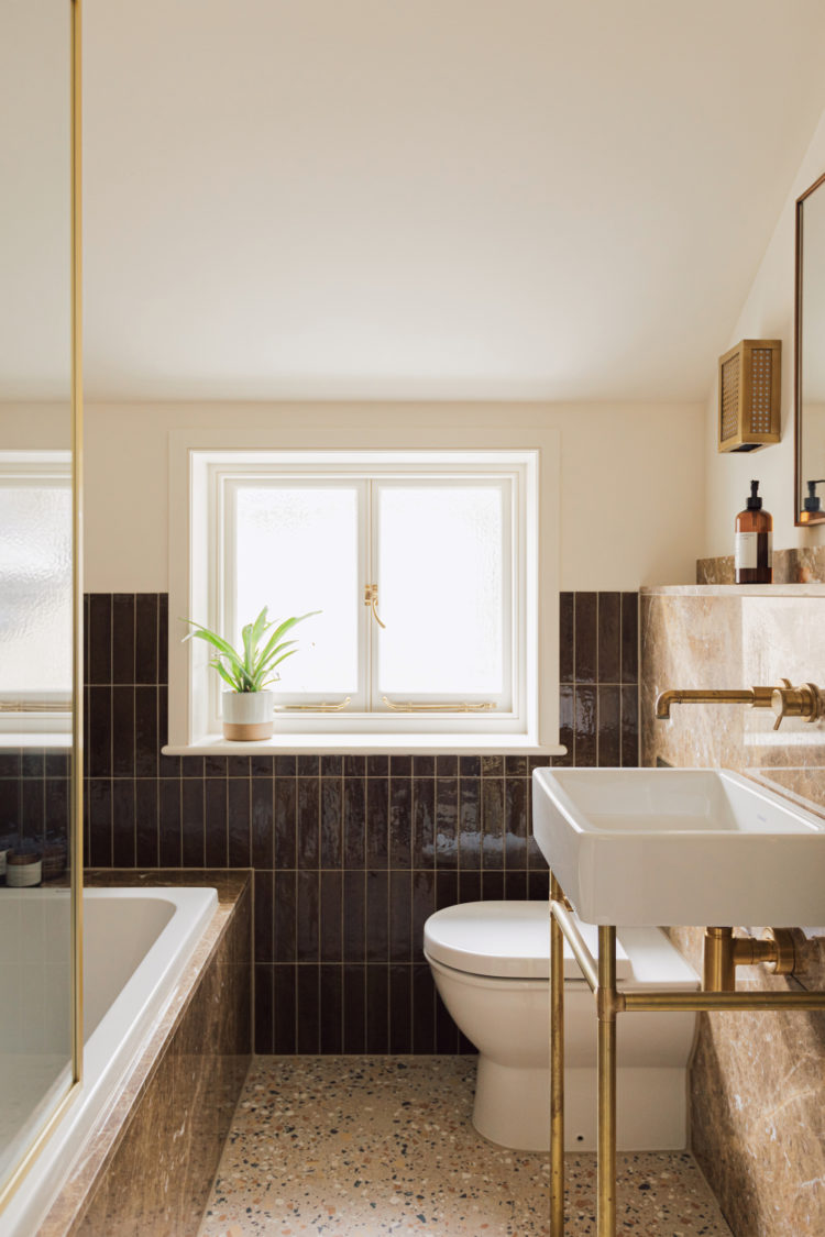
In the bathroom below, the colours are the same; black, cream and brass but it’s higher up the house and the black, this time in glossy light reflective tiles, stops lower down the wall while the terrazzo floor is a mix of all the base colours. It’s a similar idea to making the paint paler as you go up the house that mentioned at the top. And for those who live in flats- you can do this from front to back – a light sitting room at the front leading to a darker bedroom at the back.
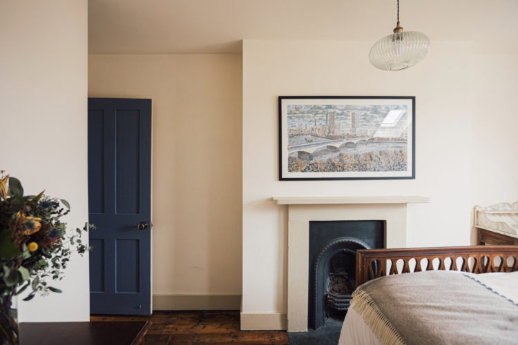
There are five bedrooms so we don’t need to see them all (you can look here) but I just wanted to point out this very neutral bedroom. Look how the blue door brings a blast of colour and highlights the fireplace. I’m also guessing that the picture, which includes a river scene, looks much bluer in real life.
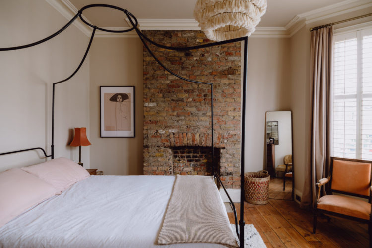
In the bedroom below the four poster brings an element of glamour but its pared back style means it doesn’t dominate the room. The warm tones of the brick are picked up in the lamp and chair and even the lamp is bringing texture to the space.
So if your house is narrow or your rooms are small I hope that has given you some ideas to carry into your own places and spaces.


Love the colours in the sitting room and what a bathroom. Any suggestions about where to source a similar ceiling light as in the sitting room. Great post, as always some excellent food for thought.
A comment on colour and placement. The photo of the staircases, going up and going down is very much like the small entrance way to a former home. The stairs were oak, from a previous thirty years, and well marked from foot traffic over that period. After much deliberation about what to do with this space, I made the decision to paint the staircases (treads, spindles, and balustrade) in a deep blue silver colour, suitable for floors and porches, leaving the banister rails unpainted. The ceiling height was almost 15′. With the walls painted in a matte off white colour, and an old ceiling fan replaced with a modern glass lantern light, the whole space became transformed. I usually prefer neutral colours, but in that space, a bold colour choice was the best decision to lift that entrance way. I can’t say it was the painted staircases that sold that property, but it did sell on the first day it was listed.
Thanks Kate, another great post. I so look forward to them each week.
Your thoughts & ideas about the “tricky second room” would be very welcome. I’ve that exact dilemma after finding it’s not worth the expense & hassle of extending into the side return and will likely go for an easier full width kitchen extension at the rear, using the current narrower kitchen space as a dining room. It’ll create an inner courtyard and I love the idea of a Japanese style “tsubo-niwa” green filled space, maybe. But need to make sure that tricky second room is not just a staging post/dumping ground off the hall and a corridor through to the dining/kitchen. (And if it is, how to make it work!)
I’d love to hear your thoughts on the open plan lounge/dining room too, especially on how to avoid the dumping ground issue Billy mentions.
This is a lovely house really beautifully decorated. Love it.
Love all the tonal colours and using the same colour on the walls as the bold sofas is clever too. Your idea of a pantry/larder/utility in the side return very clever Kate.
Quick question – I’ve been revisiting Design Storey which is enormously helpful. I remember a section on lighting which I can’t find now – could you point me in the right direction please? Thank you for all your delicious posts, so much inspiration and advice to draw on x
I have always been fascinated by the diverse ways people adapt this classic plan. My current house is Victorian but has a different plan. If it did have this plan though with this fairly wide kitchen, I would do what you suggest here : add a utility room in the side return but I would leave space for a tiny internal courtyard to allow light and air for the middle room. The added advantage is that you wouldn’t disturb the bathroom plumbing and the drains , which can be costly. I would tile this inner courtyard with morrocan tiles and fill it with plants and possibly a small fountain.
I’d love to know what other things you’d suggest in a post on this topic. You have such great ideas!
Ooh yes please to your utility! You would find me hiding in the foliage nursing a cup of tea and acoiding family hustle and bustle!!