I had thought of trying to find a white modern palette cleanser for you today after the reaction to the Wow!house on Wednesday but instead I found this and I liked it more. To address that – yes it is full on but it is also a showcase for the designers’ ideas and as such I found it interesting. Some of the rooms are definitely too much for us to bring into our own places and spaces wholesale but, viewed as inspiration and as a catalogue of thoughts and stories I liked it. That said, I wonder if photographs intensify everything and make it seem busier than it is when you are standing it. Anyway, moving on what do you think of this rather pretty two bedroom maisonette in east London?
It’s on with Inigo for £1,200,000 and has three bedrooms although, as is often the case, the third is small (2.5 x 2m) so would make a good office. Or, you could move the bathroom up from beside the kitchen and create a downstairs office where the bathroom is – you’d have to make alternative arrangements for the loo door but it’s doable. Have a look at the floorplan here. A bit of jiggling about with the bedrooms might also give you the possibility to add an ensuite or second bathroom between the two bedrooms as well. Remember you only need 1m wide and while 3m is perfect you can do it in 2.5m if you are prepared to breathe in while you dry.
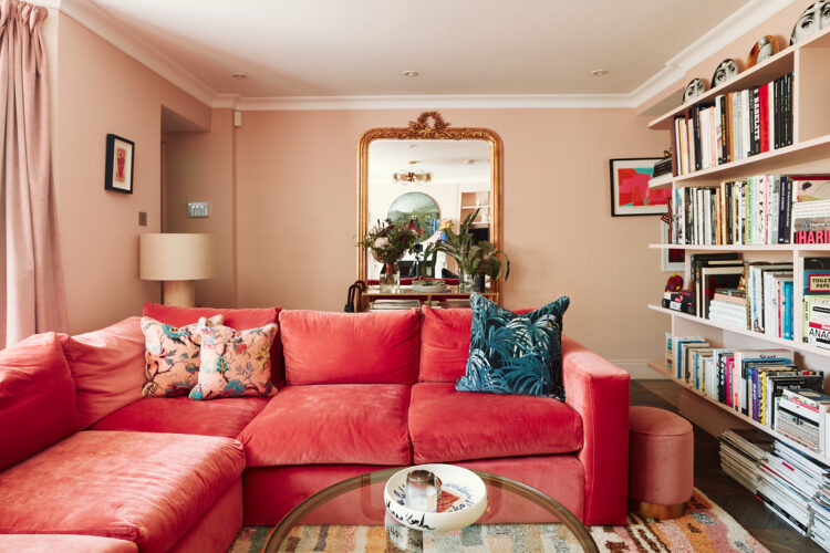
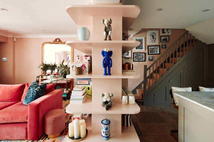
So what do we think? I was drawn in by the tonal colour palette which will always feel more restful to me than contrasting colours. Here it’s shades of pink with a cobalt blue disrupter and a bit of muddy olive to ground it all and stop it feeling too sugary. If pink isn’t your thing you could do the same thing in green, with burnt orange and burgundy, or blue with lime green and muddy yellow. As always, this is less a road map and more a picture of a general direction.
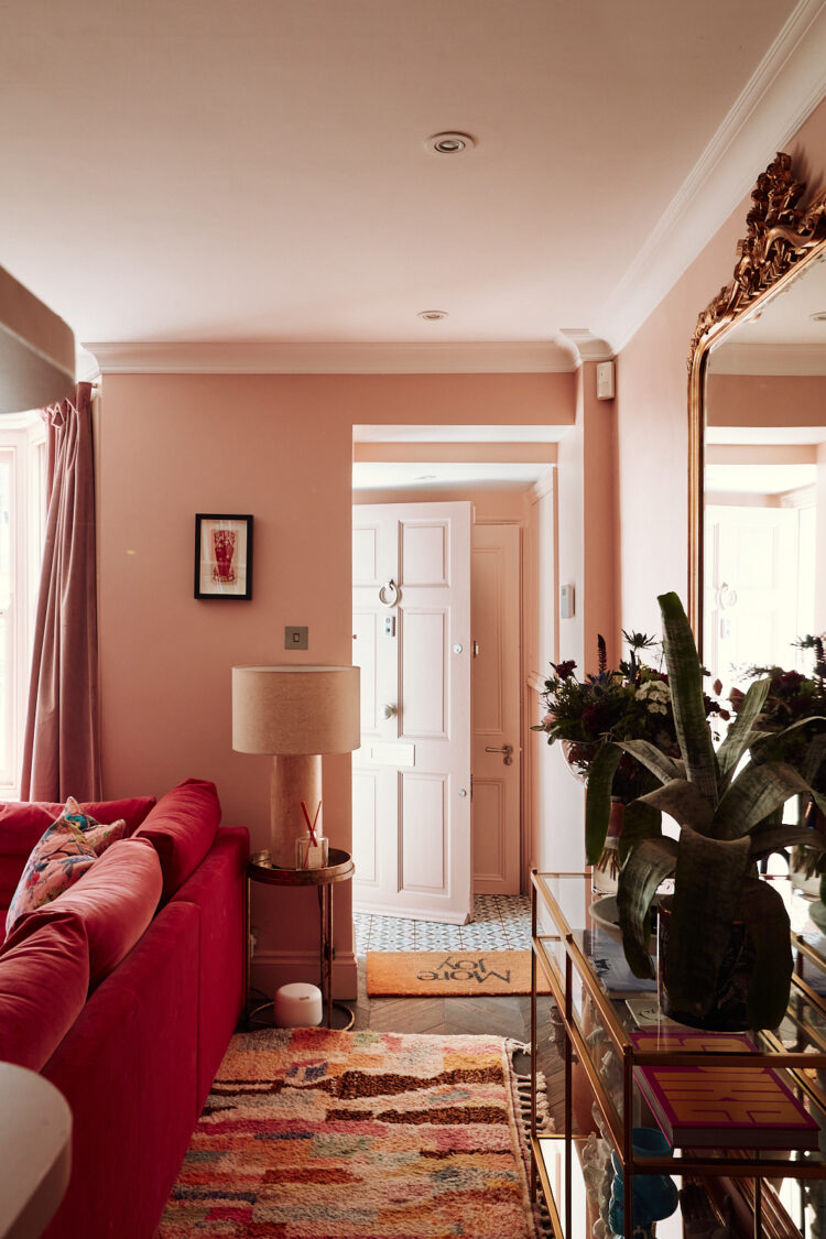
If you are thinking pondering lighting plans notice here how there are downlights but they light a clear path behind the sofa to the door. They have a point so they are there for a reason and the rest of the work is done by lamplight. That’s a good way to use these lights – give them a reason to exist rather than just covering the ceiling in them.
If you wanted more you could put one in front of the window so it will shine down the curtains. Keep it about 30cm in from the edge and remember it’s always better to put them over fixed points – paths, windows and doors so you can move furniture and pictures around and not end up with the light in the wrong place.
A final point to note on this room – while colour will always be your main focus don’t forget the shapes as well. If you are looking at room that on paper, or your moodboard, looked perfect and then, somehow, wasn’t, take a look at the objects. Rooms tend to be angular – mostly square or rectangle or versions thereof. Furniture tends to be straight lines so you need to soften it all with some curves. In the picture below you see the round globes of the ceiling light over the round table and then the round mirror over the fireplace. The curves carry the eye around the room.
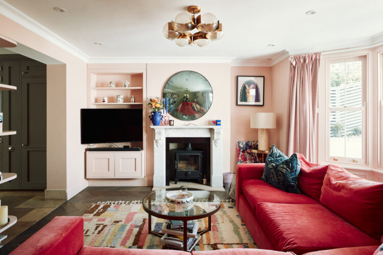
Now you will have heard the term broken plan before – it’s the new open plan! The point being that aside from opening up small, dark Victorian spaces, open plan also allows light to flow around a room. Broken plan recognises that we might like the odd wall but we don’t want to lose the flow of light.
And so we come to this bookshelf arrangement which is a clever way to make use of a half wall. My guess is that the doors were taken out either side and this was a supporting wall but instead of just having it as a bit of wall between a room it has been turned into a display unit and it works brilliantly.
When we knock two rooms together the usual plan is to knock a large hole in the middle and keep a bit at the sides to hold up the ceiling. Here the sides have been taken out to provide openings while the middle remains and does a job. An interesting reversal of the norm and one that it might be worth book -marking for future reference. Looking at my own knock through, which was done before we moved in I wonder if that might have worked well here to provide a little more separation between the two ends of the room.
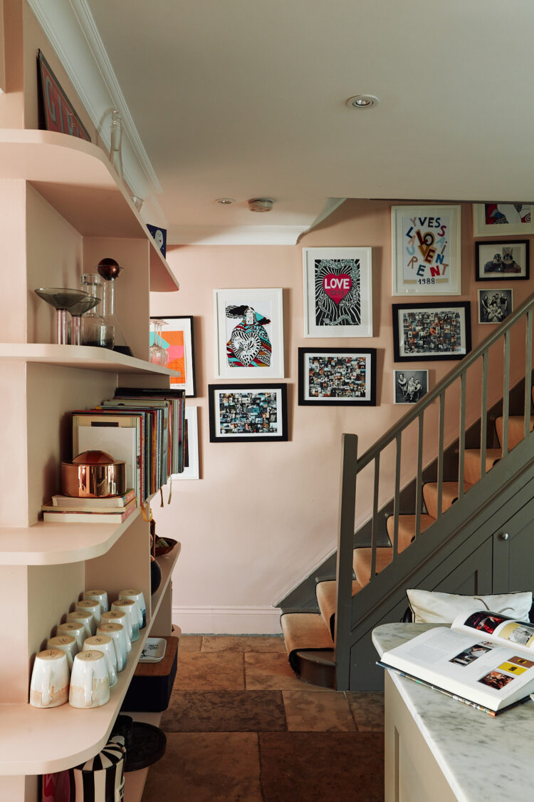
This is from the other side and you can see how the shelves double up as kitchen storage as well and while the colour changes – to the darker olive grey the pink carries up the stairs and provides continuity.
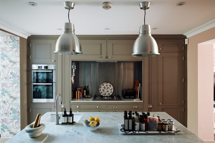
Here’s a bigger shot of the kitchen. I’ve seen a couple like this recently where the oven (or sink) is enclosed like this. It works really well in small kitchens and I’ve also seen it with a door so if you had the sink there you could hide it away completely. Probably less wise with an oven in case of residual heat.
This is the view into the downstairs bathroom and the owners have done a good job in making it look glamorous as it’s on view from most of the rest of the downstairs. The marble carries from the up over the wall and the bath reflects it back so it almost disappears. The loo (check the floor plan) is tucked away out of sight and this is a key point. No-one wants to see a loo when they walk past a room. If you have only a loo in there and there is no choice then you probably need to keep the door shut. If you do have options and the door might be open then try and think about what you might see as you walk past.
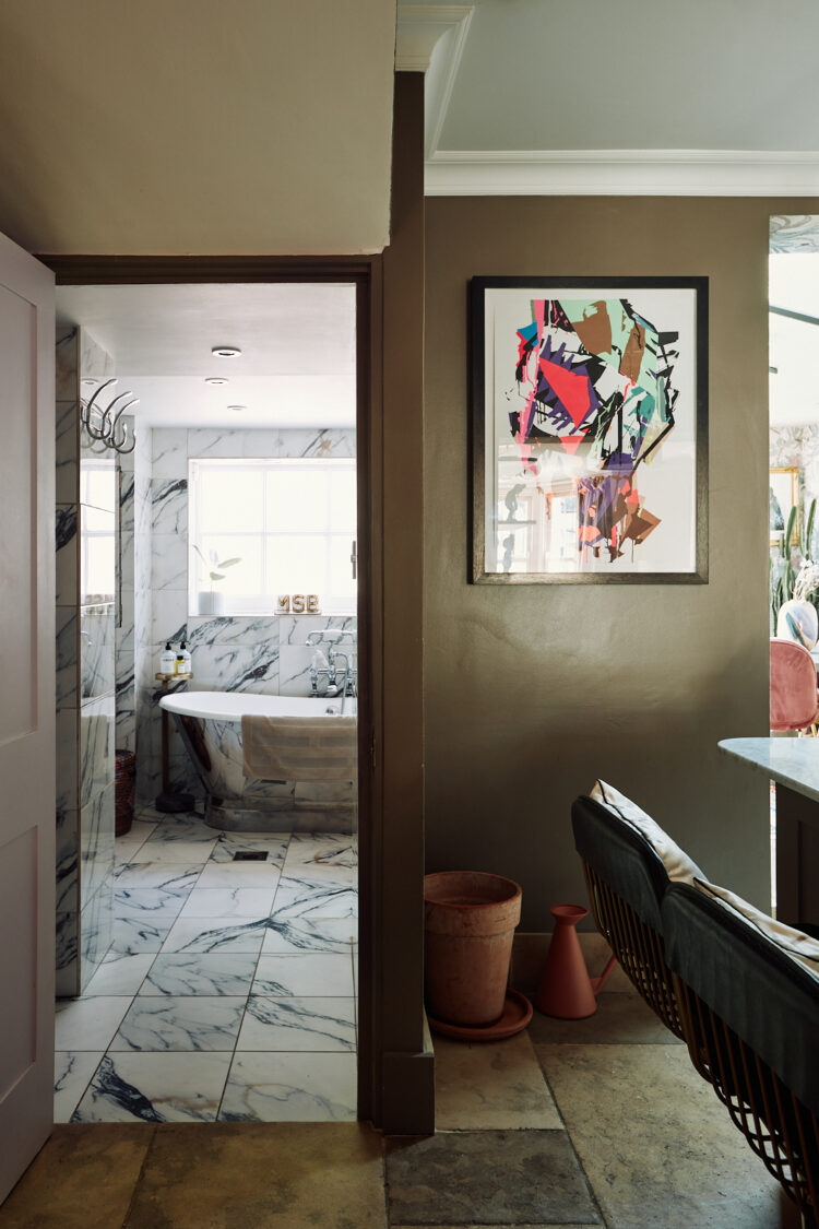
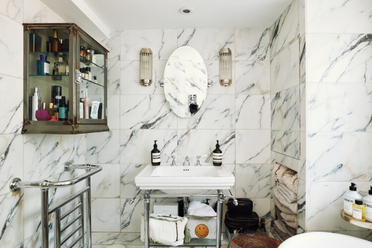
Here’s the full view – the loo is in a tiny room behind the glass cabinet by the way. The marble is quite busy but that vintage glass cupboard softens it and adds character. Start counting how many vintage glass cabinets you see on social media and in magazines because it’s rapidly becoming the accessory to have. They work brilliantly in bathrooms and are becoming more common in kitchens too so if you see one grab it. Even if you don’t want it I’m sure you can sell it on!
So what do you think of this one? Ideas to inspire? Let me know in the comments.


Love that simple idea with the shelving. Will be storing that one away for possible future use 🙂 Love the colours too but then they are very similar to my own, along with the all marble bathroom, so I’m biased 🙂 Ours is Calamine, I wonder what pink this is? Oh and that muddy green – Lush!!
Whilst I appreciate that they probably ‘tidied up’ here for the photos I really like that you can actually see someone lives here and envisage where all your stuff would go.
Trots off to view the bedrooms on the estate agent site……………….
Love this one, love the colour palette of the downstairs, the pink and the olive and the kitchen. Love the Friday property look see but esp enjoyed this one..
I can’t get over the price for what is really a decent sized flat with a downstairs bathroom, but there’s lots that’s pretty and clever here – including putting the kitchen in the darker middle room (although having a sink right by the back door is useful).
This is also the most similar layout to my own house that I’ve ever seen on the blog, and what we did was to move the bathroom upstairs into a space carved out of the back bedroom (ours was quite a bit bigger, although it is tiny now), putting an office into that room downstairs while saving the loo, to give us one full bathroom and a downstairs toilet. It has worked great.
Love the living room and the bookshelf is so clever! The colours are gorgeous. Aside from a cabinet though the bathroom isn’t for me – all marble bathrooms just make me feel like I’m living in a block of stilton!
“Living in a block of Stilton”: perfect and funny description for my (previously-unnamed) to the “all-marble” approach on walls and floors.
I love this too!