Ok stop all the clocks and cut off the telephones and all that – this is the one. It’s a two bedroom house in east London and while it’s more expensive than last week – and sadly the lack of space means we won’t be sharing it – it’s so pretty that I think a bank heist may be in order. Come and see and, at the very least, let’s see if there’s inspiration for our own places and spaces.
This Victorian house was built around 1850 and has been recently and meticulously restored and is now on the market with Inigo for £1,450,000. Now it’s one of those houses where you go up to the front door so the reception rooms – two – are on that floor with a bathroom at the back and the kitchen and dining room are on the lower ground floor with the second bedroom. The top floor has the main bedroom and en suite.
So yes it’s two bedrooms as it stands but you could probably find a third and even a fourth if you lost the en suite or didn’t mind the bedrooms being spread over the whole house. Friends of mine had a house like this and it’s tricky if you have small children as you might want to be on the same floor as them, or not want your kids to sleep near the front door so they’re perhaps not ideal family houses. But if you’re downsizing or child-free they’re lovely.

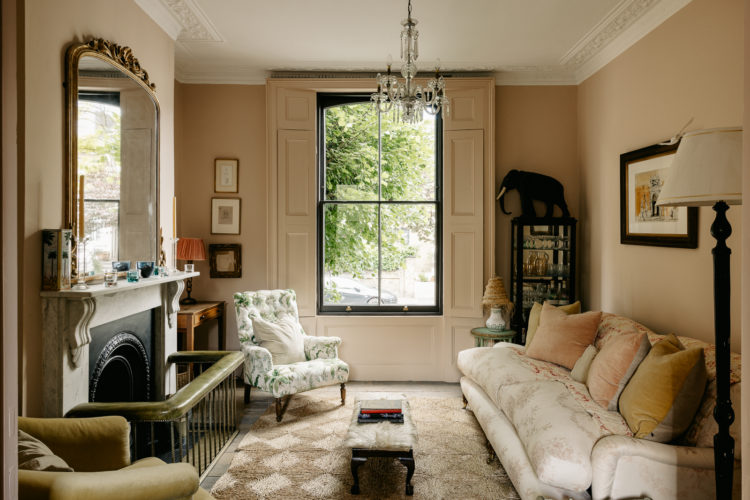
So the gorgeous room at the top is the back sitting room on the raised ground floor and looks out over the pretty courtyard garden. I’m seeing a lot of rooms painted in this soft pink at the moment and while The Mad Husband has said he can’t cope with a whole pink room (apart from the bedroom) I think we can all agree that we’re going to rebrand it as warm cream/deep mushroom or even beige and leave it at that. What makes it work and not be too sickly is the black windows and accessories which punch through the richness of the colour and stop you drowning in pastel sweetness. It’s a generous squeeze of lemon over a plain fish dish or a sprinkling of black pepper on a strawberry.
Above you can see how the black architrave frames the view of the front reception room which is pictured below. This is a deeper browner shade but it works really well with the pink at the back and serves to give this open plan space two distinct feelings. There is a door that divides the two spaces too. Now two sitting rooms may seem excessive – especially as with two bedrooms it won’t be like you have lots of people to seat but there is something love – if space permits – to designating one as a tv room and one as a cocktail and chatting room. Or you could have one as an office (bagsie the back) or a library/music or even play room if you wanted.
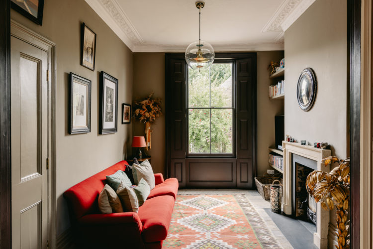
We’re really here for the colours though – in sort the front sitting room is a darker version of the back with the walls deepening from pink to clay and the sofa from a pale cream floral, to a darker floral with a soft red to a plain red at the far end. It’s a colour palette you could adapt on any spectrum – yellows to greens, pale blues to dark blues, lavenders to olives.
Now let’s go downstairs as this is another layout you could think about, particularly if you have a narrow hallway which many period properties do. You will have seen houses where the hall wall is removed by the front door so you step straight into the sitting room. I have never been sure about this particularly when you live on a street rather than in the countryside where this means you can feel a little close to the road outside. In addition, while it makes the space feel wider, you can’t actually move the sofa back or you wouldn’t be able to open the front door. A better, but more expensive solution is to create a large internal window between the two which brings in the light and feeling of spaciousness but keeps the front door and hall separate.
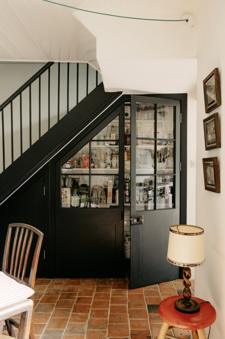
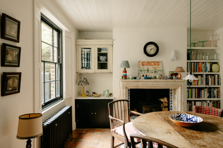
Or you can consider this; keep the front sitting room as a room on its own – so don’t knock through – and remove instead the back portion of the hall wall by the stairs. This creates a much wider area at the back of the house, which is often where those halls become really pinched and gives you something like this above. They have also created a rather lovely pantry in the cupboard under the stairs and made a feature of it. Take a look at the floorplan here to see if you think that could work for you. Obviously the front room here is a bedroom/study rather than a sitting room but the same principle applies. And of course you could either keep the wall between the two solid or add a sliding door so the whole space could be opened up if you fancied.
I have seen this done in other houses but ones where the sitting room was part of this open space and it’s the same issue as having the front door going into the sitting room – you have the stairs coming right in and while this might be fine if you live in a child-free house, if you have smalls and a party at the same time then that noise is going to travel round the whole house. While having friends for supper in this place might be noisy you do at least have the option of closing the door to the front room and making a noise there – or even allowing children to go in the front room room to watch a film while you entertain in this open space. It’s another thought to add to the constant library of what is the best way to move the walls around to suit the way you live and the people you live with. This is my current favourite. The other, from a few weeks back, was to put the cooking part of the kitchen in the darker middle part and the dining/working/sitting part at the back by the garden.
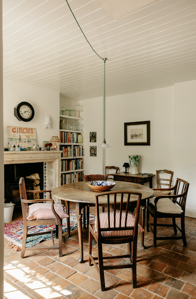
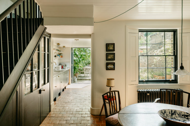
A closer look at the dining room because this terracotta floor adds to the sense of it always having been there while the wooden clad walls is a) a great noise reducer (case in point) and b) creates that sense of a cottage and while this is an urban house in one of the biggest cities in the world it has been decorated to feel like a cottage. And I, as they say, am here for that.
One other point – if hanging a pendant light over the table keep it as low as you can. This makes dining more intimate – if you dim all the other lights and really makes the softly illuminated table the focal point of the room.
We’ll stay for one more look from this angle as you can see, as with the sitting room upstairs, that the soft cream walls have been given edge with the black accents. For anyone new round here my maxim, which featured in the first Mad About The House book has always been Something new, something old, something black and something gold and this room has all that. Stick to that in any room, whatever its colour scheme and you will immediately bring it together.
For those questioning the gold – well it rhymed but essentially it means metallic or shiny so you bounce the light around the space. In this case it’s the glass fronted cabinet in the alcove, the porcelain light over the table (and do not forget the notice the green cable).
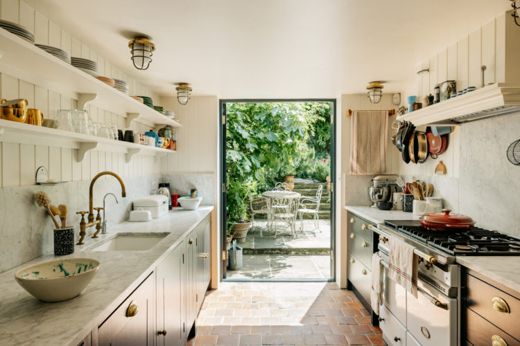
And then we come to the kitchen. And, as you can see, it’s not the largest of rooms and you would lose a lot of storage if you had to put a dining table in here so by opening up the space between this room and the one behind you immediately create an accessible dining room that doesn’t make the cook feel cut off from proceedings as well as space for the perfect galley kitchen where everything is within reach.
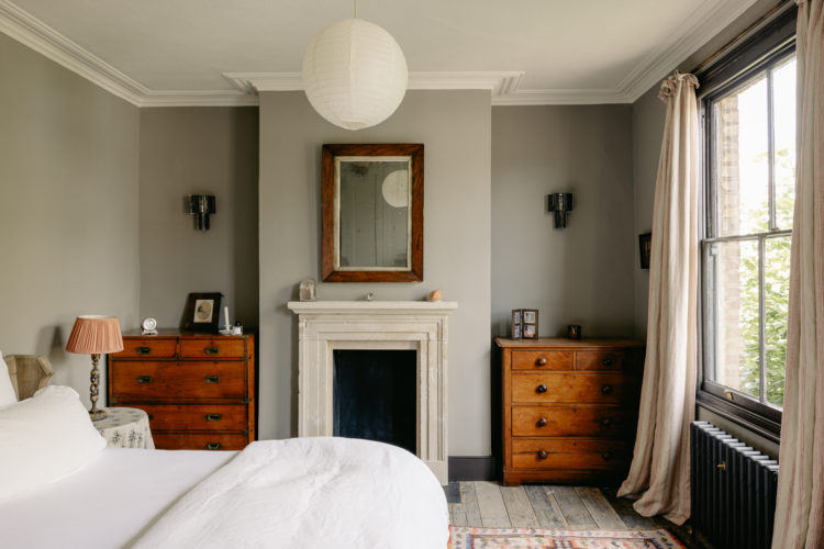
Upstairs to the top floor and the most fabulous suite. Again the black accents remain – on the windows and radiators but also the wall lights. The walls are a soft grey which is really warm. A word here on grey – it’s moment in the white hot heat of fashion has slightly passed but it’s still a classic for all that and I’m guessing that many, many of you have at least one grey room.
Now the passion for all things Scandinavian, while classic, is also being edged over to make space for maximalism, which doesn’t have to mean a riot of colour but does mean more stuff that a pared back Scandinavian (and by Scandinavian we usually mean classic Danish, which is more architectural than the cosier more rustic classic Swedish look). So if you have been feeling that your grey walls are looking a little cold you can warm them up with accessories.
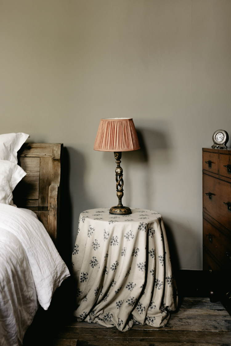
Grey is very easily influenced and if you add a warm wood (preferably vintage) and swap the white for cream and bring in some warm pinks and oranges you have a whole new look going on. Remember, while we’re on the subject that the light in a north-facing room is cool blue so a blue grey will be colder, while in the yellow glow of a south-facing room, a warm yellow-based grey might turn beige. Again, since grey is so reflective of everything around it, you will need to take this into account when choosing your shade. For the record I had Farrow & Ball Pavilion Grey in a south facing bedroom with an antique wooden table in the corner and when the sun shone it was beautiful.
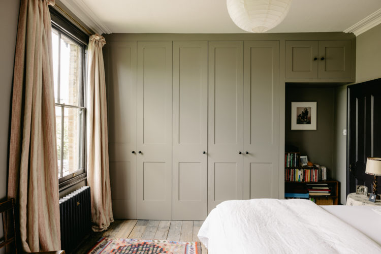
Above a wall of storage with a space at one end for books and a more decorative alcove. If you have a wall of wardrobes but need to find a workspace you can recreated something like this (perhaps further away from the door) so you can close the door on it at night. Even if you don’t actually want to work in the cupboard ( I worked in a wardrobe for a year or two) you can at least use it to store the work things so they are out of sight and mind when you need your brain for yourself and not your boss.
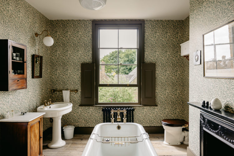
We’ll finish with this bathroom, which was probably a bedroom originally and while I said at the top that you could add another bedroom by losing one of the two bathrooms, I knew that when you saw this you wouldn’t want to. Because isn’t it lovely? I don’t need to say anything more but now we need to find more money than last week and, because of the location we have less space. Maybe this week we all chip in for a timeshare and we can each have a week in the city soaking up the culture – or perhaps just soaking in this bath.


What you refer to as pink couldnt be further from pink or any tone of pink if it tried as the tones are far more browny than pinkis. It is far more latte in colour and when was the last time you had a latte that looked pink? If you have received a pink latte I hope you asked for a refund.
Well it’s the colour that’s closest to setting plaster which is a popular shade at the moment and is, indeed, brownish in tone, but I think most people would be familiar with that shade and what to look for if they wanted those tones in their decor.
I shall be putting in an offer immediately*, this house is DREAMY.
*when I win the lottery
The fabric on that chair/couch in the shot where the chair is framed by the doorway is stunning and kind of familiar. Does anyone know what it is?
Hi – I think it’s the Duncan Grant Clouds fabric, made for Charleston by Laura Ashley. I think you can buy it from the Charleston online shop.
Thank you, that’s fantastic! I quite fancy some of that, and it’s not mega expensive. I am actually going to Charleston in a couple of weeks, so will look in person first.
Absolutely lovely! Do you have a guess on the wall paint color in the first photo? Thanks
Try Jonquil by Edward Bulmer, Masquerade by Little Greene or Pink Ground by Farrow & Ball but remember pink becomes much deeper and more intense in a south-facing room so if that is you you might want to try Threadneedle by Mylands which is a cooler shade of pale pink.
The owners of this attractively assembled house must surely be creatives?
A delicious treat for a Friday. Thank you Kate.
Love love love the idea of knocking down the wall opposite the stairs – would transform my Victorian terrace as I can’t afford to build into the side return. Do you think it would work if the front and back rooms are already knocked through into one large room?
Yes I think this is a really good idea too. It would work if you want to have one huge open plan space. I might be tempted to add some large folding doors back to the wall/space between the front and back sitting rooms so you can close one area off if wanted. If you’ve got the builders in already… and this just gives you another option.
Can’t believe you mentioned downsizing in relation to £1,450,000!!!!
Very pretty and desirable house though it is, I dont expect many downsizers to be able to afford that.
Yes fair point – that’s the insanity of the London Housing Market. I could have just said child-free -I’d been having a conversation with someone about that very subject so I expect it was on my mind when I typed!
This is gorgeous, and much more like my own Victorian terrace (which also has the stairs coming up from the dining room) than anything else I’ve seen online. I’ll be studying how they’ve handled that more.
A wonderful home. This layout might cure me of my snacking in front of the tv habit. Cheers from Canada!
This is a lovely, lovely house. Superb.
I love absolutely everything about this beautiful house, the warm smudgy colours and gentle textures. Makes me want to redecorate from top to bottom ….