Well that was controversial last week wasn’t it? I was expecting the comments about the darkness (it was dark) but I wasn’t expecting such dislike of open plan living (although I completely get that) and ultimately I thought it was interesting to see such a completely unexpected interiors to a somewhat classic Victorian terrace. That said it’s great when everyone takes the time to engage and comment so thank you all so much for that. I suspect this week’s properly will be much less polarising.
It’s a two bedroom apartment in a fancy, schmancy part of of North West London so the price has gone shooting up from last week, while the space has been dramatically reduced. It’s on with The Modern House for £1,100,000 but there are some ideas you might find useful for your own places and spaces all the same.
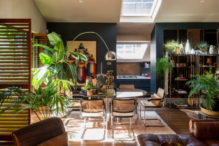
So there is essentially one big living room with lots of space for the table and the kitchen looks like it has been tucked into the original side return which is a clever idea – rather than sticking it all along the back and meaning the the living space is removed from the outside.
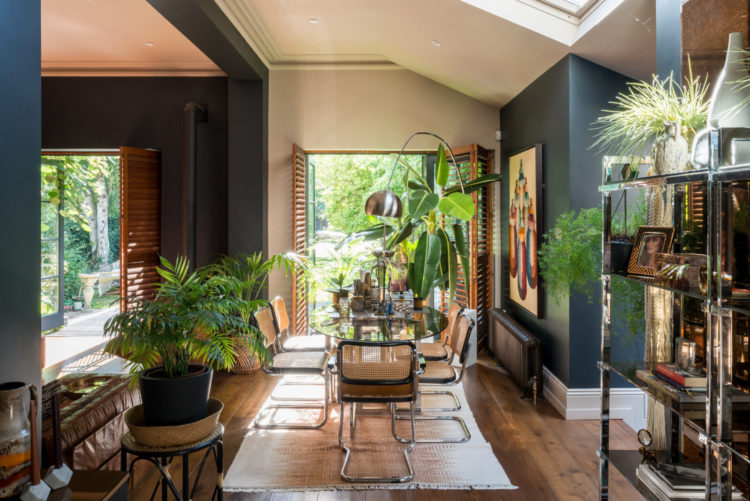
Here you can see that there are two sets of doors leading to the garden and although it’s one large, fairly square room, it has impression of two distinct spaces. This is partly to do with the way it has been painted and partly to do with the layout.
The paint cuts the space in half visually and the rug under the dining table provides another separation between living and dining. Note, if you are putting a rug under a table that the chairs must sit on it full when pulled out -as these mostly seem to be. The glass table almost disappears – you have to look closely to see it’s there at all – and the chair legs are as sleek as they can be.
Imagine how much more cluttered this space would feel with a wooden table with four legs as well as six chairs with four legs as well. You can see why the Finnish architect Eero Saarinen came up with the Tulip table in response to this: “The undercarriage of chairs and tables in a typical interior makes an ugly, confusing, unrestful world. I wanted to clear up the slum of leg.”
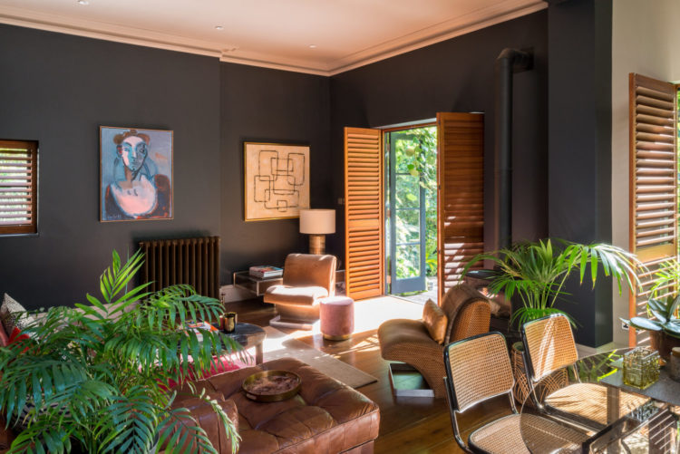
You can also see how the owners have used plants to break up the space and how the seating area, while it doesn’t have a sofa with its back to the dining room, is very firmly angled away with the focus towards the middle of that relaxing area.
The colour palette is minimal as there is a lot to fit into this space so the doors and furniture are all in natural shades of wood and leather while the dark walls help to zone it. Somehow the lines on the louvred doors, the radiator and even the palm leaves all seem to tie together but that’s probably a step too far.
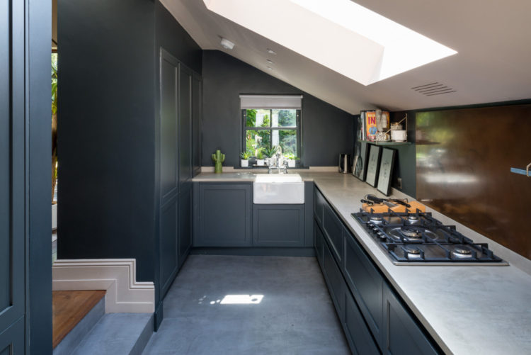
Now come into the kitchen. It’s a narrow galley kitchen but, as I said higher up, it seems to have been built into the side return leaving a large square living space where each part (living, dining, cooking) has a garden view. Running the sitting room all along the back with large bifold doors (we had one of those recently) doesn’t really give you more usable space (just more empty space) and means the kitchen and dining are probably fairly dark as they are push towards the middle of the building. Always examine a floor plan and see if there is a better way to use the space that isn’t necessarily the traditional way. We’ll see another example of this in a minute.
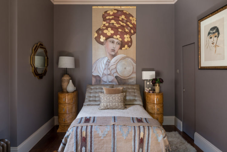
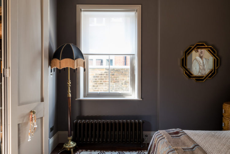
Now into the bedrooms and this is where you should look at the floorplan. It was an arrangement like this that gave me the idea for my walk- through wardrobe behind the false wall. I stayed in a house in New York where a space between two bedrooms had been divided to create a bathroom and behind that a dressing room, only in that house it could be accessed from both sides and was shared between two children as a mix of toy and clothes storage.
It’s a really clever idea and you can just see above how the dressing room is accessed via that sliding door that has been painted to match the wall. And yes I would either have painted a white skirting board on that door to continue the illusion or painted them to match the wall.
And I’m including this picture as I just think it’s pretty. For me this milk chocolate shade is a really restful bedroom colour but I imagine it won’t work for all of you. If you do like then try Attic by Little Greene, which reminds me a while ago I showed a room in a sort of tan shade and lots of you liked it and we couldn’t find a match but I have just found Middle Buff so have a look at that. Fenwick and Tilbrook have Bear Cub and Earthborn have Muddy Boots and Rocky Horse.
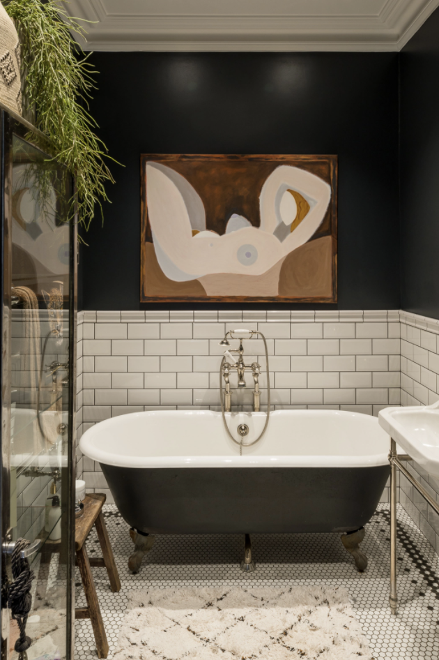
Finally, a small but pretty bathroom. The picture brings in the colours from the bedroom, the white metro tiles and ceiling offset the dark walls and painted bath, while the penny floor tiles bring pattern. I imagine that’s a faux plant as this is a windowless bathroom but never let it be said again that you can’t bring style and character to a small windowless space.
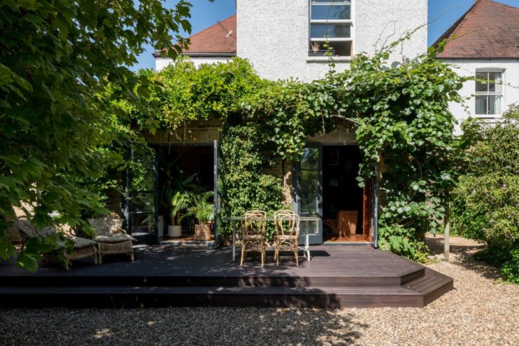
And the garden. Because we will have warm days again and, who knows, next time we get to sit outside under a blue sky some of us, many of us if we are talking warm blue skies and not winter blue skies, may have had the vaccine and be sitting outside by choice with friends and family. Remember, no matter what happens the sun will rise again in the morning.
And on that note I leave you for the weekend.


Fantastic looking apartment. Just bought a two bed recently, and can only dream it ever looks half as good.
That said, I’m not sold that the rug underneath the dining table is the correct size. The table is off centre, so the seats on the right hand side are further under the table than on the left. (The same for the chair at the garden end). Also the journey from the living area to the kitchen looks like it might be a bit problematic. I know television is a dirty word, but not sure how one would fit into the living area.
Bathroom is fantastic, the artwork perfect all over, and particularly fond of the kitchen splashback.
That is a lovely looking flat – as others have said, stylish without looking staged. I keep looking at the pics trying to see what makes it all work so well.
Oh My! Love the colour scheme and clever use of plants ( which is an inexpensive idea that everyone can try).
We have recently procured a gazebo , a fire pit , sheepskin rugs on chairs, candles, fairy lights and hot chocolate (there’s a Lunar Gin out there too ) and are making the most of cold winter nights – sitting out in the moonlight with the glow of a fire has added a new dimension to our garden space and something we have enjoyed at this difficult time. Highly recommended for those lucky enough to have a garden.
I’m going to say it and invite the inevitable boos…too many indoor plants. The kitchen was a dream, though.
Love that bathroom!
Your last sentence properly made me cry.
Really elegant grown up space. The galley kitchen really works in the setting. Love your quote about the “slum of leg”
OO, love it!
Global travel seems evident in this flat. Well curated furnishings with a strong sense of art and style. I love the louvered doors out to the garden. The natural wood here and throughout this flat is grounding; the plants complete the sense of bringing the outdoors indoors. The shades of chocolate palette work perfectly with the interior. I am not sure what a side return is but agree the placement of the kitchen away from the relaxing atmosphere of the rest of the flat is super clever! The skylight addition adds light and once again the feeling that one is not far from being outdoors. I would also do something about the door to the dressing room to make it completely disappear from view.
So beautiful. This house takes me back to the house I grew up in, we had the same chairs and smoked glass dining table alongside the antiques from my mothers family. It all feels like home without being too cosy, not something that is easy to achieve. The plants also soften the whole feel – this house makes me want to take long, slow breaths and relax 😍
Oh I love this. Love the colours, textures, use of warm wood and plants, links to the garden along with stunning pieces of art. This is exactly the mood I would love to create in my own home – I could settle straight in.
Feels like the opposite of last Friday’s Ramsgate controversy!
This one is really stylish and clever. The kitchen in the return is inspired. Love everything about it. Agree about the dressing room door … I’d actually attach a piece of skirting to that door provided it didn’t impede the ability to open the door. Gorgeous chocolate shade too… we used to call that Mink back in the day 😉
Beautiful dark apartment, so inspiring to see some color, here in the states all the bloggers/designers do now are white / tan /gray rooms, which rarely look good in the average persons home, and are so boring and repetitive. If I hear the words “farmhouse look” one more time, I’m gonna scream. Your blog is always so much more interesting, thank you
Not my usual style but I love it! It seems considered, yet not overly styled. I also love the way they have lowered the floor to the kitchen to increase headroom. It allows the kitchen to be a separate space, yet whoever is cooking/getting drinks can still be part of the conversation at dinner.
This is an interesting, elegant flat and like Jodie and Sian I found it a lesson in how art can make a powerful impact in a room. I’m looking again at the large (ish) pile of paintings and photographs that I’m planning to put on the walls in the new year. I suspect some much loved pictures may have to be curator-ed out…
It’s a beautiful apartment. I absolutely love everything about the bedroom. From the throw on the bed to the artwork, the wall colour and the pocket door. It’s dreamy. It’s never a colour I’d be drawn to on a colour card but it looks stunning here. Enjoy the weekend.
Absolutely beautiful! A really clever use of space and I love the way the colours have been put together. For me, these pictures also show the impact that art has on a living space, whether it’s the living room, bedroom, bathroom or kitchen. The owners have great taste.
Fabulous taste, the artwork is stunning and compliments the colurs beautifully. I like the bifold doors. One dislike is the sitting area, the radiator could have been moved to somewhere less conspicuous and the single chairs don’t look particularly comfy. Aside from that, I would live there.