Right we’re going aspirational for this week (after last week’s post on how to add character) but I’ve chosen this one because I think there is value in it for everyone and we will be focusing on the downstairs rather than the numerous bedrooms. And to those who have asked for a wider variety of houses – especially in France and Germany please do send me links to good sites where I can find them. I have featured lovely Swedish houses before where we all have to ignore the gorgeous enamelled wood burners in the corner, but it would be lovely to find the equivalents of The Modern House and Stadtshem.Se.
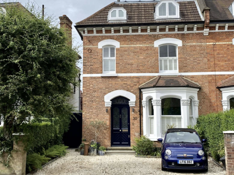
Here it is and while it’s a semi-detached house with off-street parking there are many houses in the UK that are not dissimilar (with or without the loft conversion) and clearly the Putney location and number of bedrooms account for the price of £2,495,000 via Savills. Anyway, coming in?
Now, end of terraces houses always have an extra foot or so of width and that has allowed for a downstairs loo by the front door. This house is nearly 20ft wide by the way which, for a London house is generous. My current terrace is around 17 and the last one was 15ft for context. But none of that is as important as what they have done below.
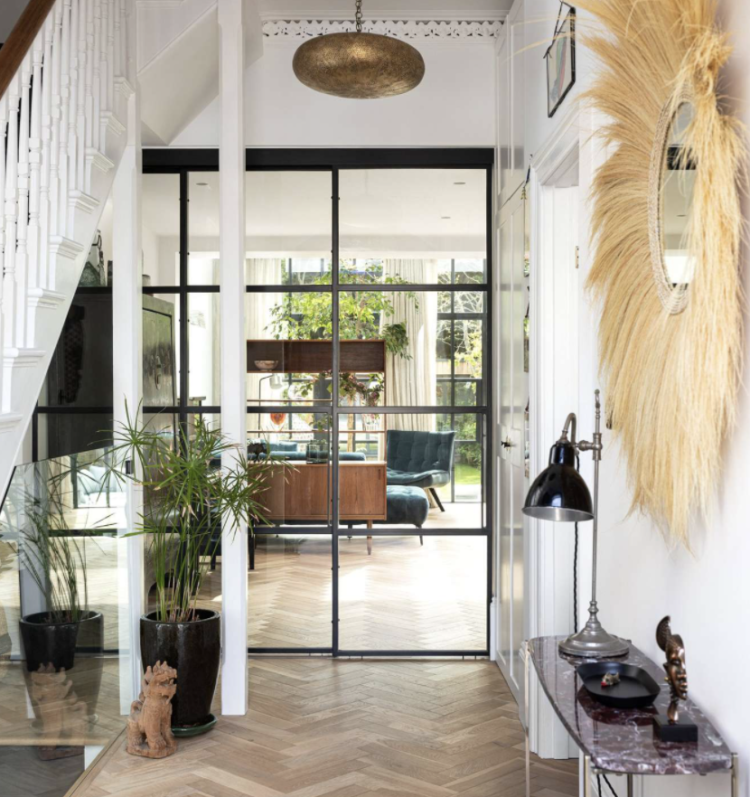
And that’s the glass wall/door. This is one of the greatest investments you can make to your downstairs layout be it house or apartment. Most hallways are narrow and dark and many of them don’t afford a view of any outside space at the back. Replacing a door or – part of – a wall with a glass wall or window will allow the light, and therefore the eye, to travel though the space and make it all feel bigger as well as brighter.
Now if your space is small and you need that space for wall storage (if it leads to a kitchen for example) this may not be possible at first glance but, if you are reconfiguring the space, see if you can have low units below an internal window, or put a banquette and a table there. In a long narrow hall could you put a window to the back half of a sitting room between it and the hall? Lots of terrace houses remove the wall between the hall and the sitting room to make the latter wider but it’s always a slight compromise having the front door leading straight into that more private relaxing room. Often a half wall ends up being reinstated, not least as a space to hang coats.
Or consider moving the sitting room to the back end of the room (where there might be doors to the outside if there has been no side return extension) and putting the dining room/home office at the front. Better still taking the sitting room to the back of the house with direct access to the garden and putting the kitchen in the middle.
The point of this is that this particular layout may not apply to you in your house at this time but it’s about firing up the brain cells to think about what you need and what would work for you and the way you live. There is a tendency to move into a place and start redecorating without questioning if the rooms are in the right place first. Kitchens have traditionally been at the back with the sink under the window to give a view while washing up, but people have dishwashers now and it might be nicer to put the sitting room at the back so you can take advantage of that garden you owe so much to the bank for.
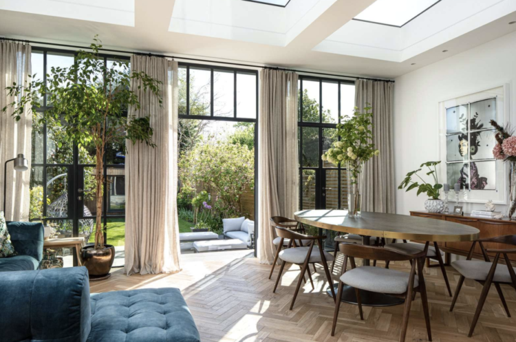
Because, as you can see above, this very big extended kitchen/living/dining room is gorgeous but how much do they use the original sitting room now? Sometimes it’s not about building more space but about really thinking how you use the space you have and if that means adding an internal window to bring more light and extend the views well that’s a lot cheaper than adding a new room.
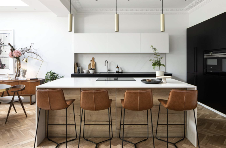
While we’re in the kitchen which is a lovely big space … It’s a fairly classic layout for this type of extended room. Before you scroll too far I’m going to point out the curtains over the doors at the back – which, incidentally, go with the internal door (for a bit of red threading). And once you notice that you start to see other details – the legs of the stools above for example. Another point on legs – if you have this much seating in a room you need to be careful of Eero Saarinen’s “slum of legs” for which he designed the Tulip Table with its pedestal legs and matching chairs. The large table here is on a single pedestal so it doesn’t look messy with the dining chairs, especially since the bar stools are also quite “leggy”. These are the sorts of details that will make all the difference to your finished room so it’s worth noting them all as we go past.
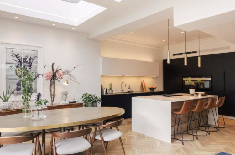
A couple of other points worth pointing out in this room. The dark back wall hides all the appliances – a bit like painting the wall dark in the sitting room so the tv doesn’t dominate – but to keep the space feeling lighter the cabinets over the sink have been painted to match the wall so they recede into the background. Taking them up to the ceiling would have made it appear higher as well as giving more storage and avoiding a potential dust trap but it’s up the individual to think about their own needs. And don’t forget the future-proofing – large range cookers are lovely but you have to bend to get things in and out, eye-level is more ergonomic – for all ages.
To the lights – a grid of spotlights which may or may not be in the right place – hard to tell unless you’re standing in the space but generally speaking – put light where you need it and not to make a symmetrical pattern. In a well-lit room you should be conscious only of the fact that it’s well enough lit for you not to be thinking of where the lights are, as it were.
Over to the dining table and it looks like it might be brass – this is a good solution when you have a wooden floor in a kitchen as you can end up with a lot of wood and it can all feel a bit too much, so varying the materials and painting some of it (cupboards usually) helps out with this. There are no rugs on this wooden floor to break things up but the stools are leather, the chairs are upholstered and the table is metallic so while the colour palette is muted and classic there are lots of different textures to add interest.
Which leads me to another design rule – you can have both colour and texture and you can have either but you cannot have neither. And while that might seem obvious, I see plenty who have done that so if you like a minimal colour palette you need to be looking at all the fabrics (cotton, cord, linen, velvet, leather and boucle) and all the surfaces (wood, metal, plastic, cork, stone and ceramic). An all-white room with all of those textures can still be a warm relaxing, and also very cool, space.
So on to the next design tip; your shapes are as important as your colours and textiles. In fact those are the three key elements once you have planned layout and usage. Consider that most rooms (unless you live in an Oast house in Kent) are made up of straight lines. Windows and doors are further rectangles and sofas and tables are also mostly linear. So you need to add interest, not just with colour and texture but by softening all those hard edges.
Enter the shapes. To return briefly to the kitchen – that table is oval – which is hard to find but takes up less room than round. If you can’t find, or don’t want, that just be aware when choosing your chairs of the shapes you are introducing.
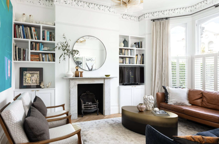
You can see the same thing in the sitting room above – round mirror over the fireplace and oval coffee table. This room would be much more boring if it was all squares and lines.
One more thing – while I look – for those of you in small spaces (and remember most large houses will have at least one small room whether it’s a bedroom or front sitting room) look at the armchairs. A matching pair, which looks chic when not attached to a matching sofa, but with wooden arms. This allows the eye to pass through and doesn’t fill the space with upholstery. Anyone who feels their room isn’t as big as they would like it to be should investigate chairs like this – especially if they have enough other places to sit so that this can be an occasional – let’s have a drink and a chat chair rather than a curl up with a film – chair.
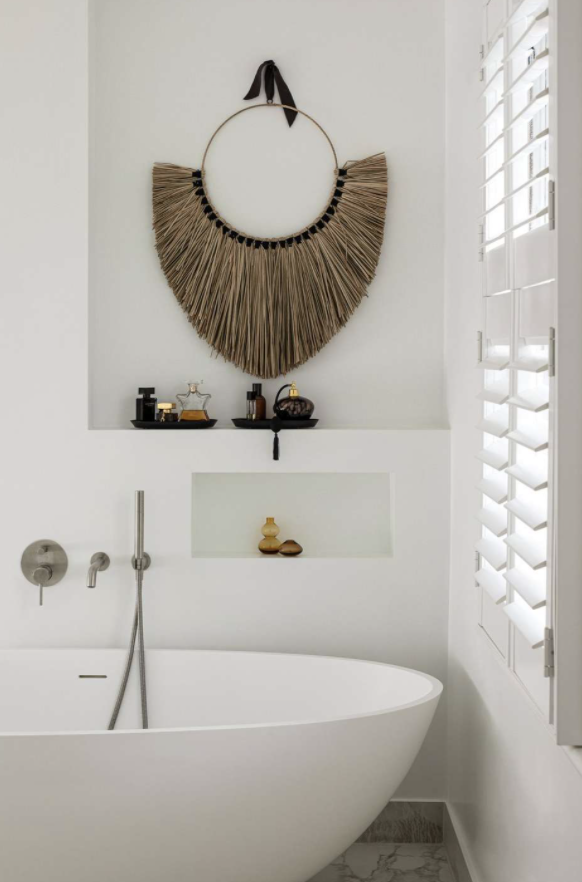
Rushing past the bathroom but stopping to say – interesting bath shape, echoed by the wall hanging but most of us would need storage in that alcove. When you buy this house and the hanging is gone you can add shelves. Make them natural and vintage wood to bring warmth and character to what is often a cold, hard, white space. Also (there’s always something else to add) these narrow baths are expensive but there’s more room inside when the frame is narrow. It’s the same principle as buying sofas with narrow arms – more elegant, more sitting space. And I know that the so-called “fat” furniture is coming up on the inside fashion lane, but it needs big rooms and we don’t all have those.
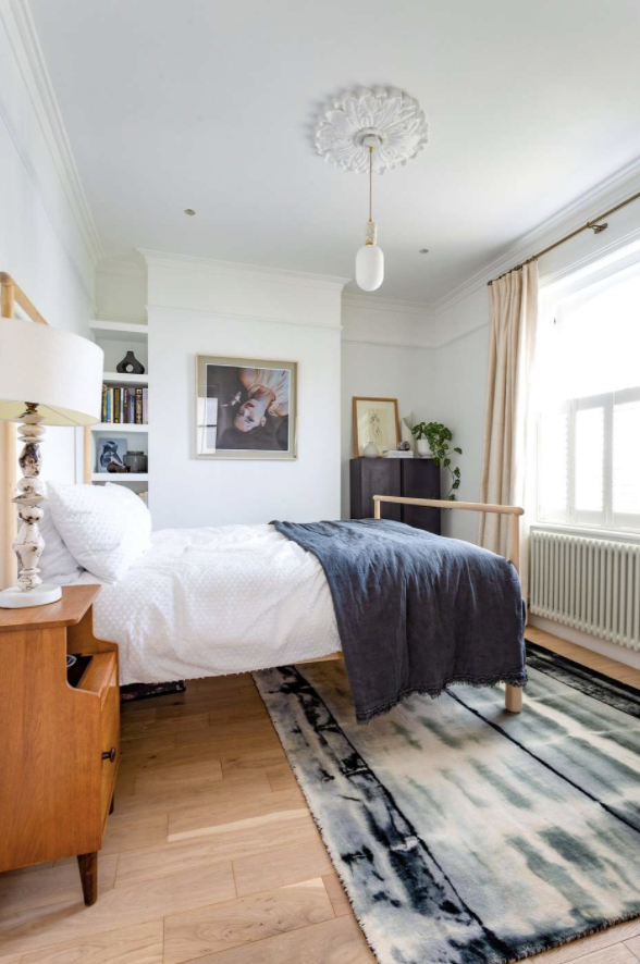
To the bedroom – two points. One the classic – what is that pendant light doing? The ceiling rose is pretty but the light is just hanging out at the end of the bed. Extend the cord and stick a cup hook in the corner over that tall chest and it will still light the room enough for you to find your bed and it will be a feature and can show off the picture and plant that have been put (should I say “styled”) with some thought as to their arrangement. So give the pendant two jobs – one functional as you enter the room and one decorative – highlighting your pretty things.
Lastly that rug. Same question – what is that rug doing? It is showing that it isn’t big enough to fill the room. It is very likely welcoming only one of your feet in the morning while the other hits the cold floor and, from this angle, it looks odd. The solution – buy a bigger rug, buy a second rug the same and put them next to each other. Buy two smaller ones and put them either side of the bed. That is all. If that is a design hill it is one I am prepared to die on.
And before I find any more hills I shall leave it there. A different house this week but hopefully one that is full of lots of tips that you can adapt to your own places and spaces.


Dear Kate,
Your blog is so much fun! I am from the Netherlands. Just bought a house build in 1904. Would aboslutely love it if you have ideas. I am sketching and fantasizing every evening! If you like Dutch houses, you can visit, http://www.funda.nl
A really useful house thank you. I love the glass wall
I would love for someone to find a site in Germany with pretty apartments or houses for sale. I bought an apartment in Berlin last year, and let me tell you, the real estate sites here are pretty sad. Terrible photos, if any, and extremely impersonal, the interior design lacking. As a Swedish person I mainly use UK and Swedish sites for inspiration. Maybe Berlin-based fantasticfrank? Although the styling does feel somewhat staged, they do have very pretty apartments for sale.
I like homes with shelves and nooks for books and storage. To have them built in is even better. I would prefer to have my bed parallel to a window rather than full on facing it. It could be that the layout of this bedroom is such, this is the only space for the bed. It could be that there is an outside view which the owners enjoy waking up to see. In this room, with that arrangement, the placement of the rug would be less of a distraction. The rug could be cut into two pieces, bound and would then fit on either side of the bed. Or replaced with any of your suggestions Kate All good!
In a number of professional interior designer rooms, photos often show a large pendant light seemingly hanging in space. It could be the angle from which the photo was taken, but a hook and a cable would create a different view.
That glass door between hallway and living room – light bulb moment! We are about to replace all our internal doors (farewell faux-Victorian polystyrene-filled monstrosities) and I’m definitely going to look at modern glass to showcase the view and share the light.
Very interesting Kate thank you. I love these posts!
It’s my geographic bias, but I’d love it if you featured more properties out of London. Here’s what £2.5m could buy you in the Highlands in Scotland: https://www.rightmove.co.uk/properties/110040455#/?channel=RES_NEW
And here’s something much smaller and a tenth of the price but equally gorgeous on the Scottish/English border: https://inigo.com/sales-list/west-view
In all my concentration on relative property prices across the UK I forgot to applaud Kate for her wise point about glass internal doors. Our house is 1930s with a very long internal hall with no natural light. When the previous owners added a large kitchen extension on to the rear, and south facing side of the house, they added big double glass doors between the hallway and kitchen, filling it with light and giving you a very welcome view of the garden beyond. I thank the previous owners every day for it!
Here is a website dealing with properties in Southern Burgundy. Most of the decors will be out-dated and rough, but some pretty places with good bones. Maybe you could do some before/after posts.
https://sud-bourgogne-immo.com/en
Thanks for this, it’s exactly what I want to do with the back of our house. One day!
Meanwhile, in Wales (close to where I grew up) £2.5 mill will get you this beauty….. https://www.rightmove.co.uk/properties/71614579
And London is only 2hr15mins on the train 😉
Love this! 🙂
That was so beautiful and informative. We don’t deserve you in our inboxes, Kate!