One thing I have noticed, not least while trying to decide on the colour for my own kitchen, is how we do all get used to seeing the same colours and combinations again and again. So when I saw this house I was immediately drawn to its unusual pairings of blue and green and the creation of something that feels completely different.
It’s a four bedroom townhouse in south London that is on with Inigo for £1.65m. Part of a group of developments built in the 1850s on what used to be farmland it has great views from the top floors and the rooms are good sizes. There is always that one issue with a raised ground floor that one bedroom is on the lower ground behind the kitchen but whereas this can be problematic with small children (depending on how many you have of course) it’s great for teenagers or anyone who perhaps wants a home office.
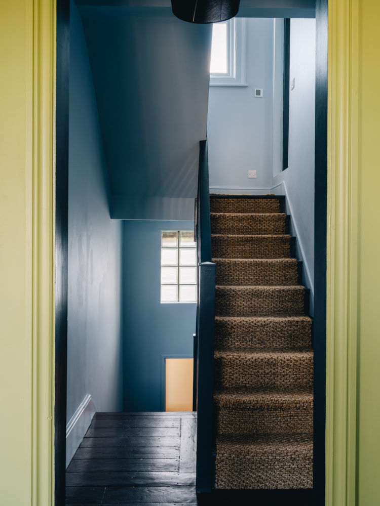
So you enter on the raised ground floor to this wonderful murky palette of green and blue. The colours feel right for the period but the way they have been used gives a thoroughly modern feel. I particularly like the tonal use of blue with a darker shade on the bannisters picking up from the blue on the walls. This is something you could recreate with any colour pairing and it highlights the space and creates a more architectural feel as you’re not sure if it’s paint or or shades or the building itself. I know that white does the same thing but when it’s white and a colour it’s less modern and more traditional. Try it with two shades of your favourite colours and see what a difference it makes.
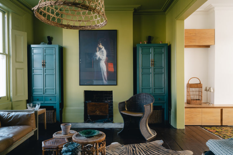
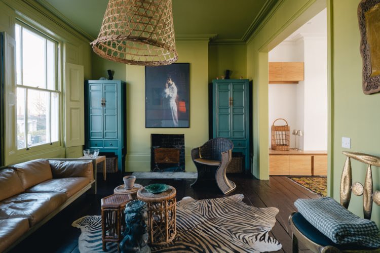
The colour palette continues into the sitting room where the bold blue cabinets bring a symmetry to the space. Another tip for a calming space is to work in twos. Interior stylists will tell you that the key to arranging shelves and mantelpieces is odd numbers and while that works for smaller objects, if you prefer a calmer space try balancing things in pairs. So matching cupboards like this actually work to calm the space despite the strong colours. Then note the cluster of rattan side tables which are all different but work as one larger piece. The tall picture over the low fireplace draws the eye up to the height of the ceiling. And it’s a truth universally acknowledged that a black and white stripe always works but if you feel straight lines are too, well, straight and modern for you then look at the zebra print for a variation on the theme.
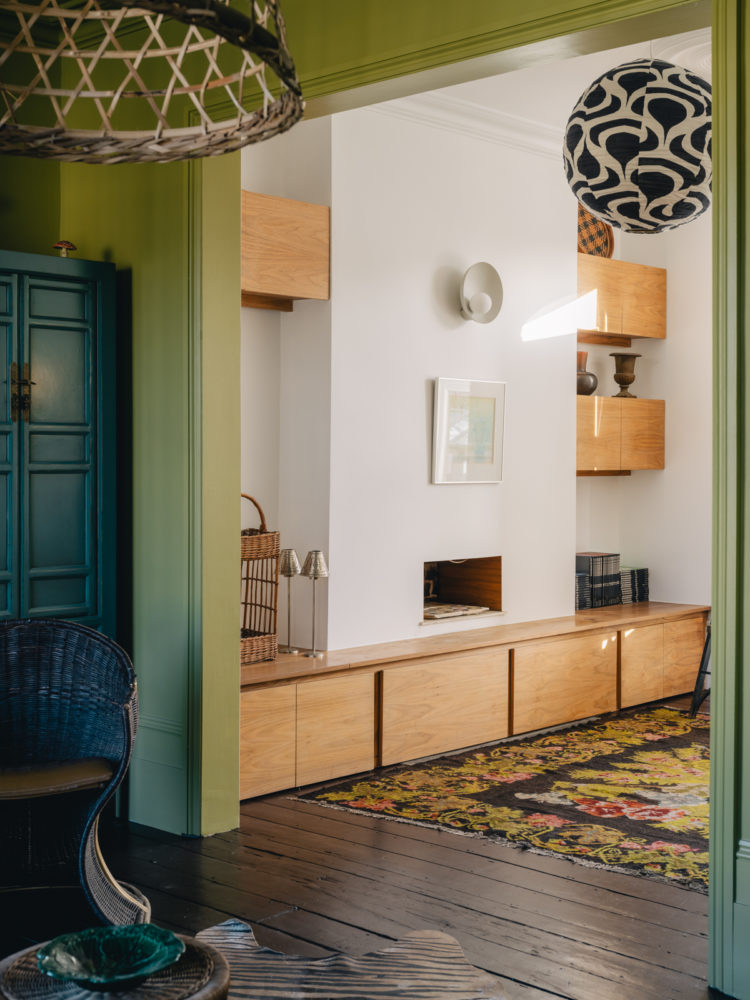
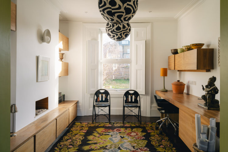
The back part of this open space is a complete contrast. The rug brings in the green to provide continuity but the whole space is lighter and more pared back. But in addition to the rug, the ceiling light in black and white also picks up on the zebra from next door so there are gentle links between the two.
And again, you can see the use of symmetry with the matching shades and two chairs which balance the fact that there is low storage on one side and a desk on the other. Matching the storage on both sides of the room would have created a tunnel like effect.
If you have a long thin room and are worried about that you can foreshorten it with paint. If the window wall at the end was painted in the same green as the main sitting room that would have the effect of shortening the white room and making it appear wider. I’m not saying that should have been done but it’s a good way to show you how that technique would work.
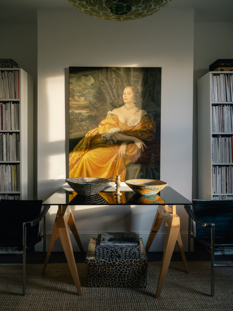
The light in the image below makes the whole room look like a painting. The gold dress of the portrait is picked up in another fabric lampshade as well as the pale wood of the table legs which sit under a dark glass table that reflects and bounces the light around. This is a masterclass in mixing old and modern. You might feel that a modern painting is needed in this room, which is heavily mid-century in style but the oil brings character and colour and provides that all important tension which is so key to a successful scheme. In the same way if you have a lot of period furniture then try contrasting it with more modern art rather than traditional oil paintings.
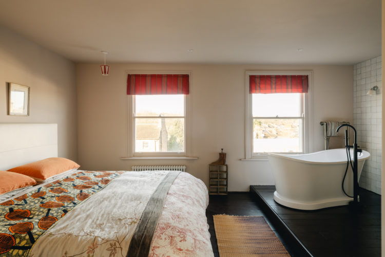
Moving upstairs to look at the main bedroom and the colours are instantly calmer. There are two bedrooms on the first floor and a shower room behind the sitting room on the floor below, while the top floor has been given over to a huge suite with a bedroom with bath and shower in it. A separate loo and basin and a large dressing room.
I’m still not sure I would be ready to have a bath in such an open plan space but that’s more about me than the decor. If this was the only way to fit a bath and a dressing room into your floor plan you could look at creating a false wall across the middle of the room so you could hide the bath behind that if you wanted more privacy. It make the space at the end of the bed tight but always remember when you are planning that a door is anything from 76cm wide and while 1m is ideal you can totally manage with 90 or even 80cm. The trick, if space is an issue is to make sure you have a low bed with no footboard to dominate.
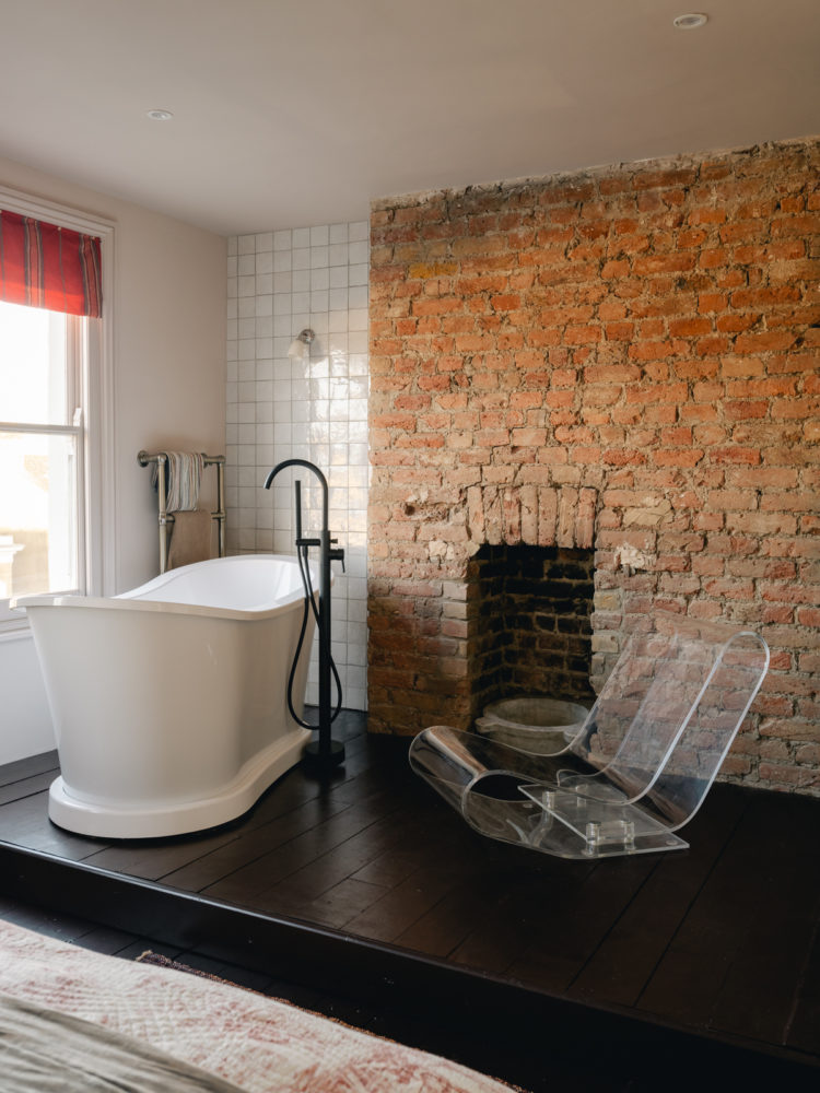
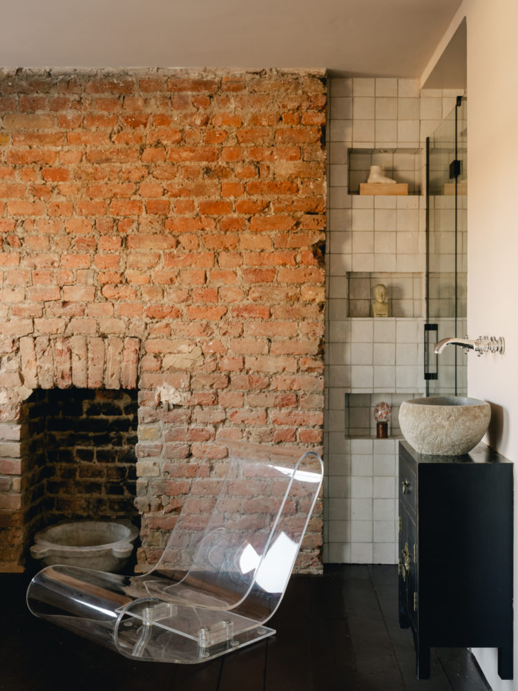
Below you can see how they have exposed the brick chimney for texture and filled in the alcove with tiles for more of that “tension” in this case rough brick and smooth tile. And if you ever wondered about the invisibility of perspex or glass furniture then there’s a great example. That fabulous sculptural chair looks great but doesn’t fill the space. It’s also perfect for a bathroom whereas an upholstered chair, which might look great with the bed, might sit uncomfortably with the bath.
Just going to pan across so you can see how the shower has been tucked into the corner here. If you want to look at the rest of the space you can access the floorplan here.
As always there are lots of clever ideas that you can adapt for your own places and spaces and perhaps we can all be inspired to try some more interesting and unusual colour combinations. She says looking at the cream colour that is currently planned for the hall walls….


Love the painted ceilings and would have been great to see pop of yellow on those shutters. Not sure about the bathroom though unless you lived on your own, but that’s because I need the peace! I know they would have had to tidy and declutter for selling purposes but where on earth is their ‘stuff’ 🙂
I love your description of a ‘murky’ green &blue. Prefer it to anything F&B have come up with ! it describes the colours perfectly without having to trek to a Dorset Beach. I love those chosen colour too…much more than the palette of the rest of the home.
Fascinating. I adore green and blue together but feel that this is a house of two halves making the paler rooms feel quite bland in comparison. About the master bedroom/bathroom, thought my eyes were deceiving me, so I checked out the images on Inigo and yes, the black vanity unit is floating!
It’s fabulous, not my colours at all but through your eyes I can see how well it works.
I’m not mad keen on baths/showers in bedrooms, still wary after having once rented a mouldy house! It made me slightly mad about ventilation. But a wall (and a big-ass silent extraction fan) would make all the difference.
They have been very clever in their use of the spaces. I have a similar grouping of wicker tables (which my kids make fun of) Ha ha, so there! Cheers from Canada!
Oooh I adore ALMOST all of this. I’m not mad about the bath in the bedroom but gosh that can be forgiven. I too had thought of a little wall. I can’t live without a bath so I’d do anything to fit one in.