A two bedroom apartment for you in Marylebone, W1, this week and it’s a riot of deep saturated colour and a lesson in how to use it. Bear in mind you might not like these particular colours but it’s about how they have been used which provides the lesson. It’s also a call to action that just because it’s small doesn’t mean you have to paint it all out in white. Unless you want to of course!
It’s a two bedroom (842sq ft) apartment that’s on with Inigo for £1,400,000 (central London, prime location etc) but the good thing about this is the layout. Kitchen and living room to the right, bedrooms to the left, central bathroom. Often the issue with period conversions is that you have to through a bedroom to get to any outside space or the bathroom is by the kitchen and miles from the bedrooms. It’s one of those details that when you are desperately hunting you decide will have to be your compromise and it ends up being really irritating six months after moving in. So when you see good layout you should grab it because while you can change these things it’s expensive.
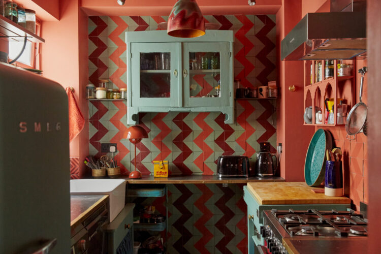
Now let’s start with that kitchen because how joyous is that? So often kitchens, and especially small ones, are kept neutral to give the impression of light and space but there the owner has just picked a colour scheme that makes them happy and gone with it.
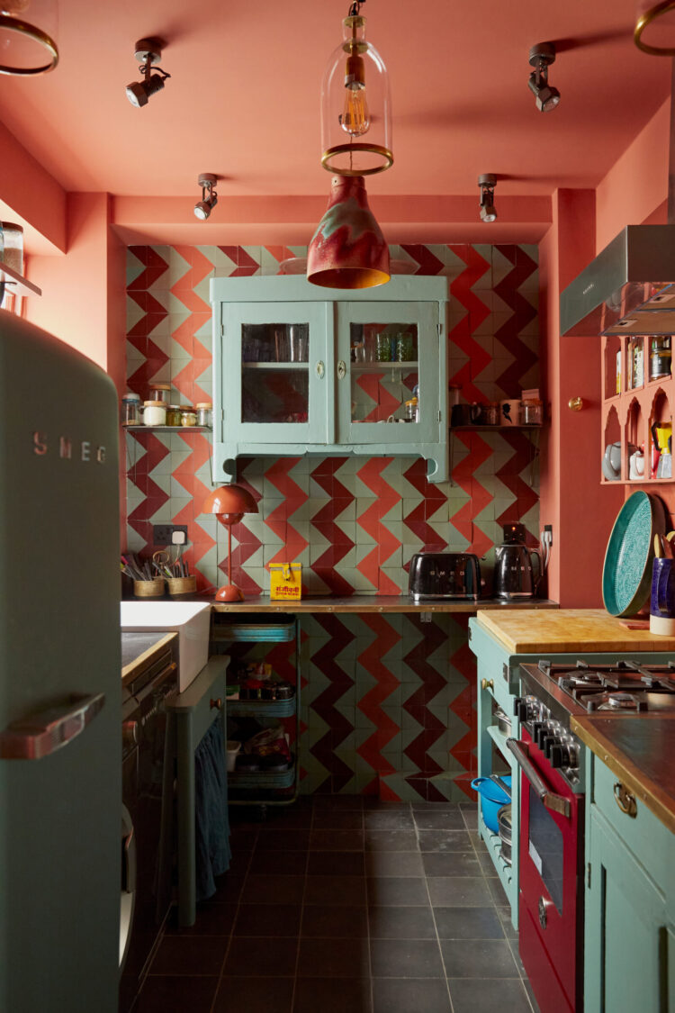
The science bit for those that want it? Red and blue (or orange and blue) are opposite each other on the colour wheel which means they work well together. But when you use such strong colours you can feel it’s all gone a bit kids’ nursery so there are two things to do: firstly – don’t pick the primary versions of each shade but find something a little more subtle. Here, for the sake of argument is orange and duck egg. You might want to name them differently but you get the idea.
Secondly, and this is key – by adding tonal variations you add layer and sophistication to the scheme rather than just two or three flat blocks of colour. So the walls are orange/coral but the oven deepens to a burgundy and the tiles are a mix of all three. You don’t have to have zigzags if that’s too much but could instead have stripes or checks. The joy of tiles is that in a room where there are few soft furnishings (curtains and cushions) mixing tiles like this is a good way to bring pattern and break up what might otherwise be overwhelming slabs of paint.
Finally, points for another glass cabinet – this time painted to create a focal point on the busy tiled wall.
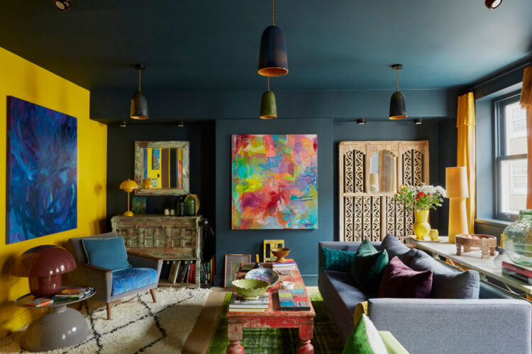
Now the sitting room is more complicated for me although remember all ideas are adaptable. I love how this room has been wrapped in a deep navy which really showcases the art on the walls. As regular readers will know I have a complicated relationship with yellow so I might not want to do a whole wall but here’s where it’s clever use of colour. Firstly the large blue painting really stands out on the yellow wall and might otherwise be lost. Secondly the yellow curtains framing the windows make it feel like the sunshine is flooding in and being thrown over to the far wall. It’s a clever trick. While only yellow works for the sunshine feel, the idea of using curtains in one shade and picking it up on the other side of the room is a good one. It gives more weight to a feature wall which isn’t then sitting there along but has a relationship with the other side of the room.
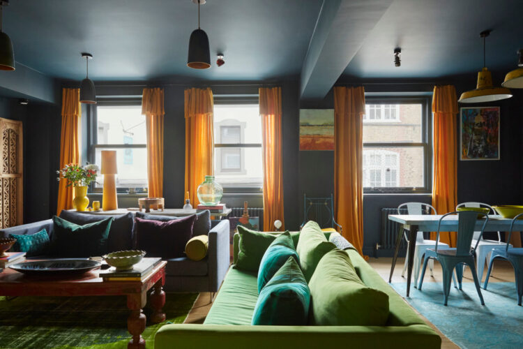
Above you can see how the curtains – even without the yellow wall – are still part of the room as the colour is picked up on the vase of flowers and lamp base. This gives the room that layered effect – almost like a diorama. Of course all rooms are 3D but by bringing one colour to the fore like that you emphasise it and highlight the objects.
Back to my comfort zone of more muted colours but, that said, all these colours fit together well which shows the benefit of either creating a moodboard or at least painting swatches onto large pieces of paper and seeing how they sit together. The kitchen and sitting room are bright jewel-toned spaces while the bedrooms are more muted in tone.
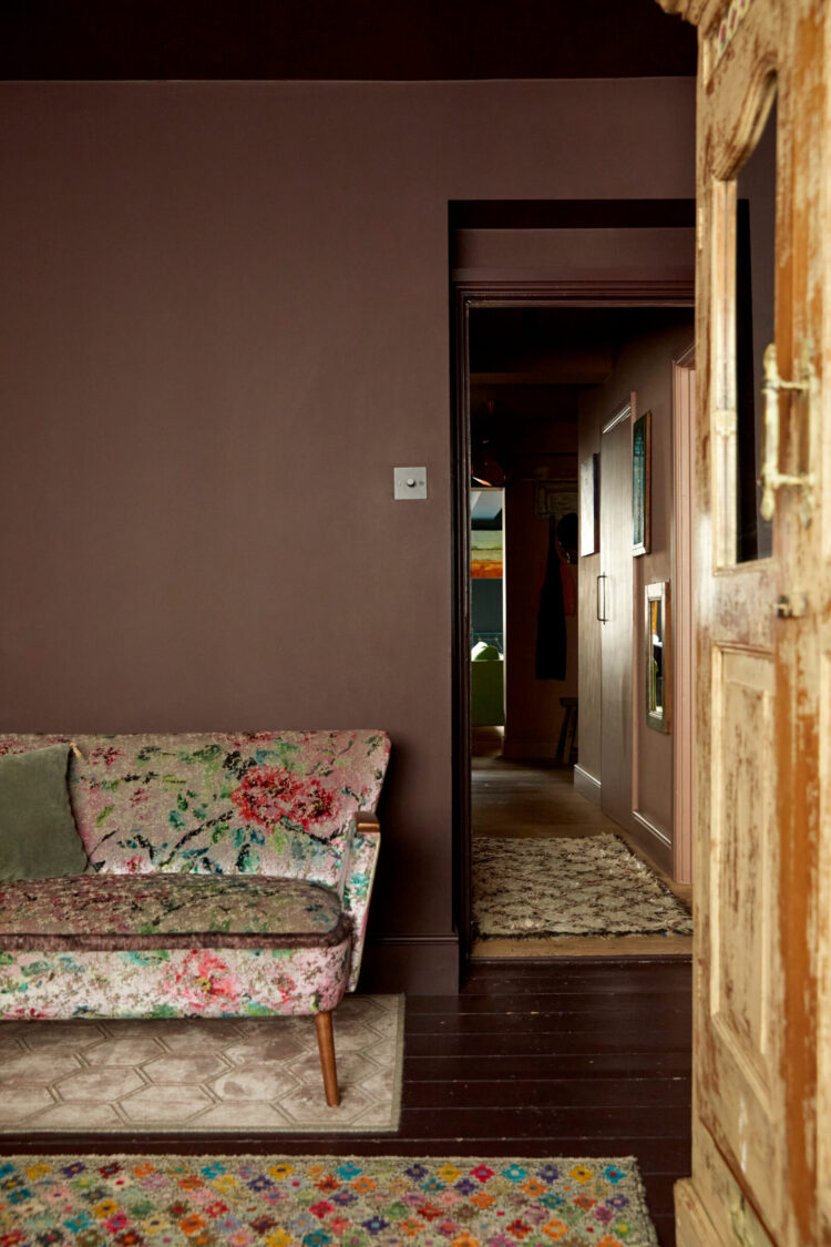
Chocolate brown is a gorgeous warm colour and look how well it shows off the patterned sofa and rug. The joy of a patterned sofa, by the way, is that while it might feel like a scary purchase and a plain one feels easier, you can redecorate over the years using all the different colours and tones within the fabric and the room will look completely different over time. Better than buying a plain one and then feeling that you can’t redecorate as the colour will no longer go. Paint is cheaper than furniture.
This is another beautiful and yet perhaps unexpected colour palette – deep chocolate and blush pink – intense but lovely – lightened with a shot of mint, deepening to emerald and some blue as a disrupter. Being generally more conservative in the number of colours I use in a room I might stop with at the first three but the blue does work as well if you like to go further. They all, also, seem to have come out of that painting on the right which is one of the first places to look for inspiration.
It’s not about matching your decor to your art but about incorporating colours and tones therein to make the best of both. That painting stands out on the dark wall but the other colours are all used with in the room. The point being that it’s a bit more than matching a girl in a red dress to a couple of red cushions.
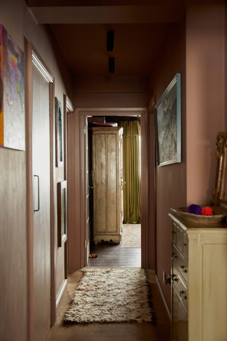
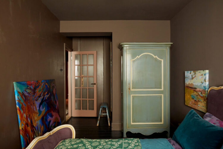
And let’s hear it for the drenching of walls and ceilings in the same shade for a really cosy and cocooning feel. This is not a huge bedroom – it’s long and thin – so using a single shade blurs the edges and allows you to look at the objects within it rather than focusing on the corners.
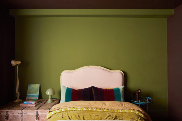
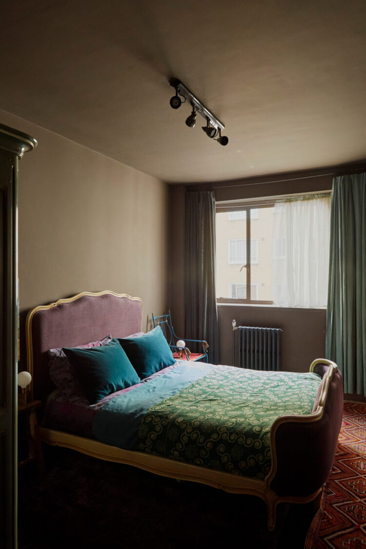
Another gorgeous colour palette here. Pink and yellow is a classic, as is pink and green. Yellow and green are seen less often but here – because the shades are all from the same muted family it works brilliantly with the paler blues (think back to the kitchen) and deeper burgundy as smaller touches.
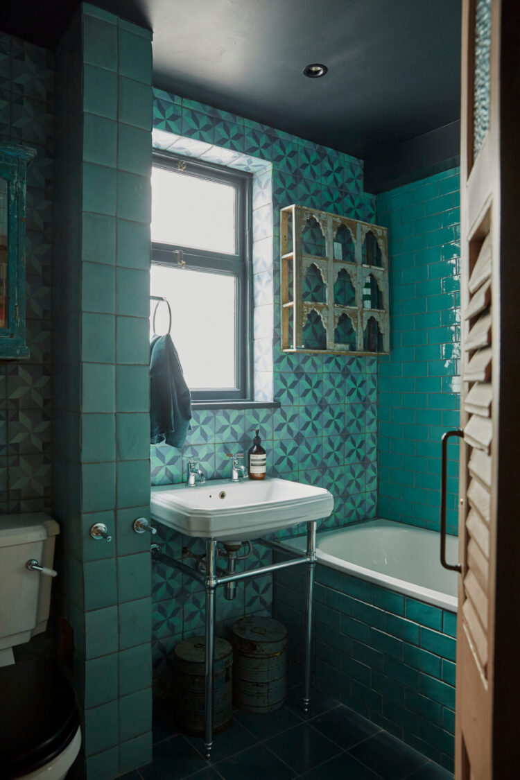
Finally, the bathroom, which sits in the middle of this home and joins the navy from the sitting room with a richer version of the blue from the kitchen and hints at the flashes of blue in both bedrooms. This then is a red thread – from a whole blue room to a partly blue one (sitting room) to blue and contrasting colours (kitchen) and ending with complementary shades and flashes of blue in the bedroom. Here it’s blue, you can use green, pink, yellow or any colour you please but regard this as a template in how to balance a colour palette.
Who’s moving in? I would definitely take colour inspiration from here would you?


I love the colours and would love to live here (although the husband would disagree). However, when decorating I just don’t have the “inner eye” to be able to imagine what would work so I tend to play it safe (mistakes are expensive!)
It’s so refreshing to see a home that hasn’t been ‘decorated to sell’ or decorated according to “everyone else’s” definition of taste. Taste is very personal and speaks volumes about who you are. Cookie-cutter homes seriously lack the personality of the space as well as that of the occupants! An interesting home to analyse, and very well done, Kate (as ever!)
Thanks for the post, Kate. Really enjoyed looking around this flat. Especially liked the kitchen, which has given me food for thought for renovation of my downstairs loo as thinking of using Bamboozle, Farrow & Ball, for it.
Also, the floral sofa looks as though it could be Designers Guild *swoons*
To me, this is really off visually. It’s not the colours as such or the number of them, I think it’s the combination of muddy muted colours and bright primary ones together, which I find is jarring and shows all the colours at their worst.
My thoughts exactly.
I love Mad about the House and read EVERY posting! Just a little correction: isn’t green opposite red on the colour wheel, not blue? Blue and orange are opposites.
My thoughts exactly.
well yes although I guess I was grouping as variations on a theme!
I just love it – and your analysis of it is spot-on! Thanks for this one.
It’s giving me a headache. I believe you that it’s considered. To my inexpert eye, it looks insane…off to look at a soft pale green wall.
And breathe…
Agreed: 100%! I can recommend Ivanhoe, by Crown Decorating Centre. It’s a restful, soft & warm , pale green.
Lovely jewel tones. This is soo cleverly done, the whole apartment!
I’m not sure about the zig-zag tiles in the kitchen, and would take your advice about doing a stripe or check instead, but the rest is beautiful. I love the patterned sofa, as well. It’s absolutely gorgeous against the wall colour and then the little green cushion, to finish it off!
I love colour, so it’s not that. I think it’s the student flat feel that pervades, for me, that puts me off. The art & lighting & general feel. I’m out of the London bubble ( thankfully), but I would want something beautiful or with more potential & just generally, lovelier for that price bracket. Each to their own, however.
Kinda love this wild bouillabaisse….just for me, minus the dark ceilings . Great post!
Gorgeous to visit, way too much for me to live with! No need to look down the back of the sofa for the £1.4 M for me, but I applaud the boldness and cleverness with such beautiful colours.
I could happily live here thank you very much. Loving that bathroom door.