So far this year we’ve done small flat with no original features, a new build and a narrow house, all of which have, I hope, provided useful pointers and inspiration for your own homes. This week we’re just going pretty. I love this house and while it may not be applicable for many of you, sometimes you just need to feed your soul with some loveliness – I know I do.
So come on in to this terrace town house in London, which has three bedrooms (would have been four but they made a big bathroom) which is on the market with Inigo for £1.8m. Yes we’re doing, as some of you have requested a full on Fantasy Friday. But let’s forget the price and have a look because there will still be things to inspire – not least the colour scheme, but also the layout.
To the back of the house first, where if you look at the floor plan, the owners have built into the side return to create a larger kitchen diner. Now for any Londoners among you, you will see that the extension is the classic “dog leg” and doesn’t run full width across the back of the house. This is common in terrace streets and has to do with neighbours’ right to light and it applies to one side and not to the other. We had similar issues when we extended our Victorian terrace at the back and it can be annoying as creates an odd shape.
The other, very common, arrangement you see is that the extension is used to create a large kitchen diner and then there are two sitting rooms – or a knock through – but the middle one is usually dark and windowless and is little more than a passage which no-one really wants to sit in.
So let’s go through the differences here as I think you might find them useful if you ever come to be in a similar type of house – and, while this one is wide (just over 5m) it’s a classic shape that varies in size – my last house was about 4m.
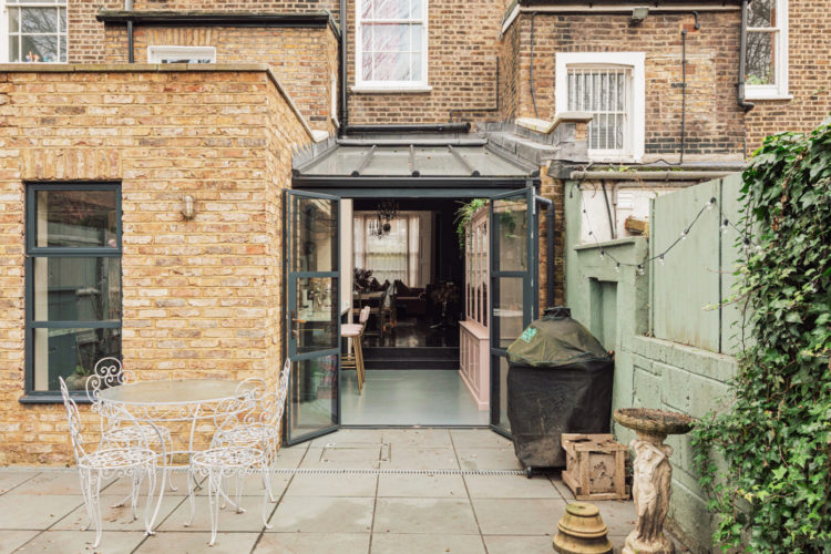
Here then, is the back and while every house will vary slightly the brick part might have already existed – it might, originally, have been the coal shed and outside loo. The glass roof is the so-called side return that has been filled in to extend the living space. As I said, a common arrangement is to put the kitchen under the glass roof and the dining in the brick part.
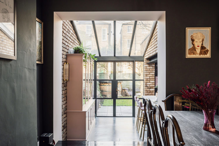
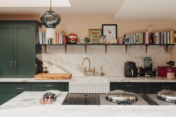
But, instead the whole of the back has been made into a generous kitchen with a partially glazed roof while the dining area has been moved into the back of the sitting room – the darkest part of a terrace house – which is perfect for a dining room as they are mostly used in the evening when it’s dark anyway. Particularly, as the expanded kitchen allows for a generous island with stools for breakfast and lunch.
If you have similar plans do take a moment to think about how you would use that dark room in the middle (mine is a library so it works well as a dark cosy space).
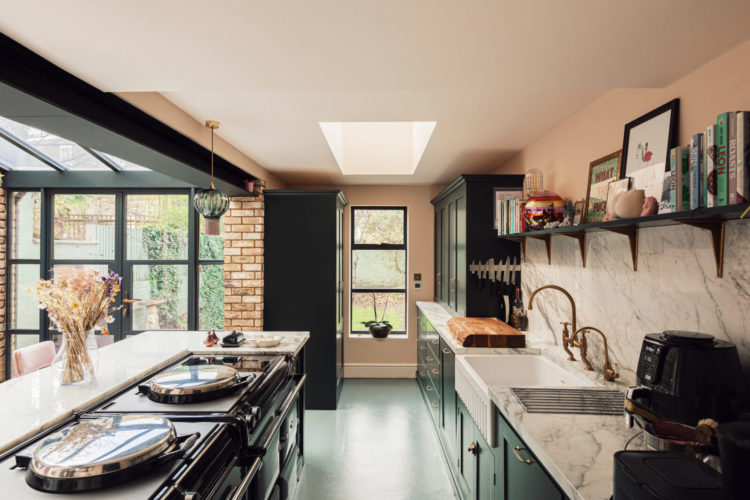
Now the kitchen itself. Again, the usual plan is to take the kitchen all along one wall which can create a sort of tunnel effect. The other common thing is to add acres of sloping glass roof over the kitchen side (which also means the neighbours can see in from their bathroom/bedroom next door. Here the fact that the glass is over a mostly empty space means you’re not sitting in a goldfish bowl.
But also the kitchen has been tucked into the brick part of the building (less conservatory) and the odd bit that sticks out at the end has been used for storage – you’re going to have to scroll back up I’m afraid.
Now I will say I’ve never seen an AGA installed in an island before but there’s no reason why not and, as you can see, there’s a generous expanse of worktop around it for eating and prepping and chatting.
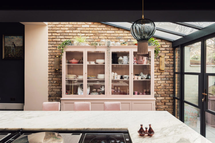
I love the dark green cupboards and soft pink walls and if the budget runs to it then extending the worktop up the walls as a wipe down splash back is such a good look. Since the cooking happens on the island there’s no issue with splashing from cooking so you can arrange an open shelf as you wish and that adds to the unkitcheny kitchen feel (it’s a big look at the moment). It’s also a big room so storage isn’t an issue – you might have to adapt that in your own space. I have installed shelves from counter top to ceiling which provides a huge amount of storage.
So we will leave the kitchen but below is a view from the front right through to the back. The dark green of the kitchen units is echoed on all the downstairs walls but the pale ceiling bounces back the light from the glossy dark floor which, in turn, is catching the light reflected from the glass roof.
This is a great use of space as a dining room but would also be a lovely WFH space too as it remains relatively separate from the rest of the downstairs so if you had a large desk top computer that needed setting up you could do this and leave it set up at night and still have a kitchen and a sitting room to go to.
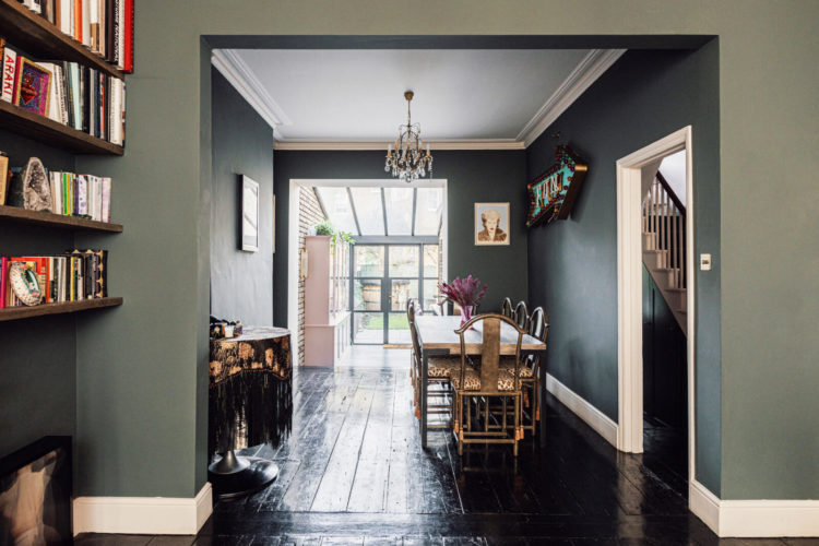
For completeness here’s the view back through the other way and you can see how the pink sofa links back to the pink dresser in the kitchen. This pink and green colour palette continues throughout the house and you can see how it turns up in different combinations and materials throughout which makes it a great lesson in colour combining. Note also that plants count towards the green and these trailing ones even echo the chandeliers in the front rooms.

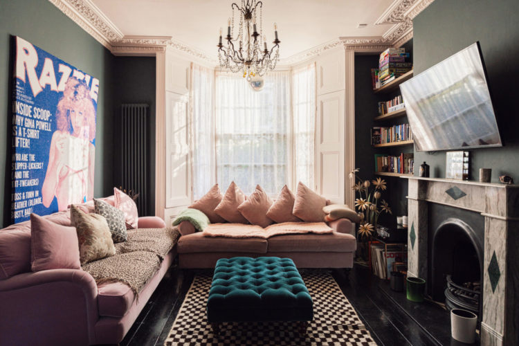
We’ll just pop into the sitting room, which isn’t huge, and the owners have decided to go full on comfy tv room and filled it with comfy sofas. And since I know you know what I want to say about this room I’m going to instead draw your attention to the rug. I have spoken before about the immense versatility of a black and white striped rug and here is a gorgeous check one which is vintage and more unusual. And so I’m going to take a moment to point you in the direction of this rug edit I did recently for The Rug Company looking at different types of rug and how to style them and, in which, coincidentally, I picked out a vintage Atlas black and white check as one of my favourites – and if I had the budget I would totally have added it to cart.
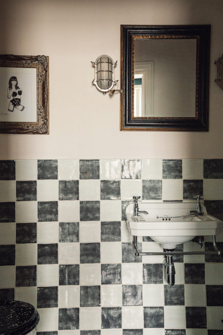
And then, because this house is all about the red thread I thought we should go up to the bathroom because look at these gorgeous tiles. There are lots of check tile patterns around at the moment and the joy is that it’s not an expensive look as you can use very cheap plain tiles to create the look. Obviously if you pick hand-made zellige your budget is going to spiral very fast but it is a very affordable look.
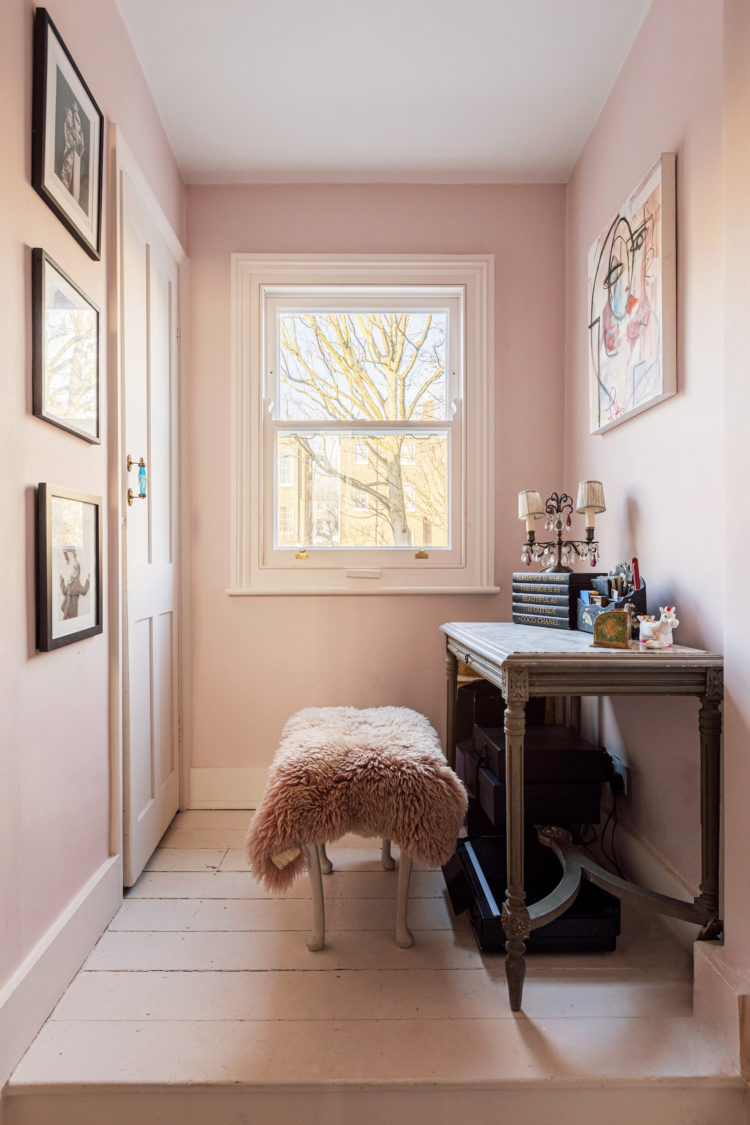
Staying with bathrooms and this is a lovely large pink room, which may well have been converted from a bedroom, which is what we did. If you look at the floor plan you could reinstate this as a bedroom by adding a wall and creating a shower room as they have done on the floor above or by making a bathroom across the back of the house.
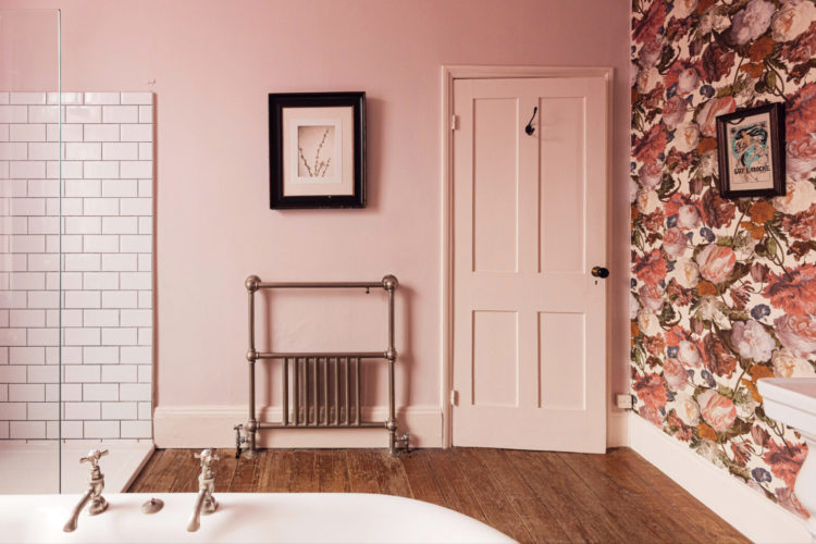
As in using this space below which has been turned into a lovely light-filled work space. Now the issue is, of course, the door and regular readers will know what I’m going to say here – yes it’s back to the sliding door folks. This is the perfect space for one since, as things stand, you will have to move the stool to open the bathroom door and, if left open it will block the light from the window. And yes you may think you always shut bathroom doors but you perhaps don’t live with teenagers who feel the need to aggressively slam and lock the door at 3am when clearly no-one is going to disturb them, but leave it wide open the rest of the time.
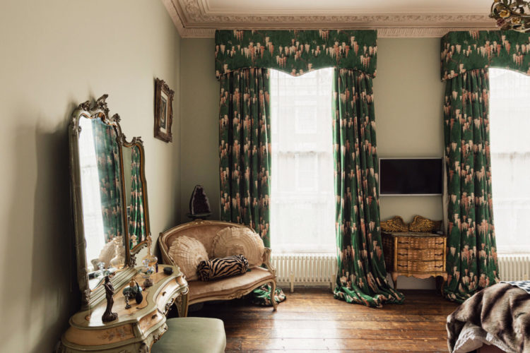
Lastly, as we’ve spent a lot of time downstairs I just wanted to come into this very pretty bedroom. Here the pink walls have been swapped for a pretty pale green and there is just the merest touch of pink in the curtains. And this fabric, by the way is the Pearl Lowe Wisteria for Woodchip and Magnolia and I recognise it because I have a large sample of it. I wasn’t sure it was right for me when I saw the sample and now I see it fully represented in a pair of sumptuous curtains I rather adore it. Also the pelmet – they’re coming back. But this time instead of frilly bits of swag and extra material think of a piece of wood cut to shape with fabric glued on flat like it is here. It’s a great contrast between the full length velvet patterned curtains and the more simple ruffle free heading.
This really is such a pretty house and I hope you have enjoyed looking round. Will someone now buy it please so we can all come round for tea and see it IRL (as they say). There is lots more to see so do check it out here.


A lovely house. Thank you for sharing. And thanks fellow readers for uncovering the Daisy Lowe connection. Makes so much sense! We should have all guessed anyway from the pink headboard in the master bedroom which is so similar to ones in her mum’s West Country home!
Can we talk about the Patrick Swayze photo? Do you think they’d leave that if I bought it?!
Nice house but I don’t understand the point of that extra loo on the first floor. It seems to me it would be more useful as a utility room or with the wall knocked down as a small semi private study area with the desk tucked in that corner. That’s probably why there’s a stool in front of the door: nobody uses that loo!
The pink dresser is a standout piece in this kitchen. I am selling a similar dresser without glass doors, painted in grey/blue, on eBay. Sadly we couldn’t take it to our second floor flat because it is very heavy.
Jennifer Bets – thanks for sharing that it’s the home of Daisy Lowe. Before reading that, all I could think was it’s very Faded Glamour/Pearly Lowe style. Now we know why! Gorgeous home – just move me in (once I’ve got rid of my 2 teenage daughters…!!!)
This is lovely. Does anyone know what colour the pink walls are in the bathroom?
This is my kind of house and I love it to bits. I find it very inspiring for future decoration projects in my flat. Everything gets a tick apart from the TV room as I can’t stand televisions over fireplaces. Thank you for this great article, Kate!
I recognise (and covet) the kitchen from a recent magazine feature on Daisy Lowe: https://www.idealhome.co.uk/kitchen/daisy-lowe-kitchen-designed-for-entertaining-291000
So perhaps no surprise you noticed the Pearl Lowe fabric!
It’s fabulous! I was just going to comment to ask if anybody had an opinion on the likely type of flooring used in the kitchen, but the answer is given in the property listing – they say it’s “heated concrete resin” (which isn’t exactly clear to me, but I assume means poured resin over concrete). I absolutely love the look and practicality of seam/grout-free flooring for kitchen and bathrooms.
Love Fantasy Fridays too!
I love it!! What shade of pink do you think they have used?