A lovely London terrace for you today and the sneak announcment that the founder of The Modern House, Matt Gibberd, will be a guest on the next episode of the podcast to talk dream houses, reinventing estate agency and the future of commuter hotspots. Very excited for that one. In the meantime, there’s this.
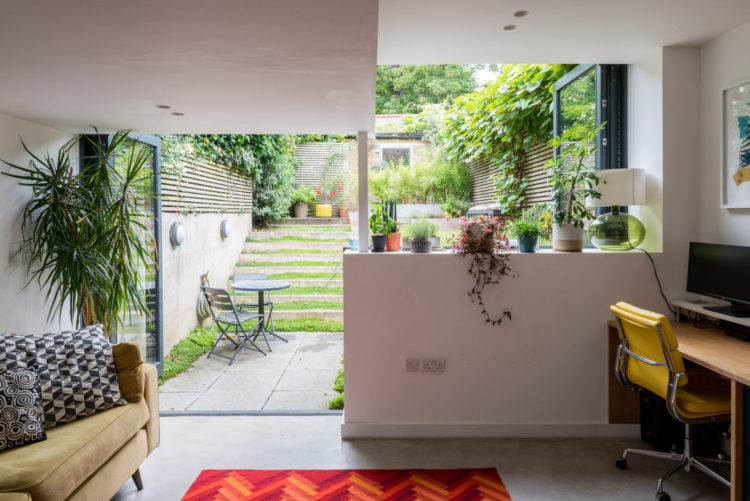
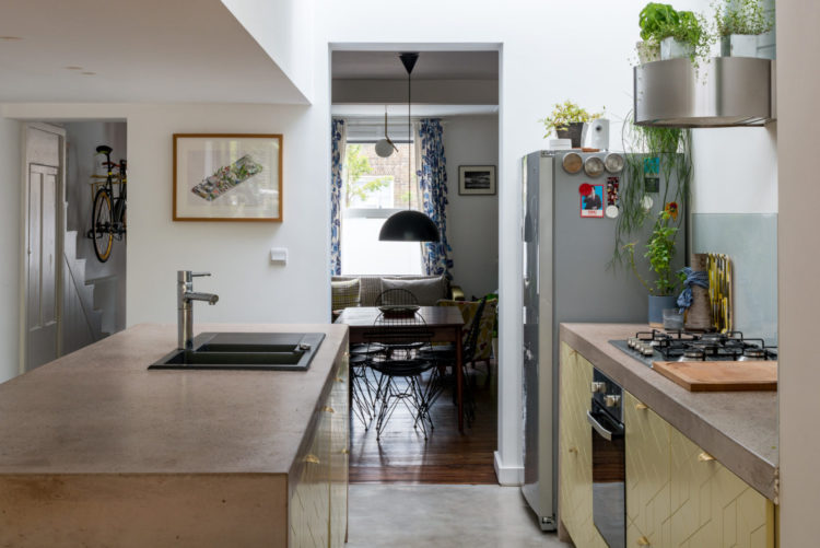
A two bedroom end of terrace from the 1870s, which has been redesigned into a series of open plan spaces by Fraher Architects and is on the market for £775,000 with the aforementioned Modern House. And wouldn’t that be a lovely place to sit for a home office? Having spent years working at the kitchen table, I do think, for me at least, the kitchen is the nicest room in the house to be in but sadly, for most of us, there isn’t enough space for a proper set up like this.
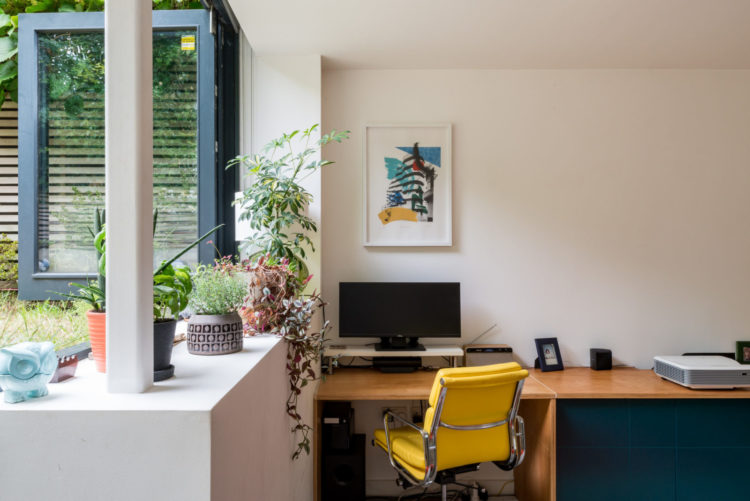
This is definitely where I would happily spent my days, although I have a sneaking suspicion I might drag a stool over and put the laptop on the low wall itself so I could stare out at that pretty garden. But it does bring me back to a point I have often made before – don’t stick the office in the darkest (second) smallest room in the house because you won’t want to spend any time in there. By all means put the filing and the printer and the actual practical stuff in another room but plant yourself in the lightest brightest space if you need to do anything creative.
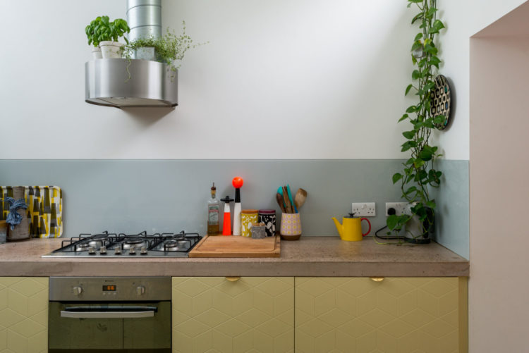
A close up of the cupboards which look a bit Superfront to me. For those of you who aren’t familiar, Superfront make doors for Ikea kitchens and handles for everyone. There are lots of different designs and that handle is called the Holy Wafer. I know that because I have gazed at it many a time….
Regular readers and podcast listeners will know that lockdown has made me start dreaming of this muddy yellow for a kitchen too. I draw the line at the bright yellow chair but I know that Michelle Ogundehin, tv presenter and former editor of Elle Decoration, had a bright yellow office chair which she calls Mr Happy yellow. And once you see one spot of yellow you start to see it everywhere – even the flowerpot at the far end of the garden.
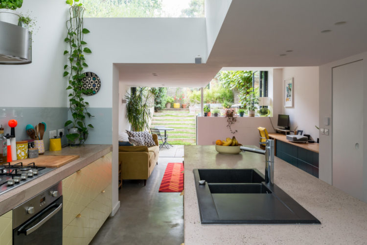
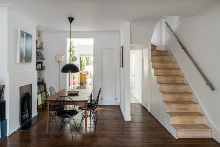
The downstairs has been largely opened up to create this kitchen family area above and a seating dining area below. It’s not quite open plan but is the new buzzword – broken plan. This means that you have lots of half walls – half both vertically, like beside the stairs below, and horizontally, by the kitchen workspace, which means that you don’t have one large open space which can be hard to furnish, but a series of smaller spaces through which the light can flow. It’s a way of opening up without totally opening up as it were, and it’s great for small dark terrace houses which are often long and narrow.
Taking out most of the wall by the stairs also makes what is traditionally a small dark room in the middle of the house lighter and brighter. The one issue to consider is small kids and late night rowdy dinner parties.
Before we leave this space, note how low the pendant light is over the table. It creates a more intimate feel which, in a room that is short on walls, can be a really good trick for creating the sense of a room that might otherwise feel a bit corridor. As long as the tallest person isn’t actively hitting their head then go as low as you dare.
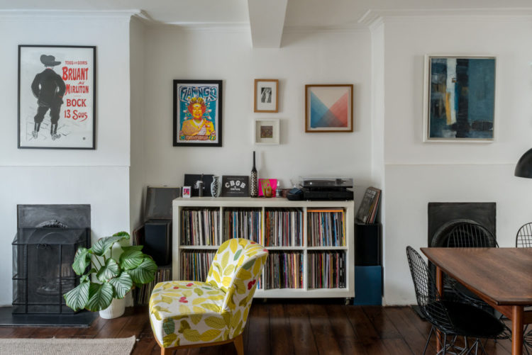
Moving to the sitting room end and most of the knock-throughs I have seen have meant that you get a half wall between the two areas – mostly to hold the supporting beams up, but here the architects have done away with that and created a proper alcove between the two ends of the room. This not only helps it look more like one room with two functions – sitting and dining – but also gives you a space for actual storage and furniture.
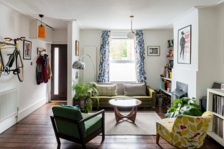
And you can see from this end that the wall between the hall and the sitting room has been mostly removed here as well. Be warned this was probably quite expensive in terms of joists and propping up the rest of the house, but factor that in, or have the conversation if you think it would work for the way you live.
Here the sitting room is still private from the front door but it does give a little more breathing space. As I said at the top, Victorian houses are often very narrow – my last house was 15ft wide, including the hall, so removing that wall would have made a big difference. But it’s not for everyone – some prefer to be smaller and cosier and keep the hall and stairs apart.
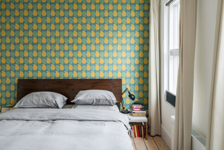
Upstairs and this great wallpaper is a real feature and yes I think the bedroom, behind the bed, is the one place where a feature wall can really work. This is a vibrant design and might make you feel more energised than relaxed but by putting it behind the bed you can feel lifted when you come in and then turn your back on it when you want to lie down and relax.
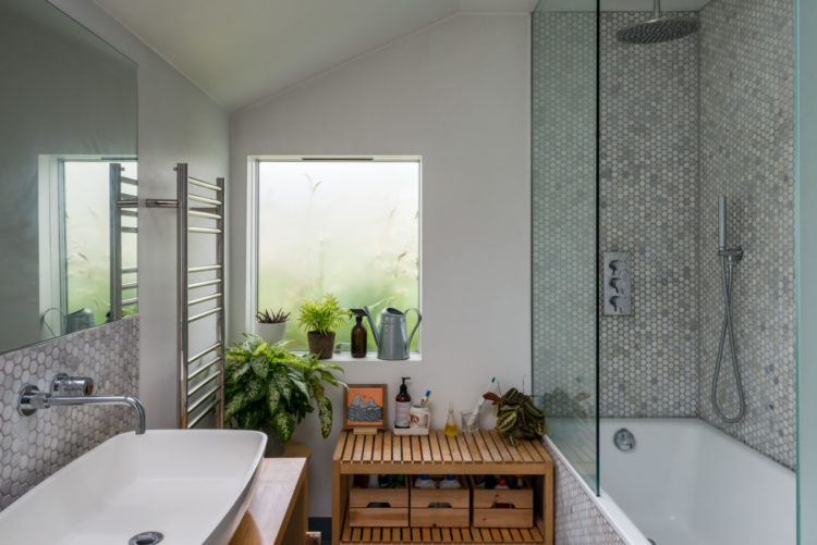
And a bathroom with a window is always a treat. I lived in many a flat where the bathroom was carved out of a space in the middle with no natural light, which is why I am probably drawn to this one so much. The deep sill with space for the plants gives it a slightly tropical feel. I might have been tempted to take it further and add green tiles.
So house tour done. Who’s moving in this week? Remember it’s Fantasy Friday only for spending the imaginary lottery money, we’re not getting into issues of mortgages.


I’m interested in the coving in this house, it’s more of a ceiling border and I think it looks really sophisticated. My red thread is also yellow!
Recently moved into a mid century modern house with double yellow front doors. I do not like the shade of yellow I “inherited “. Any suggestions? I have access to US brands plus Farrow & Ball colors. (not to lemony) Cheers
P.S. love Kate’s taste of color
Love it!
Love this house and especially that double height garden. Really quirky. Nice space. Lotto tonight!!
Neptune has an advert showing a yellow painted bedroom .The shade of yellow is what I would describe as Ochre. The bedhead is grey flannel fabric and the bedside lamp base looks deep navy, with a cream coloured shade. A winning combination to my mind. I feel that the colour ochre is on it’s way!!
The house does not tempt me, this time.
OOPs I am another Anna !
I love this house tour (esp.the bathroom!) and the broken plan idea. Thanks, Kate.!
This week I’ve painted a bright, sunny yellow around the kitchen window. It’s joyous.
I already have a yellow plant pot, kitchen timer and bowl of lemons in what is essentially an all white/grey kitchen which leads into a dining room with a yellow sofa and then into a living room with a yellow cushion. There’s my red thread.
Would love to see it!
https://pin.it/6WpEKgR
Anna – I hope the link works.
Yep, I could move straight in here and love a bit of broken plan. It creates so many interesting views. Agree the right shade of yellow give a lift in any space.
I grew up in a Victorian terrace and I definitely recognise what the original floor plan would have looked like.
My parents kept the separate hall, but opened up the dining room and lounge back in the 1980’s – were they before their time! Created a great, open space which then led through to a bright kitchen with large patio doors to the garden
Love this house! The full details show the amazing garden which also explains the window layout at the back.
Absolutely love this house Kate. And how spooky as when I clicked on the link it’s actually in SE14 where I was born and bred and lived for the first 29 years of my life! One for my Pinterest board thank you 😊