This London loft apartment was designed by the wonderful Ilse Crawford but has been on the market before so I don’t know if she is selling it or if it’s a new owner that hasn’t changed anything. Either way it bears examination because a) Ilse is brilliant and b) it’s a real lesson in creating storage, working with original features and using colour to give the impression of large, light spaces.
It’s on the market with the Unique Property Company for £1,200,000 and while that may be out of your budget, there are valuable ideas here that can be adapted to many other spaces. And it’s always nice to have a poke around other people’s houses isn’t it?
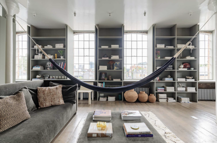
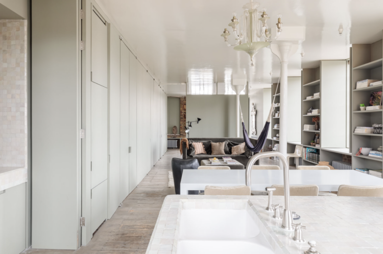
Let’s get the hammock out of the way to start. That’s the recognisable part that distinguishes it as Ilse’s work. Of course not everyone can have a hammock but bear in mind they don’t take up much space – you can always unhook one end and roll it up against the wall when not in use. And imagine how wonderful it would be to just lie in a hammock gently swinging and pondering your next move.
The point about it is more that it’s about having fun; about enjoying your space and not worrying about the rules. It might be a hammock, it might be a kitsch china leopard, the idea is that it’s your home and you should put things in it that will make you smile.
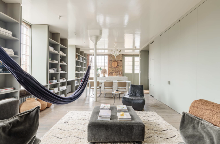
Moving on to the colour scheme next and, as you will see, the entire apartment has been painted out in a soft sage green. Using one colour like this will blur the boundaries of the space and make it feel larger. It will also make the furniture stand out against the backdrop. It’s also known as the gallery effect as everything fades into the background apart from the pieces you want to show off.
So the floor to ceiling shelves show more what they display than the fact they are there. The doors on the walls of cupboards recede into the background. And while we’re on paint – that high gloss white ceiling catches the light and bounces it around the space.
Now, of course, you may wish to zone your space by using different colours and that’s a valuable decorating tool as well. But if you have a small space and want to create the illusion of space this is how you do it. Another trick – to add definition if you like – would be to use a darker version of the wall colour on the woodwork. It will bring the space in a little but you might feel it zones it more.
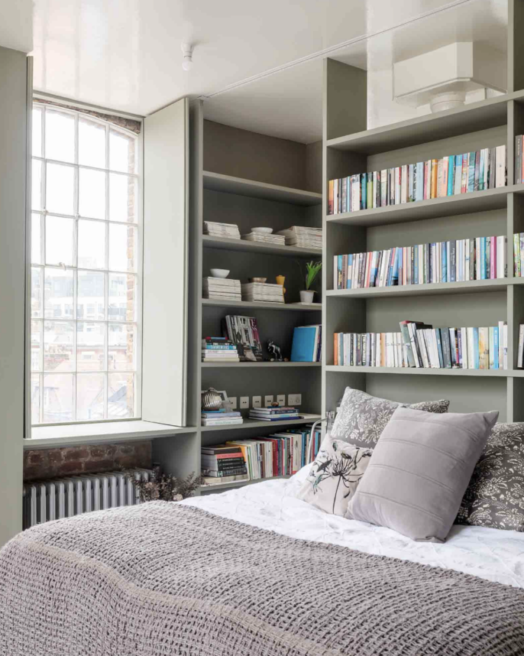
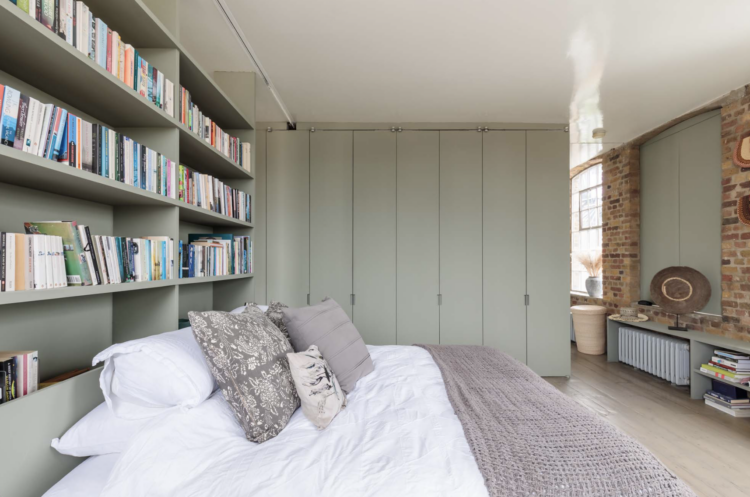
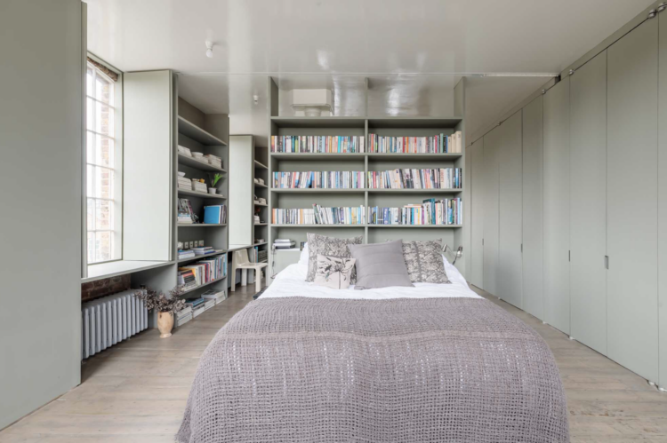
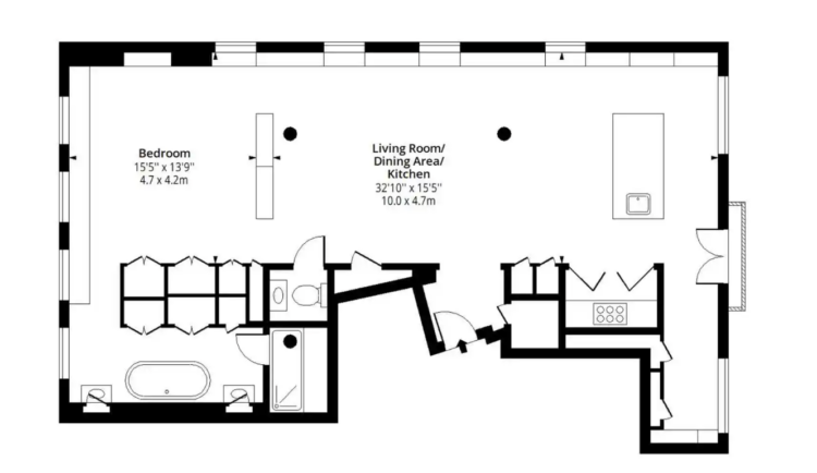
You will also note that every wall has been clad with storage. I’m going to add the floor plan here so you can see how the space has been divided. There are shelves between all the windows and remember, if you are storing books 25cm is plenty deep enough. You might want slightly more for plates. A wardrobe needs 60cm for hangers so you can immediately work out what you can add in your own homes.
In this case there is double sided storage between bedroom and living room and bedroom and bathroom. That does require a bigger space but it’s an idea you can ponder and possibly adapt to your own requirements.
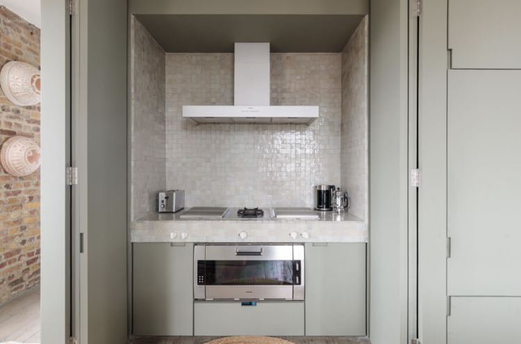
You can see also that the kitchen has been located in a cupboard so that it’s not on view when not in use. Currently pantries are very fashionable but if you have a kitchen sharing space with a living room then you might want to think about putting the oven behind doors to create more of a living space. And, of course, you can buy integrated appliances for everything else.
The double sink is clever too. Rather than two side by side so you are either facing the sitting room or have your back to the guests it has been located on the end of the island so you can stand there and see everyone. You can also, it occurs to me, have two people washing up at the same time should you require. Many hands make light work and all that.
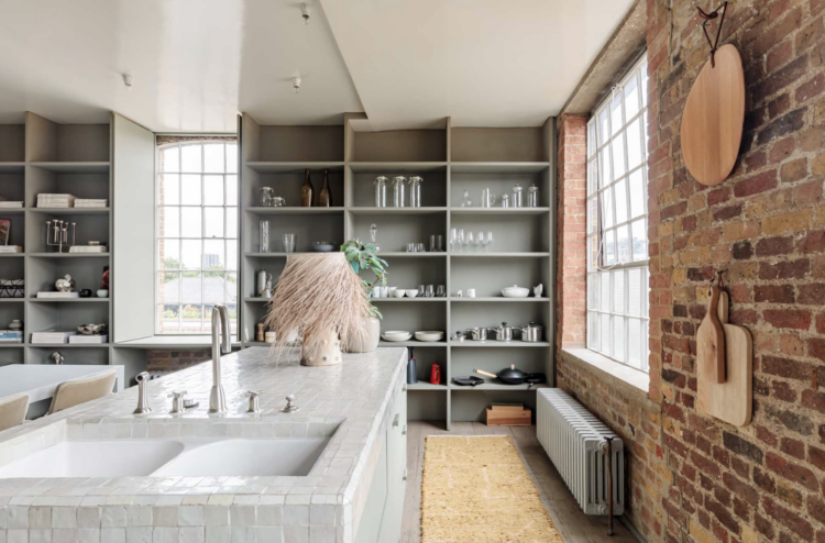
Now we’ve looked at colour and layout but this is a loft. And, as such, it has original features such as beams that you have to work with as you can’t remove them. You can see two of them down the length of the apartment in this shot. And yes they are perfect for hanging hammocks – that’s a niche kind of situation I agree, but many of us have features/architectural details that we’re stuck with and need to work around.
In this case they are quite so they sort of disappear. They are also rather lovely and I might be tempted to add a strong colour and really own them as a feature. But look below. There’s one in the shower. And that really is working around a problem. That was the best place for the shower and so that is where the shower has gone. As long as there’s space to get in and out it can remain as a quirky feature.
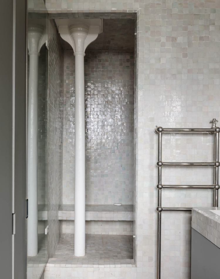
The other point – perhaps more relevant than that of finding stray columns in your bathroom – is that this is a one bedroom flat. As long as the residents of the bedroom and users of the bathroom are fine with that that is all that matters. And that is the point to take from this. It’s your house, do what’s right for you.
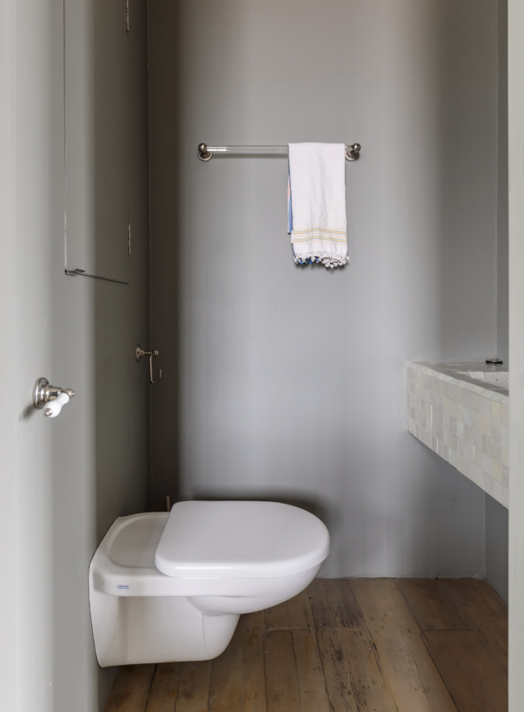
Below is a good example of creating the illusion of space in a tiny cloakroom. The basin and loo are wall mounted, so you can see more floor which makes the space feel more cluttered. Also if that sink unit came down to the floor it would make the leg space around the loo feel more cramped. If you look closely there’s a cupboard over the loo as well which not only hides the cistern but probably stores the spare loo paper as well. No detail has been overlooked.
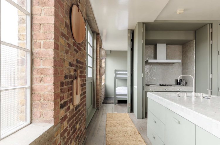
The apartment is billed as one bedroom but you can just see here a set of bunk beds. There’s no door so you probably can’t sell it as a two bedroom but if you didn’t need those beds it would make a great little study tucked away out of sight.
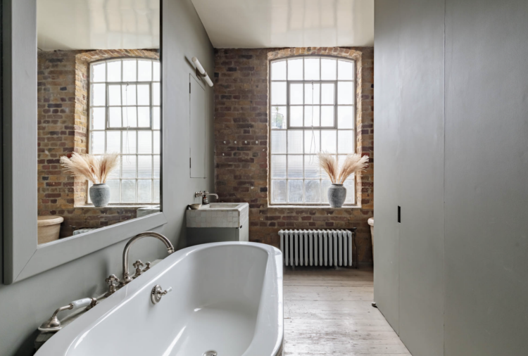
We’re just touring now but here’s the bathroom behind the bedroom and you can see lots more storage. And – honestly you wait years to find the right images to illustrate your points and they all come along at once (maybe I do need to embrace AI) – and see how the mirror has been positioned to grab the light from the window and bounce it back into the room.
So there we have it. A one bedroom apartment looking at colour, layout, awkward features and making the most of the space. What do you think? I love it and I definitely think there are ideas to take for your own homes from this one.


Sage/mint-green and grey is an interesting combo combination for this pad; it is lovely yet it seems claustrophobic; very unsure about the hammock in the middle of the living area; outside would be best or on a balcony but then I’d worry about falling over. Sorry.
Mostly very beautiful but I think the large bookcases are overbearing and distract heavily from the beautiful windows, giving a cramped impression. I would have covered the radiators in between the bookshelves/windows, instead of placing large items in front of them, which, to me, adds to the cramped feeling on that wall.
The sage green is exactly what I’m looking for. Closest I have found is Contentrd by Sherwin Williams. Any idea the color here or any suggestions?? Thank you!!
Cromarty by Farrow and Ball?
OMG! I’m totally in love with this apartment! I love how Isle has zoned the space to make it a very practical yet absolutely stunning place you would want to linger longer in!
Oh I love this apartment, though much more when it had Ilse Crawford’s stuff in there, just like it is in her book “A Frame for Life”. Those photos are a huge source of inspiration to me. You can see in these photos above, however, how good bones are everything. Ilse and Oscar’s structure, layout and materials are still there, even if their wonderful objects are not. Let me call the bank…
Is grey coming back? I feel like in the past couple of weeks I’ve seen a few mostly grey interiors, when for a long time I didn’t see any.
Oh. I think that there is a folding door into that small “bunk bed nook room”.
Ilse is a genius!
Ilse Crawford is a genius and this apartment is a dream. Finally, enough bookshelves! Now, where did I put that £1.2m…?
Brilliant design !