A treat for you this week as we are going to take a proper look around the home that was featured on last week’s Grand Designs. Those of you that watch the programme may relish a closer look and the rest of you will, I think, enjoy seeing it for the first time.
It belongs to former fashion journalist turned interior designer, Beth Dadswell and is one of those rare homes that made me properly jealous. Beth and her husband Andrew Wilbourne bought the derelict dairy in south London and were determined to keep as much as possible of the original – a move of which I heartily approve.
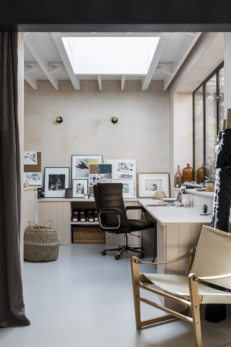
When their architect Takero Shimazaki came to look round for the first time, he totally understood their vision and just said: “OK we’re keeping everything.” And they tried, they really did; repurposing old gutters into garden lighting and keeping original switches as well as exposing the original beams and bricks where possible.
So often on programmes like this, and in life it must be said, people fall in love with a run-down building and then proceed to rip the guts out of it turning it into the home they want. And I’ve lost count of the number of homes I’ve seen on Grand Designs where an amazing building has been ruined by cheap furniture and a complete lack of interior vision.
I’m sure there isn’t always much money left over for the fixtures and fittings when you’ve built a whole new house, but very rarely do the owners seems to bring anything of their past lives with them. This is something I constantly preach – your home must tell your story and you must bring things from your old house to the new. Your Granny’s armchair, someone else’s Granny’s armchair if you like, but pieces with character and history that you will incorporate into your own story.
In this case, the building had its own story to tell and was allowed to do that while Beth and Andrew brought their own history to blend with that of the building and it has so much more beauty and character for that.
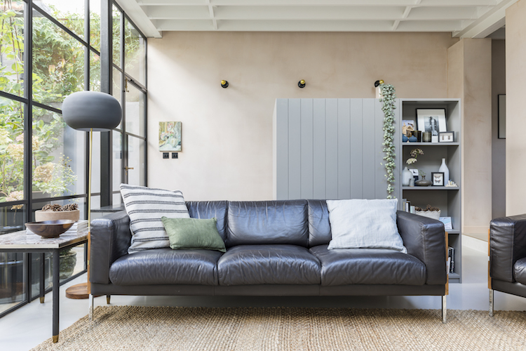
The ceiling joists were left exposed with their pretty cross beams and outside the exposed brick walls were left alone. Inside, because I know you are going to ask me, the plaster walls were left in their original colour and simply sealed with decorator’s varnish.
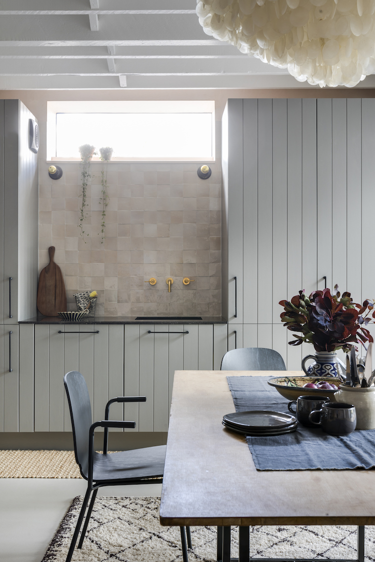
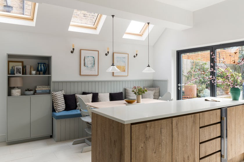
A simple kitchen was created from cheap tongue and groove while the money was spent (I’m guessing) on brass taps black handles and zelige tiles to create something that looks so much more bespoke and expensive that it was. This is another key thing to remember when it comes to interior design – spend money on the touch points and the details as these are the bits you interact with and will remember.
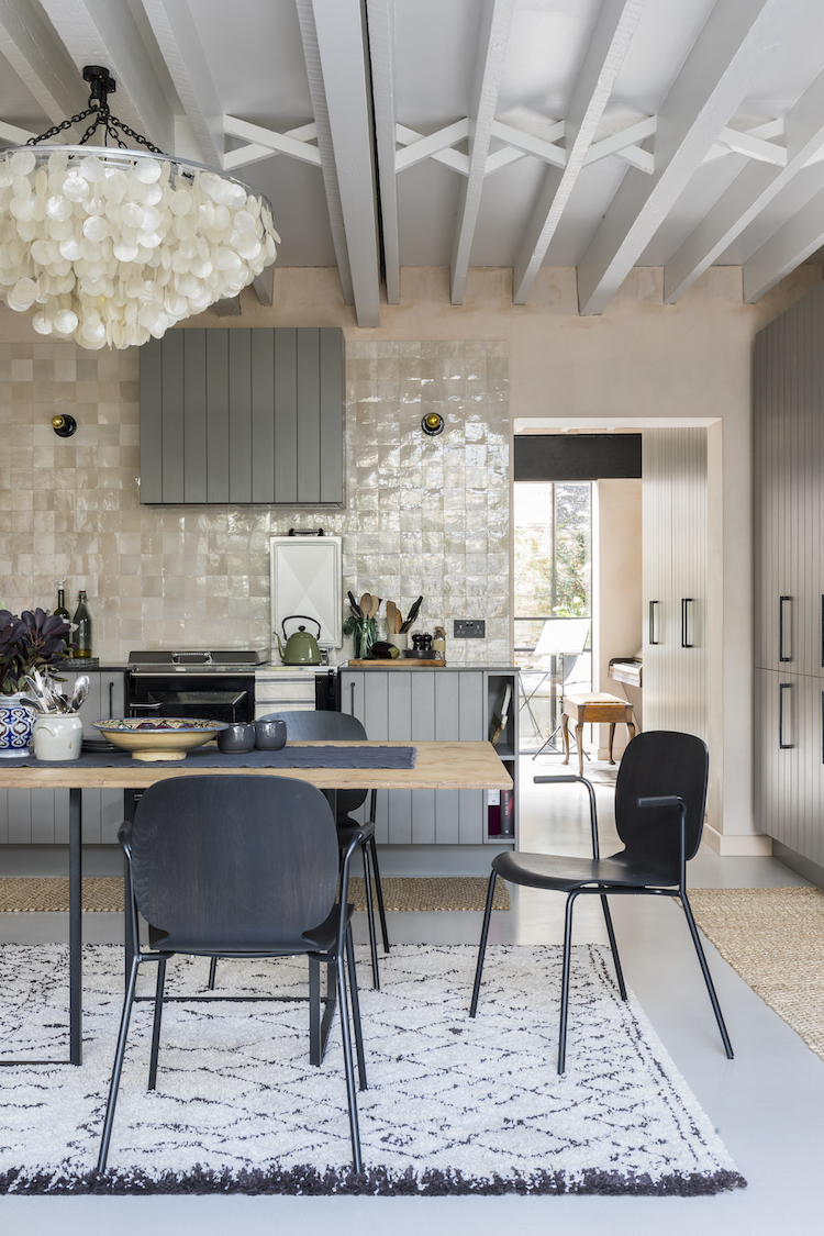
Beth has been renovating and redesigning properties for the last ten years and has developed her own style mixing modern and vintage, and inexpensive with unusual using a soft palette of colours that compliment the style of the rooms she is working on. The overall look is both calm and characterful and very much echoes my own ethos – see the kitchen below with its black accent, touches of natural wood and mix of old and new.
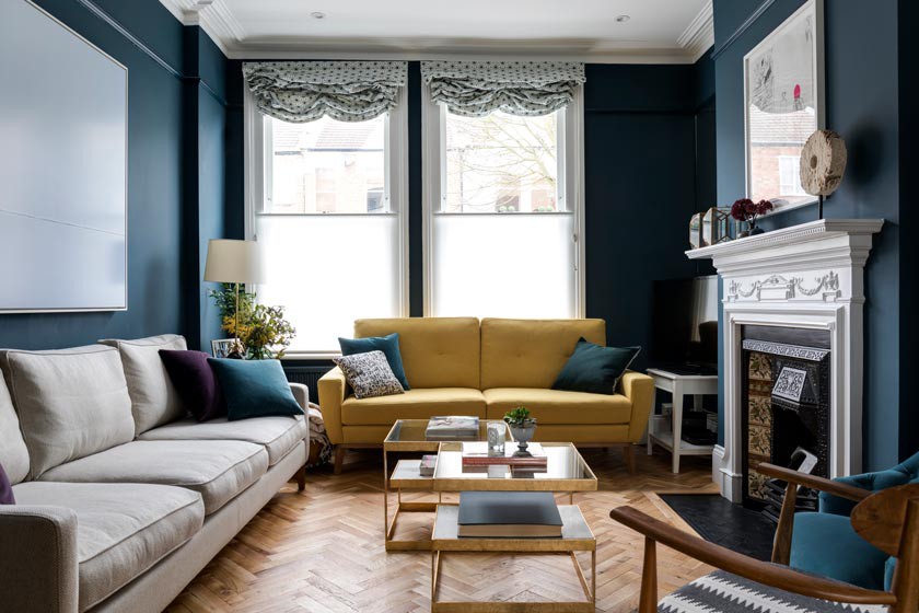
But she’s not averse to a dark wall either, as this sitting room below shows and is that a turmeric sofa in the bay window? I noticed last week, by the way, that Grazia devoted a double page spread to its colour of the season – saffron. So call it what you will – and Beth says it’s mustard – it doesn’t if you’re wearing it, sitting on it or, erm, eating it – there’s no escaping it these year.
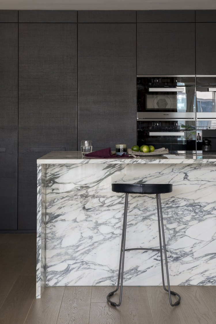
Another dark wall in this project and a more luxe feel with the marble island showing that Beth is capable of more than one look – and a glance round her extensive portfolio will show you that.
“After 18 years in fashion journalism and several quietly buying and renovating properties with the help of a builder friend I decided to leave fashion (and its endless travelling) following the birth of my son, now 11.
“I always encourage clients to celebrate and restore any period features, to avoid too many shiny/new finishes and to have plenty of older pieces in the mix. This makes a room feel cosy and lived in rather than show home,” she says.
“Inevitably I have worked on lots of Victorian and Edwardian properties – restoring them to their former glory – but having completed The Old Dairy I am hoping there may be some more industrial projects on the horizon.”
It was a brave decision to call her business Imperfect Interiors but for Beth it sums up her ethos perfectly. Her interiors are not imperfect but are, in fact, perfect because they celebrate their imperfections and incorporate them into the overall design bringing the kind of character and personality that you can’t create with dead straight walls and square rooms.
I hope you have enjoyed today’s stroll through 10 Beautiful Rooms, personally I’m wondering why I spent so long trying (and failing) to find the perfect millennial pink when I should have just gone back to the plaster and left it natural which would have been so much better. I love Beth’s house and if you want to see more of her work then visit her site. You may even want to hire her for your own project….
All images by Chris Snook make sure you credit if you pin or use


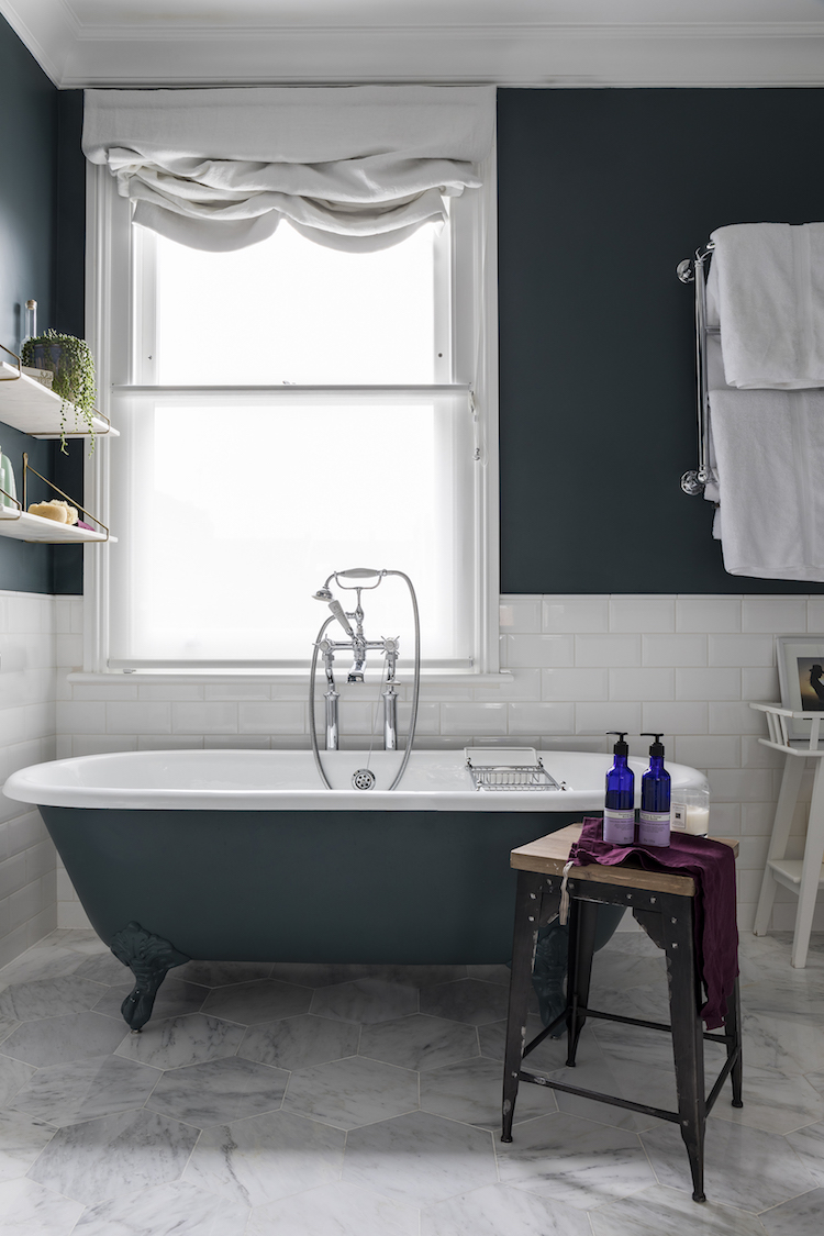
The soft hues are to die for! It’s wonderful to see that inversion of very light rooms and a dark bathroom. Of course, the white tiles bring that cleanliness that is necessary for a bathroom to be appealing, but painting the walls and the tub brings in a luxury element that many bathrooms cannot achieve without fancy lighting. The jewel accents really bring out that richness to the room – and the cloth blind is a dream!
This is a lovely home, but since I didn’t see the GD episode I’m at a loss as to what the couple saved from the dairy architecture. It just looks like a modern interior. Cheers, Ardith
Love the look of all the kitchens, but particularly the last one in charcoal. What material are the wall cabinets?? It almost looks like it’s covered in linen?!
Thank you all for your really lovely comments- I have been quite overwhelmed by how kind and complimentary people have been since the programme aired. It’s funny because you spend so long with all of these ideas/visions in your head that once they are actually a reality you feel quite surprised when other people are so excited! Hopefully that doesn’t sound jaded, it is just an odd feeling, and probably because I am exhausted!! The Zellige tiles are definitely worth a splurge- they are from Mosaic del Sur and I absolutely love them. Consider them the jewellery to finish the outfit!
Having watched Grand Designs since it was first aired, I can honestly say this was my favourite house EVER, one I would happily move into in a heartbeat – although for me it was the outside space that truly made it special, I absolutely loved the way the iron roof frame was left, the planting etc. Fabulous. Can I admit to not being too keen on the actual interior design? I understood what had been terms of using the same colours etc. everywhere in order to create flow, but not my cup of tea.
My dream home! I have a question, we are planning a kitchen renovation next year and I have had these tiles in mind for a while, but do you know where these tiles are from? Depending on cost might have to be clever were we place them!
Thank you!
I loved this post – the look of the house, their attempts to keep so much of the original, what you said about Grand Designs and the crappy interiors and everything about the way you wrote it. Now going to search out the programme for tonight’s viewing. Thank you!
Wow, this is stunning. I’ve been planning on a zellige tile backsplash for the hob area of my new kitchen, then worried that it needed pattern, should I go for something else… This has put me firmly back in the zellige camp.
I totally agree with what she says and I watched it on Grand Designs too, fabulous to see more of the house. The perfect new shiny interior in an old house is all very well but as you say, it lacks any character, a home really should be about the people who live there, you are so right, that is what makes it welcoming and fun to live in. It is like a giant memory box.
Oh Kate, this is so lovely. Truly great design because of its effect: soothing, not too sleek and new, the right balance between that gorgeous original plaster and the olive greeny-grey kitchen cupboards, the light wood. Love it all….
A word about turmeric, mustard, saffron, whatever it’s called: I used to absolutely abhor the color yellow (such a restrictive word now, isn’t it?) yet I figured out a few years ago that this matte gold color was stunning especially mixed with other more sober colors like black or grey or mallard blue. A rather neutral color actually, with real color! A French friend of mine introduced me almost 20 years ago to the term “couleurs passées” ( aged colors) which opened my eyes to the beauty of the watered down yet rich moody versions of the primary colors. I have been a fan ever since.
Imperfect or Impertect as shown below the pictures?
lawks – thank goodness for you with your perfect eyesight! All corrected now. Honestly a million thank yous x
Oh, I so agree with both your and Beth’s philosophy but I fear that we are a dying breed,
For the last house move 18 years ago, we took very little and virtually started from scratch. I am now planning the next move and really want to keep/move as much as possible to our new home. I think the challenge is actually placing the ‘old furniture’ into the new home setting. If you check out Beth’s previous home on her site and now the renovated dairy, you can see how the old furniture and items moved house and found new locations in different rooms in the dairy. Inspiring.