And this comes with apologies to all those who were waiting for it in their inbox this morning – I mistyped the date and scheduled it for tomorrow instead. Here it is now. I’m so sorry.
I hope you are all enjoying the long weekend and lounging about in a suitably lazy fashion. As I write this who knows what the weather will be doing. Today – Easter Sunday – we were promised rain so we abandoned plans for a barbecue and opted for a slow roast instead. The sun is currently beating down and there is hardly a cloud in the sky. Sometimes I think these forecasters literally just look out of the window
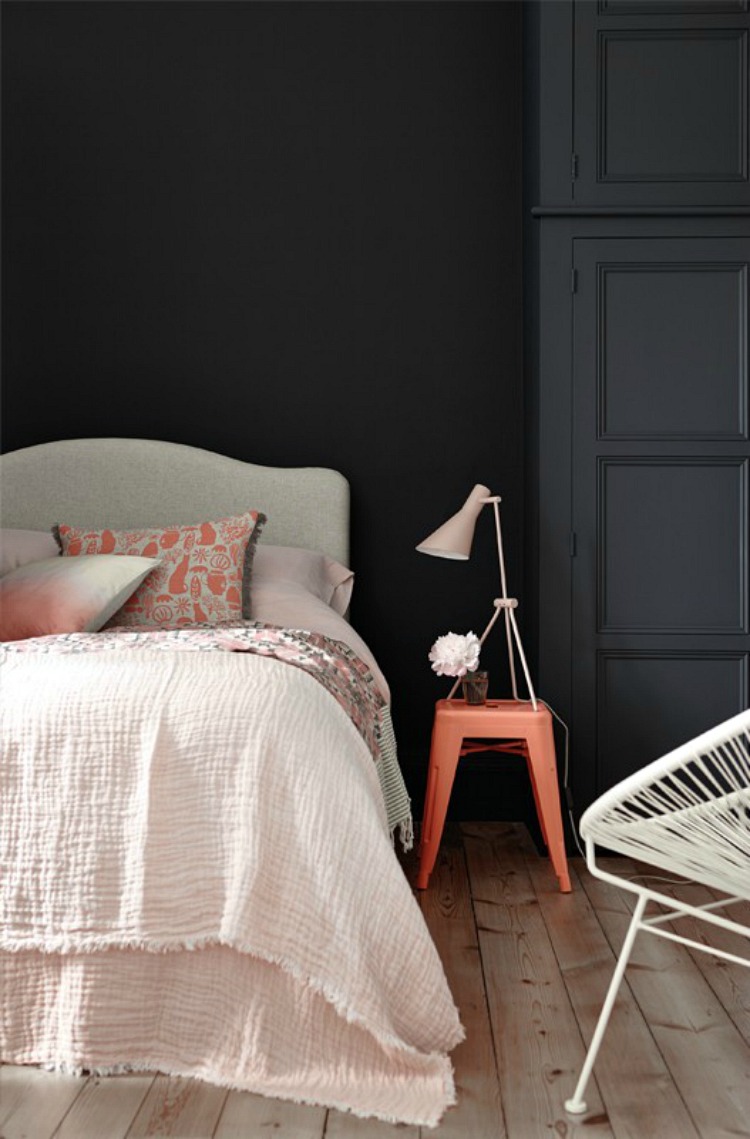
We’re going to start with a little dark and moody, not for any particular reason other than that this is one of my favourite rooms. It’s by Little Greene and is basalt walls with a stool painted in orange aurora. Basalt is a deep blue black that changes according to the light and while I have no orange in my house the addition of this more coral shade with the blush pink is more than pleasing. If I were ever to redecorate again – which clearly I am not. Never. Ever – I might be tempted to just shamelessly rip this one off. No more agonising over paint colours. Just this.
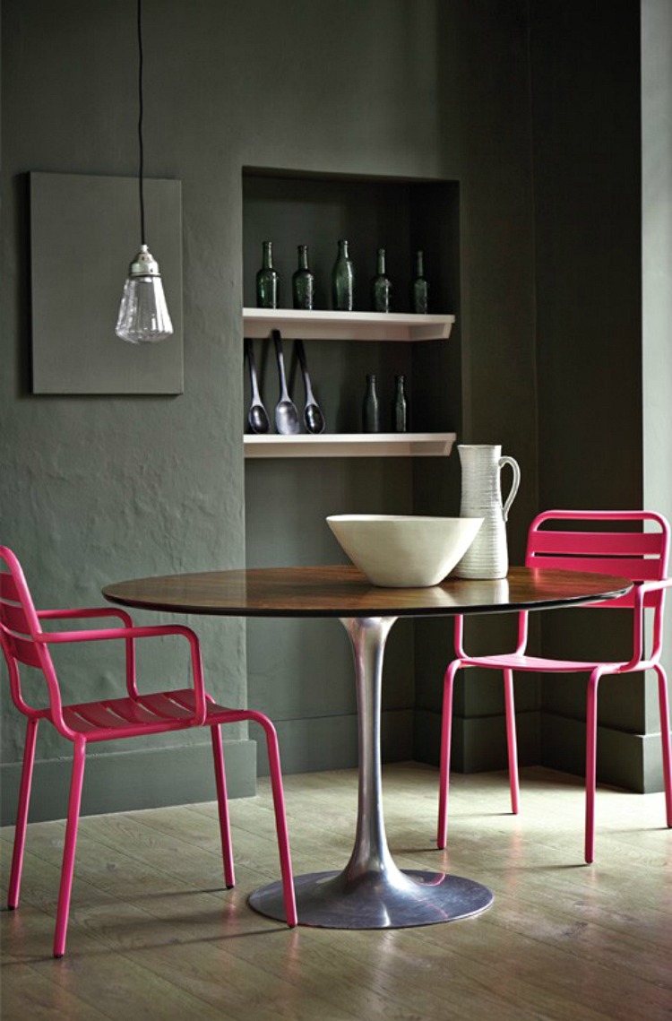
This is another riff on the currently screamingly fashionable pink and green combination which we are seeing everywhere at the moment. This time a dark green is lifted by the addition of neon pink chairs. It just goes to show you can find any variation on a combination and find one that works for you. I rather love this and there are some bright pink shades in my own house, as well as blush – which would also look great against this shade – it’s invisible green by the way.
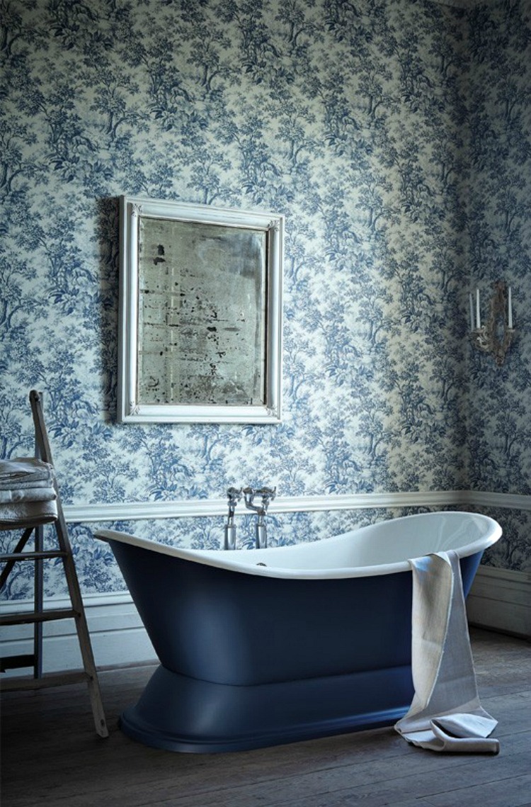
Moving to the bathroom and yes you can wallpaper in a bathroom as long as you have reasonably good ventilation. By the way, little by little we are moving away from the feature wall. I know that designers have been saying it for ages but it seems to take around three years for what we see at trade fairs and designs shows to percolate down to real homes. Which makes us about on target for wallpapering all four walls and not just one. Wrap the room, it looks bolder, more confident, more considered and better. Basically it shows that you had the confidence to go for it rather than just picking one wall and panicking. If you were a little nervous of this pattern you could have painted below the rail and papered above – or vice versa but however you choose to mix it up do it all round the room.
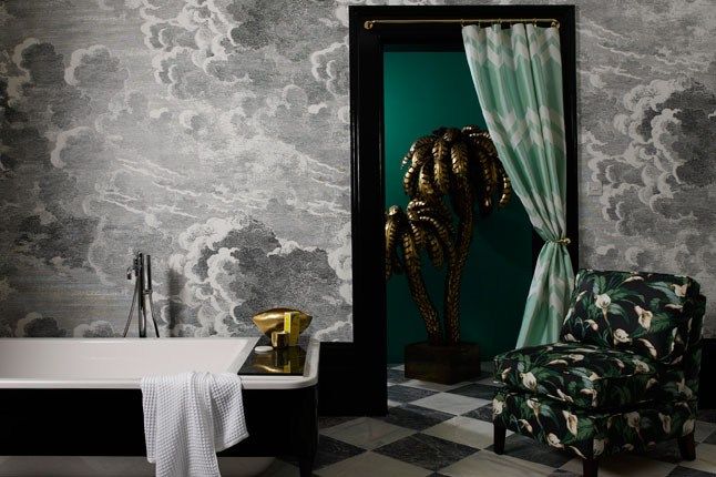
This Fornasetti wallpaper by Cole and Son has long been one of my favourites as has the combination of black and and white with green. The only thing which has prevented me from bringing this wallpaper into The Mad House is that I think the clouds are a little stormy and I feel I need more restful clouds. Note how the black door frame and skirting boards really anchor the space and set of the paper though.
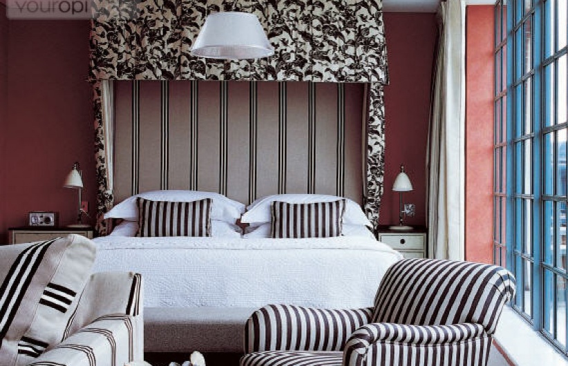
More black and white but this time mixed in with a little pink. Note also the pattern clashing. That’s a scary thing to do and I know that many of us worry that we won’t pull it off in our own homes. But there’s nothing wrong with taking inspiration from the professionals – in this case the designers at The Soho Hotel The colour palette is restricted – black and white – the patterns are opposing – flowers and stripes. Nothing else – no geometrics, no dots. If you wanted to bring in a third pattern then you would need to change colour. So, for example, you could have added dots or spots in the linen ecru colour with some of the coral wall shade instead. But, if you’re not comfortable then don’t do it. It’s like wearing a new outfit – if you feel uncomfortable you will look uncomfortable and it won’t work.
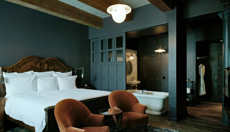
One from Soho House in New York for you now. Another old favourite and a teaser for the opening of their latest venture The Ned, in London, in a couple of weeks. I have been invited to the opening lunch so I will definitely bring you some pictures as soon as I have been in. I’m sure it will be the usual fabulous mix of vintage and stylish that so many of us fancy for our own houses and, of course, now you can buy most of the things they use so it’s totally possible to recreate the look at home instead of paying the membership fees.
Hotels so often provide inspiration our own homes whether it’s tricks for clever storage or squeezing bathrooms into small spaces or just colour schemes. Once it’s in a hotel or bar near you it’s either coming to a house near you or it’s already there. Remember how industrial style started off in a few trendy cafes and spread to the residential market. So it’s the same with paint colours and styles.
That’s not to say we should all be influenced by trends but it can provide inspiration and ideas for your own spaces. Recently I have stayed in a couple of hotels which were all white. Yes they were restful but gosh they were boring. I might not like lots of colours at once but I definitely like strong shades and one or two brighter elements in there.
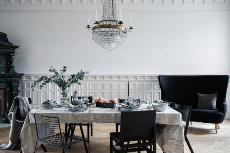
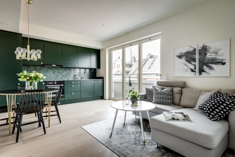
Mind you this room above is very white but the panelling brings interest as does the dark furniture. The point being that it isn’t just colour that you need in a room. There are other tricks as well. Mind you, it can also be good to use colour in more unexpected ways such as this green kitchen below. I bet most people would have bought a safe neutral kitchen and painted the walls green, reasoning that they could always change them later. But this owner has taken the opposite route and it really works.
After all, greenery is huge at the moment – plants are here to stay – which means that green paint, in all its forms, is also a safe colour choice at the moment. It’s one of the new neutrals – mix it with pink, white and black for a really fresh and modern look.
So there we have 10 Beautiful Rooms. Done. Enjoy the rest of the bank holiday – or I hope it was good if it’s now over and I’l see you back here tomorrow for the next guest post – this time it’s Ciara Elliott, the editor of Essential Kitchens, Bedrooms and Bathrooms and she’s going to tell us her top five tips for successful decorating based on what she has seen in some of the most stylish homes in the country.


Do we know what paint colour they used in the Soho House NY picture? I’m currently debating painting my (white and sterile) bathroom in either Stiffkey Blue or Inchyra Blue but I do love the greeny shade in that picture!
Love all the rooms you have featured this week, we seem to have dived straight back into winter up north and they provide that cocooned-wrap-aound luxury element so essential when it is cold and miserable outside.