These Mondays do seem to rush round fast don’t they? So here we are again and I thought I would do a bathroom special this week. I see so many wonderful bathrooms and they’re all so different and yet it’s a room that we all have so it’s good to have a look at lots of different styles. Admittedly ,these might be bigger than the average, which in the UK is about 8ft by 6ft, but that doesn’t mean we can’t have fun with the decor. There might not be space for a freestanding bath but you can still introduce colour and great lighting.
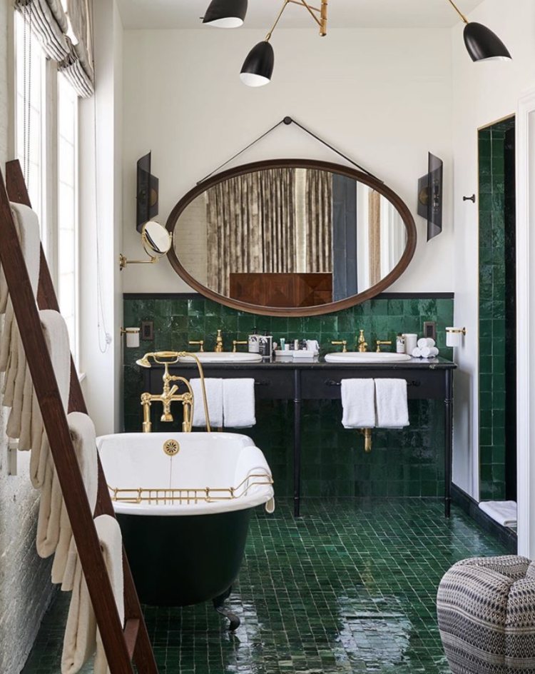
First up is a bathroom at the new Soho Warehouse in Los Angeles and this is all about those fantastic green tiles on the floor and running up the walls as well. They work brilliantly with the black and there’s nothing to stop you painting your own bath black, or adding a black side panel, and using black for the basin furniture. Keep the walls off-white to make it light and bright and add a vintage wooden mirror over the basin – two is nice, one is fine and perhaps more realistic.
There are lots of green tiles around at the moment. These are wall tiles from Topps – try using a matching green grout rather than the white used in these images. Zellige tiles are handmade clay tiles which are laid close together so no grout is visible. These are very close to the ones in the image above. These are particularly lovely but only suitable for walls not floors.
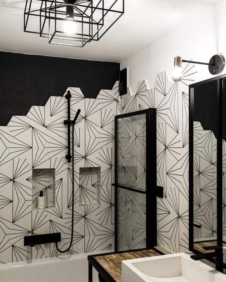
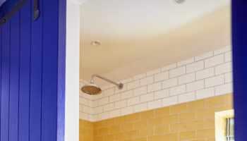
I have spoken before about black and white bathrooms being a classic but there are ways to do black and white that can really make a difference. This shower room above is a case in point. Black fittings and dramatically patterned tiles. Note also that if you buy hexagon tiles you can add extra pattern by the way they finish on the wall which is more interesting than a straight line – and in this case, will involve fewer cuts which will mean lower labour costs.
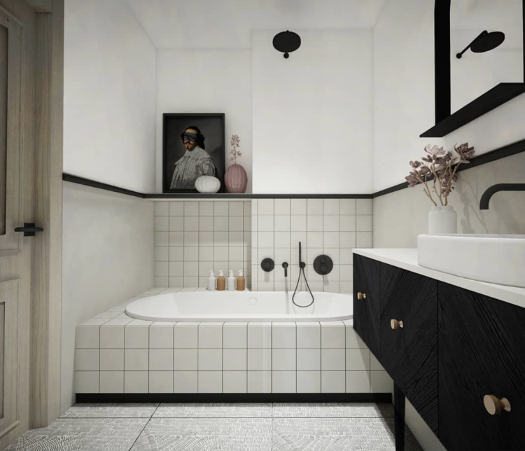
You can see a similar tile on the floor of the bathroom below which is a classic black and white until you get to the floor. The joy of tiles means that you don’t have to have the same ones on walls and floors. You can mix pattern and plain and different shapes and it all works.
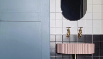
Above and below is are examples of very graphic bathrooms with square tiles. Hexagons have been fashionable for a while and won’t be going anywhere so don’t feel stressed about changing trends, but the new shape is square teamed with dark grout for a very graphic feel.
Note also that there are lots of black taps and fittings which have replaced brass as the new fashionable colour. That said, brass is a classic that had/is having a fashion moment so, again, don’t worry about trends. And if you’re still on chrome – as I am – then don’t fret about that either as it’s probably due a high fashion moment any minute now. The point being as long as you work out what you like and what suits you then it doesn’t matter about anything else.
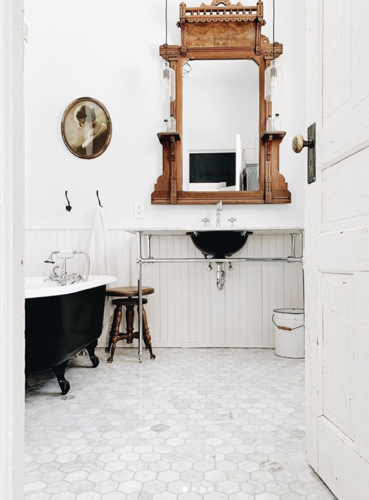
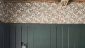
The bathrooms above and below are both very simple black and and white colour schemes but they work well to illustrate how different this look can be. Above is sleek and modern while below, with the vintage wooden mirror and wooden tongue and groove panelling is an altogether more rustic feel.
This is taking the vintage look right back. It’s a Tudor House that is available for location shoots (it’s in Sussex) via Amazing Space, but the owners have plumbed in an old tin bath so it has the look of an original rustic space but the convenience of running hot water. It’s pretty in a picture, I’m not sure about the practicalities.

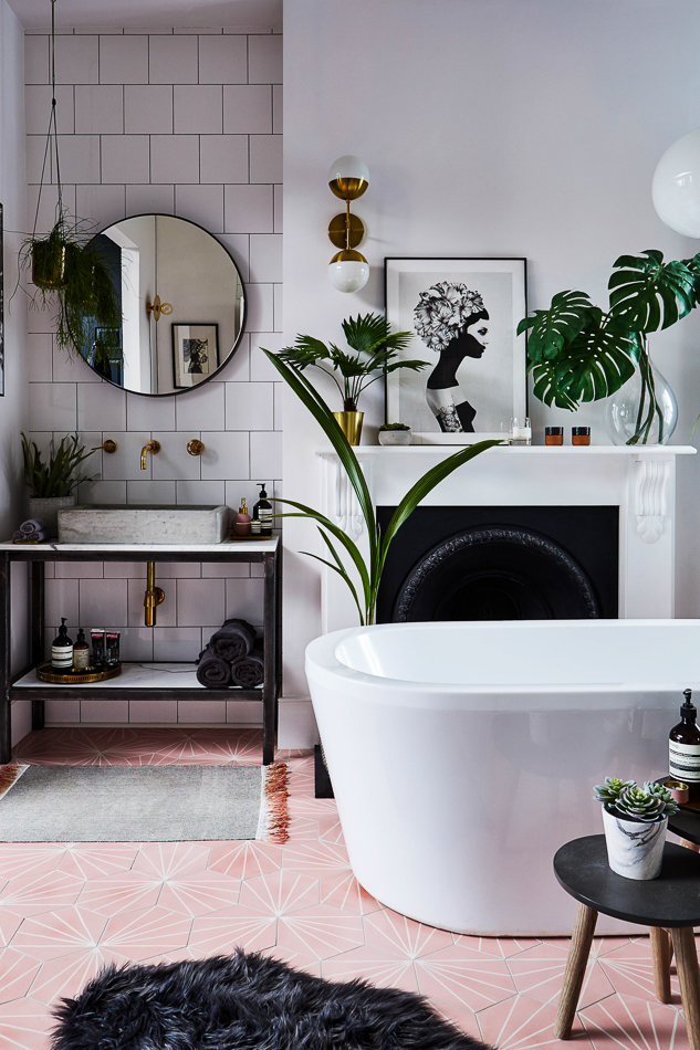
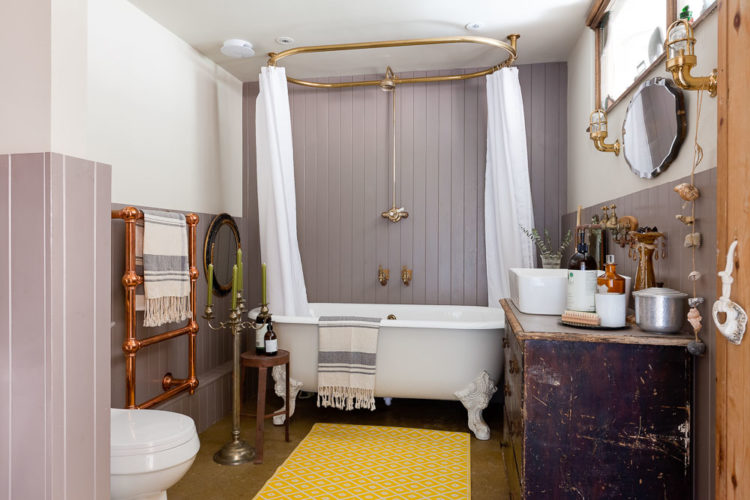
Finally let’s go colour. Because why not? We tend to shy away from colour in bathrooms and I’m not sure why. The key to getting a bathroom that feels like it’s a) yours and b) belongs with the rest of the house is to treat it like any other room. It doesn’t have to be floor to ceiling white tiles if that doesn’t reflect your style.
Here the owners have picked a sofa lavender shade and used tongue and groove instead of tiles. If you have a circular or oval shower curtain, there is no need for tiles. We did this in our last house but couldn’t find an affordable oval shower rail so we had a round one which made the shower space very small and there was always the danger of slipping, getting tangled in the curtain and pulling the whole thing down from the ceiling in a sort of Mr Beanesque type scenario. Looks pretty though.
Or what about this? The colour might be too intense for many of you but, as I always say, it’s about the idea. You could do the same thing with any colour you please. I imagine the standard lamp is also just for decoration although if you look closely at this there aren’t any taps so I’m not sure if that’s a functioning bath or a decorative set piece- this is also a location house.
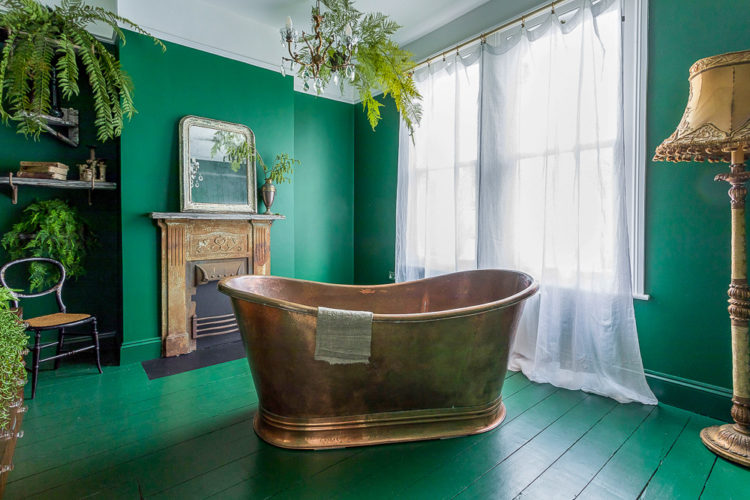
Anyway standard lamp or not, it’s about matching the walls to the floor in a wraparound colour scheme. What do you think? I hope this has given you all some ideas for your own bathrooms.
Love the blush floor in the second black and white bathroom!
Love the Nikki Bamford Bowes bathroom – gorgeous pink geometric tiles!
Wow, so much inspiration! I absolutely adore the Zellige tiles in the first one but I’d be worried I’d break my neck after getting out of the bath. I find my own bathroom so uninspiring. It was done a few years ago, before my taste had really developed, so I’m stuck with a practical but boring room. I don’t think I’d ever leave the bath if my bathroom was half as inviting as these rooms, so maybe it’s for the best.
Amazing bathroom examples! My favourite is the Home and Wood bathroom.
Love the Home and Wood bathroom! Stunning!