When I can’t sleep I decorate. Not literally but in my mind’s eye. I start with rooms I own and imagine methodically clearing them out to make way for a new design. Then, should rest still be elusive, I move onto rooms I don’t own. I might pick a style – this week it seems to have been characterless modern – and run through the rolodex of my brain mentally adding and discarding colour schemes and furniture styles to put a room together. Then I imagine being in the space, hosting friends and hanging out – it’s usually a living space. By that stage I am usually able to drift off, sometimes waking to wish that I really did own the room I designed in the dimly lit hours of the night.
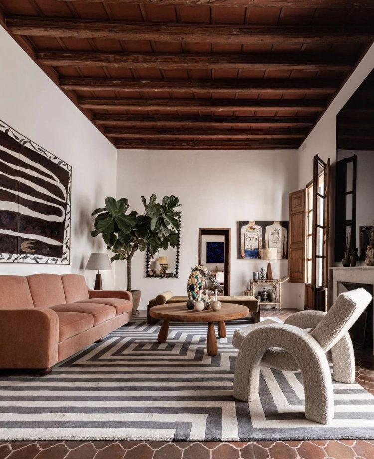
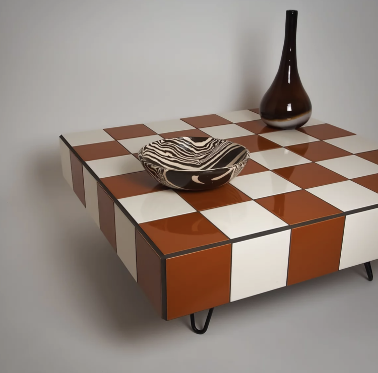
This has been the image that stopped me in my sleepless tracks this week. It’s the Palma showroom of a store called Dusty Deco. This was a good starting point for the midnight decoration as I have a sofa that is that colour. And I have a fiddle leaf fig that after sulking for the last six months has suddenly produced three new leaves. That felt like a start. Black and white (charcoal and cream) is always a good start for a room. Add natural wood and the accent colour of your choice, in this case terracotta, and the job is done. In truth this one kept me awake for long plotting how I can own a room like this. And then I found this coffee table by Ecru London and, well now I’m wide awake wondering where in my current house I can put it.
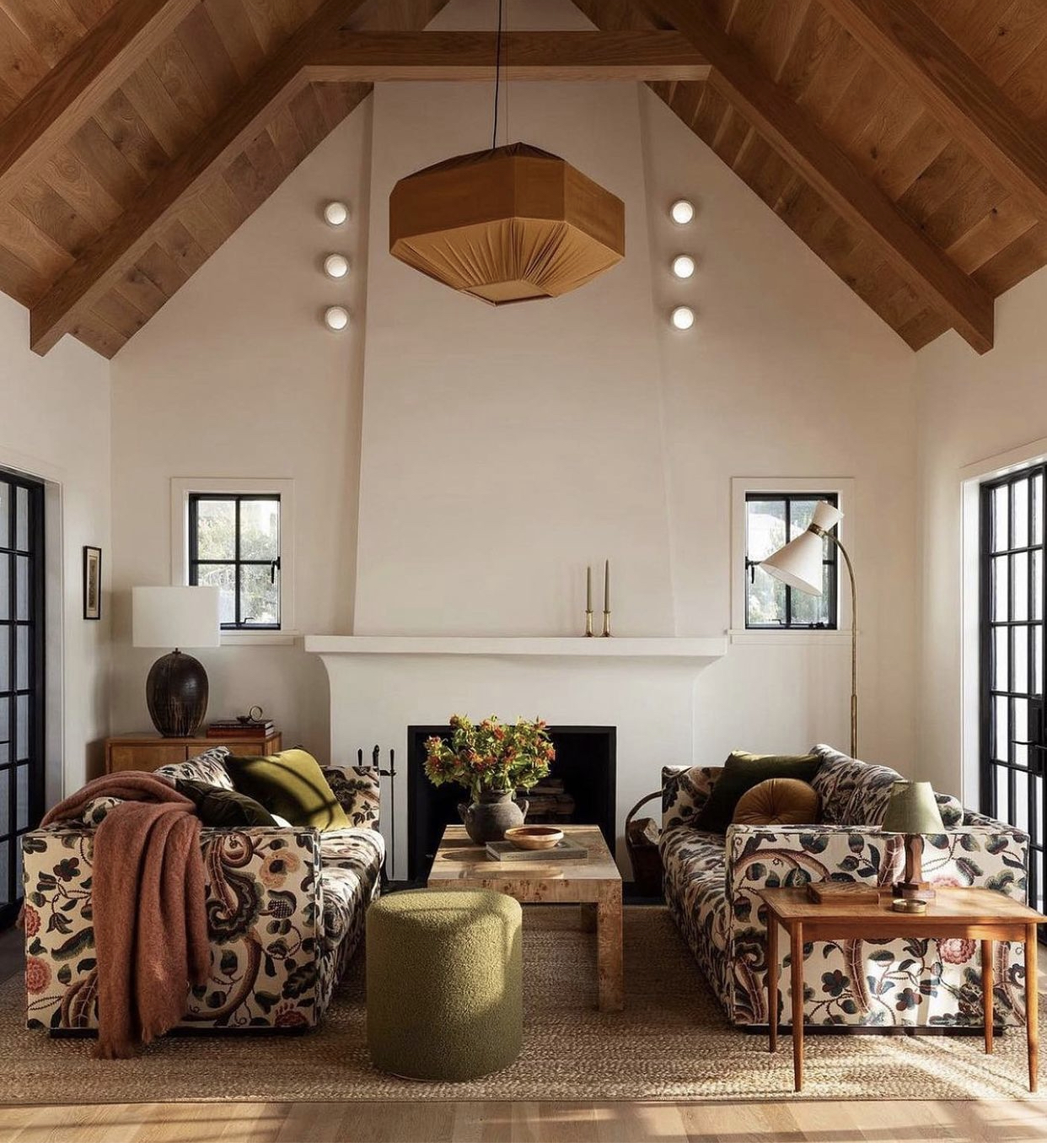
Turns out it’s quite the versatile piece too as in this, not dissimilar, room below the plain sofa has been replaced by floral against a similar neutral backdrop of warm wood and soft white and we all know how much a stripe and a geometric loves a floral so by this stage of the night I’m probably more awake than intended.
However, we should pause to muse on how rarely we see patterned sofas. I imagine the fear is that we will go off them, or they won’t outlast the decor. But I tend to find that if I love a pattern I always love it. And, I would venture to say that many of us are drawn to the same colour palette again and again. It might be different designs or variations of tone but the basic shades remain broadly the same. And, don’t forget that a multi-colour sofa will give you a multi-colour paint palette to pursue. And it hides the dirt and cat hair better than a plain one.
So, while you might start with the sofa below against a neutral backdrop, you could also paint the walls in several shades from pale pink to burgundy as well a different tones of green. You can add plain cushions to knock it back or patterns in similar colours to ramp it up. You could even go full House of Hackney vibes and see if there is a matching wallpaper – there often is – it’s a look that’s a little full on for me but for any raging maxmimalists out there it’s a strong look for sure.
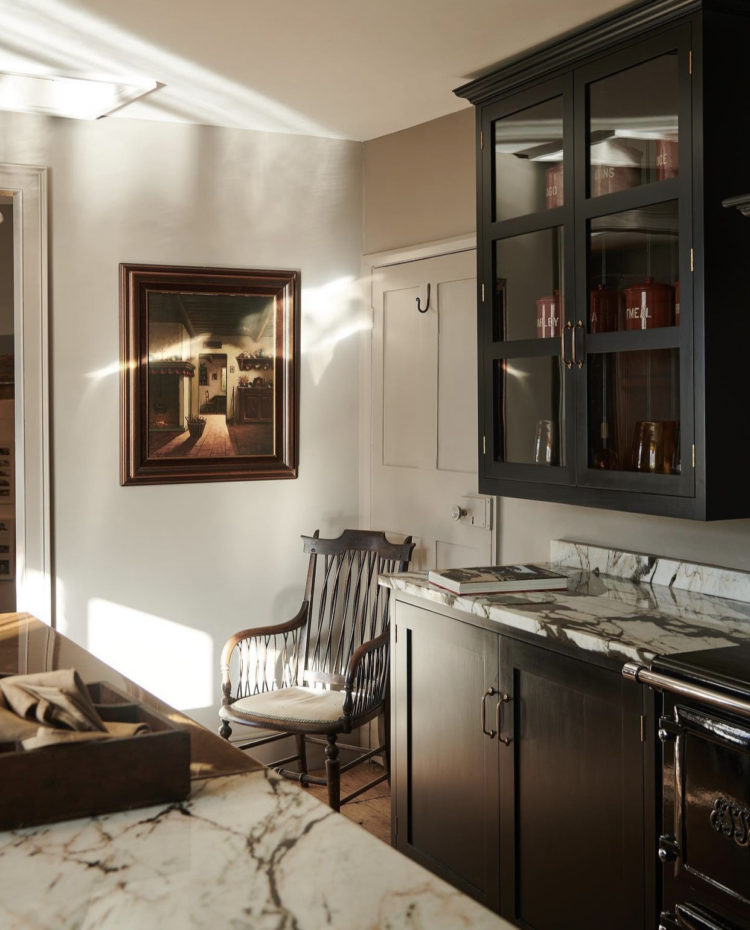
Calming back down with a look at this Devol kitchen. The last few years have a seen a real move towards painted kitchens – blue and green being the strongest contenders but yellow and pale pink are starting to emerge as well. But I’m going to stick my neck out and say that dark natural wood is also a look that is coming to the fore. This is either bitter chocolate or black but it allows the marble to really stand out while the glass fronted cupboards are as much display cabinets as storage. My kitchen has been dark chocolate for a few years now – perhaps I’m looking for justification but, be that as it may, there is one lesson we can all take from this.
If you are pondering the bold choice and bottle it you will often come to regret playing it safe. Once you get used to the new look you have created and the dialled down version of what you were contemplating before you felt compelled to be sensible, you will look again at the item or colour you rejected and wonder if you should have gone with it. I have a very subtle Caesarstone worktop in statuario maximus but how I gaze at Arabetto and wish I had been bolder. So if you’re hesitating between the sensible and the heart-stopping I’m going to suggest you seize your courage and choose the latter.
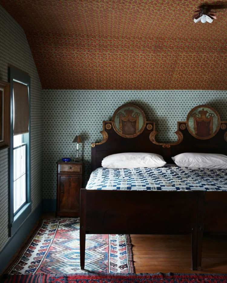
Moving to the bedroom – for some reason a room I never design in my head while searching for sleep although arguably it would make more sense. This, by Billy Cotton is the most fabulous attic bedroom I have seen in ages. If this doesn’t encourage you to make the most of your ceilings I don’t know what will. It’s clearly quite low. It’s clearly head-banging height for almost everyone except children and no amount of white paint is going to change that. Instead, embrace it. And note how the woodwork is also blue to match the wallpaper (as opposed to the ceiling paper). The only white in this room is on the bedspread and that serves only to highlight the delicate pattern on the walls. It’s back to the terracotta and natural wood only this time it’s paired with a soft turquoise rather than black and white. I imagine the design was inspired by the bed but you don’t have to have an incredible painted headboard to come up with a wonderful colour palette. And if you fall in love with a wallpaper you can always paint your headboard to go with it.
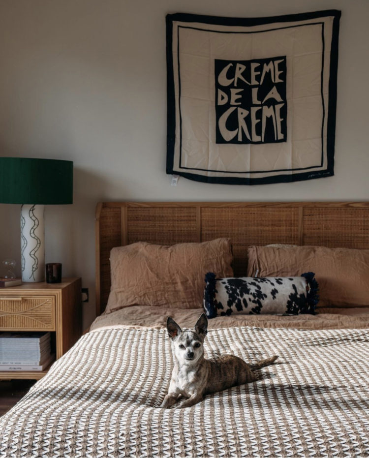
Another bedroom, this time by the stylist Emma Jane Palin (more on which below) and again, I just find this such a relaxing colour scheme. Here the terracotta linen pillow cases are pared with a rattan headboard and soft grey walls with a burst of emerald green as a disrupter. George the dog is also perfectly co-ordinated but he’s an optional extra.
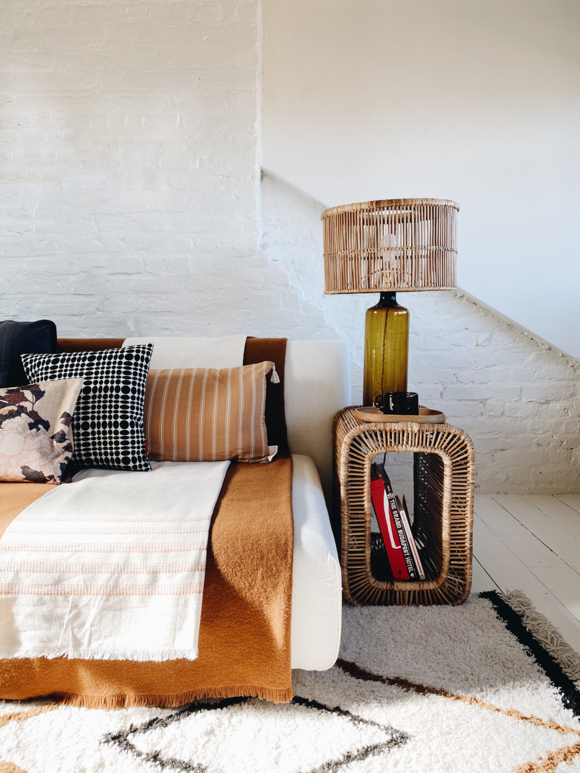
A couple of weeks ago I told you about Emma’s collaboration with Kalinko, who work with artistans in Burma to produce furniture and accessories. When I first showed you the collection it wasn’t online but now that it is I’m showing you again. I was sent the collection to photograph in my house with the proviso that it was a press loan and I would return it afterwards. Well I have found the coffee table so versatile and so perfectly suited to my house that I have bought it rather than return it. See it below pictured portrait style so it takes up less room if that’s an issue.
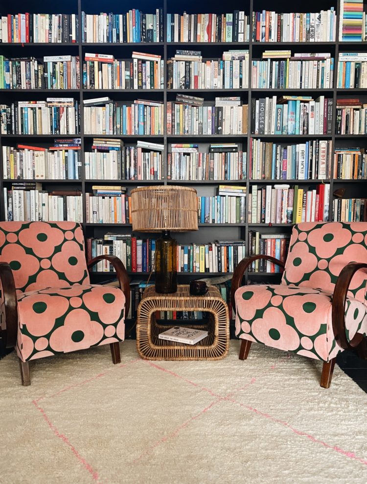
And below, breaking away from the terracotta theme of this post in my library between the two chairs where previously I was using a large pile of coffee table books as, well a table on which to rest a lamp. Rattan is making a strong comeback but it’s not restricted to garden rooms and conservatories. It works in two rooms of my house and would be equally good as a bedside table or in a modern building.
Perhaps if I can’t sleep tonight I’ll have to compile a list of beautiful rooms filled with great coffee tables.
Let me know how you get back to sleep if you wake up in the night.


Hi Kate! On a non-related side note, that opening paragraph was sooo delicious to read. My copywriting word-nerd alert was pinging. Truly beautiful writing to match truly beautiful interiors. Thank you for the inspiration. Hope you are well, Luena.
Oh you’re so kind. That makes my heart ping in return!
I go to bed so late I am dead when my head hits the pillow!
I concentrate on breathing slowly and deeply and picturing myself either walking through a corridor of very heavy, tall velvet curtains (like theatre curtains), having to push them out of the way, not rushing, or sitting in a warm forest with the sun filtering through the trees onto my face. Its taken a long time not to get frustrated by not getting back to sleep, but letting that thought go has been really beneficial to me.
I pray.
I count backwards from 1000, in French. The French makes me focus just that tiniest bit, to occupy my mind and keep it from drifting into more problematic territory; and a thousand is such a generous number that I never panic about what I will do if I’m still awake when I get close to zero. Plus the repentition, obviously (say it with me: “mille – neuf cent quatre vingt dix neuf – neuf centre quatre vingt dix huit…”)
I’m impressed. I couldn’t do this in English after 2am…
I do that, too. For some reason I always end up painting a trellis of flowers on the ceiling and down the top of the walls. I have zero talent for this, but it is clearly an obsession and I am going to have to do something about it at some stage.
You definitely need to win the lottery so you can buy a crumbling old 30 room mansion to renovate and decorate!
When I can’t sleep I watch old tv series that I used to love, but bore me now. Cheers from Canada!
I have to have the World Service on the radio to stop me thinking. Once I start designing in my head I’m doomed. Even been known to get up in the middle of the night and start moving the furniture around….it’s an affliction!
Thank you Kate! Some very beautiful rooms and objects.
That’s interesting that you design rooms. My trying to get to sleep strategy is much more passive and much less creative. Instead of counting sheep, I count the mirrors in my house. I mentally move through my house clocking each mirror and where it came from.
I count. I would never ever be able to sleep if I was decorating in my head! That is too much fun! So I count. 1-100 then 100-1 and then 1-90 and 90-1, 1-80 and 80-1 and down it goes. If I need more boring focus I color code the numbers. 1-10 are green, 10-20 are blue, purple, pink, red, brown, orange, yellow, white, gray and I need to visualize the numbers in my head. Anyway. Boring me to sleep always works!