We begin the week, as usual with a stroll through some of the beautiful rooms that have caught my eye this week. And first up, the picture of the vintage jelly cabinet that I mentioned on Friday.
Firstly – how pretty! But the point I made the other day is that it is narrow so it’s perfect if you want some storage in a tight hallway or small bedroom. A quick search threw up several on Etsy but they were under a variety of names and when I double checked with 1st Dibbs that did seem to be an American name so UK readers may have to stick to looking for narrow cupboards if they want to find something similar.
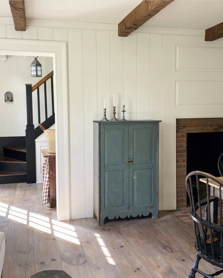
But that wasn’t the only reason I wanted you to see this. We speak often about the importance of a disrupter colour which is to be used when you have a stronger, more tonal colour palette and want to give it a shot of drama – a twist of black pepper if you will. Here the blue isn’t so much a disruption as a punctuation mark. The cream, black and wooden palette is calm and restful and very tasteful. The chalky blue cupboard gives it a focus. Any colour will do, but this brings the eye into the room and makes you notice. Once you have seen that you will look at the rest of the room. It’s a full stop, take a breath and look around sort of piece. This is a room that doesn’t want to overwhelm you but does want you to appreciate it.
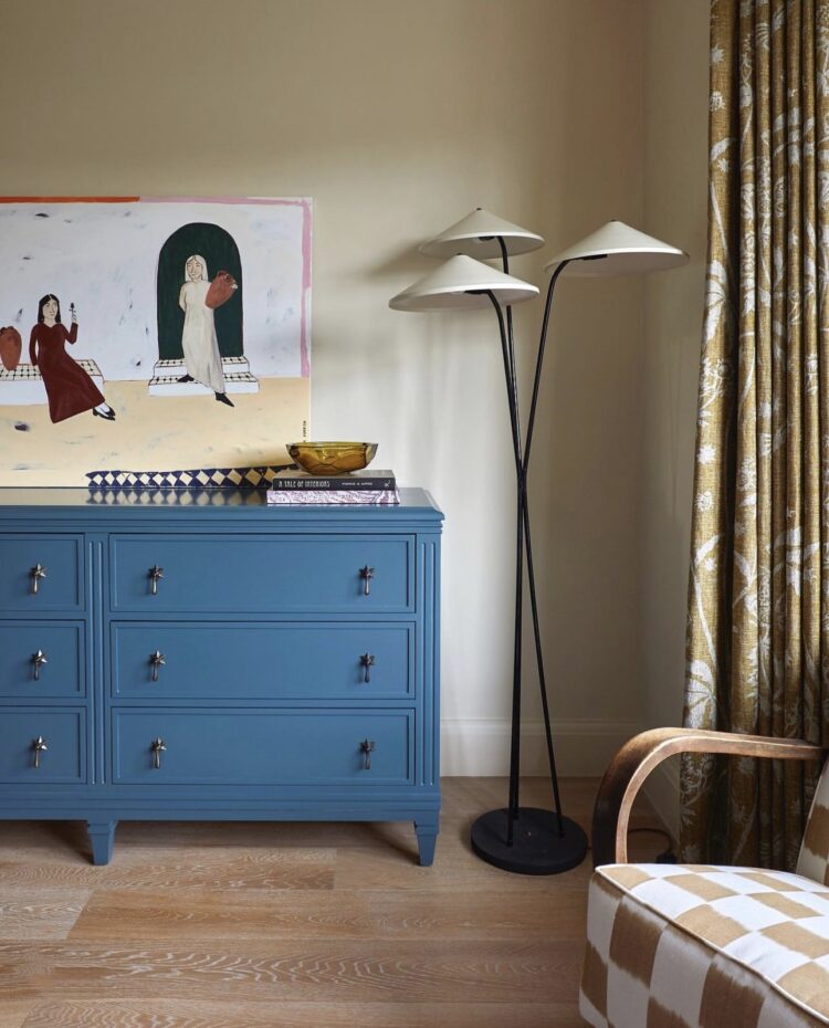
Similar tones in this room but using a stronger blue making it a little bit more disruptive, a little bit more attention-seeking if you will. And you can use the same techniques in your own rooms. A soft muted shade to just wake things up a little or a strong vibrant addition to shake it up.
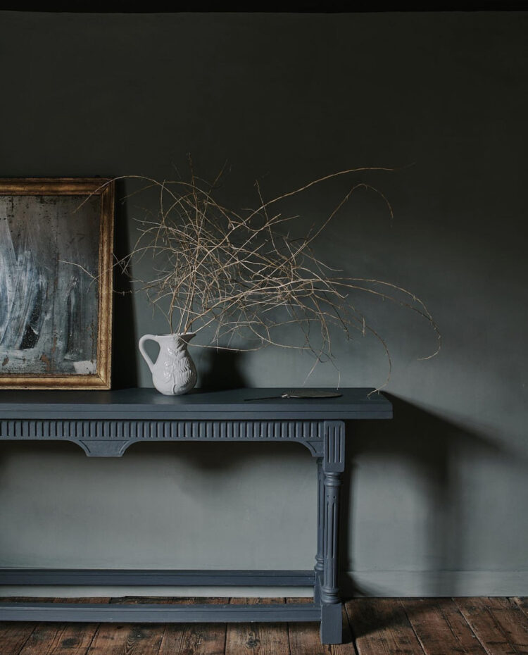
Diving into inky blues now with this lovely shot from Cassandra Ellis. She is a colour genius and her paints are lovely – I have used them. So, in contrast to the pictures above, this is a tonal colour scheme in shades of blue. It’s rich and luxurious and perfect for a hallway or a dark space that doesn’t get much light as you can really focus on the beauty of the colour. This is also a good technique in a boxy room with no special features. You don’t have to go dark but just pick a rich colour that envelops you and use it all over – walls and ceiling and woodwork.
Point one – the skirting board matches the wall. This creates a better backdrop for the table which has lovely detailing. A white skirting would distract the eye and detract from the table. Here the accent is in the simple white jug which acts like a spotlight and focuses the attention on the colours around it. Doesn’t have to be white – could be any colour you like or even any pattern you like. You could do the same thing with a huge vase of flowers.
It’s simple, bold styling and it can be hard to pull off when you are keeping it so minimal, so I’m showing you this for your own inspiration.
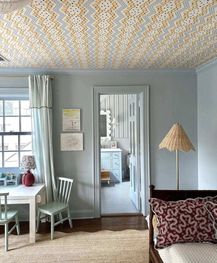
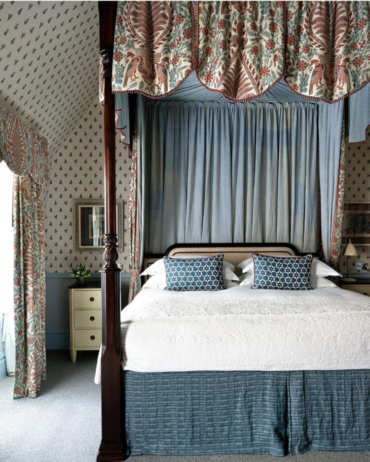
Back to the paler end of the blue spectrum but this time with wallpaper on the ceiling to bring the interest. Now firstly this is brilliant in a bedroom where the purpose of the space is to lie down, but it can also work well if you are a little nervous of pattern. Of course, you can paint the ceiling to match the walls (again tonal and relaxing) but if you want to venture into something bolder then the ceiling is a good place to start because you won’t see it all the time.
Yes it might catch your eye when you walk in. And again if you are lying down, but most of the time we tend to be looking at the walls (or other people) so a decorated ceiling can fade into the background and just send a shiver of delight when you look up while remaining content to stay in the background when not needed.
It’s the perfect example of taking a bold design decision in a way that isn’t scary. Sticking it to said ceiling is another matter, but we are here for the ideas and inspiration rather than the actual DIY.
Now this post has taken a slow journey from a muted palette with gradually increasing amounts of colour and pattern to this. A room at the new Covent Garden Hotel designed by Kit Kemp who is renowned for mixing up lots of different shapes and designs. And here you can see that you don’t need a disrupter because the pattern is doing the job on its own. It’s drawing the eye, leading it around the room and while there are different patterns in here, they all stick to the same tight colour palette which is the key to making colour and pattern clashing work.
There would be no point adding a different colour to the bedside tables as that would turn it into a straight clash and make it messy. That said, you could absolutely paint the bedside tables in one of the colours from from the curtains. So you could go blue to match the walls – or a little darker – so they recede – or you could pick one of the stronger colours from the curtains – pink or orange to make more of a statement. That’s not a disrupter but to bring it back to punctuation – it’s an exclamation mark rather than just a full stop.


I have come to dislike color schemes. As in, all of them. The minute I walk into a room (in noncommercial space, anyway) and know somebody used a mood board, that note of artificiality is struck. To me it seems like the best method is to choose a color family–bright, muted, richly saturated, whatever–and primarily work with that. Have one, maybe two colors that recur to tie the space together. To me, that’s the only way to make something feel both cohesive and natural.
Sorry, sounds like the lamp is going into a health facility, meant to type admiring
I am too busy admitting the floor lamp in the Stdio Duggan shot!
Love “Send a shiver of delight”… marvelous. Just moved into a new, open plan bungalow (in the US – and we eat preserves so maybe a Preserve Cupboard)… more color is coming!!!
thank you!
Traditional Cupboards like this are also used in France under the name of “confiturier” or “confiturier mueble”. Confiture means jam. My French friend has her mother’s old confiturier and keeps her spirits in it. Perfect fit.
Jelly is what Americans call jam, so you might have better luck searching for “jam cupboard”.
Love all those shade of blue!