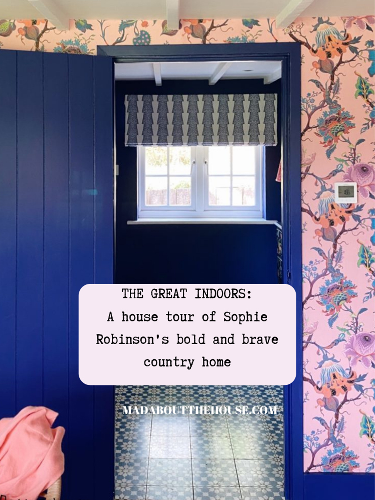
Yes she’s finally finished her house and since we have only met once since before lockdown (when we recorded at Skye McAlpine’s house, we thought it would be good to show the finished article. So welcome to a house tour with Sophie Robinson. Now you can hear the full story on the podcast so do listen there for extra details on how she creates her “room recipes” and now might be the moment to point out that The Great Indoors podcast has had over a million downloads and this is our 50th episode. So do give it a listen if you haven’t already.
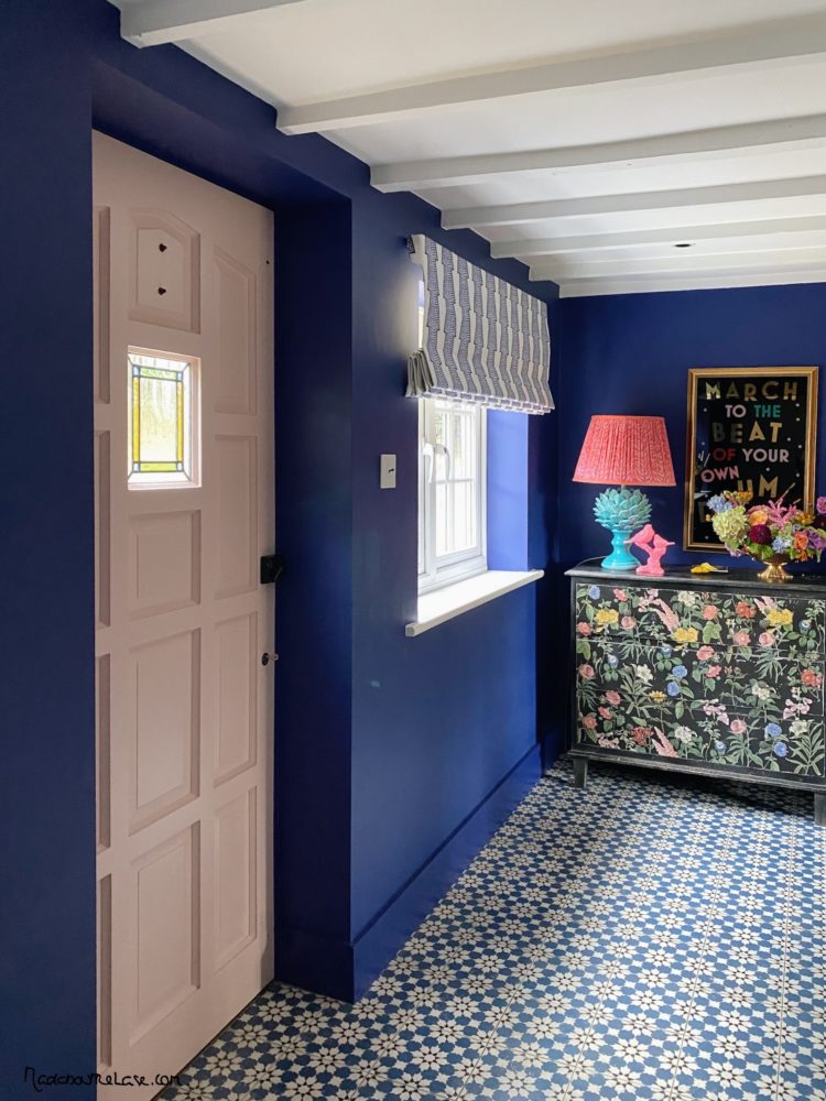
Now come on in through the pink front door (which no-one ever uses as they tend to go though the pink back door into the kitchen, which will one day soon be a tv snug as planning permission to replace the ugly 1980s conservatory with a kitchen extension has just been granted. Clear so far? Mud? I thought so… let’s break it up into a few simple guidelines on decorating with colour and pattern. And know that while Sophie obviously adheres to the bright end of the spectrum with contrasting and clashing colours her philosophy, outlined in her latest online course, also works for my quieter, more tonal palette too.
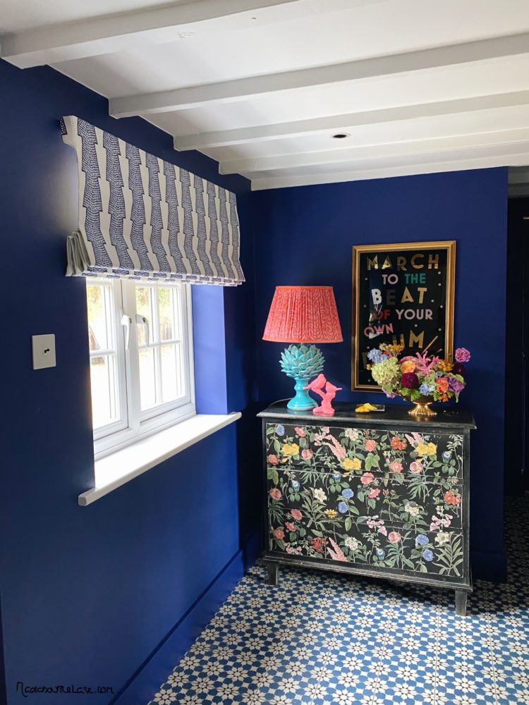
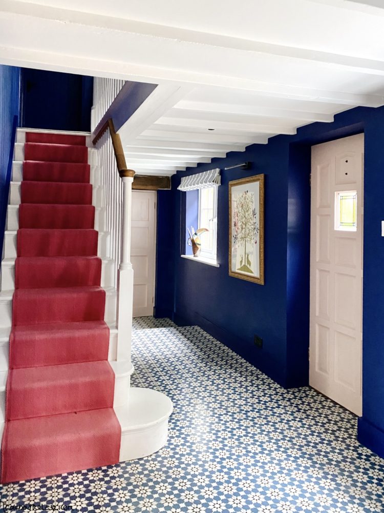
Before you leave the hall, which has featured on these pages before, note that the blinds are now up. And here I may take a moment to blow my own trumpet. In addition to writing and podcasting and stying, Sophie and I often chat all things interiors too and when she told me she was looking for blinds she said she wanted something bold and bright (of course) that would perhaps bring out the pink of the stairs.
And I said I felt that the stairs should be allowed to stand out in their own right (along with the painted floral chest) and suggested this lovely Spot and Stripe fabric by Ottoline Devries on the basis that the colours matched the floor and walls (blue, white and black) but it introduced another pattern (and Sophie likes to have around nine patterns in each room – count how many you have) but that also would work in the background to leave the stairs as the star of the room.
And I wanted to point that out to illustrate how you can tone down or ramp up a scheme even if you use lots of different patterns – in which case keep the colour palette very tight. And if you don’t want to use lots of colours and don’t like pattern simply replace the latter with a variety of textures and textiles for the same effect but quieter.
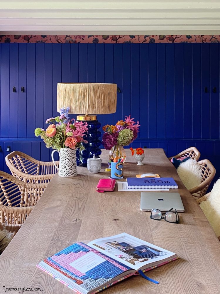
Now moving into the office and regular listeners will know that this was originally all white as Sophie thought that would be calming and inspirational and allow her to work with colour in her professional capacity. But this served to reinforce two valuable points when it comes to decorating your own homes. The first is that you must analyse how a colour makes you feel and, from there, if that is the correct emotion for the space you are designing. In Sophie’s case the white made her feel drained and empty and, she felt, actively prevented her from doing her job properly. The second is that it’s ok to take your time to get it right or to admit when it has gone wrong and allow that to inform your next move.
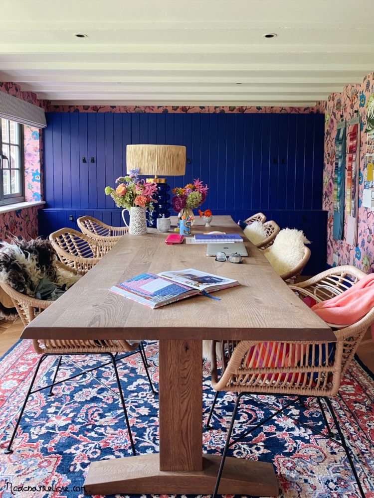
So out went the white and in came a high energy, high contrast House of Hackney wallpaper (in Amaranth pink) which she wrapped round all four walls. And again, while I could no more work in here than build my own shelves, Sophie now knows that in order to work productively she needs to feel energised by her surroundings. I like to feel calm.
A point, because it never gets old, about the feature wall. If you have chosen a vibrant pattern, a feature wall doesn’t say “look at me with my confident, bold, brave design choices” it says you weren’t quite sure if you had done the right thing.
And if you weren’t quite sure if you had done the right thing was it the right choice? Perhaps it would have been better to have plain walls and use the fabric in the curtains so you see more or less depending on the time of day. Or to have lined the cupboards so you see it only when the doors are open? Or, perhaps, to have put it in another room altogether where the emotion is better suited to the mood.
I have often come across people who fall in love with a pattern or a colour and then don’t use it fully because they are afraid it’s not sensible, or they will go off it, or it’s too much. Listen to your heart. Everyone who hangs back for these reasons ends up wishing they had been braver at the outset and plotting to redecorate.
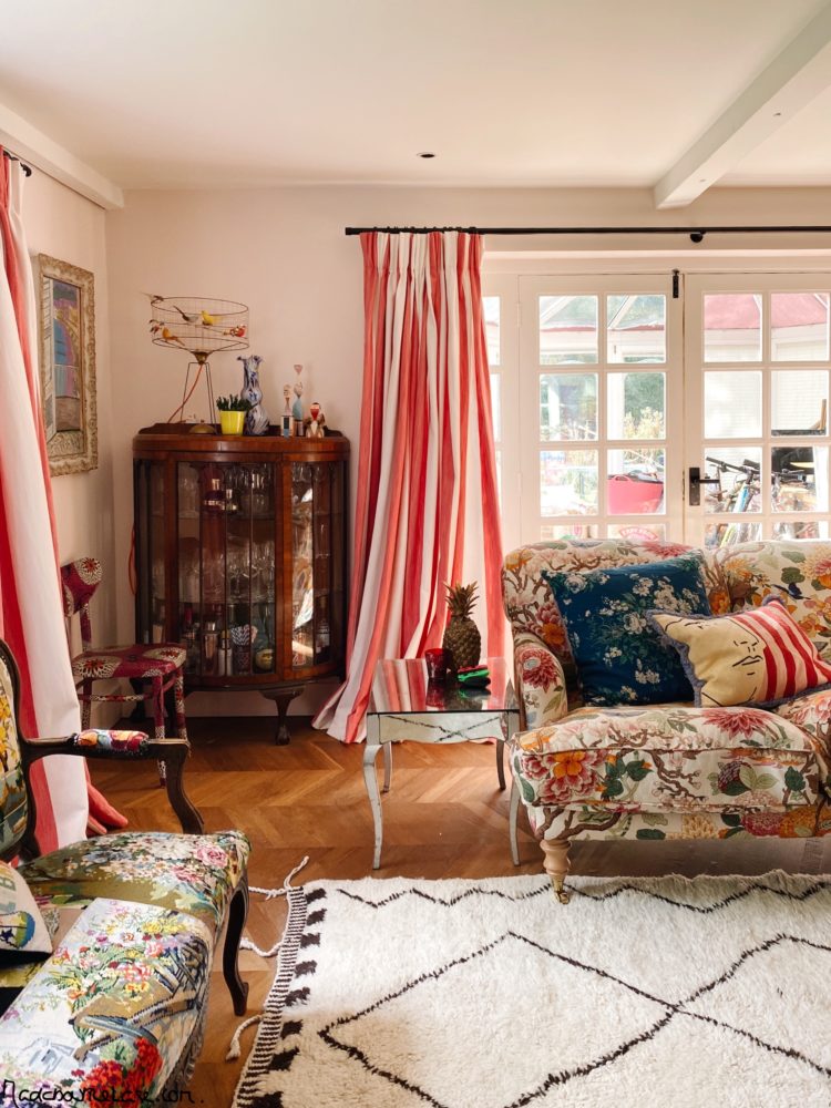
Moving into the sitting room where you can see a riot of patterns but again the colour palette is restricted. The two sofas are completely different, but the colours are similar and it’s the same with the cushions. And, as Sophie says, a good sharp stripe does slice through all that pattern and bring some edge to it. A bit like adding lemon juice to a really sweet sauce or black pepper to strawberries (try it).
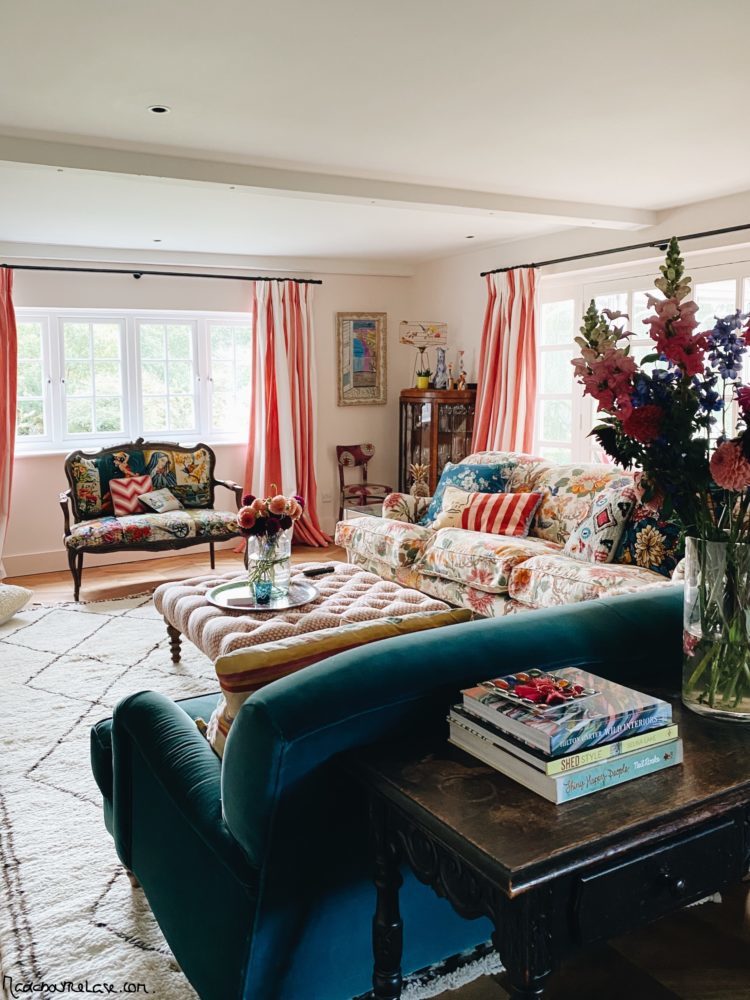
You can see by now that Sophie’s room recipes will always include a floral (several) a stripe and a geometric. Her base colour palette is blue, pink and yellow but the tones vary from mustard (coming to that upstairs) to washed out ecru and cream. She will also add accents of orange, lime and all shades of green. I might have just as many colours but they will be more tonal so I have eight shades of pink in my living room for example. You take the basic recipe and season to your taste.
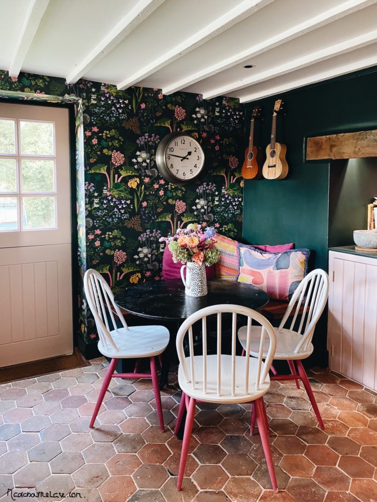
Finally we come to the kitchen where the floral red thread remains and eagle-eyed viewers will note that this wallpaper was originally painted but now a built-in bench (with a dog bed underneath) has been added so the wallpaper has been finished and wraps the whole room.
Another point to note if you are choosing to decorate in dark colours is that you should do the windows dark as well (scroll back to the office to see). A dark window frame will disappear into a dark colour scheme and draw your eye to the view beyond. Sophie’s windows, by the way, are UPVC and perfectly paintable as long as you prime them properly. She used Zinsser 123 with Little Greene for colour but Little Greene now sell an all surface primer so you can use that if you want.
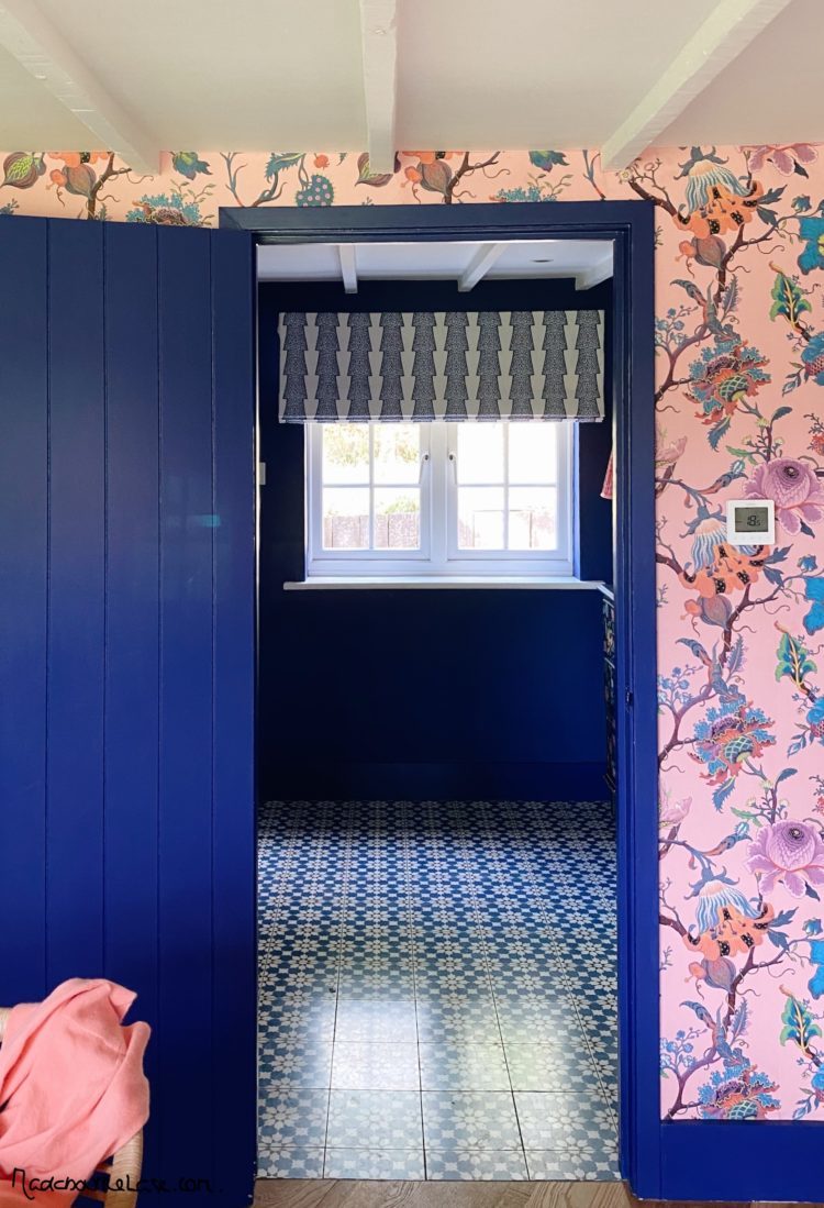
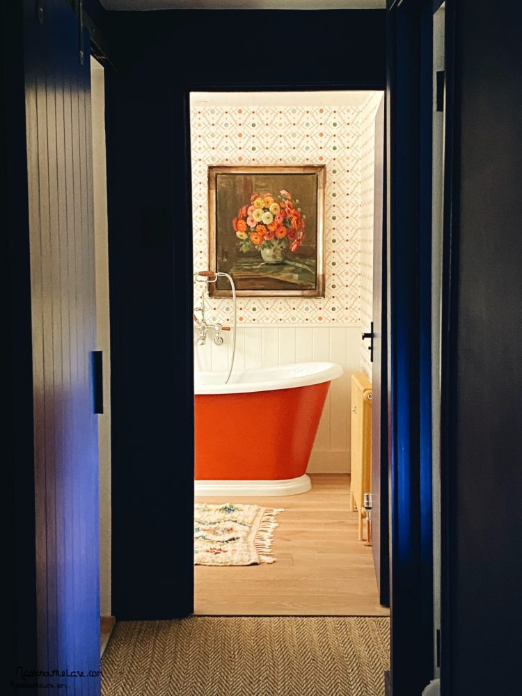
A word here – at the bottom and top of the stairs. Don’t forget the view as you walk past rooms with open doors. Above is an obvious framing of the window from the office but below, Sophie deliberately hung the picture off centre so it would be visible from the landing outside and create its own framed vignette as you walk past.
So here’s the rest of this bathroom. And this is a classic example of why you should never decorate a room in isolation. Each room is part of the whole and here you can see how this room perfectly fits with the rest of Sophie’s decor. The paler pinks and yellows from downstairs have deepened to red and mustard but there is pink in the wallpaper and a Moroccan rug is another red thread.
There is a wooden floor and the first point to note is that if you buy a new wooden floor for a bathroom, the manufacturer may refuse to put it under warranty. But if you aren’t bathing splashing toddlers and you think it’s fine for your lifestyle then that might not be an issue for you. And if you do want a rug as decor in a bathroom then you can always put a mat on top when you have a bath as rugs take ages to dry.
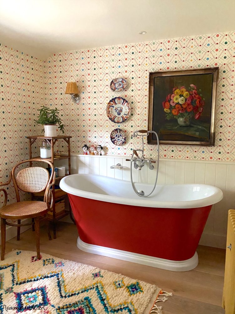
This room has essentially been decorated like a living room with a bath instead of a sofa. Wall lights and vintage furniture complete the look. There’s no loo in this bathroom (that’s in the tiny wet room next door) but you could have moved the bath over a little and put one where the shelves are.
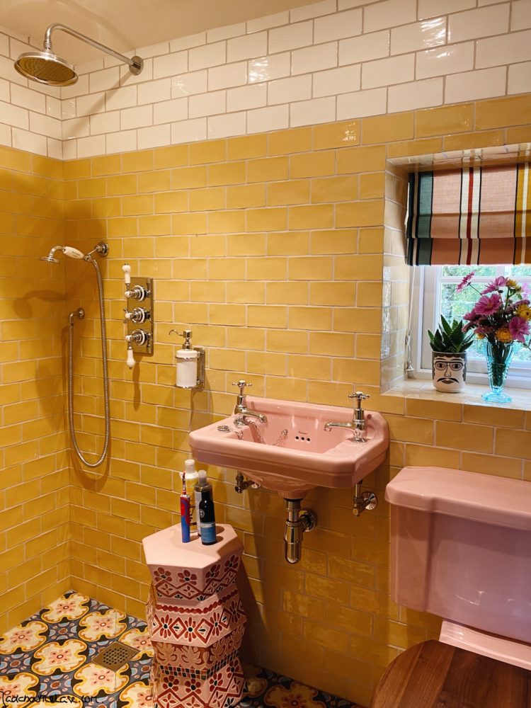
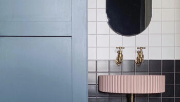
Into the wet room and the key point to note here is that it is about 1m x 2m and you can fit it a generous shower, basin and loo if you can have a sliding door. There is no space for a shower screen, but the water will only go as far as the basin while the loo and towels stay dry.
If you are thinking of squeezing in an en suite you can do it in a space this small. If you can spare one metre at the end of a bedroom then consider adding an ensuite. If you put the sliding door in the middle you will then have a view of the basin rather than the loo, which then remains tucked out of sight.
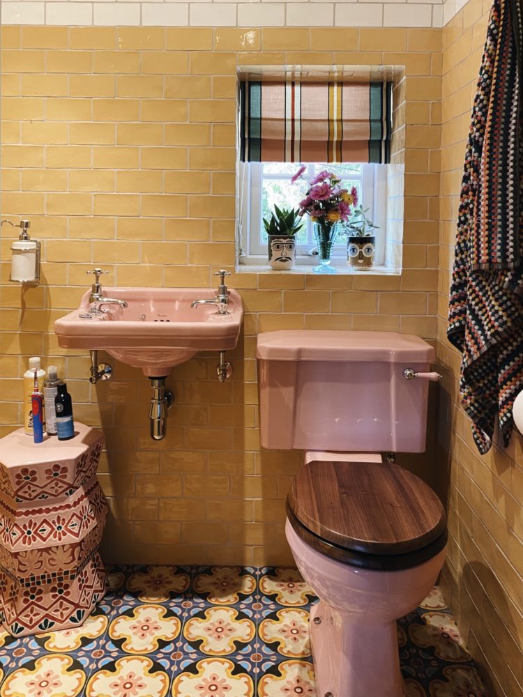
And if light is an issue (Sophie has a window) then do what hotels do and replace the top part of the wall with glass which will be high enough to keep it private but will borrow the light from the room or landing next door. Imagine if the white tiles were clear glass for example.
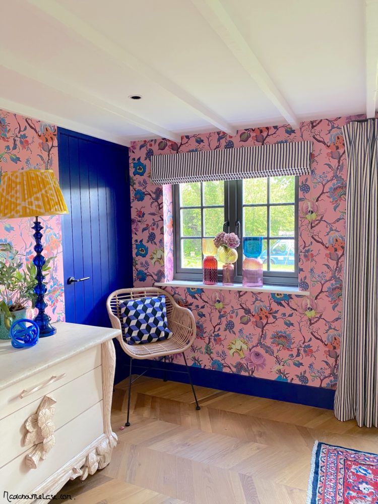
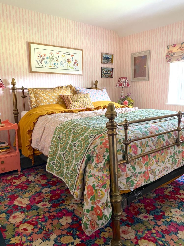
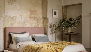
Finally the spare room, which might be my favourite room in the house despite having the most patterns and that’s because the colours are all very soft and muted. This is classic English country style whereas downstairs it’s a little more punk chintz.
So there you have the tour. We will return when the kitchen is built. Below a summary of mine and Sophie’s different styles reflected in our clothes, while it remains only for me to say that Sophie’s latest online course Bold, Brave and Beautiful Interiors launches today. It includes 54 lessons with video and downloads and how to create your own room recipes in colours that work for you.


While I admire the skill behind this, I could never live in such a riot of colour and pattern. I find it exhausting just looking at the photos. It’s a good thing we are all different.
Thank you for showing the “typography” in the guestroom : ). YOU & SOPHIE ARE SO INSPIRINGLY FUN. Thanks for brightening my world.
Exhausting!
Favourite room the bathroom where I would need a long soak .Would have picked one of the dark spot colours in the wallpaper and painted the lower cladding of the wall to contrast with the lovely bath colour. Also wouldn’t mind a lie down in bedroom.
I love seeing pattern in clothing on others but shy away from it generally myself – admire Sophies boldness and in these dark times maybe we all need even a pinch of pattern to cheer us up.
Everything about this house makes me happy. It’s very inspirational.
I’m with you Kate. I would stay for the night in that guestroom and wear my dark glasses throughout my visit!
The photo of the pair of you illustrates the obvious attraction of opposites.
I have been coveting the wallpaper by the dining room table for a while now. Planning to put it in my utility room!
This is a wonderful post. My taste is much more subdued than that of Sophie’s. That said, I so much appreciate your commentary and understanding the global vision. Very useful.
The tiny wet room is just gorgeous. I love the colours
Gorgeous use of patterns and florals.
Joyous! My house was very Kate in colour but I’ve been heading to the Sophie side over the past couple of years. This weekend I’m going to paint the living room walls pink and recover a sofa with green velvet. I feel a search for a mad floral throw or cushion coming on and some striped curtains. Mustard yellow is my red thread. I’ll listen to the podcast with my coffee – very timely!
Sophie has such an amazing way of working with colour. It’s so lovely to see these lovely colourful rooms in her home. The bathrooms are my favourite.