Now it was only when I was deciding to include these two houses this week (yes a double treat) I realised that it might have been a subconscious design to create a contrast with yesterday’s post which was all about colour. Never let it be said that this blog doesn’t try to cater for all of the people all of the time… no I said don’t say it. Also, deep breath, these houses are both by the sea and as summer is busy packing up her sandals and getting her sweaters out for winter it felt like time for a trip. And I hate to mention it but the idea of a second lockdown by the sea is rather appealing. I had a meeting with my publisher the other day (next book next March 2021) and she told that that swathes of houses are for sale in London as people flee to the country. So, with that in mind we are off to Suffolk (£525,000) and Kent (£750,000).

First to Kent and this house in Camber Sands, which is on the market with The Modern House. The sea lies at the bottom of this garden and it belongs to the stylist Atalanta Bartlett. I remember seeing this house on the cover of one of Living Etc’s all white issues several years ago and loving it. Atalanta talked about decorating with all white, despite having three sons (she now has a daughter as well) and showing that it was all about layering textures and materials and different shades of white to create a relaxed easy look. It’s such a contrast to the rather more straight-laced White Company style, which has always struck me as involving a lot of regimented cushions and ironing.

This, however, is relaxed beachside and, for me at least, the perfect coastal look. I find the classic blue and white a little cliched with its shells and rope lights but perhaps it’s actually the difference between that American Hamptons beach look and the more relaxed, oh never mind if the dog is on the sofa, English version.
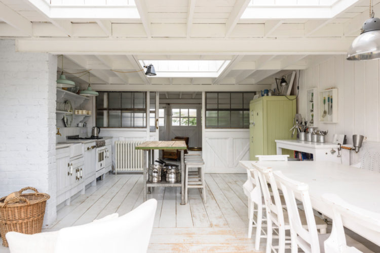
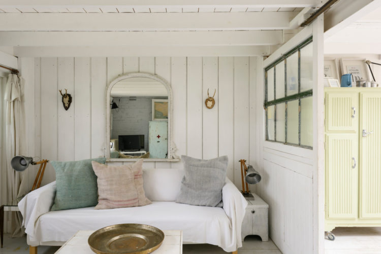
So the first thing to note is that it isn’t all bright white. The furniture is vintage, some of it painted and there is the odd splash of muted colour – the green cupboard above, a pale blue one elsewhere. Colour is also brought in via natural wood and rattan and industrial style metals.
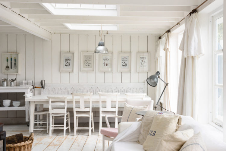
But the overall impression is light and bright and white with lots of windows to connect you to the view while the natural, reclaimed materials remind you of the nature outside.
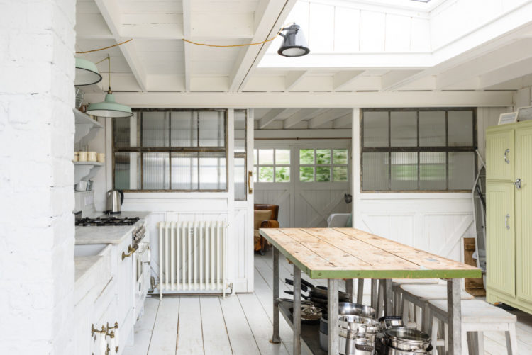
There are four bedrooms, one of which has a two sets of built-in bunkbeds so it’s a house for friends and family to come and hang out as well as there’s plenty of room. The large square living space has been divided by a half wall against which the kitchen is set and that creates a U-shape which also means there are different zoned seating areas so not everyone has to feel they are in the same room.
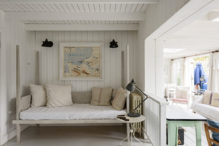
So above is one corner to hide in – imagine curling up here with a book out of sight of everyone else – while below is the other one at the end of the kitchen behind the sliding doors. And if you closed the doors and kept your head down (literally below the level of the glass) you could hide out here for a while too.
Would I change it? Well therein lies my dilemma; half my brain is all calm white interiors and the other half loves a bit of dark drama. What I need is a holiday/weekend house to contrast with my town house.. Oh…Shall we have a look at the next one?

This is in Woodbridge, Suffolk and is also on with The Modern House. It’s about half the size of the one above with a bedroom and bathroom on the lower ground and top floor and the living space on the first. Woodbridge is highly sought after and the views from every room are lovely.
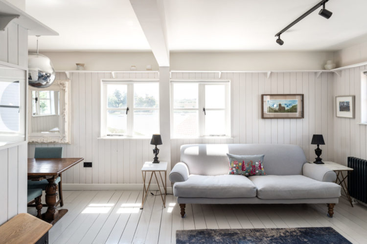
You can see this is a very similar look – wooden floors and tongue and groove walls and a very neutral palette but it’s slightly more formal than the house above. I think you might rush in all sandy in the first but here you might stop to take your shoes off and brush the sand off your knees.
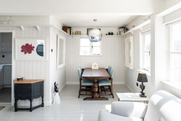
So if you like this look you can look closely and learn from them. The former is loose covers, relaxed linenti and rustic furniture, this is fitted covers with more symmetry and antiques or painted furniture. It shows you how even with very restricted colour palette you can create two different looks when you examine the details.
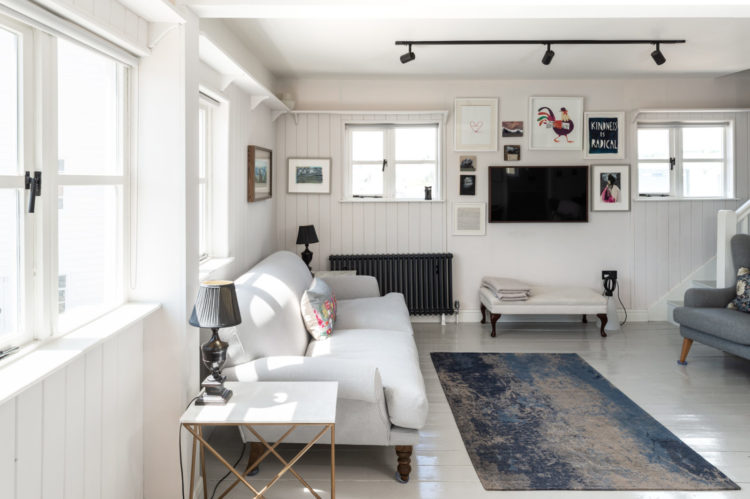
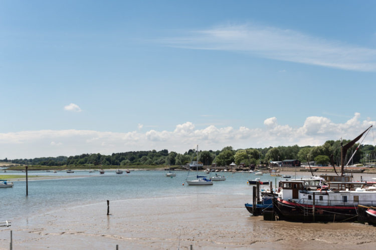
So I’ll leave you with that thought and this view for the weekend. Are you team white like today or team bold like yesterday?



Interesting, information shared is useful.
Don’t forget you have an international audience and down here in the Southern Hemisphere we are just going into summer so this is the perfect timing for this post. I’m team white but like a lot of the other comments I sit in the middle of these two styles – I like a loose cover I can chuck in the wash but I also like a bit of formality too. I’ve got polished floorboards, white sofas, sisal rugs and wooden furniture ( brown and stripped) . Most of it we’ve had for years and has sentimental value – would I buy it if I was styling a house from scratch? Some of it Yes – but some no. One thing I definitely wouldn’t buy again is sisal – which stains terribly. Don’t buy if there is any risk you will spill a cup of tea on it or the dog will be sick on it. And definitely don’t buy it for a laid back beach house unless you like the water stained vibe.
Team drama. But I love the all white with various textures and I also love yesterday’s color explosion. The two houses are lovely. I enjoy what seems to be the seclusion and the rustic nature of the first, but also like the smaller size of the second and the brick wall in the bedroom. I am also loving deVol kitchens and really love their dark monochromatic paint schemes. So I am imaning house 1 painted in a BM polo blue with sea glass greens for accent.
Different shades of white I might be able to live with but up here in Scotland where the light is different every day might struggle to feel warm – sprinkle if baby powder apparently takes all the hassle out of sandy feet
I cant choose!
For inspiration I think that all three have their moments.
I love the floral patterns matched with stripes in Sophies home.
I love the green border on the wood table in the first white house.
I love the dark wood furniture with the white in the second white house.
And inspiration is what I want so, thank you!!!
Love the more relaxed look but would need to add more pops of colour. My home is white with natural wood and rattan with pops of colour in artwork, cushions etc – I am even thinking of decoupaging my wooden dining chairs to add more colour.
I live on the north coast of Cornwall and was going to order a duck egg blue kitchen until the sales person said “oh yes, alot of the holiday homes and Airbnb’s have this colour as its a seaside theme” which immediately put me off. Made a snap decision two minutes later to go with a sage green and haven’t regretted it.
Team white here too but with just a tad more colour. Good timing on this post as moving to the coast later this month. Well, it’s the Bristol Channel really but it’s got the second highest tide in the world so that’ll do me! Thanks for this, I shall take note.
Team white here! Loose covers a bit too relaxed for me so I’m off to Suffolk.
I think I am in the middle! I love both Sophie’s use and mix of strong colour and these white interiors. I have elements of both in my own house: I have rooms with bold colour but I also have an all white loft bedroom where I sleep. However this very calm neutral white room is decorated with artwork in bold colours, brown antiques and plants.
I think I would love to stay in either of these houses for a holiday, but I’d need more bold colour alongside the white if I lived in them all the time.
I have just signed up to do Sophie’s Bold Brave and Beautiful Interiors course. In this gloomy autumn of this awful year I felt I really needed an injection of colour to cheer me up (also bought a fabulous gold cardigan yesterday!) – the power of colour!!
Oh…. your observations about both the White Company and the blue n white n rope nonsense are PERFECT 😂 Love Atlanta’s house though sure I would ruin its singular beauty.
Beautiful! I am team white all the way. Especially when you can hear the sea!
Team White with plenty of vintage furniture