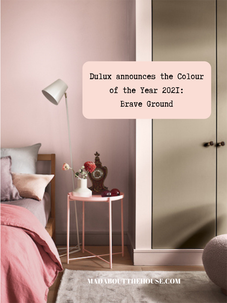
So then this Brave Ground shade which is the Dulux Colour of the year 2021, which caused much consternation before it was swiftly followed by the deep plum which was revealed as the Graham & Brown Coty.
I said I would come back to it as I have covered it every year since Denim Drift in 2017 and while it’s always a little controversial, this year it seemed to be more polarising than usual. Perhaps that’s just a sign of the times. There seems to be no middle ground in anything any more. It’s yes/no, black/white, right/wrong… there’s no nuance left. Anyway, that’s a different blog. Back to the colour.
Yes, it’s brown. And many, many people are cross about this. Firstly, let’s remember that its point is not to cheer you up after a rubbish year and if you would rather slather your walls in uplifting yellow (included in one of the Brave Ground palettes actually) or bright pink (likewise) there is nothing to stop you.
The panel who chooses the Dulux COTY (which includes Marianne Shillingford, the creative director of Dulux and Michelle Ogundehin as well as forecasters, design specialists and editors from around the world) looks at trends in social media, fashion, architecture, politics and the environment. It is as much about a colour that represents the psychological state of the global mind (Akzo Nobel is in 80 countries) as something to put on the walls.
And in that sense Brave Ground is the perfect choice.
On the one hand it is simply a continuation of the move towards warm neutrals – natural wood, cane, rattan are huge trends – that has been building for the last couple of years (replacing those ubiquitous cool Scandi grey and white tones).
On the other it is, as the name suggests, a grounding colour – a quiet, yet warm neutral that supports all the other colours but also suggests we need to have our feet firmly on the ground if we are to make the changes needed in the world. Last year’s Tranquil Dawn was anything but, but perhaps it did herald the need open our minds to the need for change.
Maybe Brave Ground means we are ready to start that work. As Marianne said: “The trend forecasting process is connective through the years and so this follows through [from last year] we need to look after ourselves and the planet and each other and Covid hasn’t changed any of that.”
She describes it as effortlessly elegant and the “mother earth” of colours that is instantly familiar and soothing. But just like mothers, it is a quiet supportive colour that works to show off other colours to its best advantage.
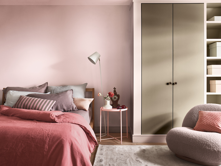
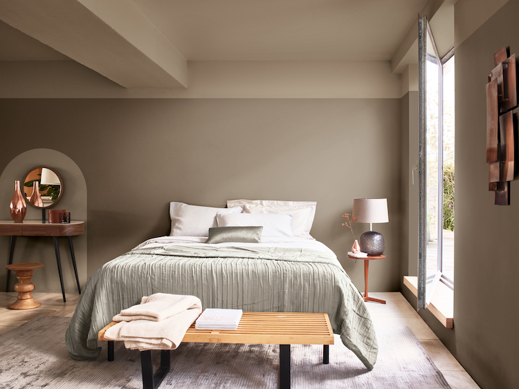
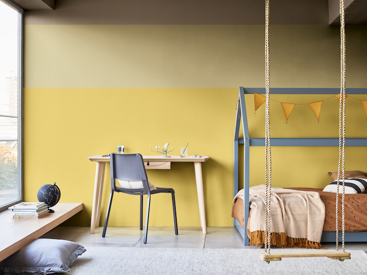
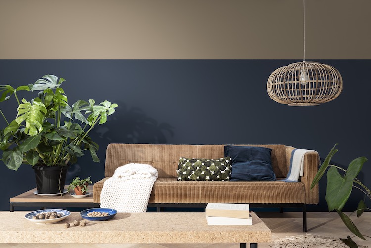
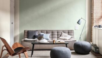
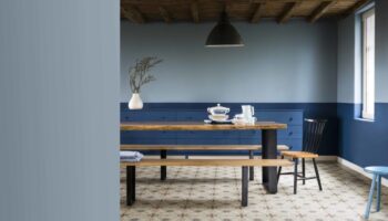
And, as these pictures show, you can see how it works with a spectrum of colours from yellow and green to pink and blue. Or you can pair it with similar shades and build up a room in shades of soft earthy tones. And how many times have I written earthy neutrals over the last few years?
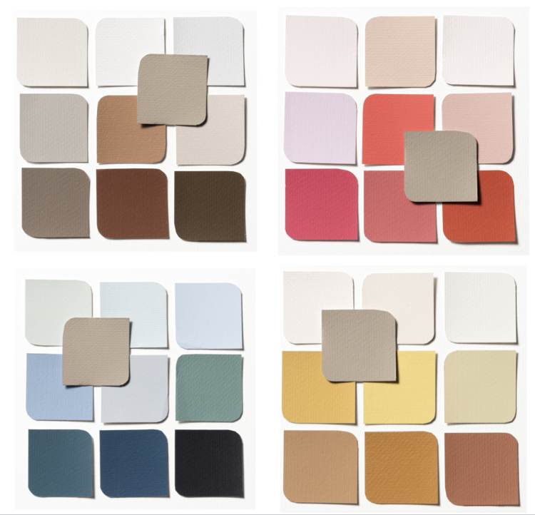
There are, as always four palettes, consisting of 10 colours all of which complement each other. Expressive is pinks and soft reds (berry rose, stolen pink and pink sandstone) and even a lilac (cosmos flower), which is a shade that has been bubbling up since last autumn and looks gorgeous with brave ground as does the very pale soda pink.
More grown up is the Trust palette with all shades of chocolate to putty which segues to the slightly brighter Timeless where you will find the aforementioned yellow (Harvest Dusk try it with Tissue Paper) with some richer browns and golds and finally Earth colours which includes some gorgeous navy blues – Cobalt Night, Mysterious Teal and Fallen Wildflower – all of which again work with Brave Ground.
It’s supposed to be a reassuring colour that reflects the strength we can draw from nature and our growing desire to align with the planet.
“As a result of the global pandemic many people’s priorities are shifting significantly, to focus much more on their well-being,” said Marianne.
“Colour can play a significant role in this – and with the calming, restorative and natural tones of our ColourFutures 2021 palettes we hope to empower professionals to create spaces where occupants can reflect, recharge and recalibrate.”
“The past year has seen how we live and work utterly transformed,” said Heleen van Gen, head of AkzoNobel’s Global Aesthetic Centre in the Netherlands.
“We have gone through the most uncertain of times, so it’s understandable that we see reassuring, natural tones returning, which can be used to create the calm and sanctuary people require.”
So what do you think of it in context? It is the perfect neutral? Will it be the new grey? Or are we still looking for that uplifting yellow?
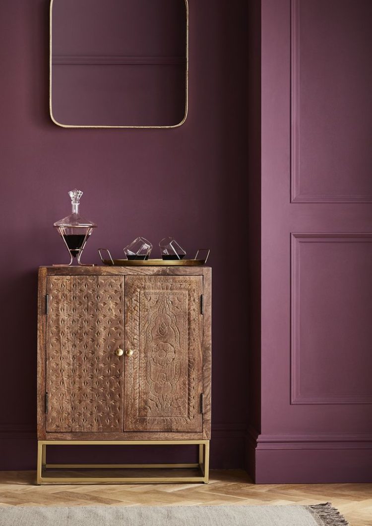
And what do you think of Epoch by Graham & Brown? Both of these are colours that are found in my own house and while I don’t have burgundy walls and probably wouldn’t have the wallpaper, I have plenty of cushions and textiles in both those shades all joined with the pales of pinks and natural linens. It’s like living in a giant slice of Neapolitan ice cream and I have to say it’s working for me.


It’s been quite a controversial one that has sparked a lot of debate. I wasn’t immediately drawn but I don’t hate it. I think it really depends how you use it. I’ve seen some some images with it that I really love. If it is a colour that resonates with you, you can make it work.
Lily-liver Ground; not as brave as it likes to make out down the pub.
Epoch; I’ve accidentally put an aubergine through the hot wash.
I do, however, love your writing.
Brave Ground not only supports other colours, it stands at the back of the room, tall and fluid. When one sees it,
there is an instant recognition of something warm and comforting offering shade and rest.
When I was about seven (early 70s) I was allowed to choose the colours for my tiny bedroom. The neo-Victorian look was big then, so I picked deep chocolate brown walls and a purple very like Epoch for my painted pine furniture. I had to live with my oppressive, gloomy choice until I left home aged 18. Perhaps that’s why I’ve picked light, uplifting colours ever since. Brave Ground is much more up my street.
I couldn’t live with it. I go for bright and cheerful colours and lots of them, much like your podcast co-host Sophie.
Great post. You nailed it! I love the Dulux palettes and the rooms you show. I’m going to try it in my son’s bedroom – he has left home, but stays over for a night occasionally, so I’m going for a hotel room/office look.
Brilliant blog Kate. I agree with everything you have written in this post. Personally, I love Brave Ground. I would use it as an accent colour with shaded whites and rusty reds.
Something about that beige that leaves me feeling slightly queasy…