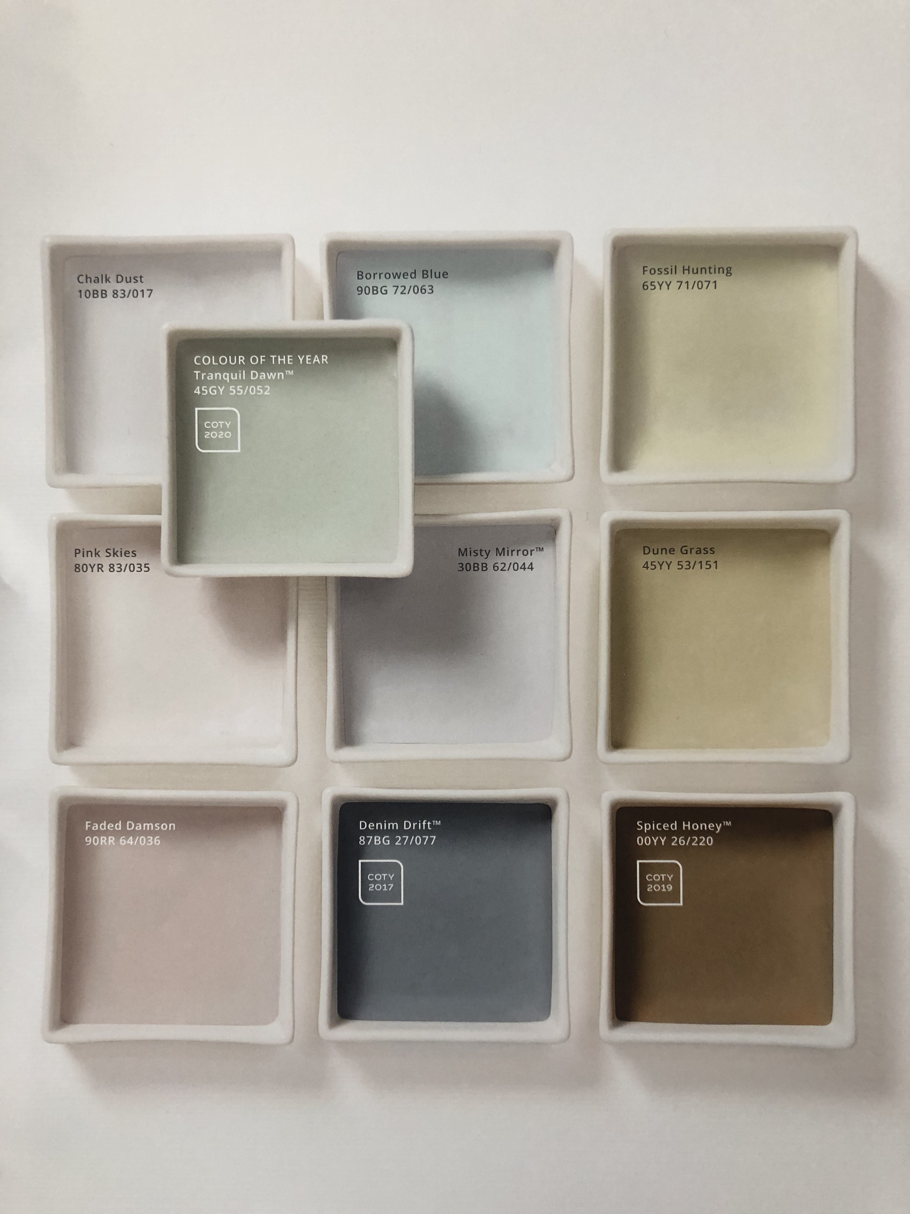
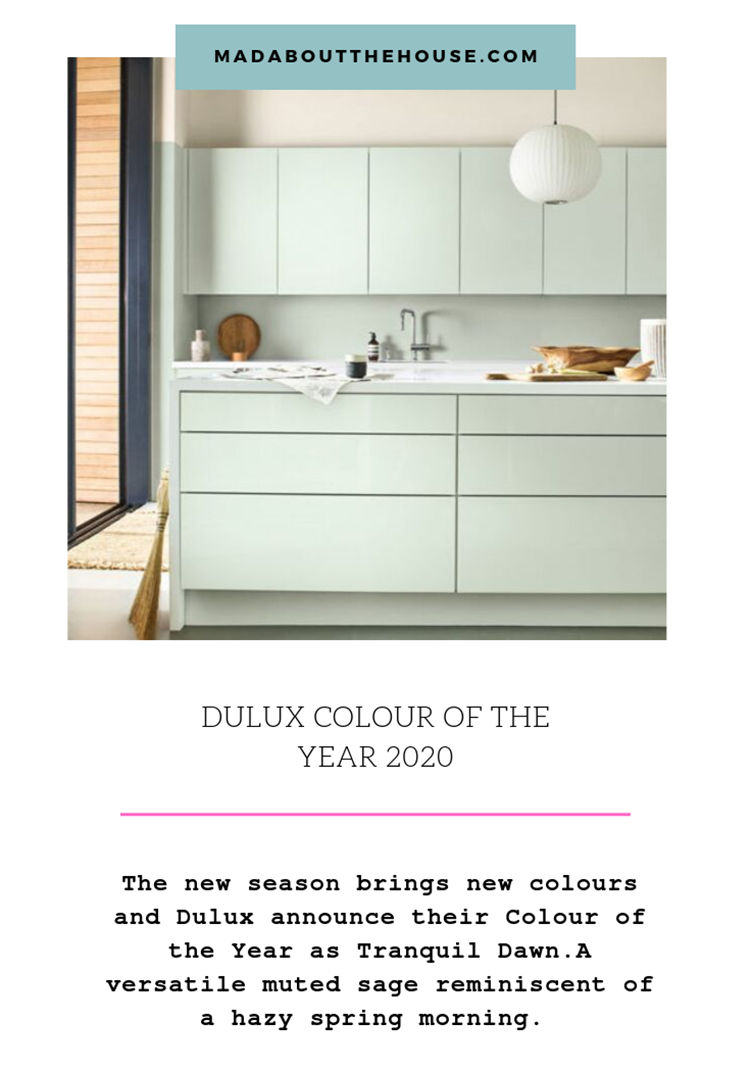
With the new season comes a raft of new stuff from furniture to fashion and all of them wearing their new colours. This week saw the annual Colour of the Year announcement by Dulux. I have been writing about this since 2014 and in that time we have seen teal, copper blush, cherished gold, denim drift, heartwood and spiced honey. I have also been predicting, increasingly loudly (and wrongly) since then that it was time it was green. And then this time it was. Or rather Tranquil Dawn to give it its proper name. A sort of muted sage reminiscent of a hazy spring morning.
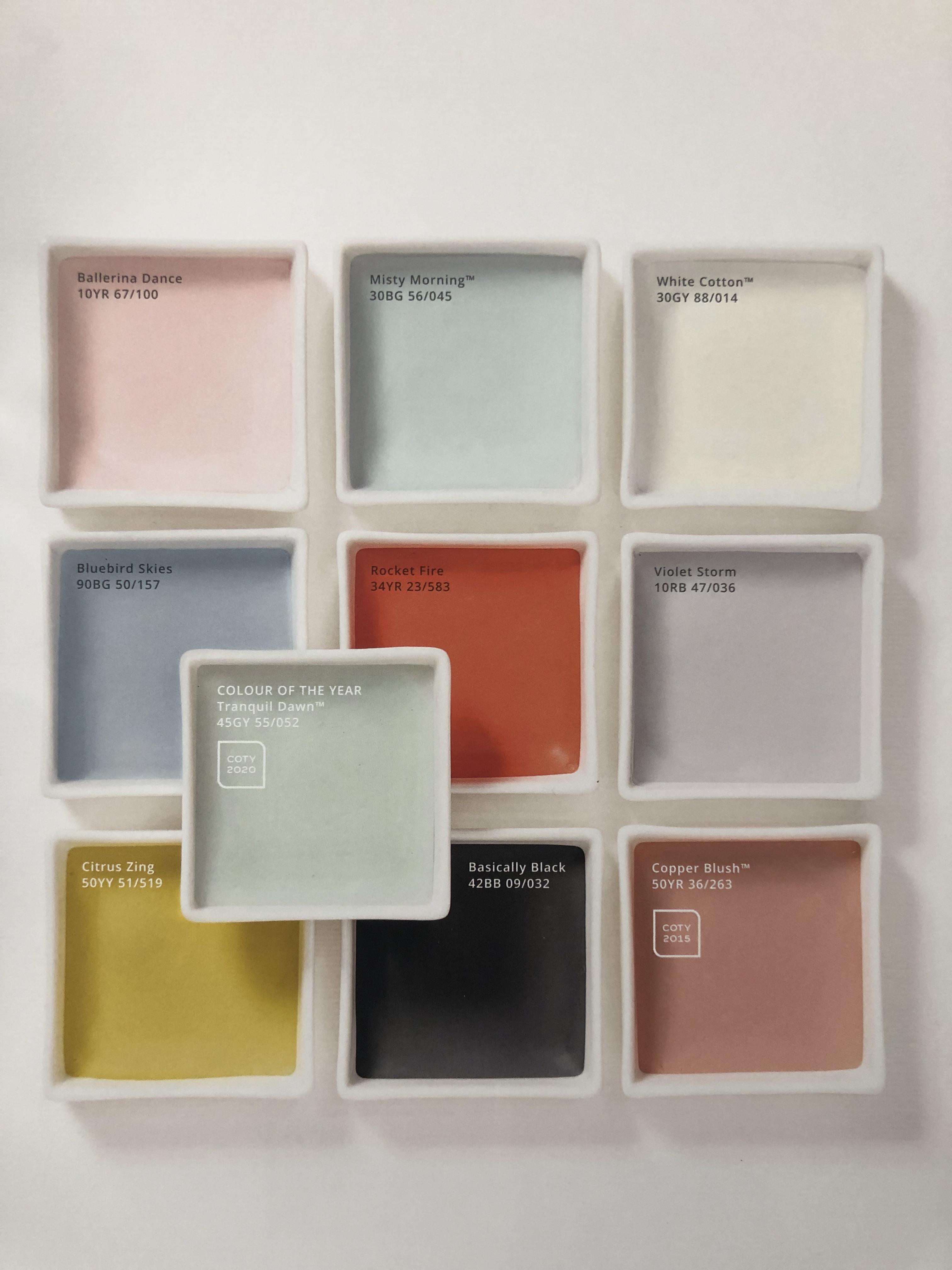
It’s a colour that is surprisingly versatile as you will see from the colour palettes that Dulux has put together and which I have included here. The company opted to base its selection around the seasonal dawn and so you see a hot orange, strong blue and yellow for summer, fading to a mix of pale, heathery blues and greens in in spring. My favourite is the warm autumnal shades with forest green, chocolate, burgundy and blush, all of which work well with this celadon type colour.
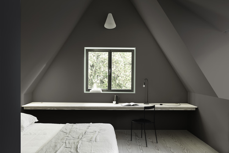
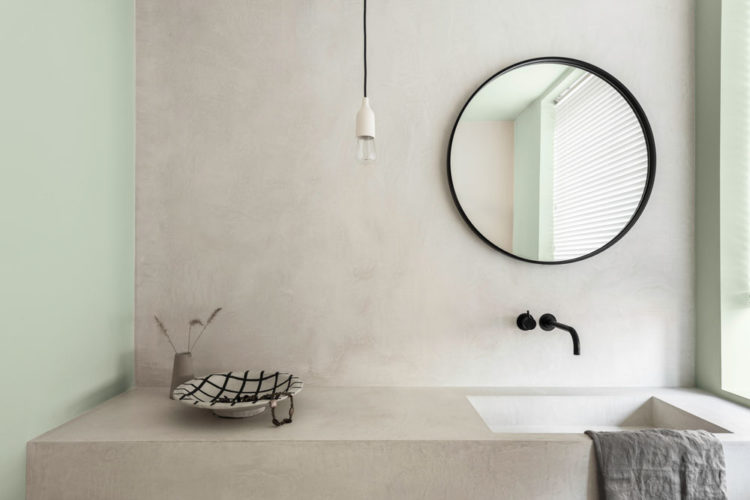
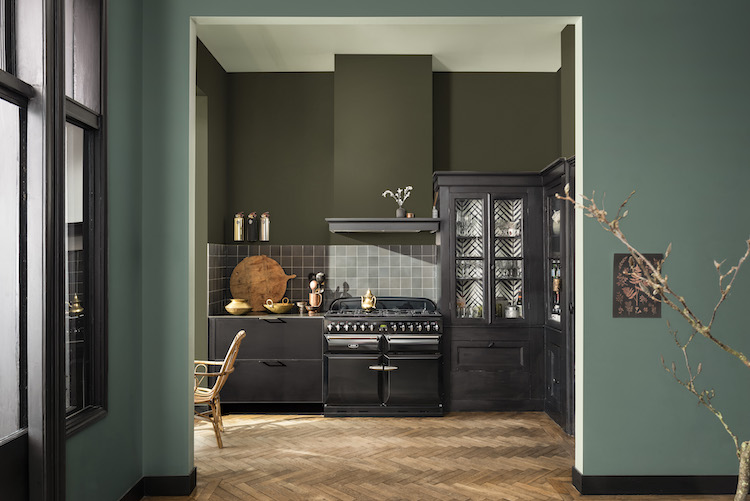
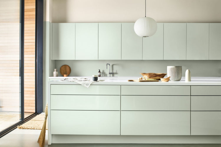
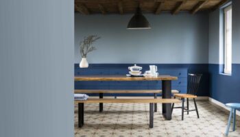
And that’s kind of the point. In previous years the coty has been a strong colour. Who can forget – and more to the point – who used last year’s Spiced Honey? But this is altogether more versatile. Pick any colour you like for your walls and use this for the woodwork or the ceiling as a softer alternative to white. You can just see below how a line of it has been painted around the dark window frame. It makes the window look bigger and also brings the greenery beyond the window right into the room.
The other big trend was the use of horizontal lines – partly because the whole colour palette is based around the lines between the sky and ground (that’d be the horizon then) and partly because decorating, as I have mentioned several times before, has become much more about colour blocking and using different colours on different parts of the wall. I’ll say it again you don’t have to use a single colour on a single wall from floor to ceiling.
If you have a long thin room you can paint one colour along the long wall and take it round the corner to foreshorten the space before switching to another for the rest of the wall. It’s a feature wall but not as we know it. Or, as I mentioned above and you can see again lower down, use a contrasting colour to paint round your window to make it seem bigger and frame the view. There are no rules, you can paint how you want.
Now I’ve spoken before about how they choose the colour – based on analysis of fashion, social media, international trends, economic patterns etc, so I won’t go into it again but it’s always worth knowing why they select a particular shade.
This year it was, apparently, always clear that it would be green. Green is a huge story at the moment as it links to everything from how we think about the planet, to the increase in the number of vegans and our fashion choices, neo-mint is the colour at the moment (it’s coming people) and how the only big topic is (or should be) what we can do to live our lives more sustainably.
So Tranquil Dawn seemed, said the clever people of Dulux to sum all that up. The start of a new decade. At a time when tech has changed our world so much and while we benefit from the increased connectivity, we are also finding the stress of that faster life (that was supposed to make things easier) more stressful and so we are actually disconnecting from real life and turning to screens.
But at the same time there is a yearning to find our place in the world, to find the right balance and to connect more to nature and the things that make us human. And so you arrive at Tranquil Dawn and its palettes made up of the lines between ground and sky during the different seasons.
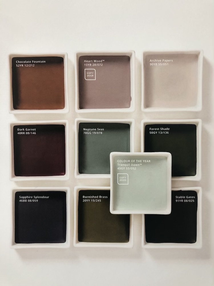
So there is the Meaning palette – inspired by a cold winter’s dawn full of icy green, warm cream and charcoal shades. It’s about calm and contemplation. I have included lots of images of this look because Dulux is only releasing the images in stages and this came first. That said I wanted to include the darker office image for those who don’t want to paint whole walls in this pale shade but might want to use it only as an accent.
Then the Creativity palette (my favourite) which is based around the colours of a warm autumn morning: forest, chocolate, burgundy and tobacco. And remember the other day I said I needed to find my disrupter colour? I think it might be Tranquil Dawn. Those are all the colours of my house and a splash of muted sage/mint might be just what it needs…. watch that space… (and clearly it was never actually going to be yellow as I said the other day. However much I fancy it as an idea it would just be too disruptive for me. Instead I shall stick with this palette in all its rich and warm glory.
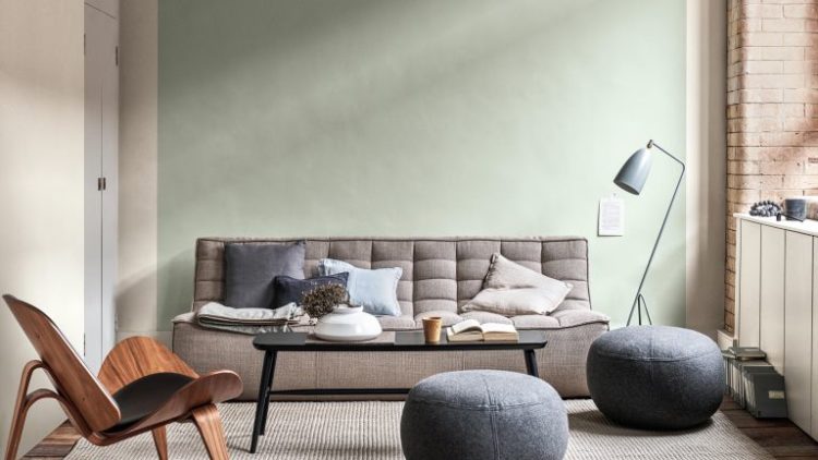
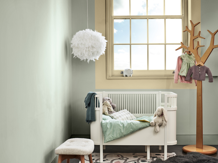
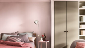
Moving to the Care palette – a hazy spring morning of earthy neutrals, soft pinks and dusky blues. It’s very relaxing and calm and, yes, pretty. I chose an image with very muted colours here because I thought the trick of painting round the window was clever and something that might inspire you.
Finally the Play palette – a hot summer dawn and, no surprises there, this mix of fizzy orange, warm yellow and sky blue isn’t for me although I can see that the colour of the year blends perfectly with all of them. Again, I have focused on a darker image with that pink stripe (copper blush since you ask – a former colour of the year).
Tranquil Dawn is, perhaps, the perfect neutral. When you look at all the colours it has been put with – and that’s 36 by the way so there are thousands of combinations – it’s hugely versatile, but it’s also a great accent. Forget about white woodwork (a recurrent theme of mine I know) but If you don’t want your woodwork to match the walls then try using another colour that isn’t white. And this year that might just be Tranquil Dawn. It loves charcoal as much as it likes a strong orange.
So what do you think? Anyone ready for a Tranquil Dawn? After the parliamentary shenanigans of the last couple of weeks I think I’m literally, as well as metaphorically, ready. So perhaps that too is why this colour was greeted with much less shock and outrage than we normally see from the colour of the year. Lots of us are already using it and now that there are all these ideas for other combinations I predict a hit.
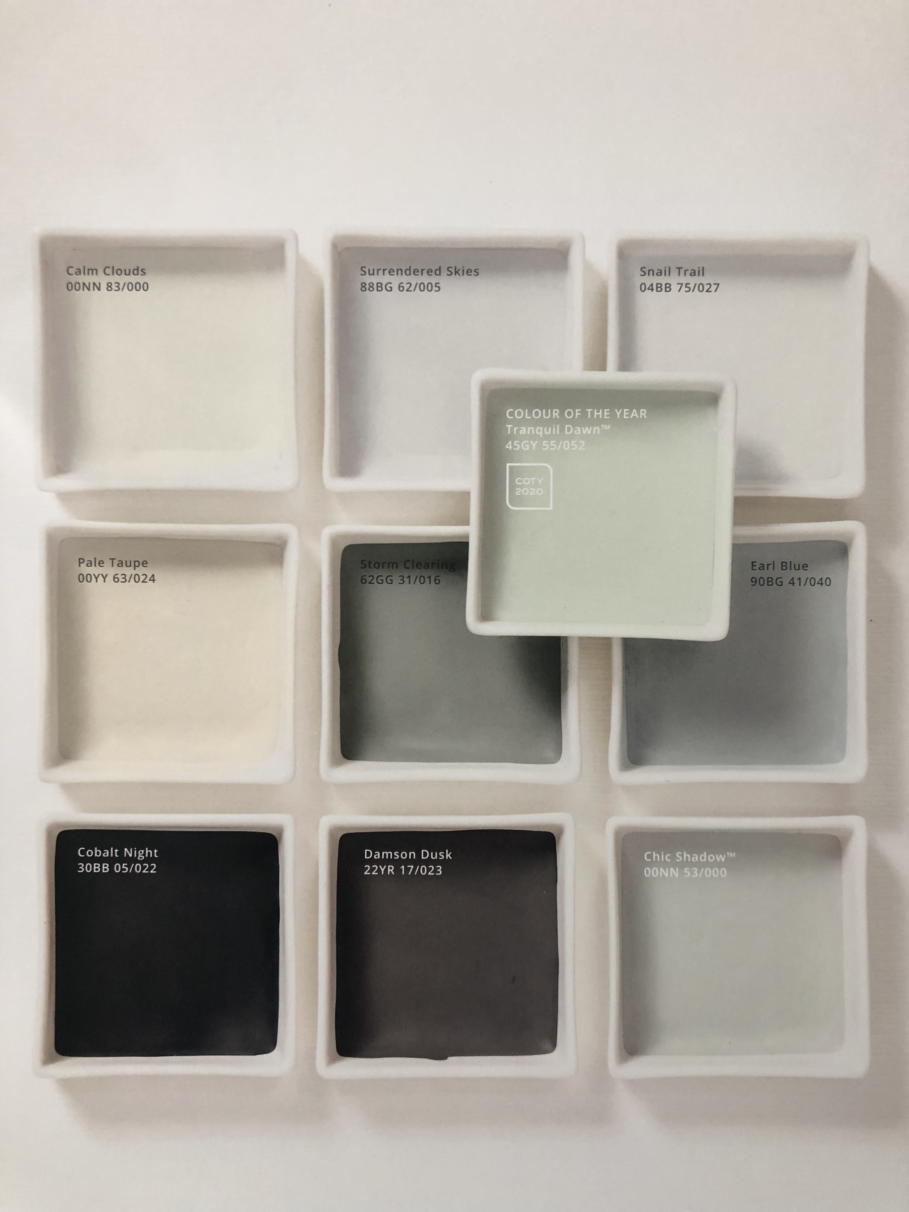
The new palettes will be released next year. In the meantime if you want Tranquil Dawn you can ask for it by number and it’s 45GY 55/052. Or you can zoom in on the palette images to see the numbers for the other colours.


Green is definitely huge at the moment and I’m loving it. Blue has always been my go-to but I think I’m ready for a change. The slightly ‘dirty’ colours in these palettes are really liveable too I think:)
I wonder how this colour compares with F&B’s Mizzle?
Mizzle is being used a lot especially in bedrooms by our family.
Similiar I think and also Cromartie is a good ringer.
About 15 years ago I used a similar colour – Benjamin Moore’s Limesickle – in living/dining room. I think I like it slightly better than the Dulux colour showcases here because it seems to have had more grey in it, making it less “sweet” and more versatile.
It’s an incredibly difficult colour to photograph as sometimes it looks very green and other times very grey – as ever a tester is the only way to really tell!
I love this tranquil green colour. My daughter recently painted her living room in a similar colour. It is warmer than the stark white walls she had before and feels – yes, tranquil. Here is Sweden colour has been around for quite a while now – more these pale colours than the bright ones though. Will show this to hubby and see what he thinks. Time for a change here too. Thank you for your inspiring posts.
I don’t understand how the Play palette description corresponds to the photo just below it “Finally the Play palette – a hot summer dawn and, no surprises there, this mix of fizzy orange, warm yellow and sky blue isn’t for me although I can see that the colour of the year blends perfectly with all of them. Again, I have focused on a darker image with that pink stripe (copper blush since you ask – a former colour of the year).” – the kitchen in the pic just below is rather bright, except for the dark window frame, and there is no pink stripe visible, unless you mean the light pink above the cupboards which looks nothing like the saturated pink in the pic of the palette itself one pic down. Or did I not get which description applies to what photo?
Sadly I was only allowed one picture from each palette for the time being so I had that image to use – that said you can see the summer palette colours in the post and there you will see the orange and the blue and the yellow so you might have to imagine what the brighter colours might look like together. And yes the pictures aren’t necessarily in order of the words – it was a long day and a late night. But all the picture captions are labelled. My apologies if it’s not clear!
Years ago when I lived at home my parents had their best sitting room painted in a very pale green, contrasted with a curved sofa in another shade of green. Carpet was a strong red/green leaf combo. I loved that room it was so tranquil.
I like these sets of palettes, lots of choice.
This is great! I really haven’t connected with previous COTY choices, but already have a (Dulux) colour similar to Tranquil Dawn on my bedroom walls. I’m going to take a good look at the spring and autumn palettes now. Thank you for the images, a big help as ever!