Morning everyone and welcome to Monday. I trust everyone is back in the swing of things now? We have one week till we take the 18yo to university so it’s going to be a slightly strange week for us, but there’s nothing like a stroll though some gorgeous rooms to calm the senses and help the slow all that fast breathing.
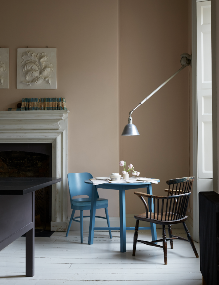
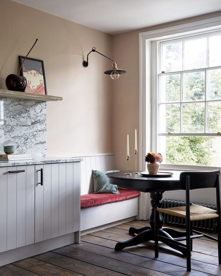
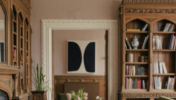
First up, a couple of rooms by Harding and Read who worked with Christopher Howe, who started out as an antique dealer, then started designing his own furniture and has now works on interior design projects as well. His shop in West London is a dream to visit as it’s stuffed with antiques, his own designs, fabrics new and vintage as well as wallpaper, rugs and accessories. I visited last week and could have spent hours there.
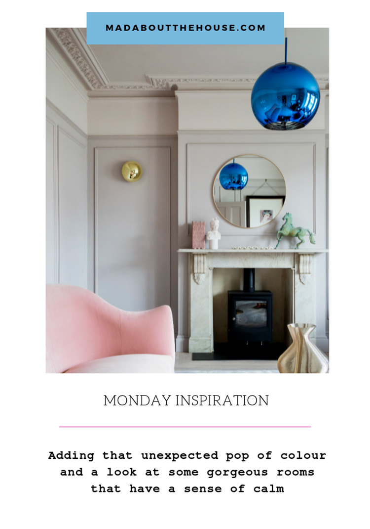
These first two pictures are from a house in Bath and I have featured this fabulous kitchen before. The walls are, if memory serves, Dead Salmon by Farrow & Ball and while I know we don’t all have ceilings and plasterwork like this room there are, nonetheless, tips that can be taken from here.
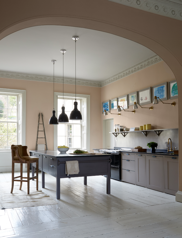
The kitchen island on legs means the space appears bigger. It’s more of a giant table with storage than a solid island which can dominate the room. And the non-matching colours also contribute to the feeling that this is a room in which you cook rather than a kitchen with no other function. The unexpected addition of the blue table and chair in the corner is wonderful and I think that should be a rule in all rooms: work out the scheme – the tonal colours and the overall feel and then add something totally unexpected in another colour or style to disrupt it all. I need to do this in my own house and am definitely going to be pondering this over the winter months.
Below the 2Lg studio has used the same colour scheme to the same effect with their muted living room and the electric blue metallic lamp shade. This shade of cobalt blue is definitely their red thread and appears throughout their home. I’m still pondering mine and wondering if, after all this time, it might need to be yellow.
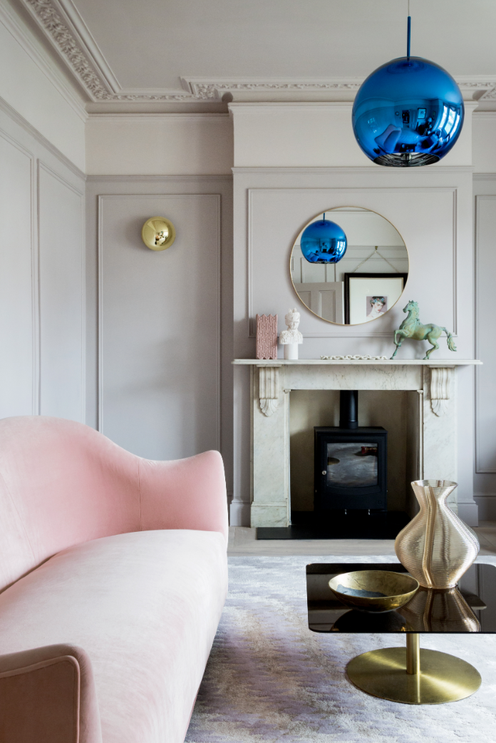
The key is that is needs to be a complete contrast otherwise it might look like you had a blow to the head. So in this case the metallic light is a punky contrast to the curving velvet sofa, pastel rug and classic brass accents. It’s also easier to get away with if it’s completely different to everything else. That said, Christopher Howe’s blue table and chair is still in a muted shade that tones even if it contrasts so, as usual, there are no rules. It’s about finding ideas that make you feel comfortable while still bringing in an element of unexpected punchiness.
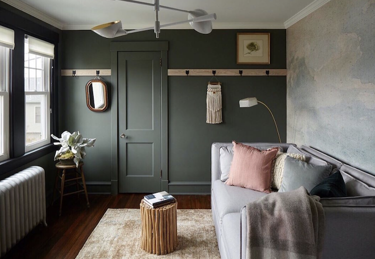
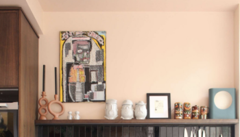
Onto this gorgeous room via Vestige Home and while there isn’t an unexpected colour pop as such there is that single pink cushion which does the same job. Interior designer Rebecca Wakefield has done a similar thing with the kitchen below. That red velvet bench cushion isn’t a change of colour but more an intense version of what is already there and it really makes the space pop. Without it, it’s pretty for sure but that cushion, as they say, “brings it”.
So if you don’t want or can’t decide on a contrasting splash of colour then look at the colours you have and see if you can just ramp up one of them – to be really dark, or really neon or just in a place you wouldn’t necessarily expect it – like the legs of a chair for example.
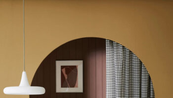
Now to three pictures from The Paint and Paper Library’s new collection, Monochrome, a collection of black and white paints that have been formulated to be used together. The blacks have been created with varying undertones including ochre, pink, grey and green so you can use them alongside their original partners to create an interesting depth of colour.
Black and white has long been a classic combination, but this is about softening those contrasts to create something still striking but more of a classic with a twist and, let’s not forget, one that might be easier to live with than the extremes of jet black and brilliant white.
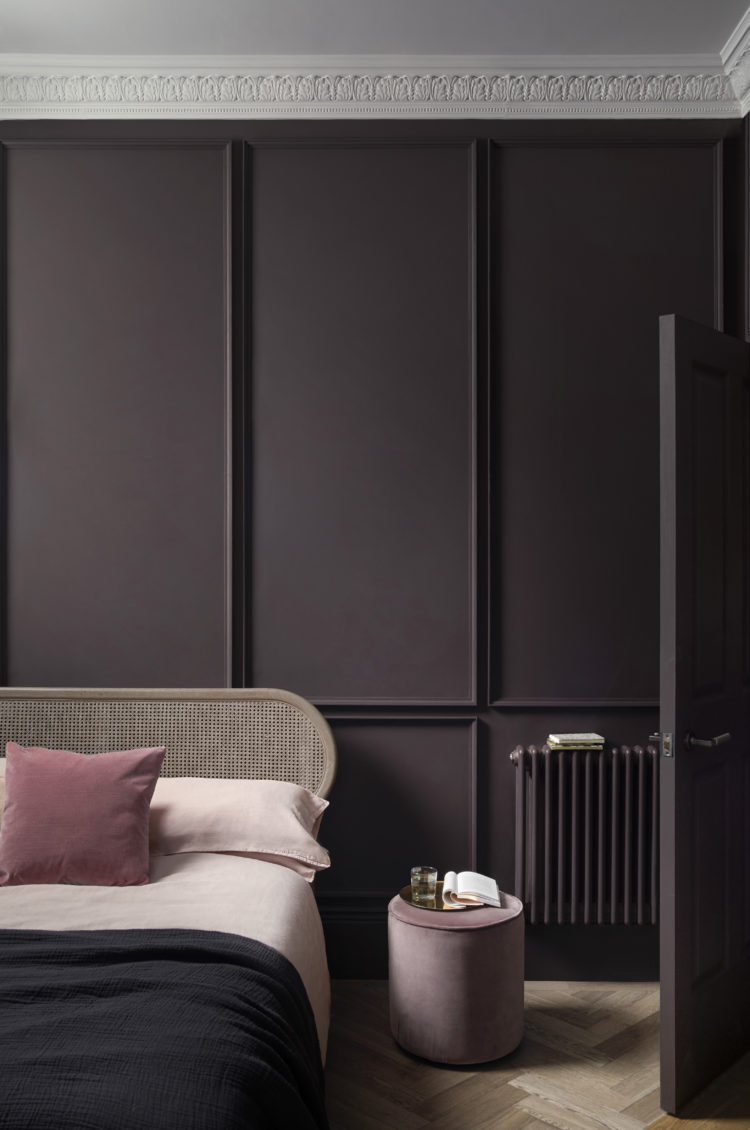
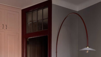
The collection is released on 19 September. Above the ceiling is painted in Eau de Violette and the walls and radiator in Pontefract. And if you needed convincing why the radiator needs to match the wall, this image ought to do that. To continue the theme from earlier in this post I think that here, the cane bedhead is the disrupter. You might expect a more classic antique bed but cane is a classic and it lightens everything and is a little more relaxed. For those of you who weren’t sure about the explosion of rattan this summer ,wondering, as I did, how it will look in your homes in the middle of a dark and cold November, then look for cane. It’s classic, it’s more grown up and it fits into all schemes where as rattan is trickier.
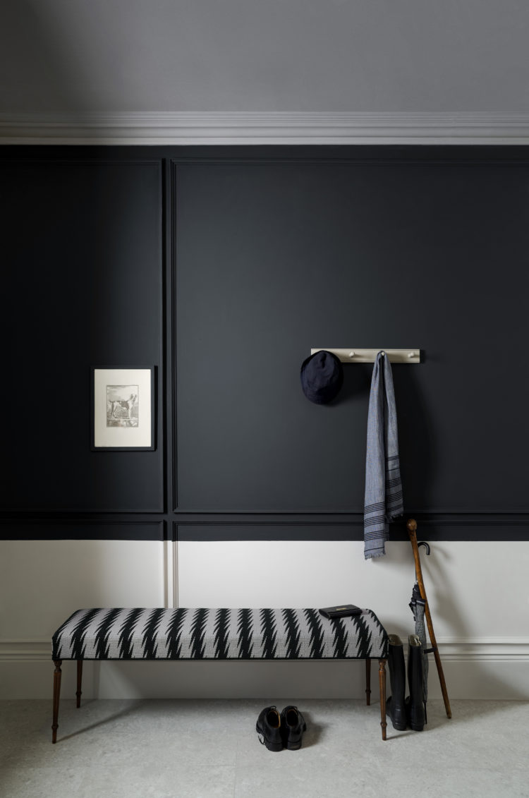
This hallway has two of the more extreme colours from the collection – by which I mean the more obviously black and white shades which are Minim and Kohl. You could add any colour to this for contrast from emerald green to burnt orange or even mint green but the patterned bench works brilliantly too.
For anyone who isn’t sure about half-painting walls, have a look at this. The designer has just taken a point on the wall and changed colour. It’s that simple. The low line here showcases the low hall bench and links it to the colour above but you could go higher if there was a taller piece of furniture. It’s about keeping a relationship between all the colours. Generally speaking, the dark colours tend to go below as that’s somehow easier for the eye to cope with but, if you’re brave, then there’s no reason why you can’t do it the other way round – let this image be your guide.
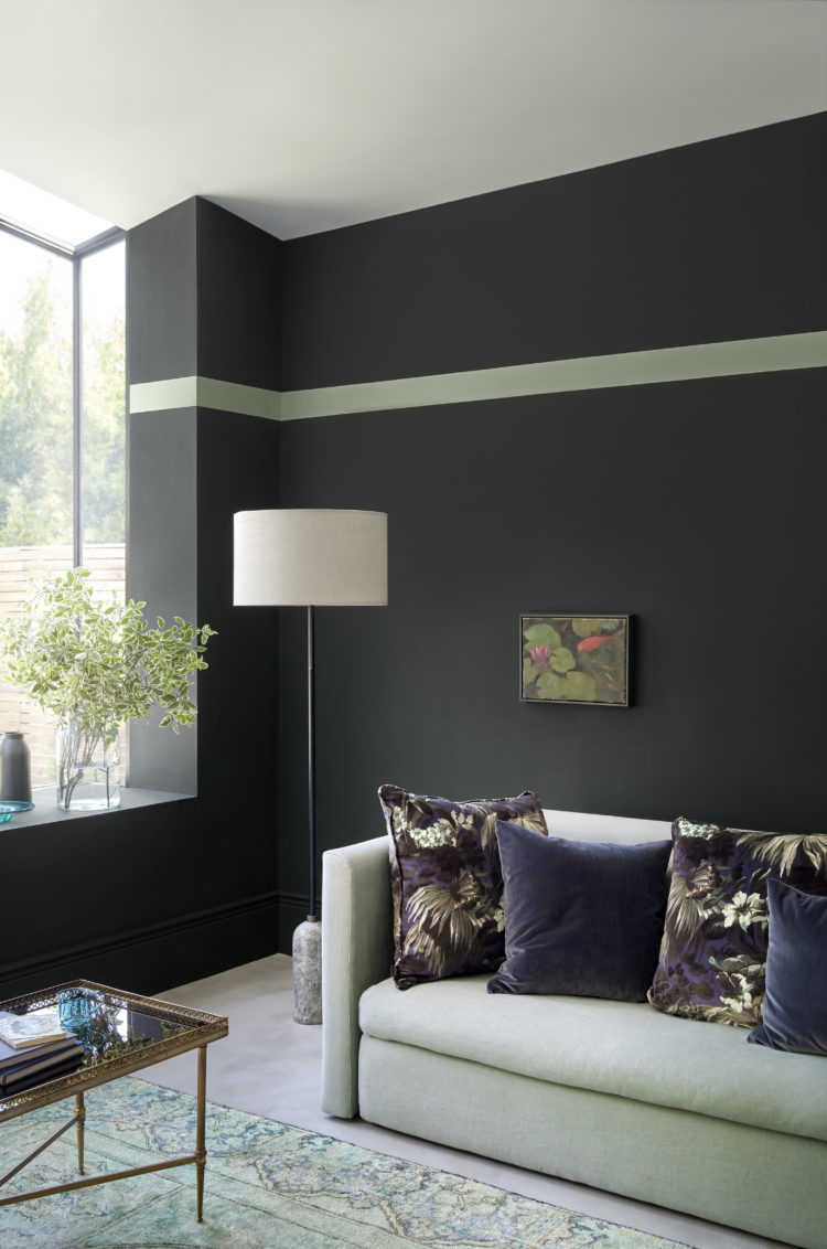
Finally, one of the easiest contrasts to pull off. There is no original picture rail here. There is no ornate plasterwork or features, instead, the stylist has simply painted a contrasting stripe to match the mint green of the sofa and rug. While the purple floral cushions provide the third element.
The moral of the story is be bold, have fun and don’t think you have to paint each wall in the same colour from floor to ceiling just because that is what tradition expects. You could take this same colour combination and paint a wide vertical mint stripe from the ceiling down the floor behind the lamp, for example. And then change the lampshade to a different, but contrasting colour. The stripe is Sobek, the wall is Ilex and the ceiling is raw chalk.
And there we have it. I’m off to make university lists and ponder my disruptive colours.

My unintentional red thread is yellow. I feel the need to repaint something in Pontefract. It’s gorgeous!
Love this idea. We’ve gone for one bright yellow vertical radiator in our kitchen diner. Its on a corner wall so it won’t be visible everywhere but it feels right for that space, where all the fun gatherings and chat happens.
A good one Kate to start off the week. Such beautiful examples.
The stunning house in Bath came to be, for that oh so lucky family, as a result of the huge financial success of Mama Mia. Christopher Howe is a genius!