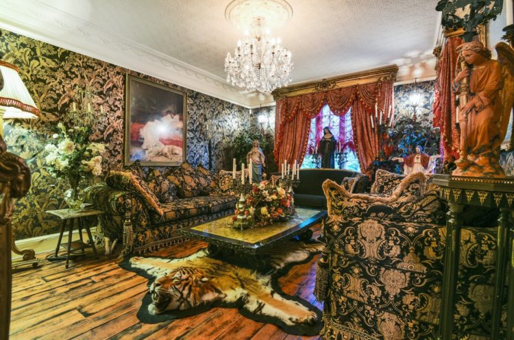
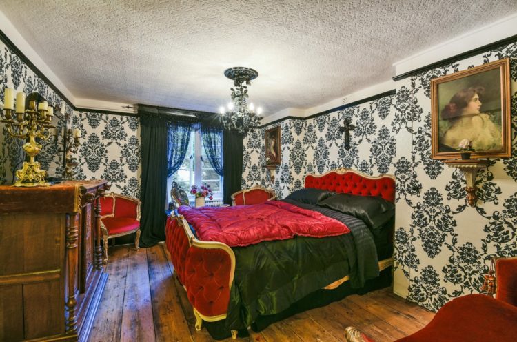
Right then this’ll wake you up. There has been a lot of talk about the return of maximalism recently and while I’m a fan of stuff, and cosy interiors, this may make some of you feel a little faint. It’s sort of House of Hackney on acid. But don’t dismiss it straight away as, as with most styles, there are elements you can adopt and adapt so that it does fit your own personal style.
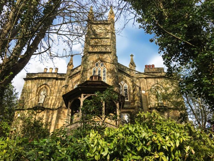
It’s a five bedroom detached house in a gothic clock house in Burton St Leonards, East Sussex, and it’s on the market for the first time in over 20 years with Fine & Country for £2.9m. It’s also a one minute walk from the sea.
Now yes it’s full on inside, but that sort of fits with the style of the building. Having said that, there are enough original features, gothic windows and fabulous plasterwork that if you wanted to strip it right back it would look amazing without all the frills and furbelows.
It was designed in 1828 by James Burton and later developed by his son Decimus, who was also responsible for the glass house at Kew Gardens. It was originally built as a clock tower and later enlarged to become a detached Gothic revival style villa.
There is a wine cellar, a laundry room and an original lavatory system designed by Thomas Crapper himself – who didn’t invent the flushing loo by the way, but did much to popularise its use.
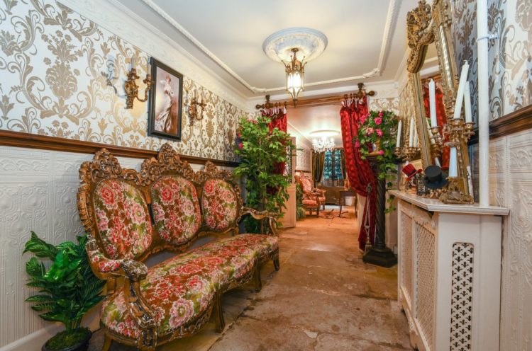
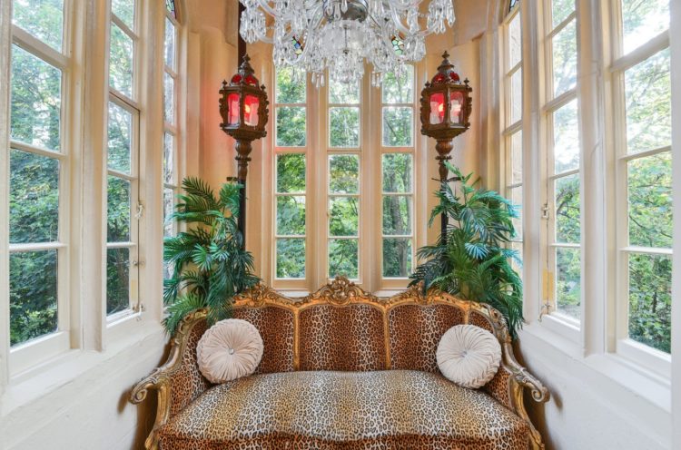
Now yes I quite understand that this is probably quite polarising as decor goes but remember you can just take elements of it. This leopard print sofa looks great against these soaring windows and the floral one above contrasts beautifully with the rough flagstone floors. I would probably just remove the wallpaper, the curtains and the radiator cover and leave it as it is.
In the bedroom below I might just swap the hard red for a softer pink shade and it would instantly calm it down, although the black lace curtains may be a little Miss Havisham. I would urge you to have a look at the rest of the house from the link above and I’m definitely adding this one to my fantasy house-hunting list.
To paraphrase Coco Chanel: when you decorate the house, take a look at the finished item and take at least one thing out. Maybe two.
Right, fancy something a little calmer to slide you into the weekend? How about this: a three bedroom house in West London that is so stripped back the walls are bare plaster. It’s on with The Modern House for £895,000 and is a proper contrast to the one above.
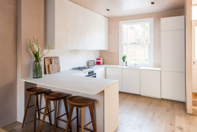
There’s something incredibly restful about the soft pink walls and natural wooden flooring and furniture. Having said that, I do think it needs the odd touches of black just to give it a little bit of punch. Although I would always advocate a touch of black it doesn’t have to be that harsh – you can use navy or charcoal or dark green as well as dark wood. Just add something to give a pale room some definition. It will also highlight the pale as it provides a contrast to it.
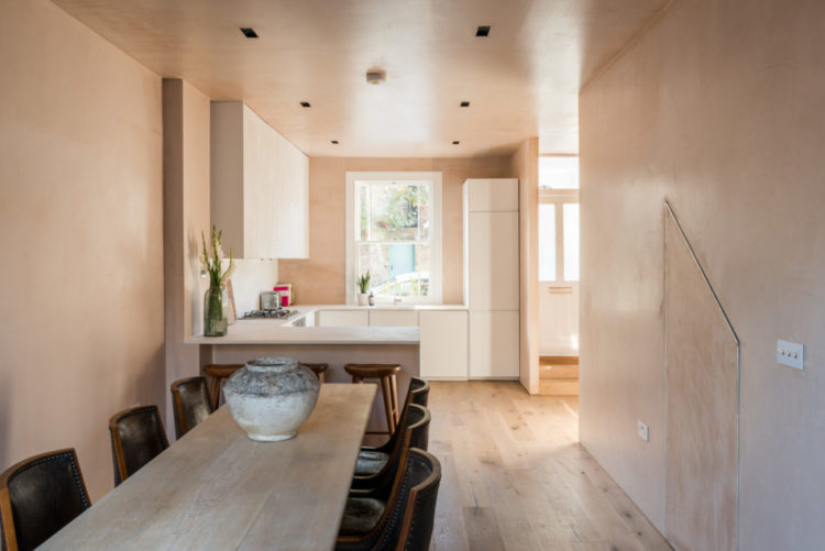
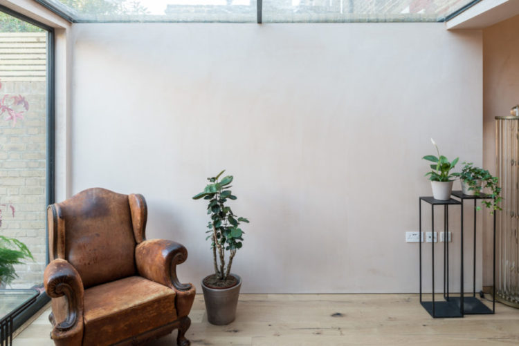
The house is also flooded with light in the open plan downstairs as you can see from the glazed roof and wall in the image below. You can see also how the plaster pink changes colour depending on the light from the sun and the time of year. If you are choosing pale colours for your own house remember that a golden south-facing light will warm up a cold colour and vice versa.
Now while this has three bedrooms, the third one is pretty small at less than 8ft square but it would work as a little study with a view over the garden. And while we’re on the subject if you have a small room that you want to make feel and look bigger then paint the ceiling the same colour as the walls. That is less distracting to the eye and won’t draw attention to the edges and corners – the boundaries of the space as it were.
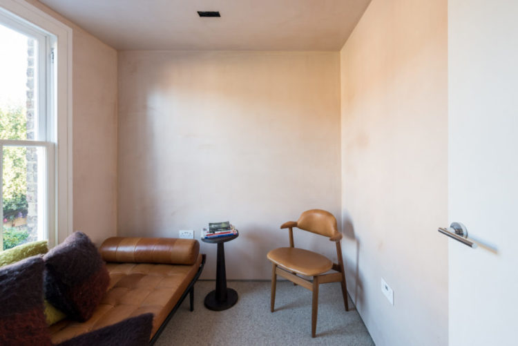
This technique has been used throughout this house which helps to unify the spaces and also makes for a much calmer feel. Although did you know that pink is officially a calming colour? A few years ago a Swedish prison painted around 30 cells in pink and reported that anger levels reduced in about 15 minutes although they usually kept them in for around two hours. Some police forces have painted their drunk tanks in pink and reported that those who had been confined in them for public drunkenness went to sleep faster than in other cells.
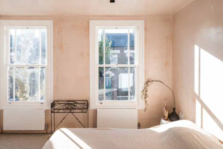
So there’s some food for thought for the weekend. I think I have finally located the right shade of pink for my bedroom to go with the dark green wardrobe and bed. Now I just need to find the time to paint it.




That’s great! I love it!
very interesting, second house style is gorgeous, elegant and very ethnic!! Simply beautiful Keep posting like this.
That was amazing! So impressive! I love the second house style – so minimalistic! Thank you for the great article!
I don’t understand the appeal of bare plaster walls, does it not just look unfinished?!
Definitely the first one for me (when I squint my eyes to looks past the furnishings to the beautiful period features!).
I’m also interested to hear what your perfect pink is Kate!
In the kitchen I have Temple by Paint and Paper Library which is a darker plaster sort of colour – very pretty and in the bedroom I am about to put Threadneedle by Mylands which has a dollop of grey in it so it works in my south-facing bedroom where anything with a warm base becomes too intense and pink.
Wow! Really love that second house-some art on the wall and a few rugs and it would be perfect…so restful! Maybe im craving an empty looking house because our 5 year old is slowly talking over our small flat with all her ‘projects’ littered about this place!
I have never been a fan of minimalism, so glad it is falling out of favour. I can think of nothing worse than living in an empty, white space, it would be like living in a fridge. I like to be surrounded by beautiful things and things that are important to me, however weird they are, that is what a home should be about. Hurrah for Maximalism!
The house in the first one looks amazing but I couldn’t live with that decor. I did like the leopard print sofa in the room with bare Windows though. I suppose the decor at least suits the style of the house – I’ve seen small terraced houses for sale near me with a very similar look and it’s migraine inducing. The second one looks awful! I expected to love it after the first one but it looks cold and uncomfortable. Which is your perfect pink? I am also on the hunt.
Hi Kate, definitely the first one for me, but I’d definitely take some of the ‘over zealous’ decoration away! I LOVE the idea of being one minute away from the sea – probably a result of living in the East Midlands where a trip to the coast is a major expedition!
Could I ask you to do an article on how to dress a sofa with throws / cushions without the result resembling a Bedouin Tent? We have just renovated our small lounge and put the “wrong colour but have no money to change it yet corner sofa back” and I’m trying to disguise it! xx
Wow what a house! (The first one that is) I adore (almost) everything about it!
Luckily the ex owners would take out most of the stuff I don’t like from the first one, including the curtains and the rococo furniture, leaving the wallpaper, which I love. And then after I’d dealt with the wooden floors which the tiger seems to have bled stripes all over, it would be splendiferous!
Totally agree Jane. Great house….lose the busy bits and start again!! A little less fuss.
I find that modern Radiator cover strangely incongruous against the floor n decor too 😳
Definately the first one for me. I can look past the interior decor and the original features are amazing. Give me character and history any day of the week. The second one looks very cold and uninviting. I would move into the first one tomorrow (dream on….).
Oh my! The first one is definitely over the top, but its got a good foundation to work on. The angles of the photos make it look like its got a low ceiling although I’m sure that that’s not the case, and the flooring looks like it needs restoring. Your second find looks great, but if only it had a couple of art images to break up the monotony. And you’re right, it needs inky stains for definition. Have a great weekend!