Still keeping it free from holly over here but in a nod to the time of year we’re including some pattern to liven things up a bit.
Lots of us are nervous about using pattern and often just default to a little bit on a cushion. When we’re feeling really brave we might go for a scattering of cushions in different patterns but the result, while pretty, can be little flat. By the same token many/most? of us don’t want to go the full maximalist clashing multi-colour extravaganza that just isn’t restful.
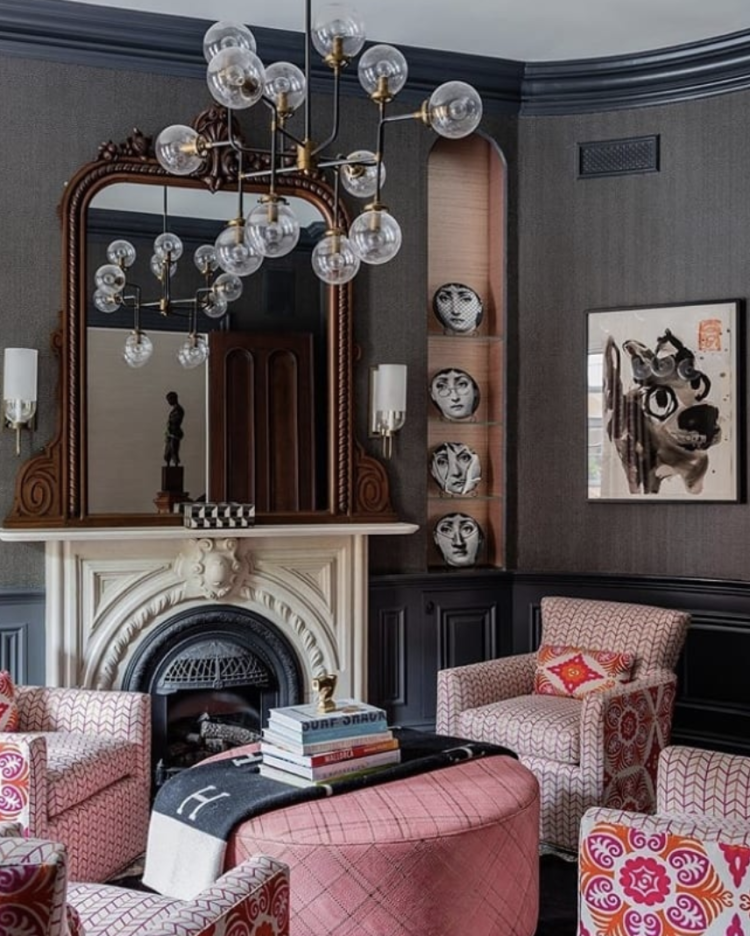
This is the answer. The colour is overwhelming monochrome – mostly pink but with a dash of orange. That’s already quite a punch combination but look how there are two fabrics on all the (matching) chairs, a toning cushion and a pouffe with a subtle pattern that brings it all together. This is your template. Repeat with any colours you like and set it against a dark wall to make it stand out.
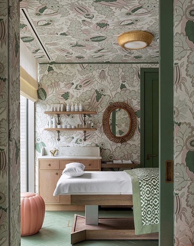
More clever use of pattern and this time all over the walls and ceiling. Yes this is a treatment room but if you kept the furniture very plain – dark green to anchor it all, with splashes of blush accents, this would work beautifully in a bedroom and the same theory applies. In both this room and your bedroom you are mostly lying down. Make the ceiling interesting to gaze at.
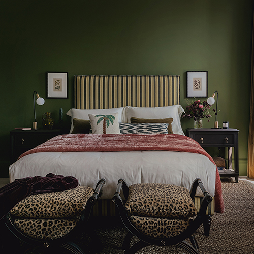
Toning it down a little more and this is a mostly plain room with a simple stripe headboard until you scroll to the end of the bed and bam! A pair of leopard print chairs. At which point you notice the rug also has a subtle, and similar pattern.
And a quick word about symmetry. The eye and brain find symmetry relaxing so while stylists will tell you you need to arrange things in threes and odd numbers that is often for a photograph. In real life, if you want strong colour but are nervous of how it might make you feel just make sure you arrange in pairs and it will feel strong and confident but still relaxing. This entire room is made from pairs. Try (mentally) removing half of them or adding mismatching lamps or chairs and you will see/feel the difference.
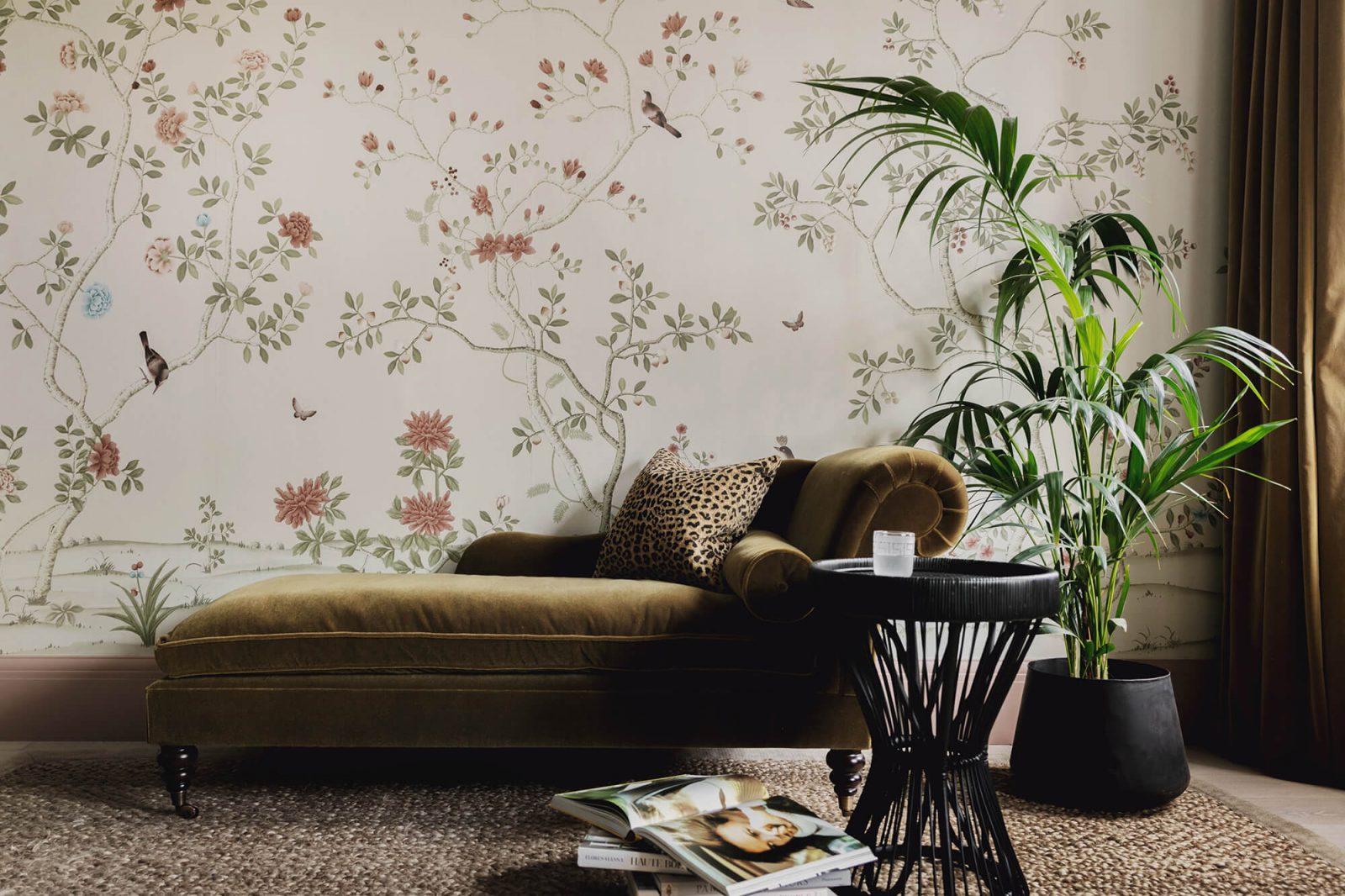
This is a good example – pattern on the walls and plain, strongly coloured furniture. The palm echoes the pattern on the wall and the leopard cushion works tonally so although it’s a wildly different print to the wallpaper they’re not fighting.
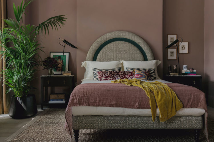
Finally, a more subtle pattern on the bed below but there is still plenty of colour. Note also how the bedside tables and lamps, which do match, are styled differently. This is the assymmetric look. I like it but some of you will find it more stressful than if there were two matching prints on the wall and a plant either side. The key is to understand which camp you fall into.
Right that’s all for this Monday, back tomorrow with the final gift guide and this time it’s the home office.


Great post! Thanks for sharing 🙂