Diving into a little subtle pattern this week as I think there is a fashion for full on maximalism at the moment but it’s not right for everyone so I thought we could have a look at it being used in different ways. I love pattern but, as regular readers no, am scared off too many colours in one place so would tend to call myself a monochrome maximalist.
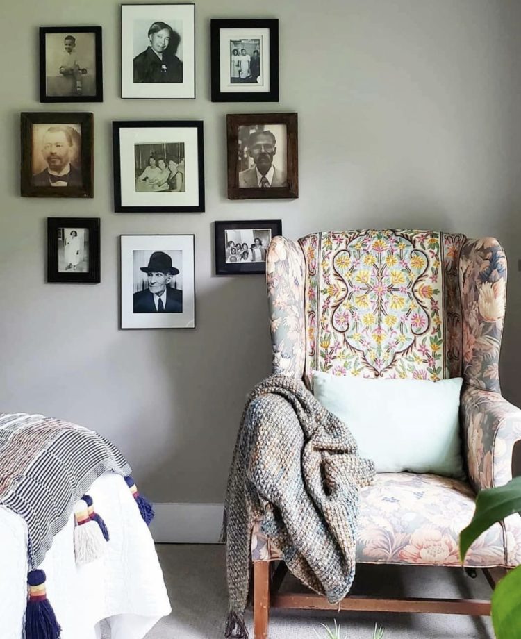
That said I’m fully in favour of using pattern in slightly unexpected, or braver ways. So rather than a plain chair with patterned cushions (the safer option – which I have lots of) I also like throwing pattern all over a chair (which I also have) and keeping the cushions plain. Or even, as Seana @bellybaila, has done, using two toning patterns on one piece of furniture (which I haven’t yet done but have definitely thought about). She told me she loved the shape of the chair and bought it with a plan to re-upholster but now loves it as is and will one day paint the wall behind it so it pops out even more.
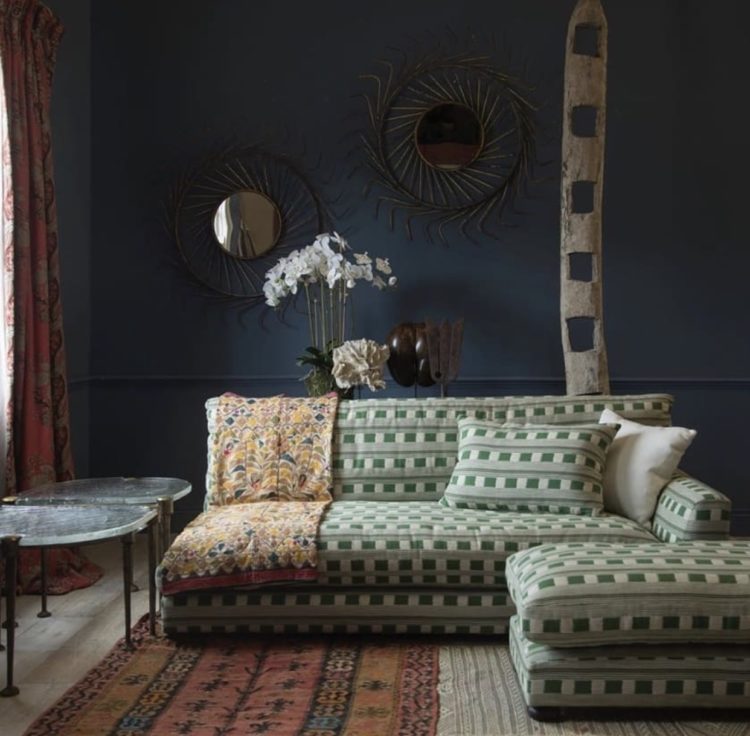
And here’s how painting dark behind a pattern really makes everything pop. This is Lost and Found fabric by Kit Kemp for Christopher Farr and the navy wall really brings it out in the way a pale wall wouldn’t. And a patterned wall with a plain sofa would also look lovely but more traditional whereas this way round turns it on its head and makes it all the more striking for that.
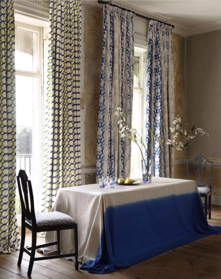
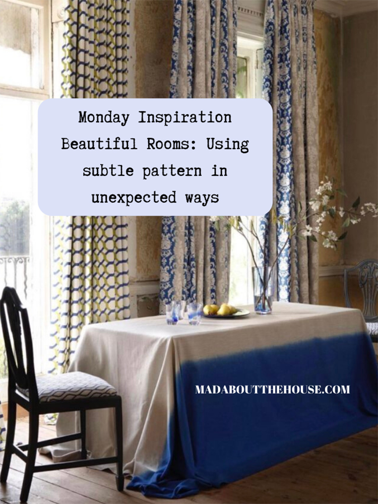
Now this is a styling shot for Clarke & Clarke, a fabric and wallpaper brand, so in reality you might not choose to have two different sets of curtains in one room… although it is a masterclass in bringing different colours and patterns together. I particularly love the way the tablecloth brings out the blue of the curtains.
I also wanted to include them because they, and the seven other brands in the Walker Greenbank group, have signed up to the Design for Diversity pledge which Rukmini Patel and I launched last week and because this shot was styled by Sarita Sharma, who featured on the podcast diversity episode the week before that, and who said on her instagram that she is now trying to source more products from black-owned businesses for shoots.
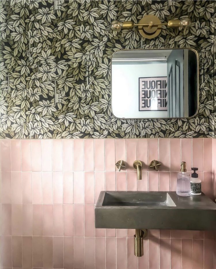
Finishing with bathrooms and this gorgeous Cole & Son Chiavi Segrete paper which looks divine over these pink tiles. Note they are classic metro tiles but laid vertically rather than in the traditional brick pattern, which gives them a whole new modern take. This belongs to Claire @ck_homestyle and is making me want to rip out my downstairs loo and start again.
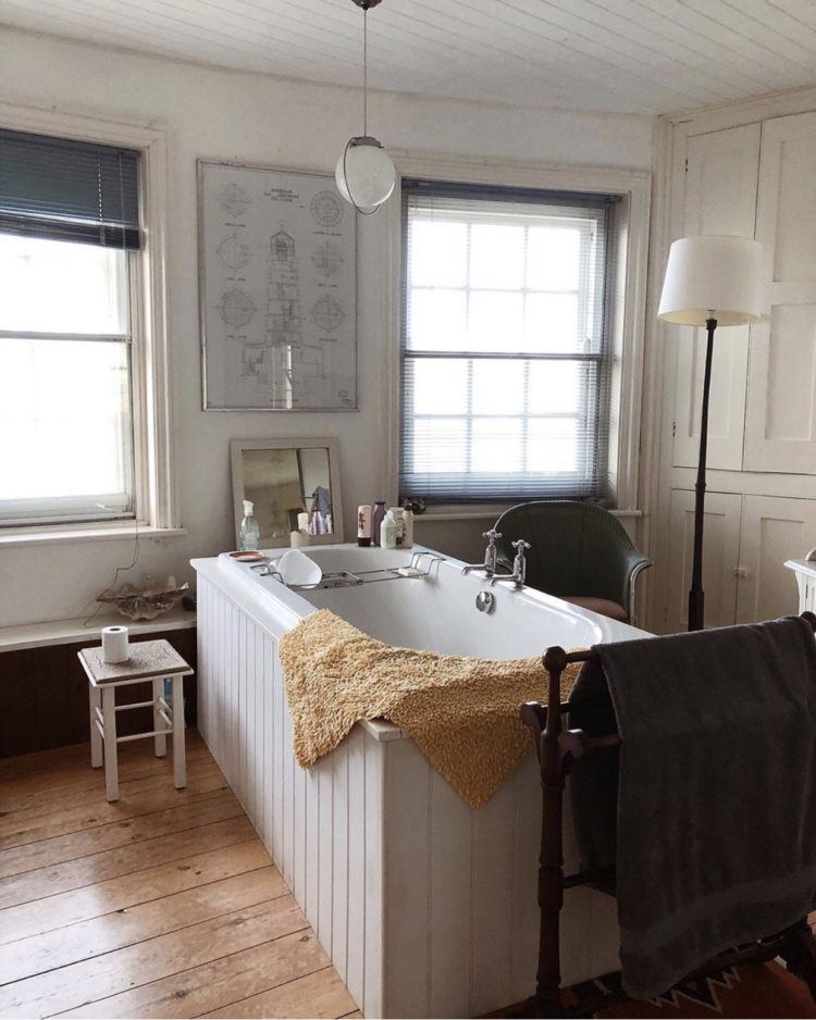
And, no pattern for this last room but the most stunning bathroom by designer Lonika Chande, who offers both remote and real life consultancy and design. This is the perfect mix of rustic and vintage and it can be hard to pull off in a bathroom when there are so many modern materials and hard surfaces.
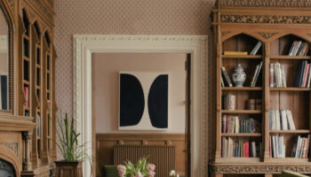
Have a lovely day everyone I hope today’s wander through some beautiful rooms has set you for the week. I’ll be back tomorrow.


Lovely photos and as always great ideas thanks again
These are all so bold!
I’d imagine there’s a fine line between getting it right and wrong though.
I think you said it perfectly when you said these designs are the perfect balance of rustic and vintage.
Very inspiring Kate, thank you! Also I finished listening to the final ‘The Great Indoors” of the series today, really enjoyed it, thanks so much for all you do!
I try to kid myself that I’m a sleek and contemporary scandi minimalist where really…I’m a full on maximalist.
Too much? Not enough I say!
I love love wallpaper in a bathroom!
What a selection of interesting patterns! The picture with two different patterned curtains really stands out.
Great photos. Love the one with different curtains. Thanks, Kate. You have a lovely day, too 😊