Morning all! I think it was interesting to note that while the overwhelming feeling was that last Friday’s househunter was useful the pictures weren’t inspiring and this has always been my dilemma with that slot – either you can have lovely images which might fire the imagination, or you can have words that might help, but you have to fill in the images in your own head. That said, I will aim for more of a balance between the two this year so we might go full on gorgeous inspiration (and probably price) this week and more of an interior design lesson next week – although it does, as ever, depend on what’s on the market. In the meantime, here are some gorgeous images, styled and well shot to start the week on a beautiful note and perhaps spark some ideas for your own places and spaces.
This week I find myself drawn to tiles yes but also to the colour and pattern they bring to a space. Interior design is much looser these days and tiling is no longer restricted to kitchens and bathrooms. While I am not, and never will be, a fan of the large slab of plain tile seen in some modern houses in the UK (too cold and unwelcoming) I see no reason why they can’t be used as headboards (cushions and pillows will soften them for bedtime reading) as well as below dado rails in hallways and even playrooms and other spaces where paintwork might come in for a battering.
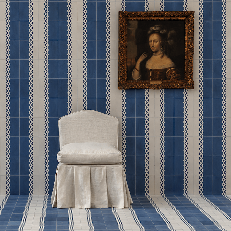
As a child of the 70s (whose smocked dresses were basically held together with ric rac) I was thrilled to see this collaboration between Bert & May and Samantha Todhunter Design Studio. Tiles are so often geometric patterns and, by their very nature, involve lots of straight lines, and these are just a delight. If I could justify a new bathroom I would be sorely tempted by these. I was going to say it’s only the fact that I have no blue in my house that is preventing me from diving in and then I remember the blue bathroom in the loft which is in need of redecorating following a long standing leak over lockdown and the installation of the wrong tap….. There will now be a short pause while I have a word with myself…. Imagine those these wide stripes as a headboard too.
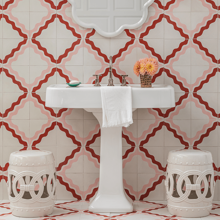
For those who prefer their tiles plain, we can’t leave without looking at Bert & May’s other big collaboration with Little Greene. I saw these tiles at Decorex last year and I can vouch for their loveliness. Above are classic metro tiles in Livid to match their paint of the same name. But look out also for Aquamarine, Rolling Fog, Chemise and Bassoon. They come in metro/subway and square and are suitable for walls and floors and ain’t that refreshing – I’ve lost count of the number of times I’ve fallen for a tile and found it’s no good for the floor and while you can stick a floor tile on a wall it tends not to work the other way round for slip and durability reasons.
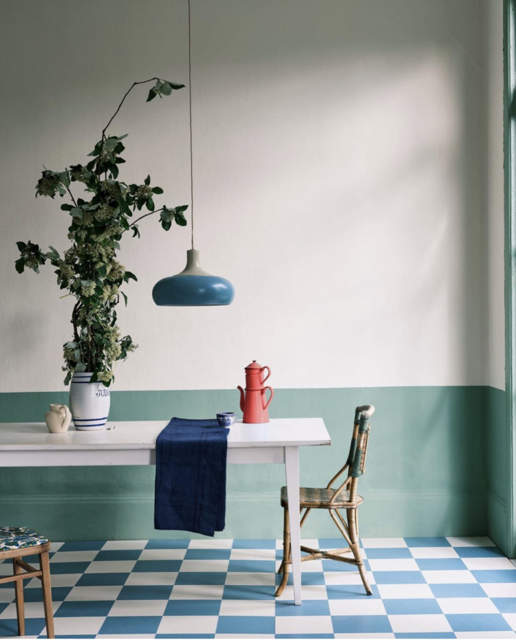
Now this is perhaps vinyl or lino rather than tiles but it’s no less lovely for that. This is about introducing a splash of the disrupter colour to really bring a space to life. It always works. Here the room is mostly shades of toning blues and greens. But this image, put together by super-stylist Marianne Cotterill, is worth examining closely because there are things you can take away.
Firstly, the blues are toning not matching so there is already more interest and depth to the decor. There is natural wood – always required in the ingredients of any room – that’s the pinch of salt and twist of pepper. Likewise a good plant or some greenery. To get really granular (and remember as a pro shot nothing has been left to chance) the check floor and the stripe on the vase. The small cream jug just draws the eye from the wall and back again. And, ok, the two obvious points but how often do you do them:
The table lamp hung low over the table so it’s not just practical but is also decorative. In your own dining space bring it as low as you can so the tallest person at the table can see below it. In most cases that will be lower than you thought. And yes, if you are in the habit of moving the table so you can dance in its place then a long cable with a hook in the corner will mean you can move it out of the way. Then, that vibrant coffee pot right in the middle of the shot.
I’m not suggesting you live your live as if a photographer was going to pop up out of the toaster every morning but it’s not a bad styling trick to take a quick phone snap and see how it looks. Sometimes that helps you to see what might be missing or what could be enhanced – especially as so many of us live on social media these days so we’re increasingly used to viewing life through a lens. Adding this burst of colour is something we can all do – in my own sitting room, which is mostly chocolate, cream and pink, I have noticed little bursts of yellow finding their way in and it’s made the whole room more joyous.
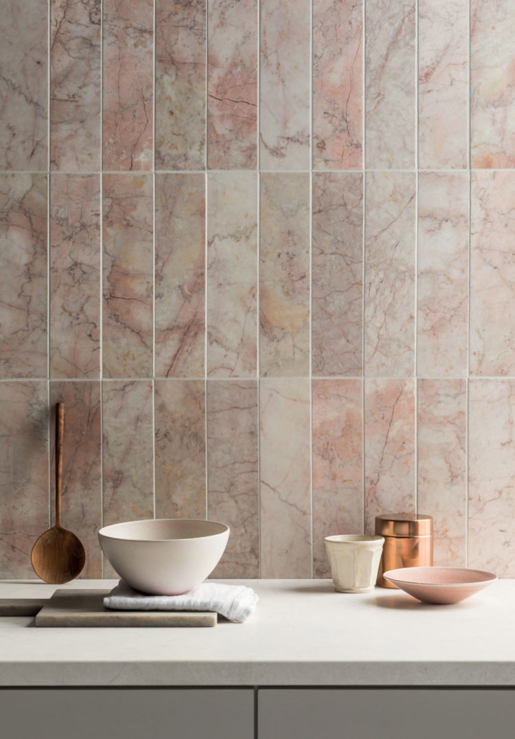
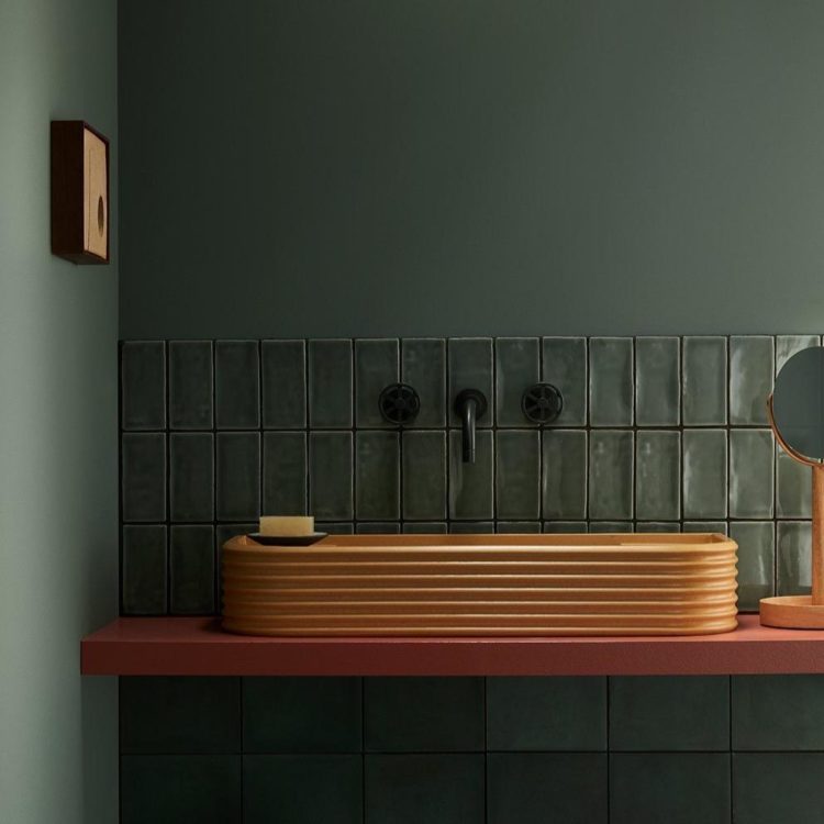
Back to plain tiles and this pink honed marble is how you add texture if pattern isn’t your thing, or you are nervous of committing to a pattern in case you go off it. Magazines have been trumpeting the death of the classic Carrara for a while now in favour of green and brown, but pink is a universally flattering colour in bathrooms and this Rosalina from Mandarin stone is both warm and textured and brings its own pattern to the space. It will love both brass and chrome, new and old wood as well as more paint colours than you might think so don’t feel that it’s a restrictive choice. Even keeping simple with off white walls and a plain floor will look minimal and luxurious.
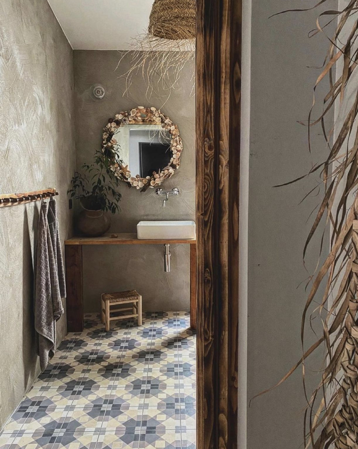
And we’ll finish with a more traditional tile pattern – using geometric shapes to create more rustic flower pattern. There are lots of blues and creams in the scheme but the overwhelming feel is vintage rather than modern and it works well with the wood and textured plaster walls. But don’t forget – as I said at the top – interior design is looser these days and you can absolutely mix tile patterns so if walls like this are not your style or budget, you could absolutely use plain squares (to echo the floor shape) in a dark blue or warm yellow or cream to bring the space together.
I hope that has proved both useful and inspiring – I need to work on a new William Morris mantra for the 21st century: Do not waste time looking at images that you do not know to be useful or believe to be inspiring… something like that – do edit for me…


My issue with tile is that tiled rooms can get really, really loud. It’s worth it in rooms where there’s a lot of water/other spillage (kitchens, bathrooms), and the sturdiness of tile comes in so handy. But in rooms meant to be cozy and comfortable, tile is going to change the audio landscape (audioscape?) markedly away from what most of us associate with those rooms. If you’re watching TV, playing video games, playing music–tile is going to amplify all of that, and not necessarily in an acoustically pleasing way. Not saying it becomes a big deal in every room every time…but it is a real risk of tile.
Hi Kate, Thank you for this item. I find choosing tiles a real problem – I love the patterned tiles and mixing colours but it can be an expensive mistake to live with if the decision is regretted. So I always play it safe, feel disappointed, looks dated quickly and I regret the choice and the expense anyway! It is so difficult to transfer the look of a small sample of tiles in a showroom to a larger area at home … I am hoping you might have some advice on this
‘Have nothing in your houses that you do not know to be beautiful or believe to be useful’ – William Morris
I love this quote!
If I could do a bathroom right now, ric rac would be it. Just as is, I wouldn’t change a thing! Cheers from Canada!
I have experienced the anguish of choosing tiles for a hall floor and my daughter in law now has enough rejected samples to pave her street! It is very very difficult because the colour on the screen can be different from the sample received. So gorgeous pictures Kate, but possibly, colour not to be trusted.
As for Friday’s flat, I am astonished that readers seem not to have appreciated a flat to put your own stamp on. I would have loved transforming it.
Speaking of tiles – you need to check out the floors in https://borgosantandrea.it/en/home/
😍
Good morning Kate, perfectly timed post for me! My wet room has sprung a leak, travertine tiled walls and floor. Floor has to come up so opportunity to change the floor tiles for something more adventurous. Food for thought indeed. Thank you.