Firstly, thank you all so much for your comments and suggestions on the last post. All duly noted and I will try to answer as many dilemmas as I can. So starting as requested for today’s Househunter I have found a small flat. The issue is often that I don’t want to be unkind about someone’s home – even if they are selling it so have tried to find lovely places where I can talk through the decisions that have been made and show you how and why they work rather than being unduly critical of what they have done. However, today, we are going to look at a modern flat that was built in the 1930s and praised for its “exceptional contribution to the design of apartments” and, since many of the images are external and the rooms themselves are fairly white and square, we can have a look at how you might add more character in your own homes. Although I also appreciate that sometimes buildings of this period do work best with plain white walls and minimalist design so you are going to have to extrapolate some ideas and see how they might work in your small new build spaces as opposed to this Grade II* listed one.
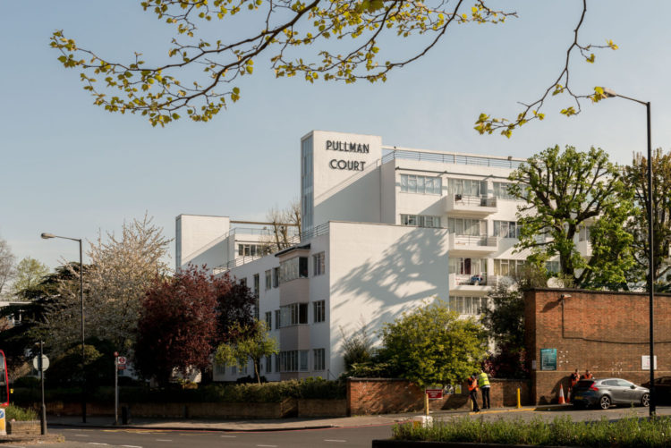
Pullman Court, in Streatham, was designed by Frank Gibberd in 1933 and is on the market with The Modern House for £425,000. It is, according to the agent, one of the finest examples of modern housing in the UK and was designed to resemble an ocean liner. The flats were also created to appeal to young professionals – each one had a built-in wireless, gas fire and ice box and, back then, they were considered to be “country retreats” away from the city smog! Originally they were also equipped with bespoke furniture and lighting to create a link between the external and internal design. There are lots more images on The Modern House site, but we will, as usual, of course, focus on the interiors.
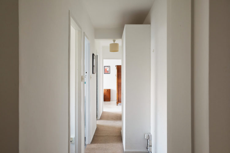
You enter via a long narrow corridor with all the rooms running off to one side (floorplan here) which is common in many flats and even period terrace houses. Now obviously here it’s all white, but the key trick here is to keep the doors and the walls the same colour – whatever that may be. White walls with wooden doors is going to draw attention to the fact that it’s a passage leading only to other places and while there’s no need to linger in such a narrow space it is, of course, the first thing you and visitors see when you enter so there’s a real need to make it look as good, and welcoming, as you can.
It has been made narrower by the storage but, assuming those cupboards are needed, you are going to have to live with that so painting them to match the walls will probably make them disappear as much as they can. But you can also have fun with paint – on the basis that it’s narrow, and ain’t nothing going to change that, you could experiment with colour blocking to add more personality. First up the ceiling. Or you could paint all the walls that face you in a colour which would foreshorten the space and bring the end closer – ideally you would use the same colour on the far wall of the bedroom too which would bring it nearer.
Finally, as I have said before, consider the view through the door. At the moment all you see is half a cupboard, half a bedside table and a small picture. That’s the main bedroom and it’s a good size so could you hang a bigger picture that would draw the eye and create a focal point? Could you hang a very narrow picture on the side of the cupboard facing the front of the picture in the foreground and another narrow one in the middle of the doorway at the end – perhaps a pair? Or what about decorative hooks and then fill them with pretty baskets or bags? And I know that pendant lamp is probably in the middle of the ceiling but as the cupboard is in the way maybe move it to be in the middle of the visible space.
Right, let’s look at the sitting room. This is a lovely square room with a corner window to flood it with light. The carpet is the same as the hall, which is a good way to make the floor space feel bigger and it’s likely that in a flat you won’t be allowed exposed floorboards for noise reasons, so pick a colour you like and stick with it. That said, patterned carpets are back (doesn’t have to be a 70s pub swirl) and you could, for example, have a pattern in the hall, to add interest if you want to keep the walls pale and plain, and take one shade into the other rooms. So black and ivory honeycomb in the hall with ivory in all the other rooms for example.
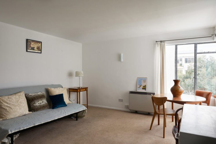
Now the ceilings aren’t that high and there are no downlights which is, in my opinion, a good thing as they aren’t very conducive to atmosphere. However, that single wall light looks a bit lonely and doesn’t look like it’s achieving much. If you have a similar plain white box with low ceilings you could commit to more wall lights as a starter. Or, if you would like a pendant light consider finding blank corner and hanging it low where you won’t walk into it.
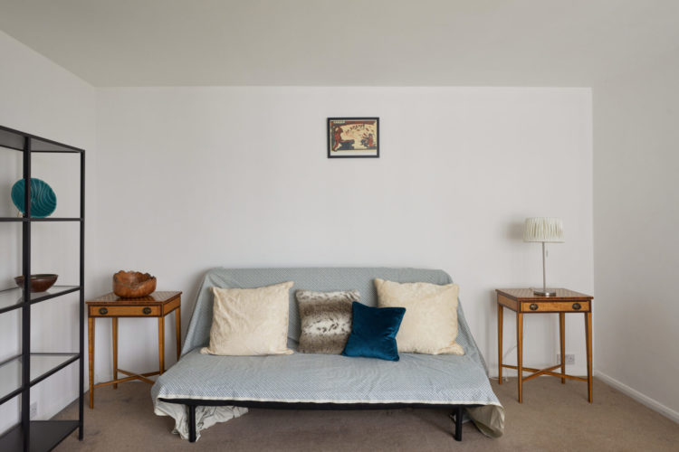
For example, you could hang a matching pair of pendants low either side of the sofa and either do away with the tables or free up space on the tables for decorative objects. You can see here that there is a wall light and a lamp on the same side and the other side has nothing. Moving the table lamp to the left hand side (as you look at the image below) and hanging a low pendant with a matching shade on the other would create a sort of asymmetrical pairing which would bring more light and character.
And that picture? It’s too small and too high. Commit to your art people. Go big and bold and get something – it doesn’t have to be expensive, framed posters are great – that fills your heart when you look at it – and hang it low enough to see it.
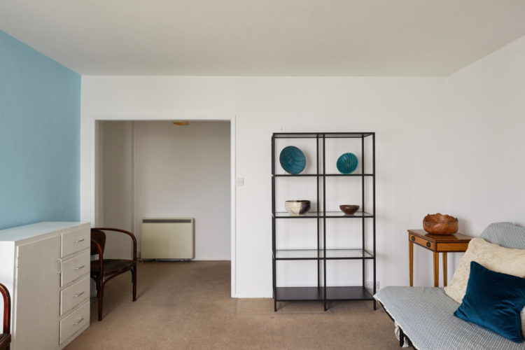
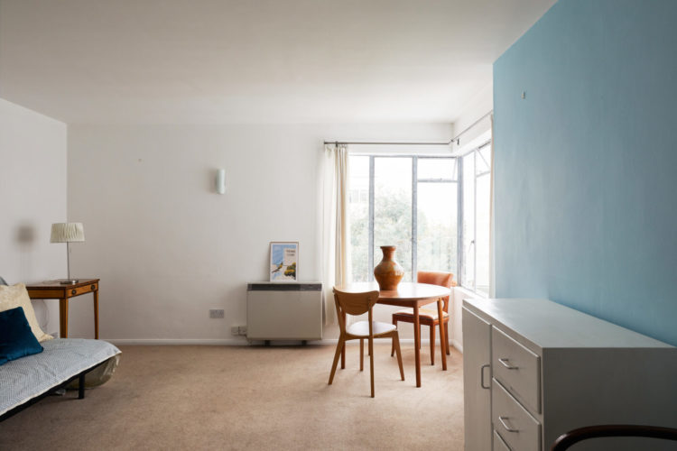
Again, consider the view out of the room. Here we see only a radiator – not a thing of beauty – and a large picture on the wall would add interest. Points for the red thread, in this case blue, though. The blue wall, matching sofa and darker blue plates on the shelves and cushion.
Shelves like this are a great idea in small rooms as they don’t dominate the space and look heavy. I quite like the contrast with the more period side tables too. But you could move the wooden bowl – which matches the table – to the shelves to link the two and put a blue plate on the table to create another link back. Then put trailing plants on top of the shelves to soften them and add more books and objects. The blue wall over the white chest of drawers could also take another picture. And a wall clock will bring a different shape and more interest to a smaller patch of wall.
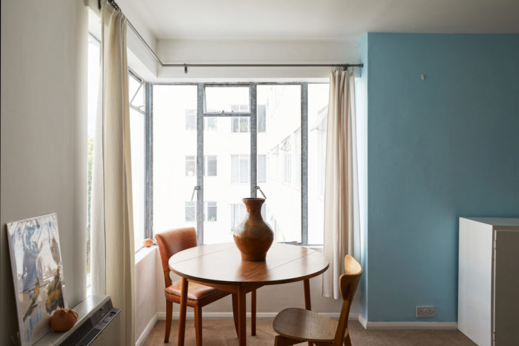
This little dining or work area is perfect tucked in by the windows but the blue wall is a little random. There is nothing wrong with a feature wall as such, but you do have to introduce it to the rest of the room so it doesn’t look random. In this case I would either take the blue (or whatever colour you have chosen) round all the skirting boards to link all four walls and/or replace these cream curtains with some blue ones that match the wall so that, when they are closed, you have created a cosy dining corner. And when open the blue continues round the corners.
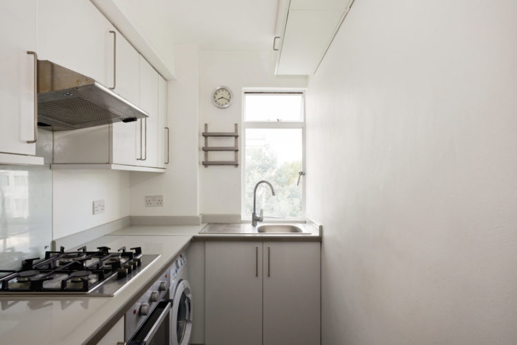
There’s no getting around the fact that the kitchen is tiny. Perhaps the cupboards in the hall provide extra storage but there’s not much you can do here as more cupboards on that blank wall would bring the space in even further and even at 20cm deep – enough for mugs, bowls and some pans – you would probably always be worried about knocking them off. And while the sink has been positioned to give you something to look at while washing up it also feels cramped.
That said, there’s a washing machine and everything you need so I think the best thing is to drench it in a colour you love. You could hang pots and pans from the ceiling and warm it up with a wooden worktop, then add fabulous tiles or a mirrored splashback to bounce the light around and make it feel bigger. This is about finding cosmetic ways to improve your mood while you are in here since there’s no real way to make a huge difference but you could definitely make it very pretty.
To go with current trends – choose a colour you love for the cupboards and add a pretty blind over the window and perhaps a curtain to cover the washing machine. Free up cupboard space by hanging mugs underneath and put utensils in old olive oil tins. Add a picture to that large plain wall – or even some wallpaper – and invest in a boiling water tap so a kettle doesn’t need to take up precious worktop space.
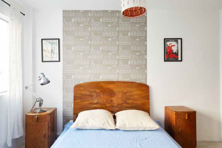
Lastly the bedroom and I don’t know if the picture was taken in a hurry or the person on the window side needs more space but all that off centre would genuinely keep me awake at night. Now hanging a strip of wallpaper all the way up is a great idea to give a bed more presence and it works really well with a divan bed that has no headboard. If you choose a paper that has no obvious direction (unlike this Mini Moderns one) you can also take it across the ceiling to create the idea of a canopy over the bed. And, of course, bring the pictures lower and perhaps use the same trick with a low hanging pendant light as this one is basically lighting the knees of the person lying on the left side of the bed (from the pillow end). Looking at the pictures it seems that the bed was moved over to accommodate a chair by the window which is probably mostly used as chairdrobe. Remembering the view from the front door maybe the chair could be position there with a fabulous picture over it that would draw the eye as soon as you enter and create a scene that immediately makes you feel relaxed as soon as you open the front door.
I hope this has been useful for your own places and spaces. We might go full aspirational next week just to mix it up a bit.


Great article. Lots to think about and learn from in a space we are more likely to occupy than some of the fabulous houses we see! Thank you.
Oh and I would add, it would be nice to see some of the colour and shapes from the rest of the building echoed in the refit: circular mirror or pictures; black and white sharp shapes etc. I am sure there are some querky ceiling lights or mirror set ups and colours in communal areas from the time period that could really bring the elegance and joy back
I thought this was a really useful article to show us how small changes could reap huge rewards. Most of us don’t live in Georgian rectories and although no one enjoys a look around one on Fantasy Friday more than me, seeing how this flat could be enhanced was also good. Actually I quite like 1930’s architecture and if I was looking for a bolt hole in the city I think this would be just the ticket. My feeling is that it has been just that for someone, or a rental, or it’s been hastily tidied up as a executors sale. It doesn’t look like a lot of thought has gone into the furnishing of it so I doubt our critique will hurt anyones feelings. But I think it could be lovely with not very much effort so I tend to agree with other comments – a few pounds spent dressing it up could bring in a better sales price.
No one who chooses the Modern House to market this flat, could possibly live here as it stands. Perhaps the home of an ancient deceased relative?
There is a great deal of potential. First change would be to remove the hall light and buy something special that you can hardly afford to hang on the ceiling.
George Clarke should be your first stop. Work through his past programmes for inspiration.
£50k would result in a stunning bespoke apartment but even £20k and some ingenuity would transform it.
A good find.
I took a look at the floor plan for this flat. The space allocated for both the galley kitchen and the bathroom is tiny; it may no longer meet building regulations. In which case, I would look into negotiating an expansion, which would claim space from the adjoining second bedroom, but would also create prep room in the kitchen, and breathing space in the bathroom. The Art Deco furniture is a rich and warm addition to this modern flat, enhancing its character and its appeal. Even without furnishings, the flat itself inspires creativity in which all of your suggestions would work well. There is also the balcony, an expanded living and garden space to enjoy during most seasons.
This is a terrific post on improving a small somewhat worn home. (And like others, I am really surprised at the lackluster presentation, especially coming from TMH!) May I add that I would hang the curtains at the ceiling to make the rooms look taller, and make sure they touch the floor. Those sad tatty rags are doing no favors to this flat. Also, I think I would remove that cupboard high up on the right-hand wall in the kitchen, put a small shelf on the wall over the sink, and position a mirror at a right angle to the window (to the right of the sink) to create the illusion of a corner window and bring in more light (unless of course it would reflect something hideous).
This post is full of great advice. It shows that even a little space can be made special with a few considered changes. And it reminds us not to be afraid of colour.
Thank you so much for taking the trouble to respond so quickly to Wednesday’s request for more ‘average’ homes. These are helpful points about making the best of things that can’t be changed, and really small changes which could make this nice flat come to life.
I appreciate that finding more modest properties will be a challenge: so many out there, and so few that will offer you good teaching points to be worth spending your time on, but as an occasional addition to the mix it will be very welcome.
I do agree with the commenter who felt that the agent wasn’t putting their back into selling this property – even just to have made sure they centred the bed before taking any photographs would have enhanced the value.
Hello from Philadelphia, a newish reader here and whilst I almost always learn a little something from your posts, seeing a more typical featureless home here and your thoughts was a full on lesson, thank you very much! Happy New Year, Liese
This is so helpful to me Kate. I’ve moved into a small 70’s house that has had no love for years and I’m slowly getting it together . I have a tiny kitchen which I’m just doing up so this is very timely! I know lots of people like the big blousy houses in Househunter but sometimes the real deal just hits the mark. I moved from. Grade 2 listed flat with 13 feet high living room and it was never cosy no matter what I did. But my quirky tiny 70’s pad feels like home as Madonna used to say! Thanks.
Tend to agree with the comment about “lack of effort” in showing the property. Surprising to find it relates to a flat designed by the Gibberd ancestor of Modern House founder, if I am correct in this assumption. Perhaps this bolt-hole is on the books for that reason. However, the comments you make, Kate, about remaining kind, do also help those of us with more space, but with lowish ceilings, and as always there are many tweaks to consider for making the most of homes we actually have. I particularly appreciate your ideas about “corners” taking in the adjacent coloured wall etc., as well as remembering the red thread factor.
The more I look at it, the more I think it must have been completely empty and in a bad state, and they have done what they could in a couple of days from absolutely nothing. There has to be a point where staging would become actual renovating!
I loved this one!
Really full of advice to add character a really simple place. Thank you Kate!
Hi Kate
Happy new year!
Very interesting post with lots of good ideas as always. However I agree with the above poster, that this property isn’t quite up to The Modern House’s usual standards, either in terms of the building itself or the room styling. In fact, it doesn’t look like anyone lives there!
Oh dear. I live for the Househunter on a Friday morning, and all the stunning properties that I wish I had a lottery win to buy. This week is just a little bit depressing.
What a useful post. Thank you. Shows us what happens when we don’t follow your tips – like view through a door, random “feature walls”, and placing of red threads. I actually shivered when I saw that off-centre bed. I hope that someone follows your advice to hitch this up a notch or two.
It looks a fabulous little bolthole flat that not much money could make it sing!
I am torn between agreeing with staging the end room to be a focal point as you open the door, and disagreeing that do you want strangers to see a personal space? Food for my thought.
Love the little dining area and would love to see it as the focal point with a large statement light and sleek curtains.
Love your analysis x
I really liked this post Kate – it was interesting being shown round a more modest but pleasant home and getting ideas on little changes that would make a big difference.
Good post – nice to start with a bit of a tricky property. My kitchen is small (not as small as this) and the window is small and east facing across the side return to the neighbour’s kitchen so we’re short of good natural light. So the advice to choose cupboards in a colour you love and generate interest with pattern and colour is one I’ll file away for the day we come to renovate.
But I have to say – I think the vendor is being rather short-changed by the Modern House here. Usually they make a huge effort with styling properties for sale, and I often think that the furniture and accessories are shipped in the for day. But zero effort seems to have been made here.