I had my annual Spring wake-up call this week when I looked out of the landing window on the way downstairs in the morning and the huge chestnut tree, which has been nothing but a tangle of naked branches for months, is suddenly fully decked out in her green dress and bursting with life. It happens every year – seemingly overnight. Somehow, while we are all wondering when it’s going to warm up, Spring creeps in overnight, unpacks her case and flings her green dresses over all the bare branches which are simply standing there like so many empty hangers in a wardrobe.
I can only assume that it’s not that I’m completely unobservant, but that it’s just far enough way to make it impossible to see the buds forming and beginning to unfurl so it’s not until the leaves are fully open that the Ta Da moment arrives. Suddenly blossom is everywhere I look as the earth begins to wake from her winter slumber. So, in honour of that, some gentle colour to get you in the mood.
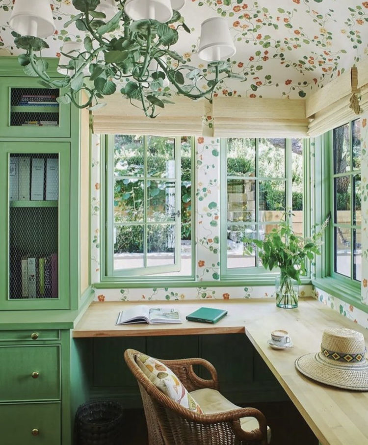
This’ll wake you up on a Monday morning. I think I would never have the courage to paint my windows this colour but I sort of wish I did. The darker green cupboard and floral wallpaper wrapping the walls and carrying on up over the ceiling would make this a wonderful spot to work don’t you think?
Obviously the view here seems lovely too but it’s worth remembering that if your view is less than perfect you can decorate to distract the eye from what is outside and keep it firmly rooted inside – either with a nature-inspired scheme that you wish you had for real, or just with colours and patterns that you love and which will always bring a smile to your face.
This is why painting windows other than white can be such a vital element of interior design. And, as a final touch, if the view isn’t great but you have a bit of a sill, then a window box will always bring you some real greenery as well as mask a bit of the urban jungle. I have a rosemary and a thyme in my window box and the idea is that their gentle fragrance will waft in when it’s warm enough to open the window. Which is not yet.
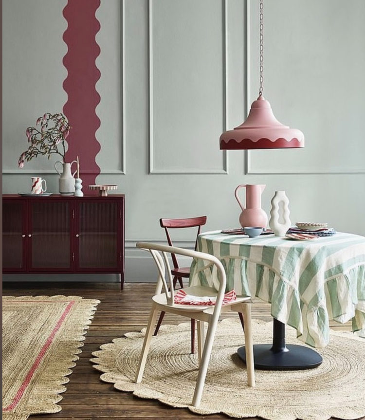
This, for me is a more relaxing and usable colour palette. Shades of pink and green with natural flooring and a scallop theme. I’m not sure you’d ever paint a wavy stripe over your panelling in a real house but this was a styling shot for a magazine and it serves to highlight the lamp and draw the eye to the matching shapes on the floor.
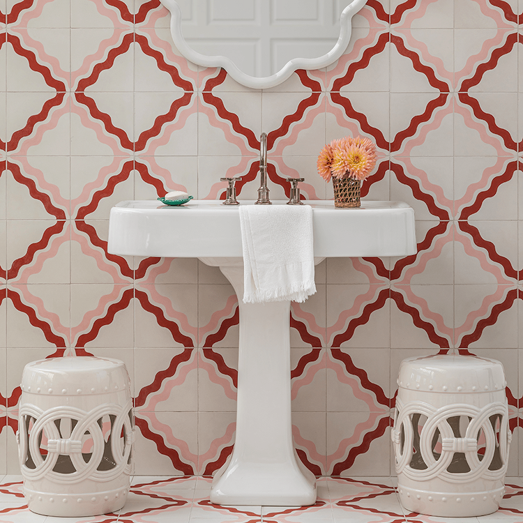
That said, with a steady hand and minus the panelling painting a sort of ric rac stripe on the wall would look amazing in a bathroom or bedroom and puts me in mind of this tile range by Samantha Todhunter for Bert & May. And if you were wondering about trends then this scallop one looks set to take over the world in the next few seasons. It’s another classic that is having a moment – at least I say classic – I had lots of dresses like this growing up in the 70s so it’s not that the idea is new just that it’s being used in a new way which is mostly all a trend is in the first place. Which is why, if you like one, you shouldn’t worry about using it. You will know instinctively which ones aren’t for you or which ones you did first time round and don’t fancy again – denim hotpants and pineapple motifs for example.
Moving from the pinks and greens to the yellows and plums and this kitchen, which is painted in Farrow & Ball cord. Regular visitors to The Mad House will know I have been flirting with yellow but will, also, know that I’m never actually going to paint my kitchen in it. Honey, however, might be a different matter. Just yellow enough to count but not too much that it will assault the senses before I’ve had the first, of two, strong morning coffees.

The pale floorboards work with the pale honey colour and the darker vintage table and dramatic marble backsplash bring some force to the scheme. And don’t forget the vintage brass flower lights. You might have thought they would belong in a sitting room – where they would look wonderful, but how much more fun to add them to the normally more austere and practical lines of a kitchen? Sitting rooms get the cushions and the upholstery and the curtains. Let the kitchens have some of the fun stuff too.

Staying with honey in this gorgeous bedroom by Sophie Ashby, who has combined these soft tones with a plum bedside table – doing the same job as the dark wood in the kitchen above. This feels like a slightly more unexpected combination but it’s all the more beautiful for that and the floral cushion brings the two colours together perfectly with the green as the perfect foil.
If you are stuck for colour combinations do take a wander – if you can – round the fabric department of Liberty, or your local fabric store – or even at online wallpaper stores like Wallpaper Direct. Tick the floral box and see what comes up. It doesn’t matter if you don’t like the pattern, this is about looking the colours and how they work together and how you might be able to use them in your own home. I have lots of plum in my house and suddenly I’m thinking I need the honey.
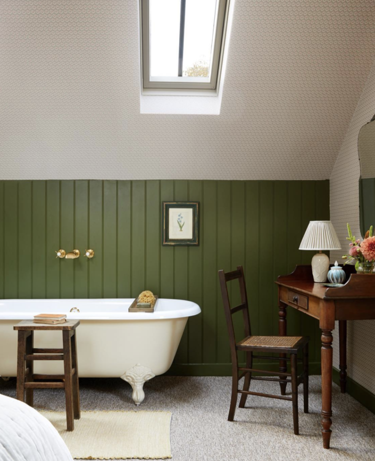
Finally, the only honey colour here is in the sponge on the bath, but the olive green and dark wood work beautifully together to create this luxurious bathroom in this holiday cottage in the Cotswolds. If you feel like tiles would be too cold then tongue and groove panelling is perfect for a bathroom. I did it in my last house (11 years ago now) and feel the time might be ripe to revisit this look. It’s warm and, for those of you who bore easily, it is, of course, much easier to change by painting over rather than having to rip out and change tiles.
I leave you to the joys of Spring and, to continue, the analogy, watching for signs that she is hunting out her floral accessories to put the finishing touches to her Summer outfits.


Love the bathroom idea! Great point that you can simply paint over the panelling when the mood takes you, as opposed to tiles! The olive green definitely brings warmth – LOVE!
I recently started to write a blog and sometimes i need to write an article about interior design and let’s say i’m not very knowledgeable on that hehe and articles like this definitely inspire
I would love to do a room like the first photo – so joyful ! I have papered the ceiling and light switches in our laundry room with Morris & Co ‘Fruit” wallpaper but the windows are wood (and not old enough to overpaint, yet). The wall colour picks out a colour in the paper and the whole effect is very happy.
Can you reveal the source of the lovely striped tablecloth in the linkk-green photo?
well, your last office, which I loved (as much as I love the new one, actually) was indeed plum and a kind of yellow that doesn’t say it’s name, since it was gold. Wasn’t it ? Loved the feelling of the bedroom !
Having had a sunny living room painted in Farrow’s Cream and always loving it I’ve recently moved to a much darker house. This one has Dimpse on the walls and I’m yearning for the sunny look again…the cord colour you’ve shown looks gorgeous and a little more muted. Hmmm. I’m off to buy a tester pot. Love these posts, they actually make for a lovely start to the day.
Spring comes like a trumpet in many parts of the world. Here in the Canadian prairies it is more like a flute. Cheers from Canada!
“Nature’s first green is gold,
Her hardest hue to hold.”
I would love a kitchen like Pernille Lind’s, which is approximately double the size of mine, alas. But now that you’ve labelled the color “honey,” is it just me, or does the ceiling fixture reference those spiral honey dippers?
No, not just you and well spotted! Also the wall lights are flowers for the bees……??? I love this clever and subtle “point of referencing” but it could just be an accident? Nah!! Either way, it is pleasing.
Hah ! I thought that too – very subtle but fun. Ditto the flower lights 🙂
That was a lovely start to the week, thanks
Very interesting, love the colour combos. We used to have a honey coloured carpet with just very subtle small shapes on it all through our living area. It was very warm looking.
What a beautiful piece of writing , made me smile with delight and I had to instantly re read it to savour all the details. Oh , and I liked the pictures xx
Omg I am in love with those bert and may tiles!!