Small space living this week and it’s a new build flat in north west London by design-led developers Artform and design studio Scenesmith. At at time when many of us live in small spaces – and those of us in big houses are bound to have small rooms, this collaboration shows you that a modern flat doesn’t have to be a series of low-ceilinged white boxes with a grid of downlights marching across every ceiling.
This development comprises nine flats of which three are still available and it’s on with The Modern House. If the aesthetic looks familiar it’s because it’s the same team which did this development which I have seen in real life and while some of you weren’t keen on the concrete ceilings I can tell you that they are high than they have to be which, in small spaces is key to making them feel bigger.
Back to the original point of white paint and spotlights beloved by so many developers and while I appreciate that allows you to choose your own colours and finish (or possibly have to rip them out and start again) it’s also interesting to see how colour and finish can be used to enhance a small space.
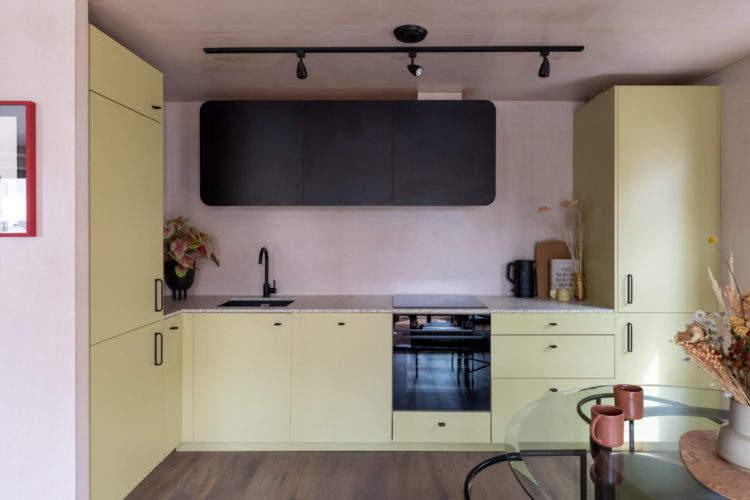
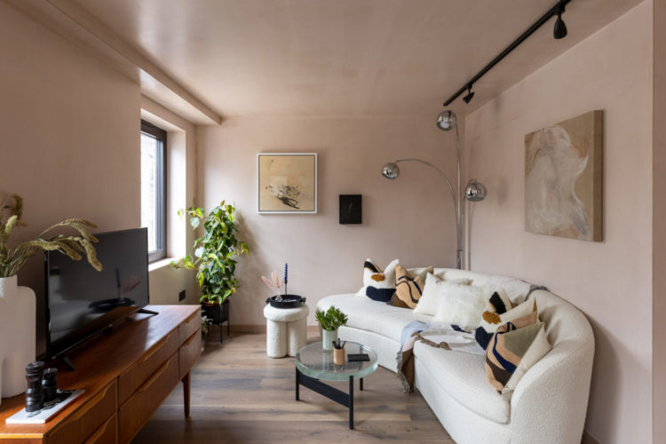
So there are no white walls here. No spotlights. And let’s look at this lighting – in a white room and in the classic chrome ceiling you’d be planning to rip them out before you’d shut the door behind you as you left. But here, in black, picking up on the window and door frames it’s immediately incorporated into the space in a way that feels more “design”. So if you have moved into a new place with lights like this, consider spraying them in another colour – even to match the ceiling (yes that can be white) to either make a statement with them or hide them. The point being that chrome may be the classic developer’s cheap friend but it’s probably not yours. And while we’re talking about painting stuff that isn’t a straightforward wall or bit of metal then the All Surface Primer by Little Greene is what you need – works on uPVC windows as well as metal and you can simply paint over the top in any colour you like. I know several people who have used it with good results too which is why I’m linking to it.
Spotlights have dominated our lighting schemes for so many years now and it’s great to see designers reaching for different ideas that we can consider. It’s especially important for new builds where the ceilings may not be high enough for dramatic pendant lighting.
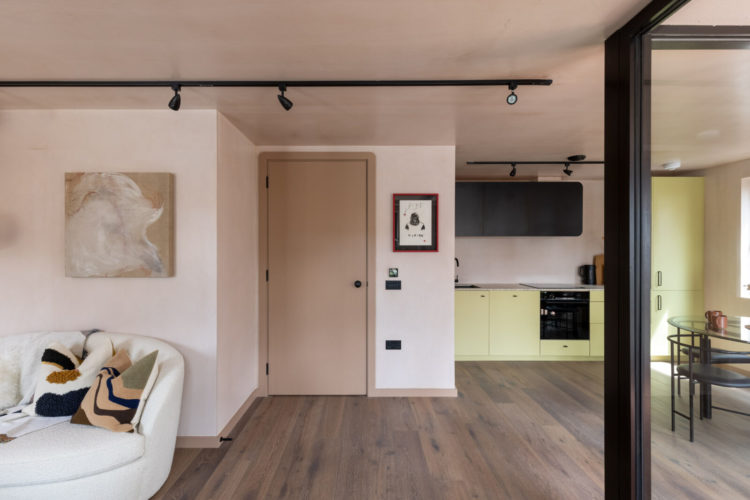
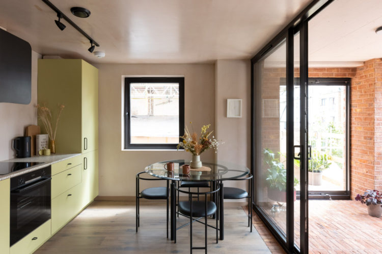
You will note the walls are a soft plaster pink throughout, still a pale neutral, still loves all the other colours but is warmer than the classic white. It also picks up on the red brick on this little covered terrace outside creating a link between in and out, which is especially important when you have glass walls.
I also love the tonal colour of the woodwork where the skirting boards and doors are in a darker version of the walls. Again, this creates a more elegant look than reaching for default white and you can do it in any room with any colours you fancy – shades of green, blue and brown will all work.
Finally, before we leave this room let’s just pause by the yellow kitchen. This is a more lemony version of the shade than I would personally choose but the point is that it’s a colour not standard white. I was talking to someone last night who was about to install a new kitchen and admitted that while she doesn’t really like white she was frightened of spending a lot of money on a colour she might go off.
That’s an understandable fear and a sensible thought process but that doesn’t mean you have to opt for the so-called sensible choice. You will want to live with your kitchen for at least 10 years and you want it to be a colour that makes you happy when you see it. This is important not just in an open plan space – where the kitchen may be more like furniture than units and so the colour takes on more importance – but also for those who don’t love cooking. They, more than anyone, need to feel happy when they enter this space to do a chore they don’t enjoy and the right colour can inspire you and lift the mood. So it might not be lemon yellow for you (or me – although I like it with the pink) but take a moment to think about what your happy colour is and make sure you use it. You might have bought a house from developer but it’s for you to live in not them.
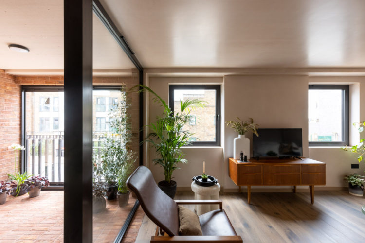
Above and below you can see the sitting room. It’s not huge but, again, it’s cosy and the curved sofa is clever. Many of us would rule out a curved sofa on the grounds that it would take up too much space but in a small room like this it’s actually the best solution. Imagine, for a moment a standard sofa that would be facing the window, or, if shifted up a little further, right in front of the television. That would feel linear and cramped and would serve to emphasise the fact that’ it’s a small space. You might be able to put a sofa across the end but it would be a squeeze and – design tip incoming – wherever possible furniture needs room to breathe. If it is touching the walls on three sides your instinctive reaction is that the space is too small. By allow even 5cm at the side (10cm is better) it has enough room to breathe and the rooms feels less squeezed.
So that probably rules out a sofa across the end. You could put it across the glass wall above – where the chair is depending on measurements – but let’s return to the curve. This allows a light to sit behind it and allows you to sit further from the tv while still angling the room round towards that and the chair at the other end. This is a room you can chat in (while ignoring the tv) as the curved sofa is facing towards the other chair, something that would be much harder in a classic straight line formation. So, small spaces, curved sofas – one to consider.
Into the bedroom and here the pendant lights have been hung either side of the bed which gets rid of the fact that a single one in the middle of the room may be in the way. Again, painting the walls to match the ceiling, in whatever colour you choose, makes the room feel less cluttered and larger as you are blurring the edges and making the bed the focal point rather than the size of the room.
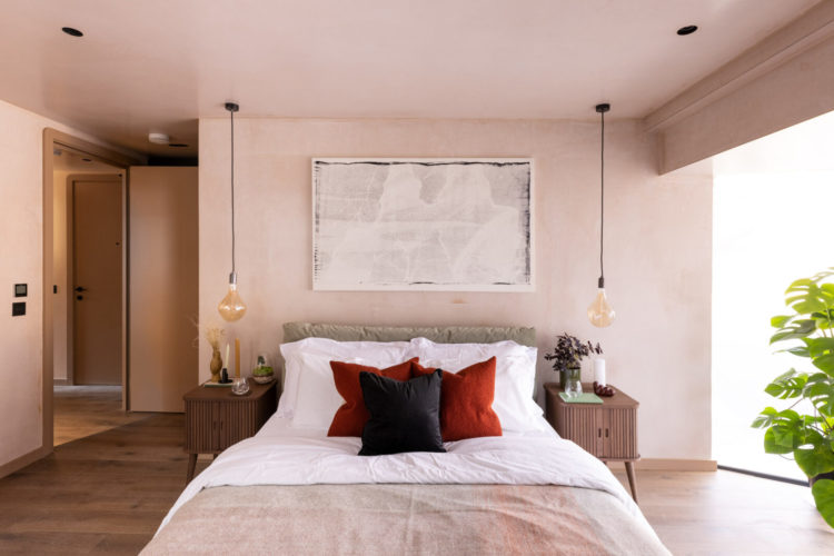
A point to make here is that while you clearly can’t make a small room bigger by making it seem bigger you can create the illusion of breathing space and it will feel more relaxed. If you can picture this with the same pink walls but a white door, white ceiling and white skirting board you are effectively outlining the edges like a cartoon and I guarantee your first thought would be “this is a small room” rather than “look at that picture over the bed” or “should we hang our bedside lights too”. The latter idea also draws the eye up to where the space is emptier which reinforces the sense of space and emptiness. It’s all an illusion but it works. It’s the same thing with the bedside tables which allow you to see the floor underneath.
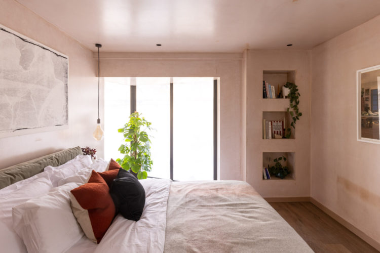
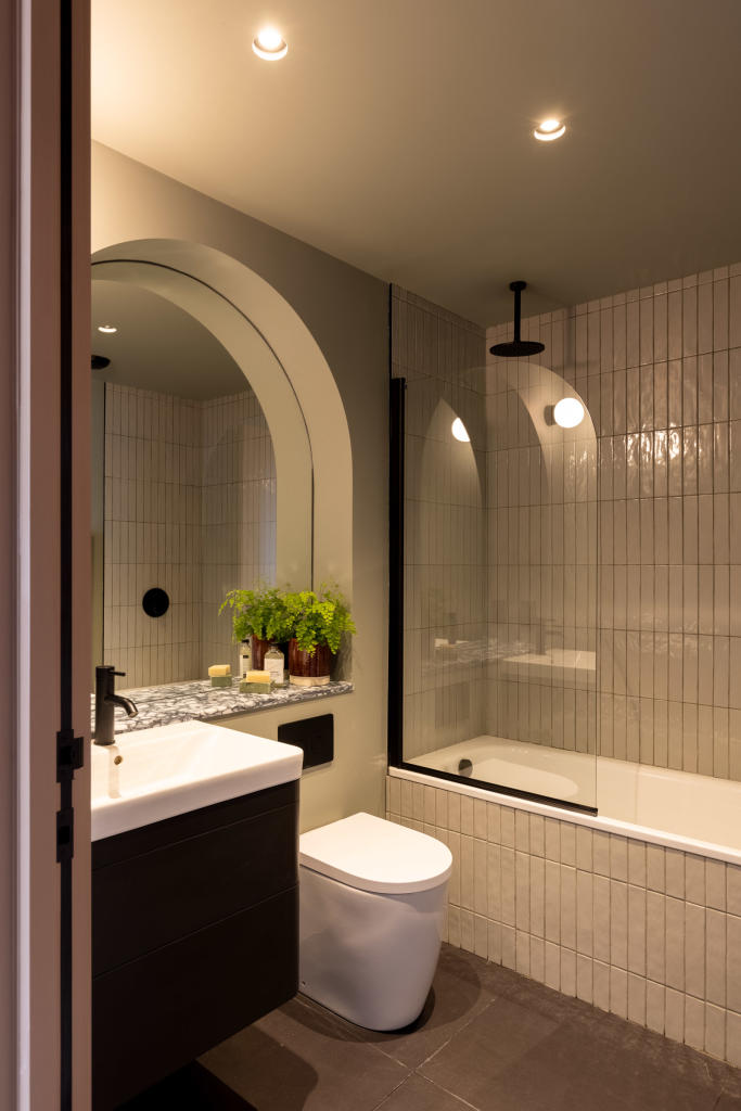
This large space has also been divided to create a bathroom behind the bed (it’s flat five on the floor plan). The measurements aren’t included (helpfully) but it’s probably around 1m to 1.2m.
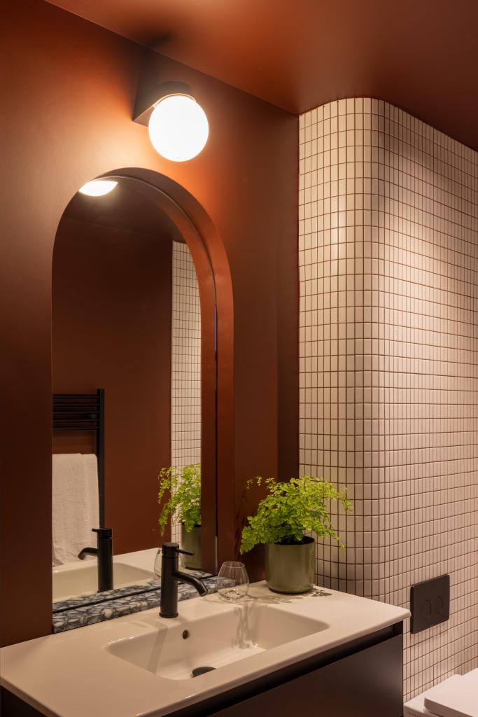
And look at this bold colour. This is a bathroom without a window it’s never going to be that light but by wrapping it in a strong colour you’re embracing that. Note also the curved mirror and the curved wall – nightmare to tile but a lovely extra touch.
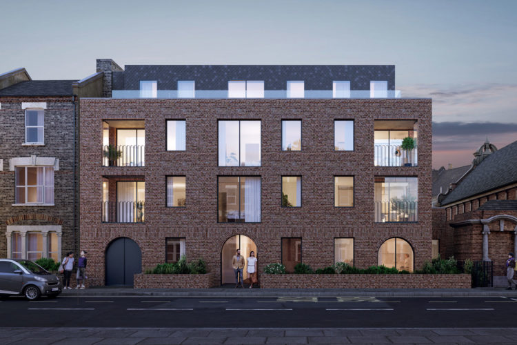
The second bathroom is below and again there are curves and arches. This has been done, say the designers to echo the curves and shapes of the exterior of the building – pictured below. Now adding shapes like this is more expensive than buying off the shelf but a) it’s a small space so you might be spending less on tiles as you will need fewer and b) it’s a way to bring in the wow factor when you haven’t got space or fabulous windows or period features to do the job for you. You can do a lot with a well-chosen colour scheme but sometimes you need to go a bit further.
I hope this has given you some ideas for how you can add character to newly built and small spaces of your own.


Thanks for the tip about using the primer. Fantastic range of colours. I’ve ordered a couple of their pale to mid green sample pots to use on rather old grubby white upvc windows at the back of our Victorian cottage. Cheaper than replacing them. Last summer I painted a couple of horrid black waste pipes above and to both sides of the kitchen door in a Dulux all surface sage green and it instantly changed the look as I painted some trellis the same colour. Wish I had done it years ago.
It is refreshing to see a flat in colours other than the standard white box look. The yellow kitchen is something different and might work in place rather than in a photo. The winter garden is a thoughtful accommodation. It also appears to be a large area. The glass partition separating much of the area of the kitchen/diner and living spaces. It could have been configured differently to open up the rooms and still offer a separate indoor garden space. The arches and curves in the bathrooms are definitely Wow features. As the rest of the flat is linear, there is a sense of having walked through the walls to another flat designed with a different aesthetic in mind.