I find myself in an unusual position this week. After four months of builders (on and off), three bedrooms completely transformed and two bathrooms designed we have reached the kitchen. This will lead through to the pantry, off which sits the shower room/downstairs loo.
The floor for this whole space has been chosen (Ca Pietra Marlborough Terracotta) as well as the wall tiles for both the kitchen/pantry (parchment) and shower room /loo (khaki and cotton). We have picked the lights, decided on the wall colour, the worktop the taps, basins, sinks and appliances.
Bear in mind we have had to do this in the sitting room and bedrooms too – not appliances but flooring and paint and window dressings.

And I’ve hit a wall. I cannot decide what colour to paint the kitchen cupboards.Originally they were going to be covered in a tough type of laminate that would protect them from chips and scratching. That was going to be a sort of warm pale pink. Then that colour was discontinued and we reverted to paint. And we went off the pink. So we sat with green for a while. Then decided that was for the loo and we should be different in the kitchen. So we went to dark brown. But we had that in the last house. Although I still like it and it would be a different version and we moved for circumstance not because we didn’t love the house any more. Although I understand it’s all being ripped out anyway.
I’m not necessarily asking for advice because you haven’t seen the rest of the house, nor the design of this room and the worktop we have chosen – that’s a bit different and there will be a reveal to come. Although I always welcome opinions I’m aware that if 28 of you comment on four different colours there will be an even split between all four.
It’s just an unusual place for me to find myself. I have made about 847* decisions in the last four months and the 848th has defeated me. (*Not necessarily a completely accurate number).
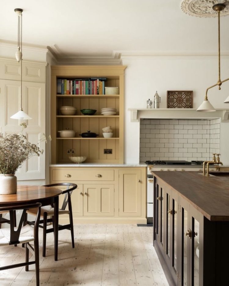
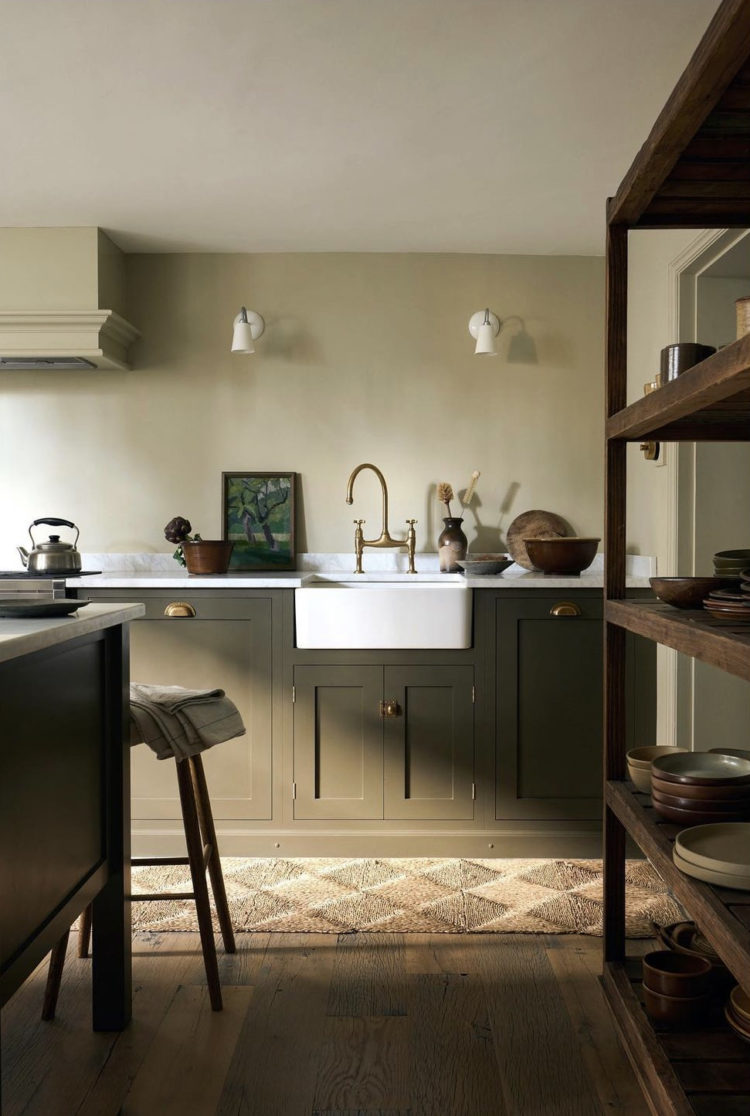
It’s definitely going to be a very dark olive green, or a dark brown leather, or perhaps a soft pink. But maybe I should revert to my lockdown self and look at that straw-like yellow. The Mad Husband, who says he now doesn’t want pink (having been on board with pink) now says he likes yellow. I’m not sure about that with the floor. But maybe it would be amazing. Although it needs natural wood like this and there’s no island. But there are shelves. And a table.
I’ve got about three weeks to make a decision….. right now it’s wide open.


Oh Kate – glad it’s not just me! I think I have ‘decorators block’ and have gone from wanting a muted grey green kitchen, to wanting a bright green one to also thinking about pink! I change my mind on a daily basis – probably as colour is a reflection of our mood and the outdoor environment, which is constantly changing! I think even once I’ve picked the colour I will initially have colour remorse. I think my problem is I would love pink but getting right shade of pink is hard as don’t want it to be ‘candy sickly’ pink. Any ideas on shades of pink would be great! Good luck!
The perfect green: NCS S 5020- G70Y
Ooh no, on reflection, an inky black blue would be fab.
I have oak floorboards and base units in what is called Aegean Blue, so probably a few shades lighter than inky black blue, and which has a bit of pink in, so a bit Little Greene James, by no means a cold blue.
Faded terracotta ! would go great with the rest (that you mentioned!) Used both Tuscan red (Little Greene) and Etruscan read F&B archive colour
I’m not going to suggest a colour for the cabinets, whatever you chose will, I’m sure, look stunning! But it is very sad to hear your beautiful kitchen is being ripped out…what a shame!
GREEN!! The Devol one featured looks like heaven to me… but I am always drawn to natural earthy colours & in particular green… it gives me joy. However I live in an old farmhouse in deepest rural Cornwall so perhaps my backdrop influences these decisions. My advice when completely stumped… toss a coin!
A(nother) vote for yellow! But I’m sure whatever you end up with will be lovely. Good luck with it.
I wish I could say not the last kitchen, the golden one by deVol, but I cannot! I am not usually a yellow girl! And I am not fond of the descriptive “straw”, but that kitchen completely draws me in – envelopes in a warm cozy cuddle by using the wood, beige, cream, and in your case, that especially gorgeous terracotta floor.
I am considering a kitchen re-do this summer as well – gah! And have found myself drawn to the simple kitchen The Gold Hive has created, all similar colours to the one above that you already pinpointed! It obtains the warmth from a wallpaper, and I would add crimson and white ticking on a banquette, plus perhaps a vintage crimson scalloped glass pendant with fringe by Rothschild & Bickers. Keep up the sharing, I love reading and seeing what you do and it may very well influence my kitchen over here in Canada!!! Thank you!!!
Hi Kate, My humble suggestion is to “sit” with the kitchen cabinets for a bit unpainted? It would lessen the stress of having to make a decision on paint colour right away, and no regrets afterwards. When the floor and kitchen/pantry tiles are in place, the arc of the natural light’s reflection in the room itself should reveal the colour you want.
Have you asked your good mate Sophie? Doubtful that you’ll agree but sometimes knowing what you don’t like and why, helps with deciding what you do like. No need to change for change’s sake – go with your gut and let’s hope Mr Mad’s gut agrees. Looking forward to the reveal.
Having been an all-neutral girl for years, I’ve now got F&B Hay in the pantry, Cord in the kitchen and Sudbury Yellow in the laundry. I’m pretty sure I’ve been kidnapped, but I love them all! Love the floor tiles, Kate!
There’s a yellow called Nicotine that Rita Konig has promoted which would suit the other colours chosen but if it was me, and I loved the colour of my old kitchen, that would be the colour I would choose again, if it matched my new choices. Being in the kitchen has to be a pleasurable experience.
Generally I love pink, probably more than most, but I actually didn’t love that pink photo. I think it felt lopsided to me—like the dark wood should be on the bottom cabinets and the pink for the top. When it’s darker in top it always feels too heavy to me. I’m also surprised at myself, because I don’t generally love yellow, but that yellow in the photo is really stunning. Soothing, colorful enough to feel like color yet neutral enough that all sorts of other colors (art, rugs, dishes, tea towels, bowls of fruit, flowers, table linens) will mix and match beautifully. Just my 2c from Philly!
I think the yellow would be stunning. We have a cornflower blue kitchen but if I could I would go with yellow 100%
I have been pondering this shade of plummy purple for a future kitchen redo – https://www.themodernhouse.com/sales-list/the-denim-factory/
It’s the dark side for me. I think a ‘Dirty Tobacco’ (darker than yellow) would bridge the two tile choices but as you are drawn to the warm and are already halfway to Tuscany with the floor tile …Etruscan Red 56 FB Archive Colour (darker than pink)
Well, Kate, I have trouble with every-single- decision I make in our house and I only arrive at one becauseI resort to the one I like the most! I give myself added complications like using what I have etc etc I know -but at least when I see a ‘pro’ in the same position I know it’s not just me! 😁 good luck, hope you make the right one!!
“I’m thinking of painting my kitchen yellow” isn’t that code for “I have been kidnapped” !?
I was thinking the same!Hahaha!
Good luck! Design decision fatigue is the worst. Probably best to stop thinking about it for a while and the answer will (hopefully) become clear. As for other people advising, wasn’t it one of Aesop’s fables where an old man, his son and their donkey set off on a journey? Along the way they were given all kinds of advice, the old man should ride the donkey, the young man should ride the donkey… at one point they both ended up carrying the donkey! Whatever you choose will look amazing I’m sure, but for what it’s worth I’m with the mad husband this time – I’m not feeling the pink/terracotta/parchment combination, too much like a Neapolitan ice cream for me, but I might completely change my mind if I saw the finished kitchen. So not much help there then.
My own kitchen refurb about a year ago was – shall we say – heavily inspired by that pink Studio Duggan one, only with the pink (the ubiquitous Setting Plaster, no regrets) transferred to the walls and the units in F&B Dyrehaven. It does feel a bit on-trend now but fortunately they’re paintable cabinets so can always change it when we finally tire of the green.
Can’t help but feel a bit scandalised that the people who were so keen to buy your house are ripping it apart though! Hope the 848 decisions about the new place are distracting you sufficiently not to feel any residual sadness about that.
Click on your link to the Marlborough tiles photo.
What beautiful tiles !
In the photo, they’ve used a gorgeous coloured grout. It’s not bog-standard ‘white’ grout (a big no-no!), more of a ‘dirty’ blue/grey/duck egg/cement.
Match your cupboards to that grout colour !
It obviously sets off the terracotta floor tiles beautifully, as they chose it themselves.
It will’ link’ the units to the floor & ‘ground’ them; the’ flow’ of colour will draw the eye down to those gorgeous tiles; it will bounce a little light up from the darker floor, and lead nicely to the darker colours in the loo area. It will look stunning !
I think straw yellow is a great idea. I am going to use Little Greene paint colour Woodbine (no 134) on the kitchen cupboards, a white with dark gray faux marble countertop and a feature wall with white and black veining faux marble on the wall with a black sink.
I am painting and stencilling the floor with Little Greene French Gray Pail and French Gray Mid colours. I am hoping it turns out as fabulous as I imagine.
If your old kitchen is being ripped out, could you ask your buyers if you can rescue and reuse some of it? The doors at least?
In the vein of being supremely helpful as a commenter (heh), I think your natural wood leaning instincts are dead on. But hear me out as to why!
I’ve seen more and more natural oak (and some walnut) lately, and many of the timber cabinet makers use ash underneath which I think looks great naked too. It’s very en vogue today and while that’s not the whole reason to adopt a trend, it does mean it’ll sit right with you as a look for a long time since we’re kind of near the beginning of this wave of natural oak cabinetry as a trend, IMO. (And of course it honours a Victorian space nicely blah blah. Even if they did mostly paint the kitchen cupboards back then.)
Wood will be popular with your husband! Men love natural wood, haha. (It’s sort of a design trope in the USA where I’m from, at least – men not wanting to paint over the dated stained wood cabinets because “it’s wood” even when the colour is more like screaming fake cherry burgundy from 2006.) Wood won’t read as femme or too trendy as quickly as other colours could.
A lighter natural wood like oak will brighten up the space more than a deep olive or brown. Brown paint reads a bit too close to the espresso cabinet trend of the early 2000s, and in general feels like a missed opportunity since you can get wood to be brown in its natural state. (I’d seriously consider natural walnut if you can afford it and decide to go with brown after all.) That light wood but not quite pale Scandi plywood vibe is so pretty and homey and it sounds like you yourself are missing some of that in this room, yes?
Obviously you’d want to make sure the pattern of the wood grain didn’t fight with any other strong patterns in the space, but I think the terra cotta floor will be traditional enough and just barely uniform enough to play nice with even a more heavily grained wood, and the wall tiles seem innocuous right now. So you just have to consider the textiles and such (any window treatments?) to keep it chill enough but I don’t think it sounds like it’s trending toward the land of pattern clash. (Oh but I don’t recall what your worktops are.)
So – here’s an idea – go with a natural oak option, but instead of doing a clear lacquer, see if you can just have it really finely sanded and oiled? And re-oil it frequently yourself? That way it’d age and patina really nicely over the years, and would be an easier surface to prep for painting if you decided down the road on a specific colour instead. (Everyone will probably yell at you about leaving the wood unlacquered, but I don’t think oak is going to be particularly harrowing to care for unsealed.)
You’re so welcome for input that could possibly mean changing your cabinet order, heh. But still, the unpainted timber ash thing is still maybe an option even without changing…
I think the straw yellow would look great with those tiles. Very interested to see what you go for.
I have gone for a very dark F&B bottle green and I regret it. Even though it is a south facing room the room feels miserable and it looks like a Magnet showroom.
A very muddy pink (with brown undertones) would be lovely. Good luck!!
I am sure that you will make your own choice as you have sight of the other items in your kitchen. Go for your gut instinct.
Let me be the first here….what about a smoky (greeny?) blue? I have just been studying Vermeer’s Milkmaid, and he’s got your floor and wall colours! There is something about his tablecloth I really like, can’t go wrong with the classics x
Olive green! Close enough in mood to the dark brown you loved before without being the same.
And alas for your old kitchen. I wonder when the drive for sustainability will properly collide with the impulse to rip out everything in a new house and start again?
Having looked at the tiles you have chosen I would say green. Adding some natural wood with the selves would be good. I think the pink with terracotta would be too girly, for me anyway. The muted, muddy yellows work well with green, so maybe something in the way of accessories would work, chair covers, blinds. I’ve got a dark green kitchen with wooden floors through into the dining area which I’m thinking of papering and adding a muddy yellow to an old dresser and a small pantry. I’m also thinking of terracotta tiles for the large open inglenook. It’s so difficult to make a decision with so many options and the cost. Can’t wait to see what you chose, good luck!
How about a buff or cinnamon, nod to brown, hint of yellow, tones of terracotta…. But it does depend on your wall colour. Good luck! Whatever you end up choosing will no doubt look awesome.
Pink, pink, pink. I’ve been through a similar journey with my house in the last few months (tho much more slowly and with only 271 decisions) and went on a similar journey in the kitchen, from F&B’s Wine Dark, via various grey tones. But the floor’s terracotta (and has to stay in the short term) so I’m using pink in the kitchen (F&B potted shrimp) but doing the pantry/downstairs loo in the dark blue).
THIS yellow, Kate! Straw yellow, not happy yellow… But I’m sure your choice will be great, whatever it is.
Metallic olive green is what I would go for.
I think it’s got to be pink. With terracotta flooring (or indeed paint) you’ve got to be really careful to treat it in a period fashion to emphasise its soft and natural nature. This is most easily achieved with a tonal scheme. I fear that combining with yellow or green will risk it looking dated, like the 90s Mediterranean decor trend!
Yellow! I cannot believe I am saying it, but I’ve been in a similar journey to you with yellow. I now think that yolky yellow is joyful and warms a room up. The yellow from the ceiling of the bedroom of the flats you did is my vote…
I’m smiling because I think your advice in this situation would be to go for it, it’s only paint and the cupboards could be repainted if you go off them. Don’t play it safe, have fun. I’m sure I’ve read that here 😉
We moved into a house that was an absolute wreck. The kitchen will be totally replaced at some point but in the meantime I gave it a quick paint job.
I’ve always wondered whether I might be the sort of person who wants a bright kitchen so I experimented by painting the cabinets in F&B Arsenic. It’s a great colour and part of me likes it but honestly, day to day I hate it on the cabinets. I’m not a bright kitchen person. It would be fine in the downstairs loo, but cooking for the family every day is stressful enough without bright turquoise shouting at me.
All that to say that the kitchen is somewhere to choose a colour that feels like YOU, not a place for “I wonder if I….” If you’re wondering, paint a wall somewhere. In the kitchen, you need a colour that already says “Kate” (and to which you can reply “hello, my lovely old friend”).
Good luck with the decision. May the force be with you.
Also – I’m sorry they are ripping out your lovely kitchen. Sigh.
Looking at the gorgeous floor tiles, the off white walls, the fact that your kitchen table I think is granite/black colour? And being totes conservative in my colour choices, I would be looking in muddy greens or a really muddy yellow. Im in awe of the pace you set so far!
Dark olive. I’ve just painted my hallway dark olive and it’s amazing. Looks golden when the sun shines on it and dark and cosy in the evening. I know you didn’t want our opinions but I’ve given mine anyway. And I selfishly want you to choose dark olive so I can see what else you put with it and copy 🙂
I remember that feeling well – we did a self build and after two years of decisions about contractors, designs, room layout, planning applications, , building materials, brickwork, lintels, electric sockets, bathroom fittings, window furniture, flooring, staircase railings, cupboard handles…. When they asked me what colour I wanted each room I just said “for the love of god paint the whole thing white”. And they did, and it was fine.
What’s the light like in there? I’m partial to Invisible Green in North and East facing rooms. But on woodwork Teknos is a very robust choice (it can be colour matched to everything). It takes about three weeks for (any) eggshell paint to properly cure, you know that I’m sure, so you need to treat with kitten gloves until then.
Or even kid gloves 🤣 it’s early!!
Your green-hating, loyal reader here likes the yellow! Good luck with your choice.