Years ago, in the middle of the last century, if you wanted to see inside someone’s home and understand how they lived you had to be invited, which meant you had to know them personally. Or, if you didn’t know them but they were deemed to be sufficiently wealthy, interesting or “society”, you might see them featured in the pages of an upmarket, glossy monthly magazine. Which is why, for a long time, interior design style was filtered through the swags and swathes of large houses with huge curtains and hand-painted wallpaper.
It wasn’t until the advent of the weekly magazines and later social media that we were all able to see into houses that might more closely resemble our own. Or homes in other countries where we could see how people lived. The visit became virtual and, at the stroke of a keyboard design was democratised.
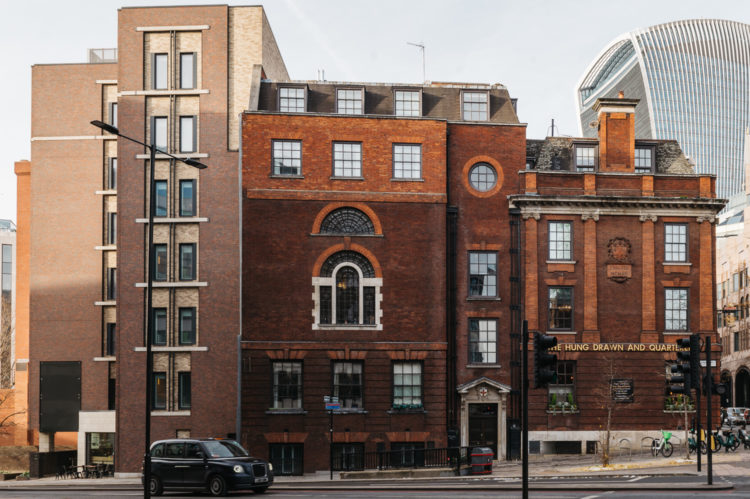
For today’s Househunter, it’s a return to that sort of property. It’s a two bedoom apartment, built in 1914, so perhaps nothing remarkable about that, but it has views over Tower Bridge (my favourite) and used to be an office for the trustees of Christ’s Hospital, which happens to be my old school. And, above all, it’s one of the buildings that, unless you know the owner, you are unlikely to see anything similar.
So I wanted to take a tour. Yes, there are useful design takeaways, but also, sometimes, it’s just fun to visit something that would normally be out of bounds.
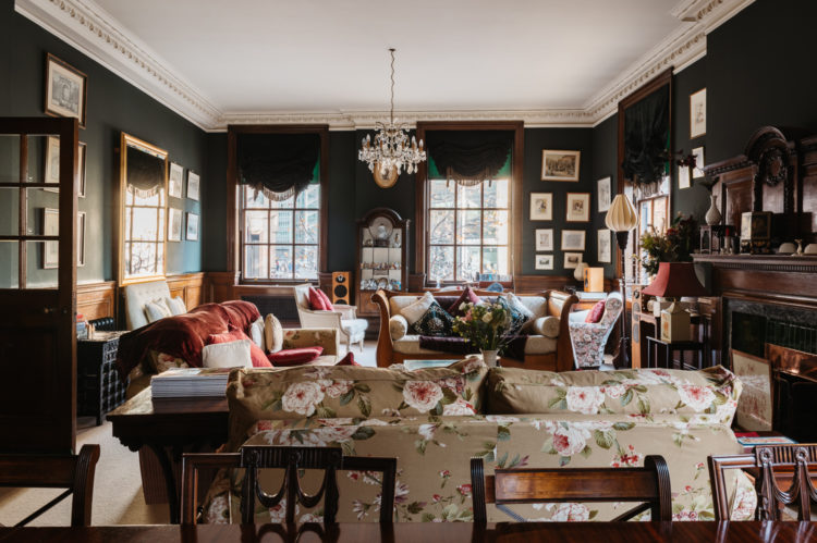
It’s on the market with Inigo for £1.7m, most of which will be to do with location and some with history. But while it may have only two bedrooms, it extends to 1,600sq ft, which is bigger than my four bedroom (1500sq ft) house, which is only that size because of the loft conversion. I tell you that not to complain about size but to give you a sense of the scale of the rooms. The sitting room, above is 34 x 18sq ft and the main bedroom 20 x 17 sq ft. For those of you who saw the reveal of my bedroom a few weeks ago where I explained you needed 16 x 12 fit a hidden wardrobe, that might give you an idea of what we are talking about. That’s also roughly the size of the sitting room underneath.
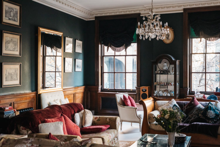
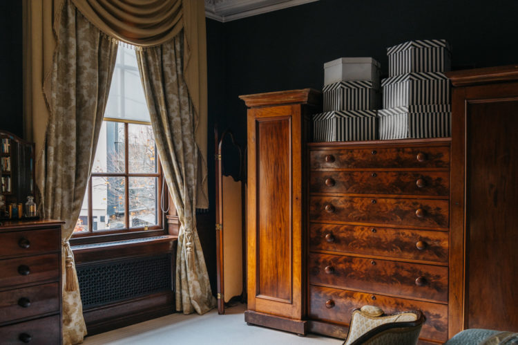
Right now we’ve dealt with that let’s have a look. Firstly bold move to paint the walls so dark. There is lots of dark wood panelling too and it’s definitely a statement to make it all dark. That said, there are four windows, glass doors to the entrance hall and maybe they are out all day and only use this in the evening under electric light -all points you have to think about when considering going over to the dark side.
The ceiling is also still light which will help bounce the light around from all those windows. If you have a small dark room then it can be worth painting all the surfaces dark to create a cosy and cocooning space but if you have a large room with high ceilings then by all means have dark walls because you love them (I do and have done) but don’t make the room seem smaller than it is by drenching it in dark.

Couple of other points from this room. Firstly the sofa. I don’t think we see enough patterned sofas. By the time we have money to spend on furniture and houses, we tend to have a fairly good idea of what we like and don’t like. And, for the newbies, look at the colour and style of pattern in your wardrobes. I’m not saying you want to copy exactly – you can take decorate like you dress too far – but it can be a good starting point. If your wardrobe is all block colours and geometric then you probably don’t like florals. Or do you when it comes to furniture? At the very least ask yourself the questions. And FWIW, as they say, patterns on sofas (and floors, rugs and cushions) can hide a multitude of spills and stains. Not to mention providing a great focal point, especially against a dark wall.
And you know I don’t really go in for rules – more guidelines and advice – but here’s one – don’t put your cushions on points. It doesn’t look good, it doesn’t look inviting and it IS a design crime.
The other thing you may have noticed as you wander around are the draped and dramatic window dressings. Before you get any ideas window dressings like these cost thousands. Several of them. Yes they can look amazing and yes it can be the decorative focal point of the room but be prepared to spend. It’s a skilled job to make them and the material is also expensive.
But the owners have gone all out here and there are some clever ideas. In the main sitting room there is a draped and fringed blind hanging over a plain green one. Now this is an idea you can use. The plain green will be to cut the light and bring privacy. It could be a cheap roller blind because, and here’s the clever bit, the fringed one in front is probably just a dress blind. So less material and no working parts. So if you like this look it’s much cheaper than having fully working Roman blinds made to fit – which, in the bay windows of my last house were between £800 and £1000 for the making alone.
To recap: install a roller blind in a fabulous colour and perhaps in linen as a lovely fabric. Then hide the workings by creating a draped swag of material over the top. Add fringing to suit. This would work particularly well if the blind was plain (in any colour of your choosing) and the top layer was patterned. It reminds me of those Elizabethan hooped dresses where the overskirt was pinned back to reveal a silk underskirt. And if that’s not what they’ve done then I have invented something clever which I may well do on the vexed issue of my own front windows…
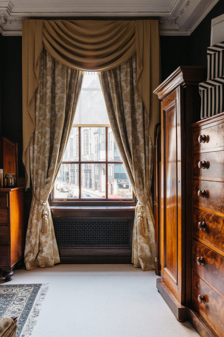
Of course, any money they’ve save on these has been splurged on the double curtains in the room above. That’s basically four curtains for one window and I’m not even going to discuss the dust that is going to sit in those folds. Again, maybe they spend the money they saved from the roller blinds on a cleaner. Above, however, is another good idea.
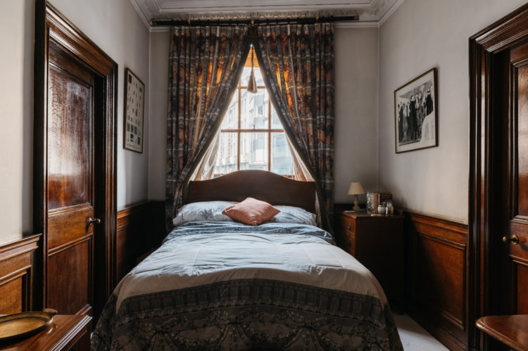
There is a traditional sense that putting a bed in front of a window is a bad idea. Probably a throw back to ill-fitting windows in draughty houses. But, if you dress the window like the bedroom above then it almost has the appearance of a canopy and it sort of likes like a four poster bed. Food for thought if that’s the best placement for your own bed. See, I told you there would be ideas to take away.
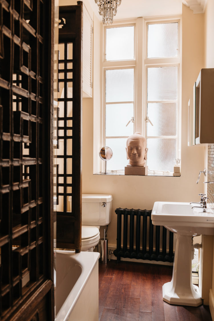
And here’s another. It’s hard to see from this shot but it looks like the glass shower screen has been hidden with a fabulous wooden screen which is perhaps more in keeping with the age and style of the building. I have just finished the bathroom and opted to build a shower with a wall and a curtain. The curtain was to save space and the wall was because without that, given the awkward shape of the room, which has two windows and a curved wall, there was nowhere for a heated towel rail and storage shelves. I’m really enjoying the privacy that a wall brings and the fact that there is now lime-scaled shower screen to clean every day.
That’s not to say that’s why they’ve done that here as there is still glass, which still needs cleaning, but hiding the glass creates a look that is less modern and more in keeping with this building. This is something else that you could consider. You could find a piece of salvaged screen material or even get fancy with a piece of mdf and a router.
I hope you have enjoyed this tour. Turns out there were some really clever ideas and, as I say, great to have a look at something different. What did you think? Remember someone lives here so keep it constructive rather than critical. Apart from pointy cushions. It is our duty to call those out.


Oh. Don’t use MDF anywhere near water! Its a big NO! MDF is a great material but it swells in contact with water. Wood with glued joints is also a bad idea near water. Wood is great but know what wood to use and treat it right.
Thank you for pointing out some great features in this house. I live in the US where we definitely overdo the staging of our spaces, and many of us live in homes that don’t have much in the way of interesting features, so maybe we feel the need to make everything else as perfect as possible to compensate…just a thought. When the house itself is more the focus, I love it when other things in the rooms can be more relaxed. This house is grand for sure, but it doesn’t come across to me as stiff or uninviting…except for the lack of table lamps. I much prefer lamplights instead of overhead lighting, but that’s just my personal preference. I can only imagine the wonderful views!
One of the things I most appreciate about the vast majority of these tours is that the homes have not been staged. Here in Canada & the US those interiors would have been stripped of any sign of personality & replaced with white walls & a few very bland pieces of furniture, the rationale being that prospective buyers want to see premises through the lens of their own belongings/imagination. It makes viewings really really boring.
It’s gorgeous. Agree with others that it has the atmosphere of a club or hotel. In my imagination this is my London flat which I stay in when I’m up from the country.
In fact, over 20 years ago I had a v dreary job in one of the dreary offices this lovely flat looks out onto. It always amazed me that people actually lived in the City of London.
Thanks Kate for truly giving us a view into this world!
(also the v dark green sitting – drawing? – room is so thrilling it’s making me seriously think about going dark in my own (much more modest) sitting – def not drawing – room.)
I love the wooden doors and furniture -gorgeous patina … feels more like a gentlemen’s club or hotel than a home .. and bit claustrophobic with so much stuff … but each to their own
so happy you pointed out the points ! other than those pirouetting cushions I really enjoyed this tour. The patterned sofa was unexpected & lively in the dark room & gave this lovely apartment something of an evolved uncontrived feeling that was in contrast to the carefully considered curtains which almost held a finger up to perceived good taste. I loved the whole apartment. Kate. I loved the idea of the wood shower screen, too ! thank you for that idea. I have just talked my bathroom supplier out of providing me with an enormous shower with glass screen. The thought of seeing my husband in full glory as I enter the room is enough to deter, much as I love him. Huge showers, with large grey tiles, are fine in a football changing room but may they remain there, with my full blessing. Panelled walls for me, please & a glazed door. Did someone say door? how gorgeous are the ones you have shown us here ! I find this apartment beguiling & I love everything about it. (except the cushions !)
You could have a point about the head Lenore… My sister has just told me to remove Dantes Alighieri’s death mask (of the Divine Comedy), which I have hanging up on the landing, as it gives her the creeps!
No need to touch a thing. I’m moving in.
It IS quite a formal look. My Grandma tried to decorate in this style as much as possible because in her head she was a duchess. It made for some interesting juxtaposition to the modest homes she actually lived it. So it’s been lovely to think back to her gold silk swags (all of which she made herself). Another take away for me is how much I increasingly like antique chests of drawers. They just sing, the wood is beautiful and rich. I’m eyeing the last remains of the IKEA drawers left from furnishing on a strict budget in my 20’s and thinking it’s time someone else loved them (and did a fantastic makeover perhaps). Off to look at my local auction/eBay… thank you.
Good bones, great space, much too frou frou for me. And that head on the bathroom windowsill is so creepy. Cheers from Canada!