It’s been nearly a year and now I’m thrilled to show you the finished house as it appears in the 25th anniversary issue of Red magazine which is out now (even though it’s the October issue). I will go through all the rooms in turn showing you what we did and where we sourced things from but for today a quick look at the pictures taken by Simon Bevan.
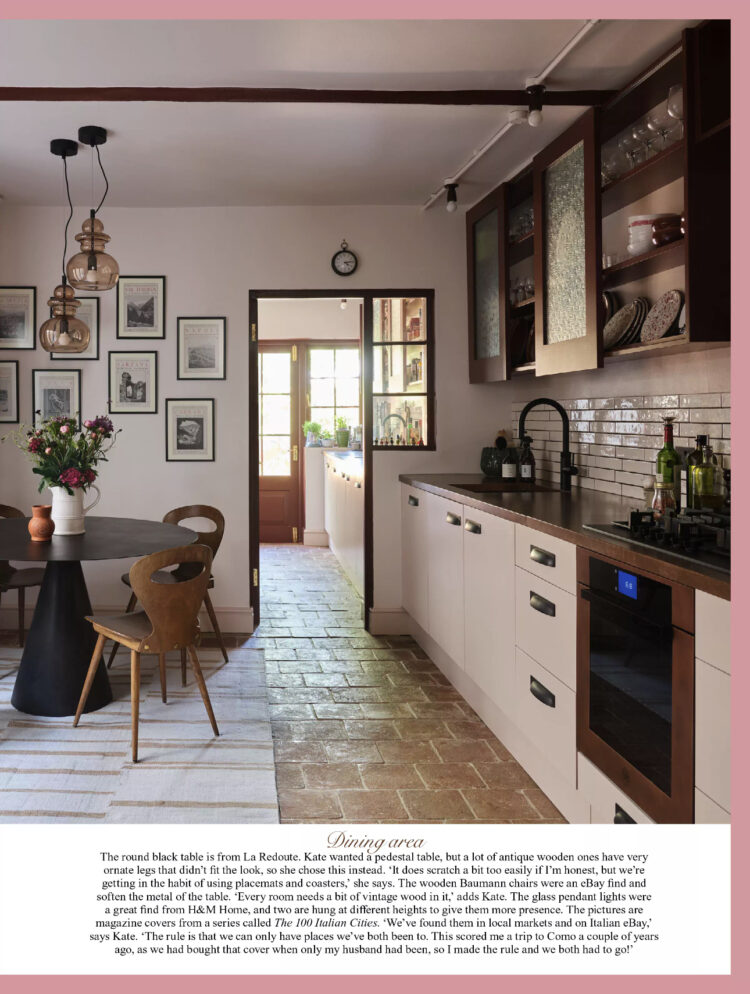
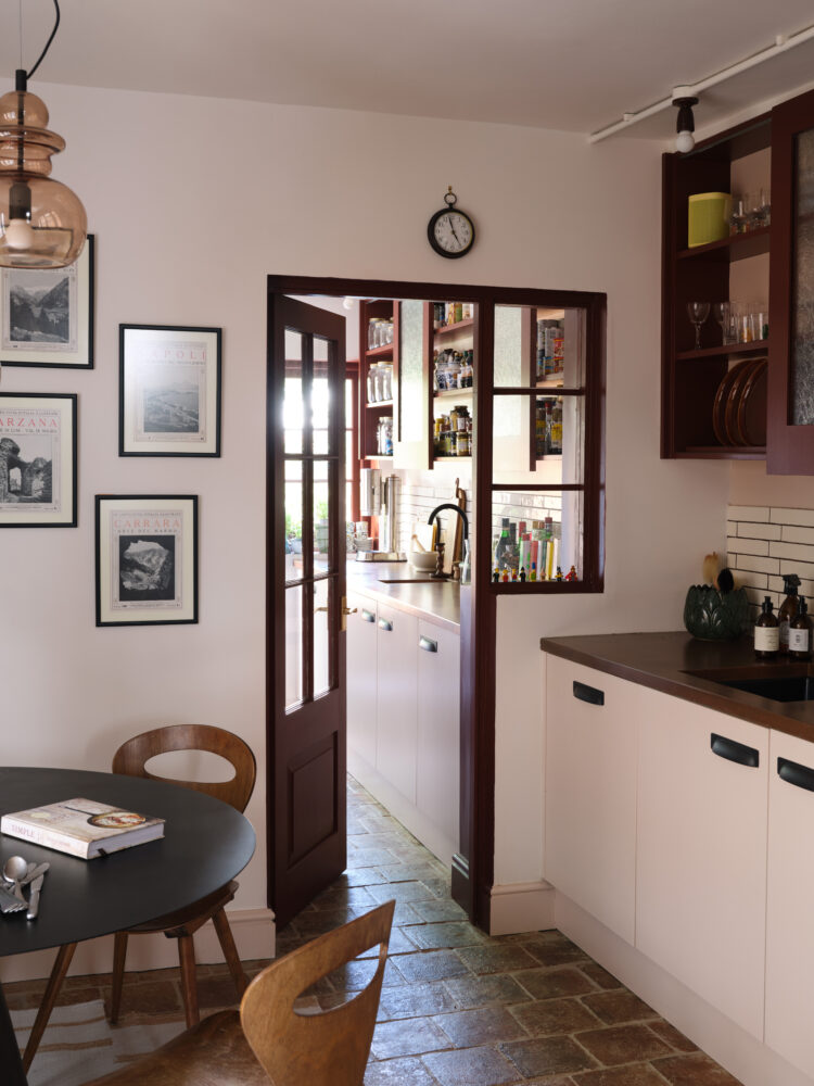
Here is the finished kitchen. I will do a before and after in the coming weeks but for anyone who remembers this had two mismatched windows on the side and led to a utility room. We removed the odd windows and added French doors (one day they may lead to a small greenhouse in the side passage) and re-installed an internal window to bring more light from the back of the house and give the sense of lengthening the kitchen.
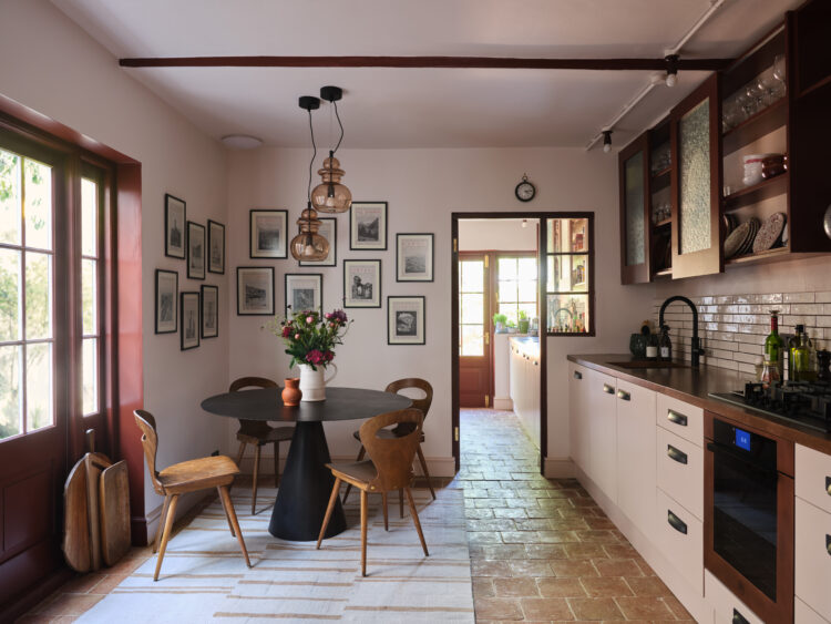
As anyone who remembers the old house will know I am a fan of open shelves but this kitchen is much smaller and we didn’t have the luxury of having so much on display so I designed sliding panels that mask the less attractive items and take up less space than opening doors. The kitchen was made by DIY Alcove Cabinets, who were brilliant and the floor tiles are the square Marlborough terracotta from Ca Pietra.
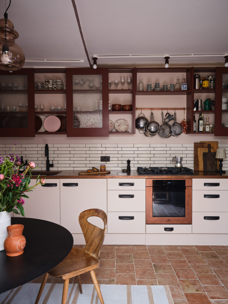
We thought long and hard about the worktop. I love natural stone but there’s no getting around the fact that marble is tricky if you’re not careful – and we are not! The Mad Husband loved the stainless steel from a previous kitchen and from there we alighted on aged copper. I found Halman Thompson online and they created this beauty for me. I was the delighted to find a copper oven at Bertazzoni and we oped for a black tap and sink so there would be no chrome at all in this room.
I wanted the kitchen to look slightly rustic and certainly the floor gives the impression that it has been there for ever and I’m so pleased with how the copper turned out. So far – and it’s been in place since April – it is hardwearing and mark free. It can scratch so we are a little careful about plate with rough bottoms but it’s fine with hot pans and water splashes and lemon stains so it’s about as fuss free as we have come across.
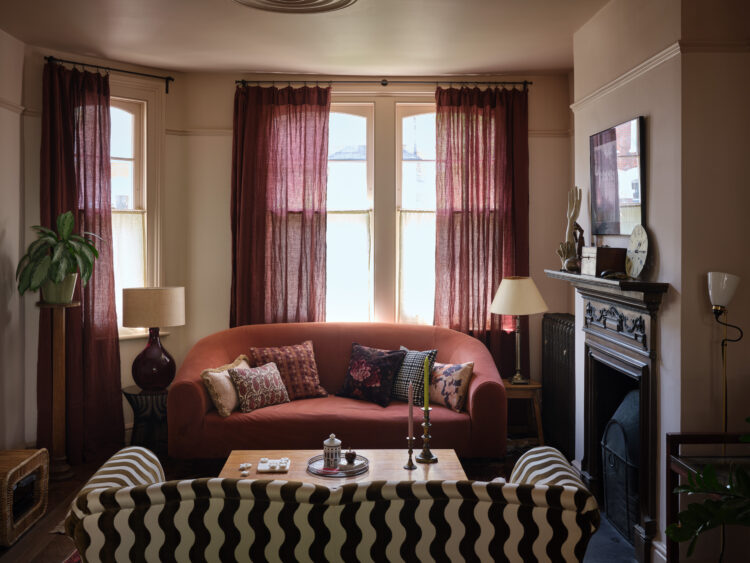
Now some of you have seen the sitting room on my stories but perhaps not the newly recovered sofa. This was the linen sofa that sat in the bay window of the last house which belonged to my Great-Grandmother. It turned out the linen wasn’t hard-wearing enough for boys and jeans and it needed repairing. I went, once again, to my trusty upholstered Sharon O’Conner of Vintique Upholstery and we found this Schumacher wave fabric that has a high rub count making it tough enough for everyday upholstery (I will come back to this subject).
I bought these two chairs from Etsy and used leftover sofa fabric to make cushions for them. The doors at the side are cupboard doors that can open out divide the room in the evenings. The curtains are Conker from The Secret Linen Store. They came with a folded hem to slide onto a pole but I felt it would be hard to pull so I added some ruffle tape and hooks and they move much more easily now.
Moving upstairs with another look at the Quirky Bloom carpet I designed for Alternative Flooring to my son’s room, which some of you will have already seen. The curtain pole is fixed at one end so that at night it covers the doors and during the day it swings back to hide the contents of the wardrobe which is both practical and space-saving.
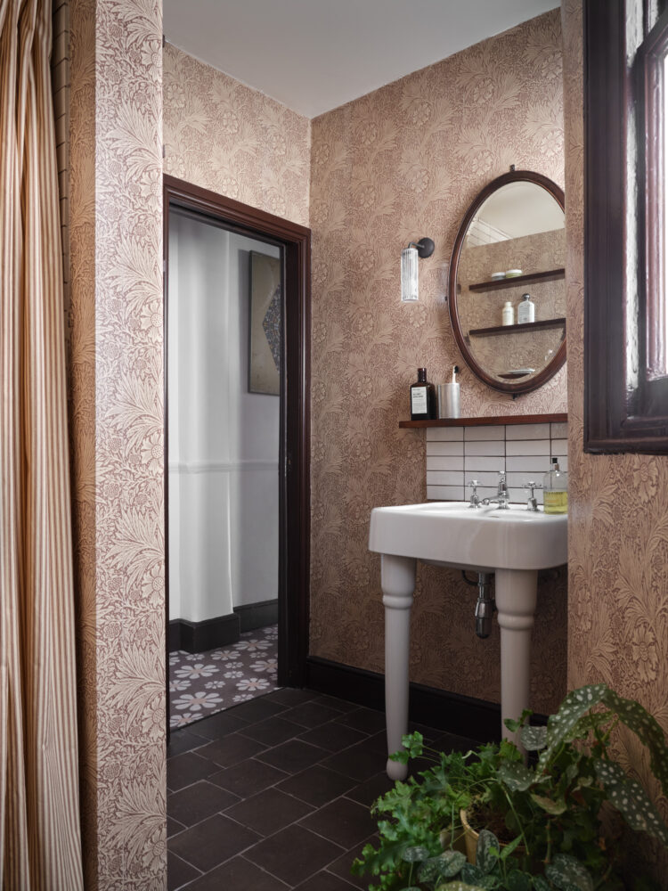
The bathroom was a big job for a small room. We removed the bath – I know this can be controversial but the plumbing is still there so when we come to sell it would be easy enough to put it back and again, we stuck with the Victorian worker’s cottage feel from downstairs by adding William Morris wallpaper and Burlington fittings.
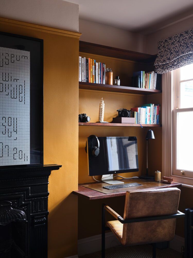
This is the office/guest room although it has spent most of the last year full of boxes of stuff to take to the house in Italy. Truth be told it’s still full of boxes which is why there’s only a corner shot! It’s painted in Little Greene Middle Buff and eventually will have a sofa bed in it for guests.
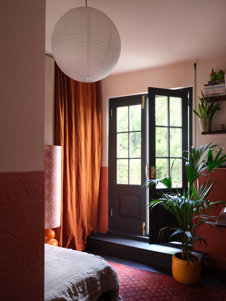
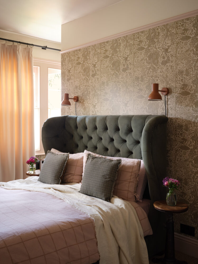
Finally, the bedroom, which was the first room I showed you some months ago but for completeness we’ll finish there. The loft is still to be done which belongs to my younger son but he’s away studying so that may have to wait a while.
I hope you enjoy seeing the finished rooms. There is lots more detail in Red and, as I say, now that it’s out I can revisit all these rooms in turn and discuss colours and finishes and answer all your questions. I hope you like it. We are all really enjoying the more tactile cosy feel compared with the old house. With thanks once again to Si Bevan for his lovely photography and to my editor Carolyn Bailey at Red. In the issue you will also find my regular column discussing six things I learnt from this renovation.


Hi Kate, loving your new rooms, especially the kitchen, which I am enjoying looking at through the blog in NZ. I wondered if you could use sandpaper to smooth the bottoms of those plates that risk scratching your beautiful new aged copper benches (glorious!) … I make pottery, and I sit and sand the bottom of every piece I make once it comes out of the kiln, to finish them smoothly. I didn’t do this for years as it didn’t occur to me, but when we installed a new kitchen with stainless steel and marble benches, I started doing it as I was worried about the pottery plates and bowls I’d made scratching them. I use a very fine sandpaper. It might work for you!
That’s a good idea…
A beautiful renovation Kate. I love your style. Warm, homely, intriguing, super stylish and Im sure inviting for all who come to your door. You have something very special there. I’m a fan from down under (Sydney) and always look forward to reading your posts and enjoying your pics. Thanks again for your willingness to share this journey with your readers X
You’re so very kind thank you x
Well done and bravo to you!
Love it all Kate, what a fantastic home you have designed here! x
Wow! It’s an utter triumph! When you think back to how it looked when you bought it, it’s a stunning transformation. You must be over the moon with how it’s turned out. We definitely need all the details now!!
Well done! Love the kitchen.
Oh wow! from a follower in NZ. I’ve been hanging out for this Kate and it surpasses expectations. The buff, copper & black and the texture in the kitchen in particular, and how you have transformed that room is a tour de force. I need to go source RED asap.
Beautiful and (ahem!) considered, in the very best possible way. Emily’s earlier comment captures my reaction perfectly:
“ It also feels like it’s been this way for a while which for me is the goal when renovating – it feels beautifully lived in already in the best possible way.”
My own renovation of a 1980s house is so problematic: appropriate to the architecture is a bit of a design problem, to say the least!
And I’ve just found this edition of Red magazine on my Kindle Unlimited subscription, for anyone else who uses kindle unlimited!
Thank you! I’ll take a look see now.
It looks fantastic Kate! I do wish my own renovation had come together as quickly as yours, but you clearly knew what you wanted and it shows! The rooms feel like they belong in the same house – which of course they do – but without feeling too matchy. It also feels like it’s been this way for a while which for me is the goal when renovating – it feels beautifully lived in already in the best possible way. You must be so pleased.
Thank you Emily – you have hit the nail on the head. We wanted it to look like it could always have been this way – just tidied up a bit. I’m so glad that has worked!
Really lovely! Wow – the kitchen – what a transformation! You have created a warm and very classy home where all the rooms flow. The floors are a triumph – I remember what Matthew Williamson said about flooring on the podcast and think you have demonstrated the power of beautiful tiles, floorboards, carpets and rugs. Bravo Kate 👏👏👏
Congratulations Kate (and Mad family!) I am sure you will enjoy the fruits of your hard work for years to come!
Love the kitchen details: sliding doors, a thing of genius – although I do wonder about your ventilation. Interesting task lighting, which presumably means no loss of head height for recessed spotlights? Love the way the design repeats through the utility room even down to the window design. Well done you!!!
The ventilation is in the corner of the ceiling over the table – it works perfectly well as it’s a super powerful extractor fan and we can open the doors. We mounted the ceiling lights to make it look a little more retro rather than having modern spots which I hate.
Beautifully done and very stylish, warm and tactile. I’m off to buy Red too for more details. Love it!
It looks lovely! I particularly love your flooring throughout – I’ve always loved terracotta tiles and your wooden floor is beautiful. The carpet is great fun! I hope we get to see your laundry/pantry (can’t see washing machine!) and the downstairs shower room. It looks like you have the same sliding cupboards/shelves in the pantry. I do have a question: what is the brown pole/plank across the kitchen ceiling?
I will go through it all room by room. The washing machine is in a cupboard in the pantry and the fridge and freezer and dishwasher are all integrated. The dark part of the ceiling is where it changes height – we couldn’t decide if we should try and hide it or make a feature. Currently we have highlighted it – this may change as it’s the work of minutes to paint over.
Congratulations Kate, it’s a triumph! I so appreciate the sense of enveloping comfort that these rooms exude. Hope you’re all enjoying your home.
Hi Kate, I love your new place; I love how cohesive your colour scheme is and how it feels so warm and cosy. Already bought my Red magazine to have a look!
I wanted to copy your false wall idea in my bedroom; however; I will only have 80cm per side of the wall to walk around. Do you think that is too tight? I might have to join the false wall to one of the sides but would rather not…
Thanks a million for your blog, I love ready it in the mornings with my coffee x
Thank you so much. A door is around 80cm so that should be fine. The only issue is if there will be enough space either side of the bed for a bedside table as if it sticks out that might reduce your access to less than 80. But you can always have a shelf over the bedhead instead.
Ooh exciting! My magazine arrived on Friday and I’ve not opened it yet! The house looks so wonderfully cosy and stylish. I too enjoy the continuity between the two houses. Loving the Middle Buff colour mixed in there. Here’s to many happy years between there and Italy! X
Have been waiting for this reveal! Feels like a home with soul, and love that it’s pure KWS (and MH I presume) rather than another same-same Insta-tastic renovation which we are surely all getting a bit fed up with?! Specially love that you’ve used plain slab doors on kitchen. Am totally sick of seeing Shaker style doors tbh – the thought of dusting all the edges fills me with horror. Beautifully executed, totally timeless and looks perfect for your family, which is all that really matters. So much work though, well done and thank you for sharing.
Agree about the doors, they look nicely retro style but none of the dusting of the ubiquitous shaker doors. We have gloss shaker doors in our kitchen, worst possible combination put in by the previous owners but not old enough to justify replacing yet. In my fantasy kitchen I’d have an Uncommon Projects kitchen.
Rushing out to buy a copy of Ref magazine!
Love love love your kitchen, especially the cabinets with the sliding panels.
^Red!
I’m sure Ref Magazine must belong to the footballing world, if not, it should!
Absolutely gorgeous – a fantastic pay off for all your hard work. I love that you can see the continuity through from the old house but with a subtle shift. In terms of colour seasons it feels less winter and more autumn. Beautiful! Looking forward to all the juicy details!