Welcome back to the regular househunter slot after last week’s Italian extravagance. That said, there were lots of inquiries so fingers crossed we will be visiting that at some point in the future. But for now we’re back on more familiar ground with this pretty Victorian house in London.
And the reason I wanted to bring you here was because of the soft muted colour scheme, which I find so restful, but the odd pops of strong green really bring it to life. I have been meaning to bring in some green to my own London house – which you have all now seen from the start of the week – but shopping hasn’t really been on the agenda recently. However, I think we have the base of the house right and the accessories can come later – as I said on Wednesday the main decisions have been made – there’s no analysis paralysis or regret here.
Anyway, back to this. It’s on the market with Inigo and it’s a three bedroom semi-detached house in a conservation area in south east London. It’s on for £1,300,000, and remember this is Fantasy Friday so unless you are serious about buying it we needn’t get into a depressing conversation about the housing market. Believe me having just had to go through the 20yo finding a student house in London, I’m all frustrated out.
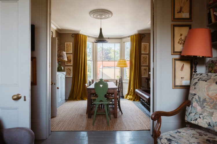
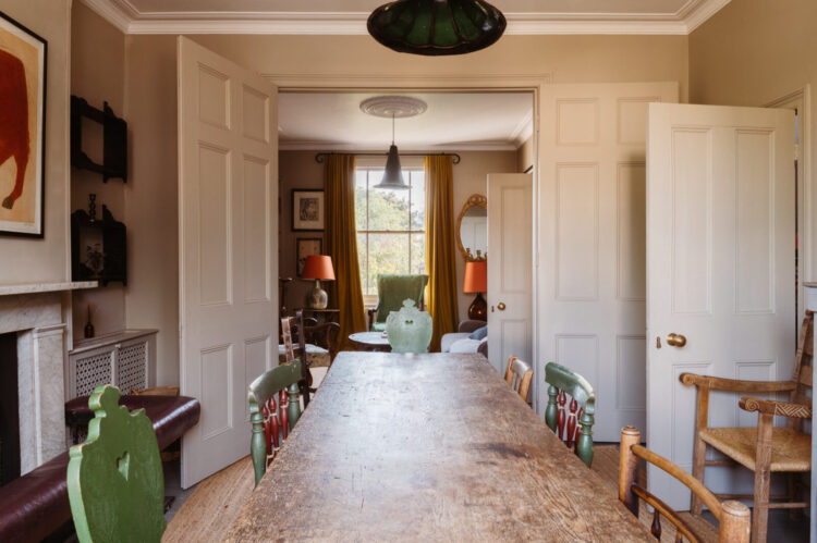
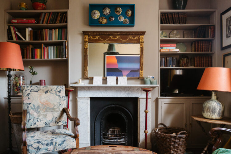
So above is what I mean about the disrupter colour. The walls are a soft creamy pink and the doors have been painted to match the walls so they disappear. They are not the feature here. The golden curtains mean the sun will always be shining in this room and blend perfectly with the walls.
But that green chair – in a lovely garden shade of green really draws the eye and breaks up all the tonal harmony. It’s not a colour you would expect, but it just wakes everything up. It’s the squeeze of lemon over the fish dish – good without, amazing with. See also black pepper and parmesan. In other words whenever you decorate a room do not forget the garnish to bring it to life.
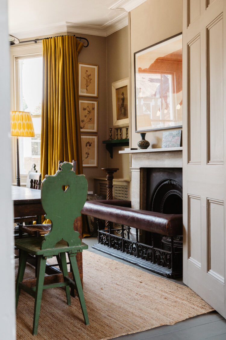
And you can’t go wrong with a simple jute rug as well. It won’t fight with the other colours and brings a vital bit of texture to the room. Remember different textures is just as important as different colours and even more so if you prefer to work with a simple and restrained colour palette then mixing up fabrics and materials is even more important.
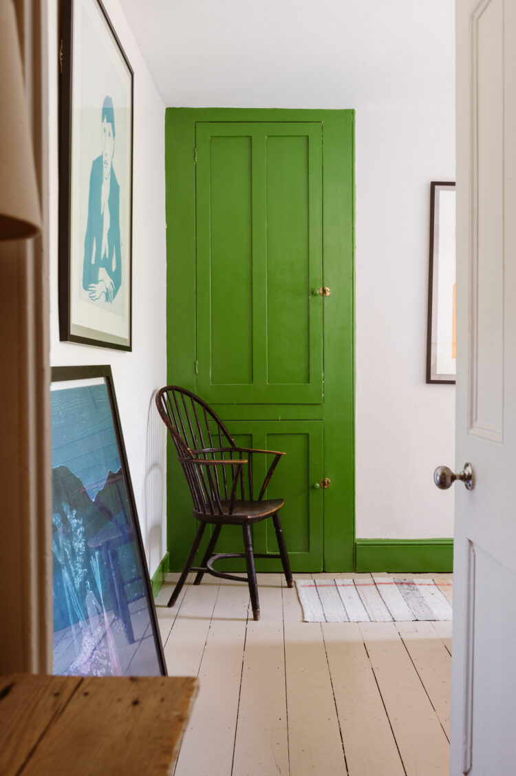
Here is that green again in the bedroom. Now I know we have spoken a lot about matching doors and walls – see the top image – but you can also do it this way. If you want pale walls but still want to bring in a little drama or colour then try using a stronger colour for the woodwork. This is the reverse of a dark wall and traditional white woodwork which, at the moment, feels very traditional. Instead keep the walls to a soft pale neutral and let rip with the trim. This looks modern and fun and allows you to experiment with colour in a way that isn’t overwhelming.
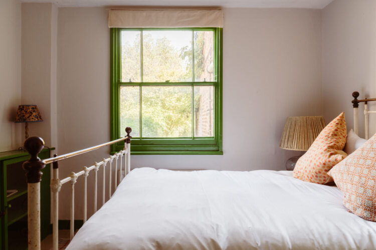
Here is the bedroom window and, in the same way that the yellow curtains keep the sunshine in the sitting room downstairs, so a green window brings the outside in all year round – even when there are no leaves on the trees outside. This is where we are about to get to in our very small garden/yard and I plan to paint the wooden fence at the back in a strong green so that even when there are no plants there will be greenery to look at through the window.
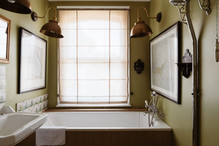
Staying with green as we move into the bathroom but this is a soft olive. It’s an unusual colour for a bathroom but it works really well. For me it’s more relaxing than the brighter green of the bedroom but some might find it dull. This is why it’s so important not just to use colours you love but to take a moment to work out what mood they put you in. For me the bright bedroom green feels like a joyous colour with which to greet the day. This olive is more relaxing for the end of the day and perhaps a more gentle start to the morning. You may be the other way round. The point to remember is that it’s more than just a colour it’s a mood – as the saying goes.
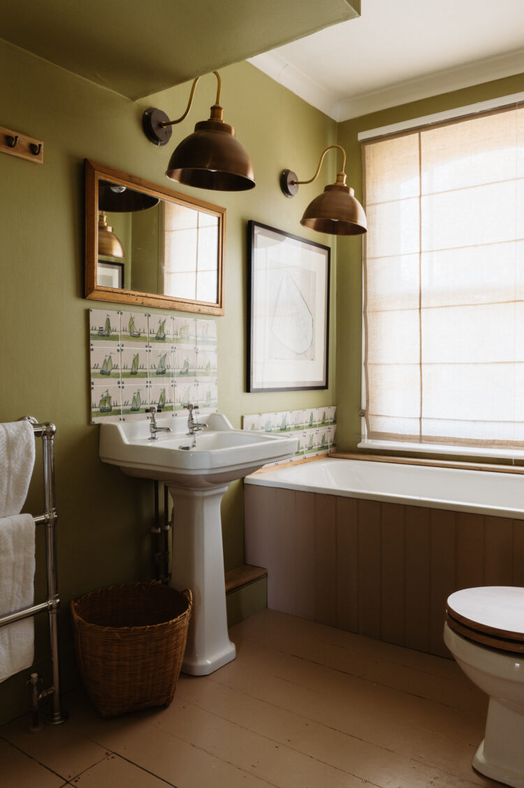
Now this shade of green loves a bit of brass but these giant wall lights are a touch. For some reason bathroom lights tend to be small. Perhaps because our bathrooms are small but here these huge brass lamps look unexpected and amazing and play with the scale of the room.
Finally, let’s head back downstairs to the kitchen. This deep chocolate works so well with the soft cream walls. Note how the painted floor mirrors the walls and ceiling and stops it all being too dark. The blue chairs are the lemon garnish – and work better with the brown than green would do but, at the same time, the blue relates to the green so it’s all part of a palette of colours. 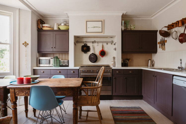
The red candles also bring to mind the orange lampshades from the sitting room where they sit with accents of blue. And you can see that that has all been brought together by the painting that is reflected in the mirror. A final point on the lamps – you don’t have to completely match in a mirror image. It can be relaxing to create symmetry and if that works for you then do it but if you find that constricting then matching lampshades on different bases can bridge the gap between calming symmetry and interiors anarchy. It depends on your tribe and only you know the answer to that.
Oh it’s lovely to be back talking all these details. I wish you all a wonderful weekend and do let me know if anyone’s buying this one.


Love the yellow curtains (both the colour and the scale!), and the fact that the artwork all follows the same tonal themes. It’s really well thought through
Hello, this is one house that I like lots and lots; I am wondering about such a deep bathtub; the individual bather must really want a bath to climb in which is easy since not wet but when climbing out of the tub, there is that ‘slippery’ when wet dilemma; so how do they muster this…getting out of the tub? Otherwise, this was an enjoyable post, the splash of colors gives a good feel to the house. thank you.
LOVE this home! It’s just my style and as I’m thinking of how to use my favorite color, green and how to bring the outside in, I find quite a lot of inspiration here. Thank you for sharing. Really enjoy reading your posts.
Does anyone have any views about painting floorboards in Edwardian houses? I’m not so keen on the yellowy colour and the busy-ness of the gaps/ damage/ knots
Have you covered this anywhere, Kate?
I painted my Victorian boards in the last house for the same reason – I don’t like the orange. Painted them off white and they were brilliant. You can do any colour you like and throw rugs over. Always looks great I think.
Lovely to have you back!
I can’t recommend yellow curtains enough – here in Manchester it’s like a sunny day every day. Until I open them.