Back into familar routines at last and it’s our regular post of beautiful rooms to get the week off to a good start. I’m assuming by now the kids are back at school – as far as possible (don’t mention the concrete). The 20yo has finally found a student flat and is off at the end of the week and we start the countdown to the end of the year. So, grab a cup of whatever you like and let’s go for a wander. And, if you’re in the market for a new kitchen or garden table keep reading to the end because I’m selling mine which you see directly below. In the meantime we will discuss the issue of trends and the role of influencers on our design choices.
It’s only now as I put these pictures together that I realise they are not dissimilar to my own house which is probably why I was drawn to them, although the new season has also brought countless features about the current fashion for all things damson, paprika and rhubarb so if you like these shades you’re in luck.
It may be that we think we don’t like to follow trends but when those are the colours in the shops it can be hard to find anything else. Paint will always be there, but the accessories do move with the seasons so if you know what you like you need to buy it when you see it. We are constantly being told that sage green is having a moment and I’m seeing plenty of kitchens and bedrooms in it but you try finding a matching cushion cover at the moment.
And talking of green, I’ve never been a huge fan of sage (the actual colour of the leaf yes – the paler colour it seems to turn into when in a tin of paint, less so) but I do love a bit of dark olive or forest which looks wonderful in this bathroom.
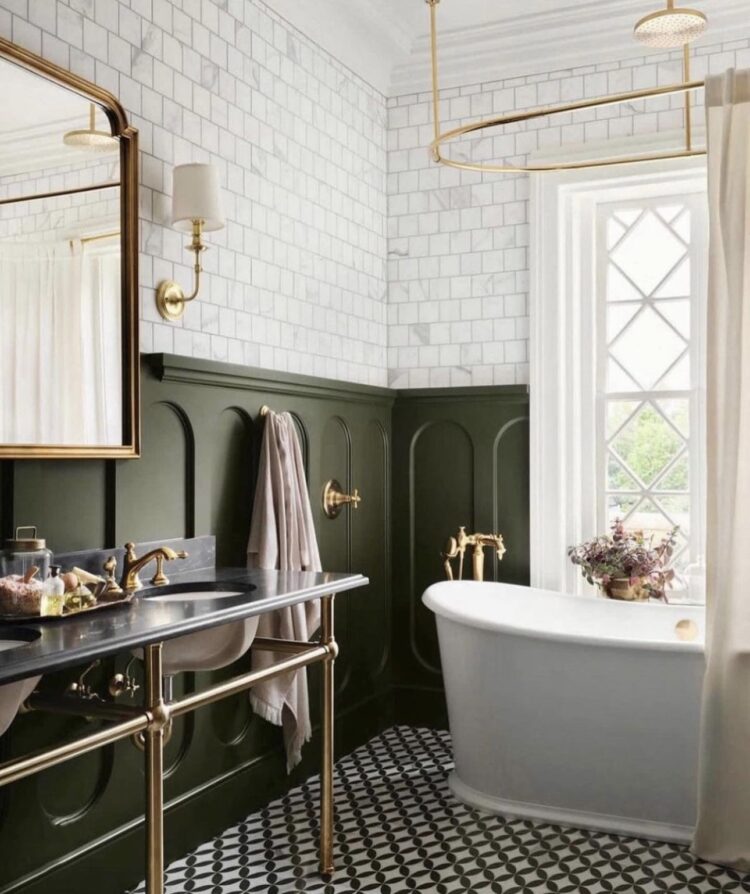
But perhaps we should discuss the brass here as I feel this may be a dilemma many of you are facing and it’s all part of the trends chat. Do you pick brass or do you choose chrome? There’s no question that brass is gorgeous with green (and all the earthy shades). It has also been in the white heat of the fashion focus for the last few years. This means, and it has already begun, that the fashion crowd will move on and start to sing the praises of chrome again. This means in turn that if you worry about trends, you might feel that brass will date and be put off choosing it.
But here’s the thing – if you genuinely love it and are confident of your style and choices then you will still love brass when it’s no longer in the spotlight. If you only love it because it’s all over instagram and every style magazine (and there’s no shame in that – they’re not called influencers for nothing) then perhaps you might want to stick to classic chrome. It’s cheaper too. Both are classics in their own way and both will cycle around the wheel of fashion so try not to be influenced by anyone other than yourself.
And take a moment to ask yourself why are you drawn to whatever the item in question is – in this case brass. So do you like it because it’s warm, elegant, luxurious – or do you actually prefer chrome – less in “yer” face, classic, easy to find matching accessories and more affordable. And if you’re stuck in the middle with a good budget I’m going to say try polished nickel.
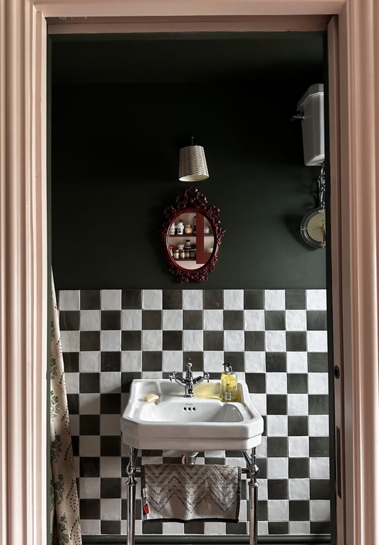
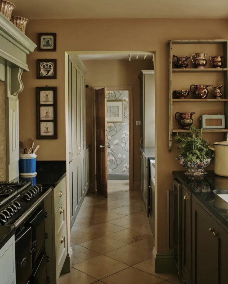
Here, if it helps is my downstairs shower room with dark green walls (Graphenstone Parlour Palm – not on a colour card but contact them) and chrome fittings on my classic washstand as opposed to brass on a similar stand from the image above. I’m very happy with the choice of chrome in both bathrooms but there is no chrome in the kitchen as I chose an aged copper worktop from Halman Thompson and mixed it with a black sink and tap.
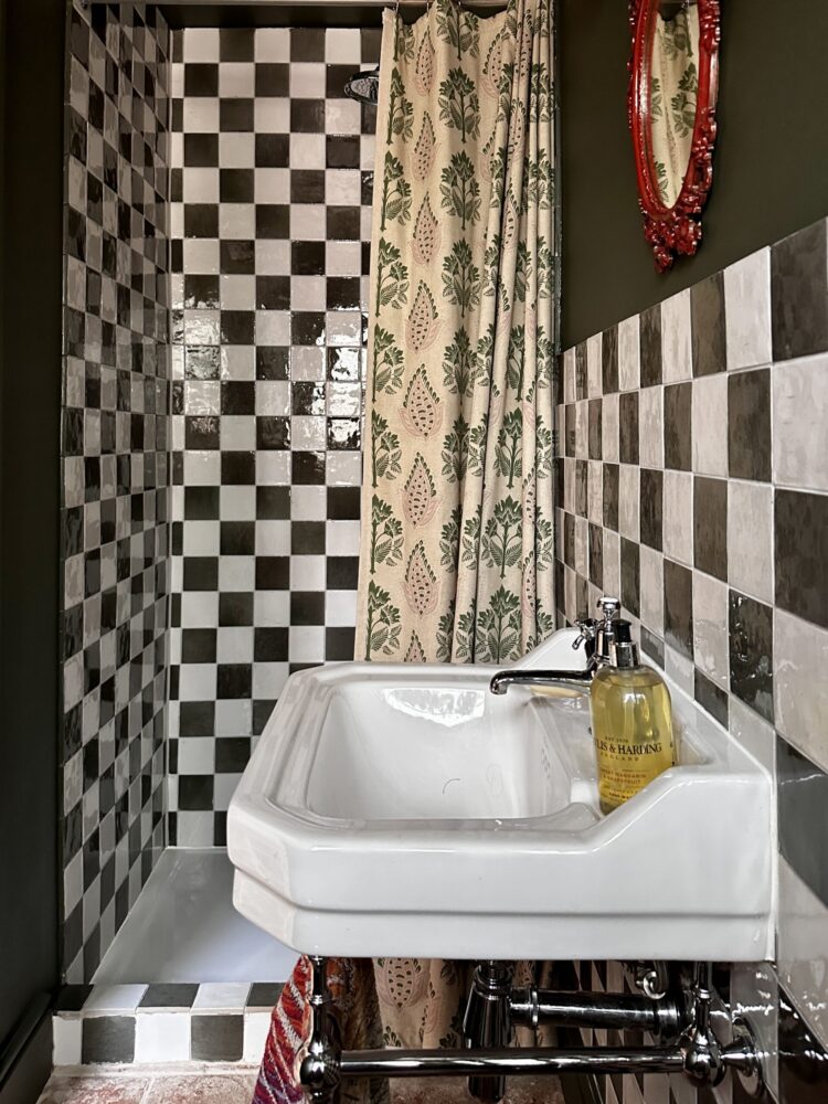
The checkerboard tiles, which is originally why this image was included in today’s round up (as opposed to the joys of green and chrome) are from Ca Pietra. They are the pottery porcelain range in khaki smoke and natural cotton. I was determined to have a check pattern in this house and while The Mad Husband was resistant I was also able to persuade him as it’s the downstairs loo and shower so not a place he necessarily visits every day. I’m fully into it and, on the strength of it, may have worked some more checks into the house in Italy.
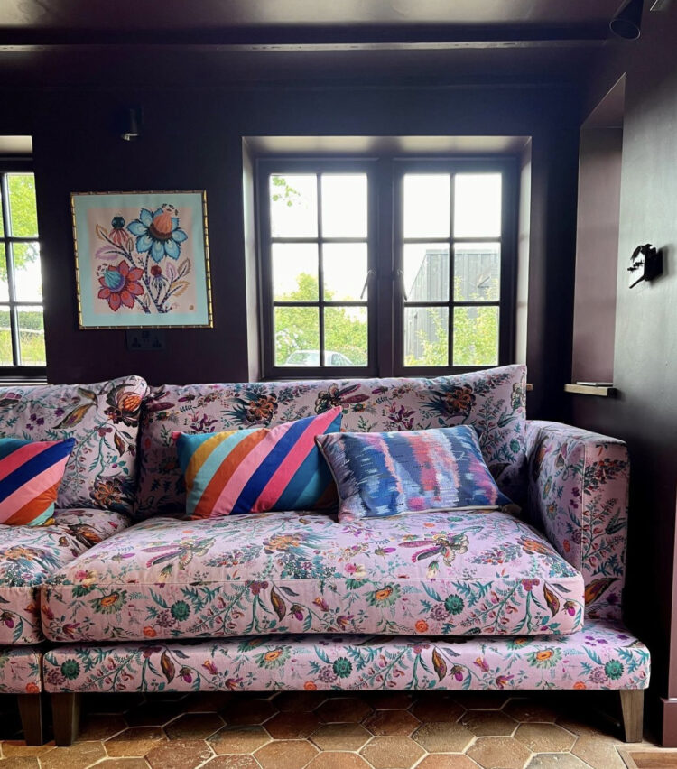
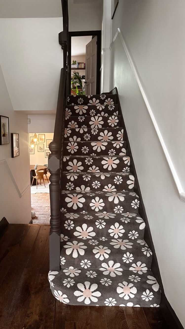
Next up I wonder how many of you will recognise this. For those of you who listen to the podcast – this is the room in question. For those who don’t it’s the sitting room of my podcasting co-host Sophie Robinson, queen of colour and lover of all things bright. And yes this is her new fabric collection for Harlequin but it’s also set against a chocolate brown wall. Do listen to the podcast to find out more about that but the question remains – is being influenced (when it’s by me!!! joke) a bad thing? I’m scoring a cheap point here, but it is true that the world of interiors has fallen hard for brown in all shades – just at the point where I move out of my chocolate brown house and do a new one with hardly any brown in sight. Well just this which is my carpet for Alternative Flooring.
The more serious point I want to make is that influencing has a bad name thanks in part to social media, but if you have been introduced to something new that you might otherwise not have considered, and if, on balance and full consideration, you decide that it’s right for you then there’s nothing wrong with that. Interior designers always talk about pushing their clients out of their comfort zones to achieve something more exciting and it’s an accepted part of the process. The key is not to get hung up on the trend or the influence but to take the time to think about what’s right for you in your home. That’s it really.
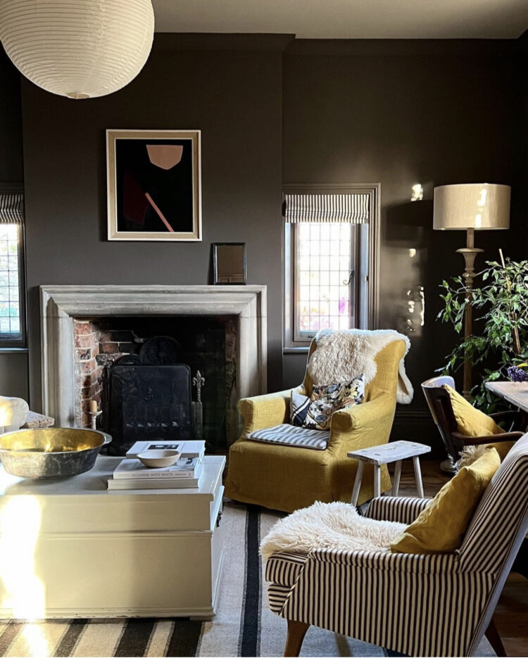
That said I do still love a bit of chocolate brown. It’s dark so it isn’t for everyone but if you have a room that can take it it loves a bit of red and pink, gets on very well with all shades of blue and, in a more surprising pairing, can work wonders with a bit of yellow. Below it’s mostly classic chocolate and cream but the splash of the yellow chair works beautifully.
And, of course, yellow is one of those shades that comes in as many varieties as grey. It’s well documented that I really dislike the primrose, lemon and daffodil versions but show me a bit of ochre, straw or hay and I’m in. This kitchen is at the deeper end of yellow – some would call it brown which I instantly find more relaxing, others would lean to mustard – less so.
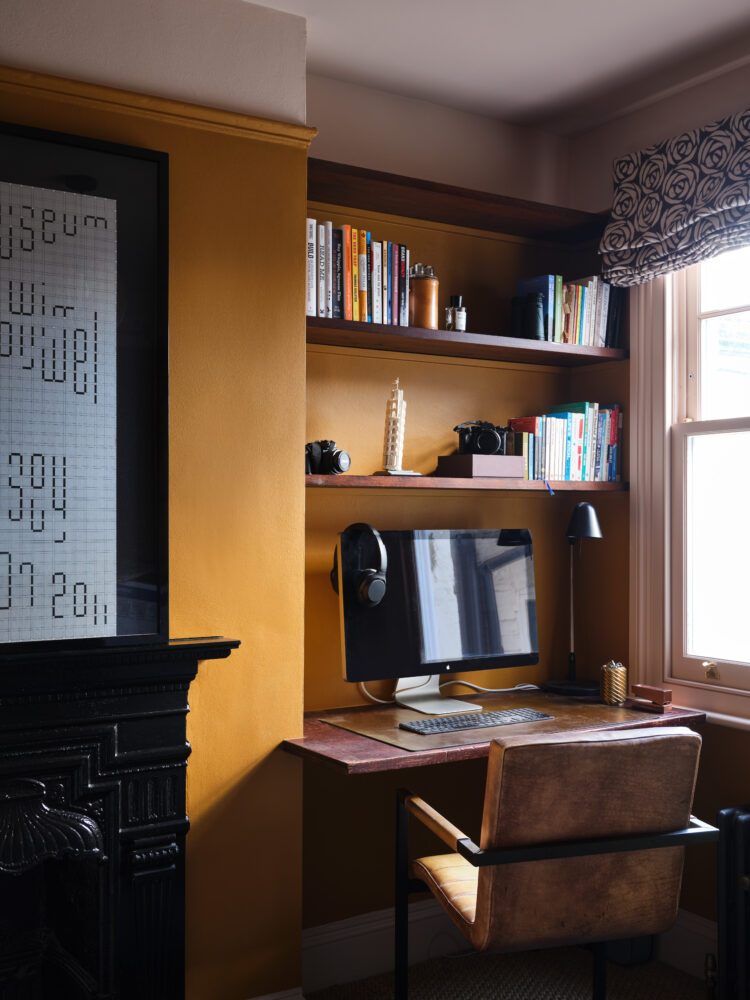
Here is a much stronger version in the office at my house. It’s Little Greene Middle Buff which I paired with the palest pink ceiling and woodwork and the chocolate rose Tori Murphy blind from the last house. It’s a strong colour in here but it belongs to The Mad Husband, so the pink was toned down and the caramel was dialled up. For me I might have leant more towards the aforementioned hay and deepened the pink slightly. Which goes to prove the old adage that’s there’s no such thing as the wrong colour only the wrong shade.
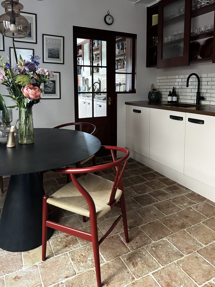
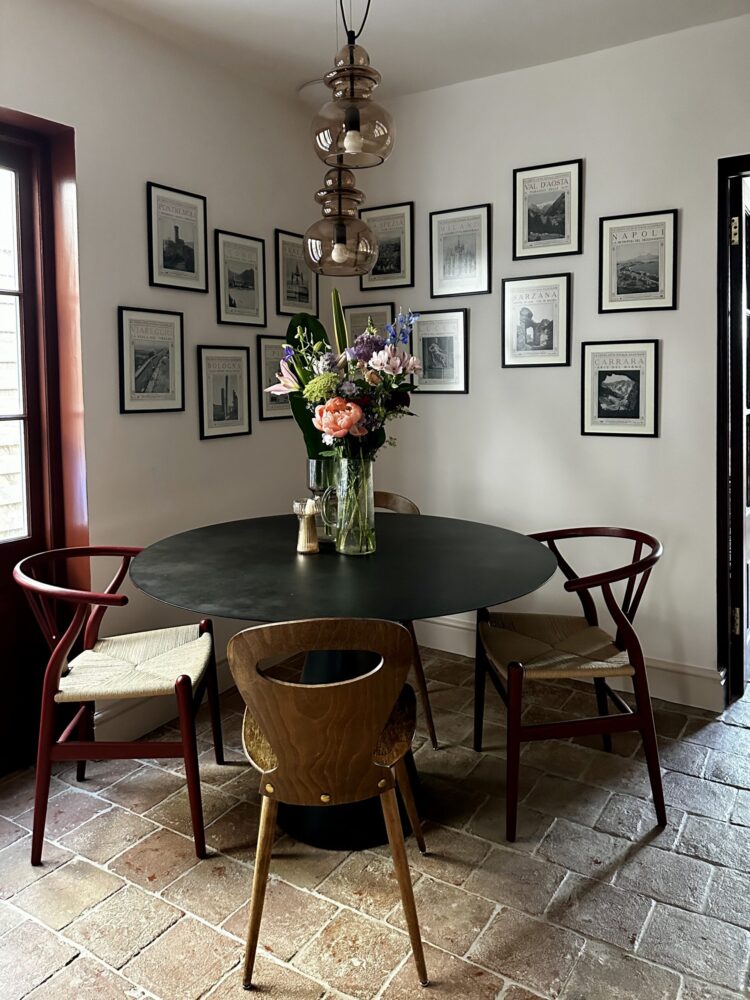
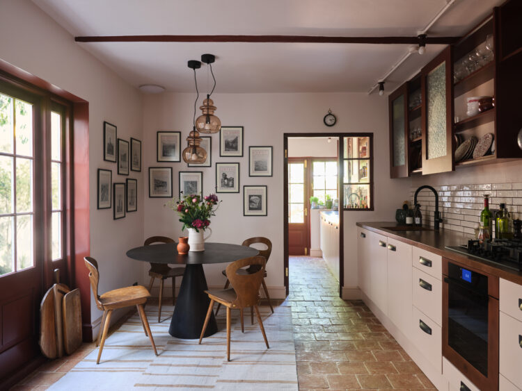
Now this table. I am selling it because I have found a vintage marble topped Gubi table which I am completely in love with. The key to vintage shopping, as I have said before, is time. When we moved in here we didn’t have time as the old table, which seats eight, wouldn’t fit in this kitchen. We had a small folding card table which we used for three months, but it was hard to get four round it and it kept threatening to refold itself if you put any weight on it. I also knew I wanted a round pedestal table and vintage ones are hard to find as the wooden ones tend to have an ornate pedestal and I didn’t want that. So when I found this one it was perfect and I forgot all about ever looking for another. And then almost a year after we moved in, my perfect table turned up so I am selling this as I have dreamed of the other for many years.
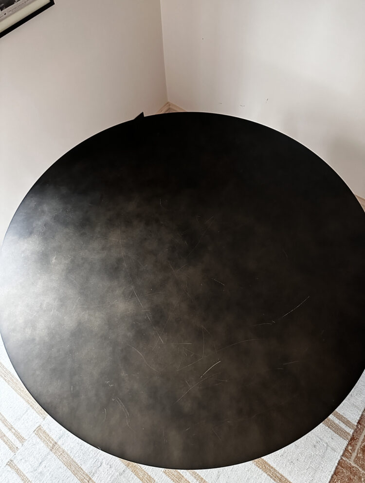
This, from La Redoute, is metal, with a slightly mottled top giving it a softer appearance than jet black. They call it gunmetal. It retails at £999 although is currently on sale for £799. It’s 120cm in diameter and is generous for four and perfect for six. The top is slightly scratched (although this would go under a placemat) and it’s fine with heat and is suitable for the garden. It’s heavy and for that reason it’s collection only from my house in north London.
Here is a picture of the top so you can see the mottled effect and the scratch. The top comes apart so it’s easier to transport by the way and if you want to arrange a courier – Shipley or something -we can help the driver to load it. Offers in the region of £350 – message me in the comments and we can then chat privately.
This picture shows you the shape of the base more clearly. Anyway let me know if you fancy as I shall be putting it on instagram later but am giving you all first dibs.


I love this post. And I agree about pushing outside your comfort zone, just a little. To me, that is where interior design influencers come into the inspiration/moodboard stage. They have access to companies that might not be as well known or provide a product or service that aids in making your dream space a reality.
Some lovely and inspiring rooms! Please could you let me know the pink paint colours used in the office (even if you’re not keen!) and the kitchen? Am planning a pink office and struggling to find the right pink.. thank you!
Hi Linda, the pale pink is masquerade pale by little greene. I love the colour but I might have gone a shade darker had I realised it was so pale.
It is all very lovely, thank you for sharing.
Oh my goodness – I love your shower curtain in your green checked bathroom. Would you mind terribly saying where it is from? Or the name of the pattern if it was custom made? Thank you! It’s so lovely!
I think it’s Messina green/pink from RoomsWithAView. (To research things you love but that don’t have explicit credits, try taking a specific screenshot of it, then sticking it into google’s lens image search – the little icon next to the google image search bar – and see if it comes up trumps. x)
Hi Kate, your house is looking fab. I just wondered where you shower curtain was from in the downstairs loo. Looks much more aesthetically pleasing than most! Many thanks, Hannah
I bought the fabric from a remnant shop and sewed it. If I can remember what it was and where from I will add it here.
Messina green/pink from RoomsWithAView?! x
Loving the new shower room and the checkerboard tiles, they look fantastic! Could I please ask where your gorgeous shower curtain/s are from?
I will try and find out – I made it and bought the fabric as a remnant.
Great post. Thank you! Lovely relaxing yet inspiring images and wise words to start the week with.
Love your red wishbone chairs. I notice that Sophie Robinson posted about her new look dining room today and she has Cox & Cox wishbone chairs. Who is influencing who? 😉
Hi Kate
I’d like to buy your table please! How is it best to contact you? I think you can see my email so feel free to contact me that way?
Hi Kate, lots of great inspiration as always! Love the greens in particular. Am planning a pink office though and wondering what colour the pink paint you have used in your kitchen is please? (And the office ceiling if that’s different) Thank you!
The kitchen is paint and paper library Powder – II on the walls and ceiling and III on the cupboards. The office ceiling is Masquerade light by little greene.