Welcome to the new look blog and to celebrate a tour of my new kitchen. The blog hasn’t changed much but it’s just had a little refresh and looks a little cleaner. Also you can see more posts on the front page so it shouldn’t be hard to find your way around and will, hopefully, provide a better reading experience. Now to the kitchen.
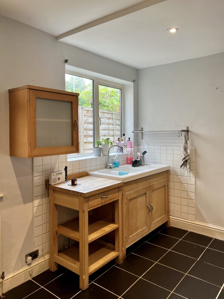
I showed you a little of this in the full house tour last week but now it’s time to get into the details – the copper worktop, the stone floor and sliding door panels. First – the before. Below is the shot from the hall the day after we moved in with boxes all along the left hand side of the picture.
There were two mismatched windows by those boxes which we immediately decided needed to become a single set of French doors. The idea was that one day they will open into a small conservatory but the budget isn’t there for now so we will just have to tidy up the side return and make it pretty instead. You can see one of the windows here and you can also, perhaps, tell that the image below was taken by an estate agent to make the room look very wide – just look at the width of the chairs to see!
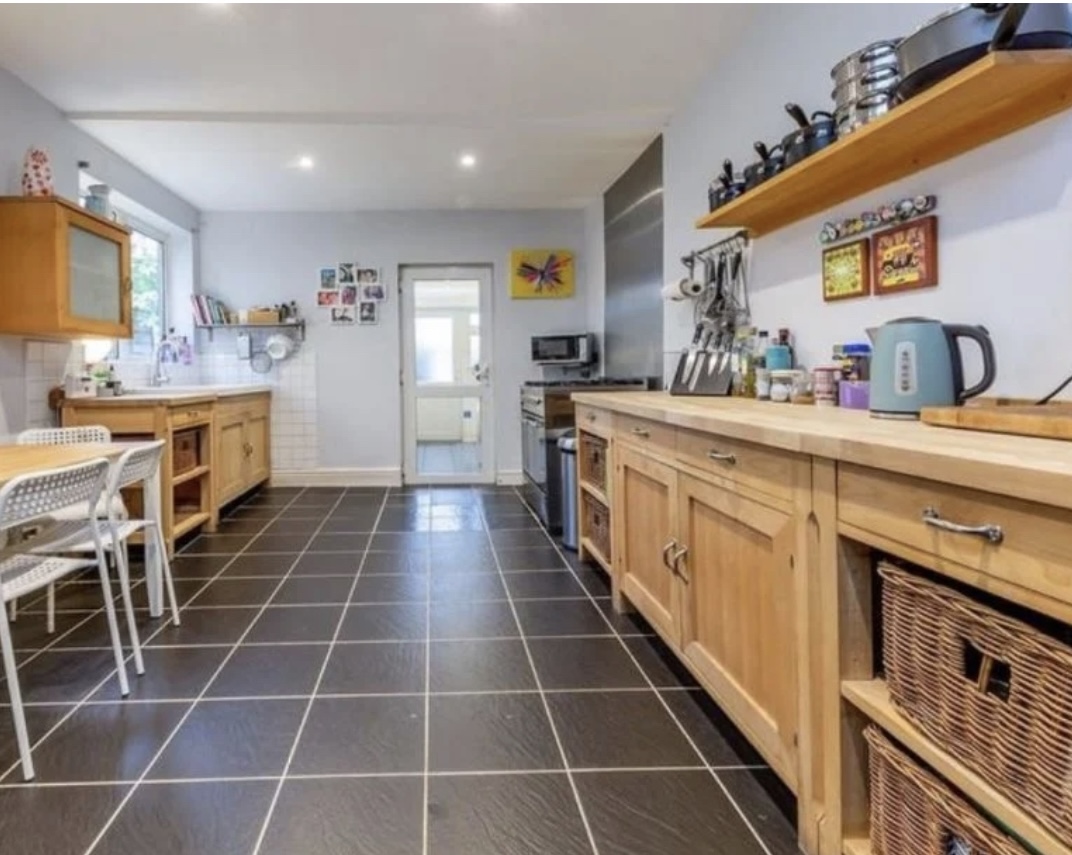
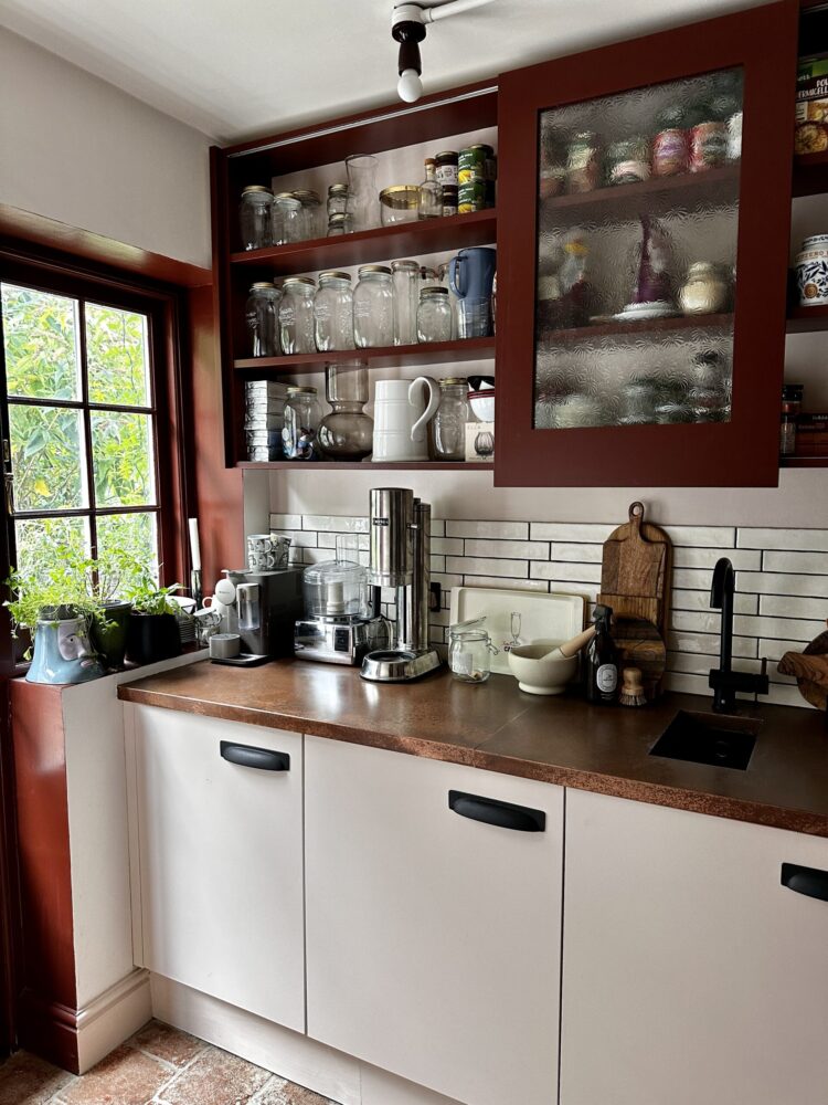
At the far end you can see the extension which was used as a utility room and which I wanted to rebrand as a pantry. Uncovering and re-installing the window to the right of the door (which was a standard back door) was the biggest job of the entire renovation. It shouldn’t have been, but as the structural engineer regarded it as a relatively small job he refused to come and visit and insisted on calculating based on photographs which meant, according to the builders, he had to overspec the size of the steel and the depth of the hole into which it needed to sit to make sure that it complied with building regulations.
So the job involved new flooring, new heating, new kitchen, new windows, new doors, new lighting. And, at the last minute, a new boiler as the original one was in the cupboard at the far end of the utility room and it turned out that, since it had been installed (which could have been anything up to 15 years ago) the rules changed and it needed to be higher off the ground – which, as there is a window – wasn’t possible. The heating engineer said it might have lasted another year or two and posited the “if it ain’t broke don’t fix it” theory but as the builders pointed out once it did die and had to move into the kitchen then we would have to make a space for it in there so it made sense to design it in from the start while the floors were up and the pipework could be more easily moved.
This meant a last minute design change, as what had been destined as a space for about 100 recipe books had to become a boiler cupboard. The books are still in boxes. We have a plan but we don’t, currently, have a date from the joiner.
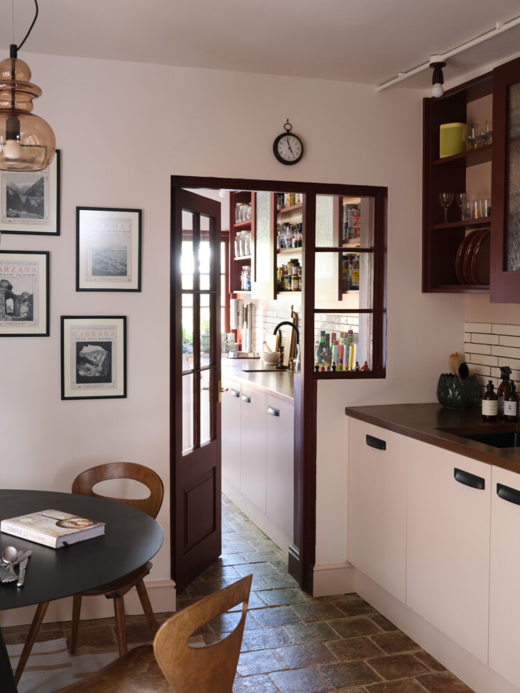
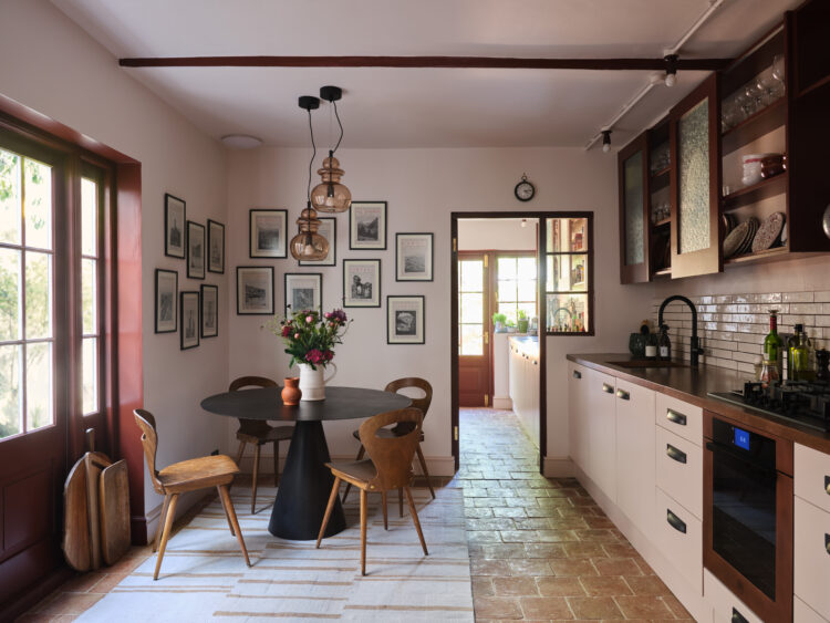
Now we’ve listed all that had to happen let’s look at the changes. We wanted the kitchen to feel like it had been there forever and to integrate the pantry with the rest of the house rather than it feeling like a box that had been stuck on at the back. Which it is! I have also said in earlier posts that we didn’t want to knock down a perfectly good space to move it to the side return. Yes the garden would perhaps have benefitted in shape but it would have cost around £125K and we wouldn’t have gained any space – just moved the same number of square metres to a new spot – so we decided to work with what we had.
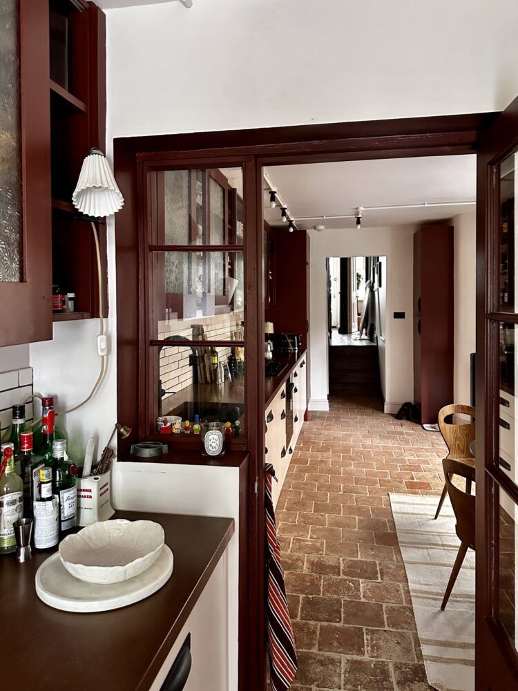
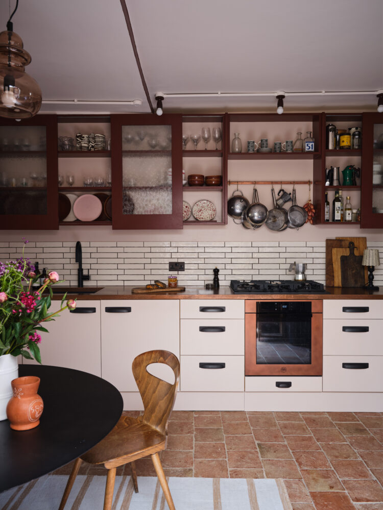
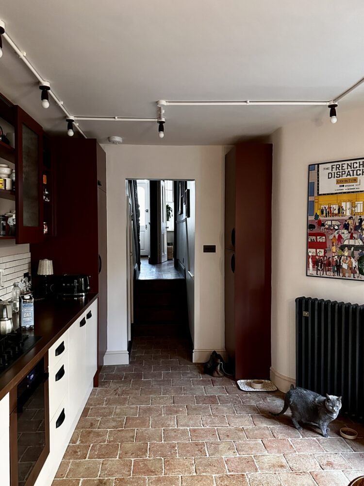
First of all that meant changing the floor and making it the same throughout. I chose the Marlborough terracotta tiles from Ca Pietra to bring an aged feel to the two spaces and try and make it feel original. We have underfloor heating in the pantry and shower room to the side but there’s a large radiator in the kitchen. This, like all the radiators in the house is from Castrads.
Now to the cabinets. I looked at companies making readymade cabinets but realised they are all standard sizes and if you want to fill the space precisely you need something more bespoke. I found John at DIY Alcove Cabinets through a recommendation. He mostly does wardrobes and shelving but has done a few kitchens and agreed to come and take a look at mine.
My other requirement was that while I wanted open shelves, we didn’t have as much storage as in the old kitchen and I wanted to be able to hide some of the less pretty items. Long-time readers will know I have often wondered why you don’t see more sliding doors in kitchens as they are space savers. This was my chance to try and John brilliantly brought my vision to life.
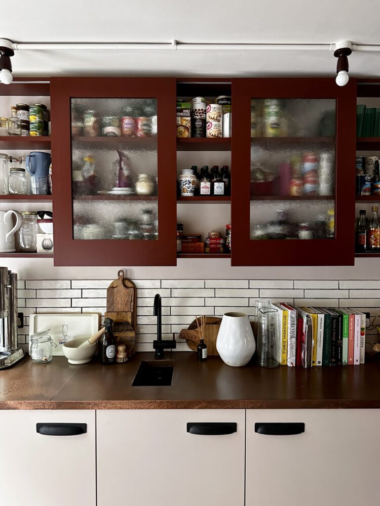
The panels are single depth and slide along runners so you can hide tins of food or boxes of cereal and leave pretty plates and glasses on display. He also calculated the cabinets below to precisely fit the space so while the sink, dishwasher, oven and integrated fridge are all standard 60cm wide, the cupboards either side of the oven are 55cm rather than me having to buy two 60s or two 40s and have awkward gaps. I’m utterly thrilled with it and while I was given a trade discount I can tell you that this is a much more affordable way to get a bespoke kitchen. We added the long cup handles in bronze from Corston Architectural to match the light switches and sockets.
Now to the worktop. This was a vexed issue for several months – long before we completed the sale. We had had stainless steel in the last house and found it by far the most practical (there’s a reason restaurants have it) but I also felt it was a little too industrial and modern for the look we wanted. Marble was out of budget and is also a fussy beast and we’re all far too clumsy to be worrying about stains and so on. Having had both quartz and wood before I wanted something different.
And then we started thinking about other metals. Could it be brass or zinc like a Parisian bar? I started wandering around Google and alighted on Halman Thompson who create aged metal surfaces including copper. A fairly new company, they were used to doing splashbacks and the odd bar but hadn’t done a kitchen before. They sent me samples and we knew it was the one. It goes perfectly with the floor and the pale pink cupboards (Paint & Paper Library Powder III) and has the resilience of metal. I asked for it to be aged with a minimal amount of copper blue and it’s perfect. It also – bonus point – is fine with hot pans and water. It does scratch BUT, we have found that if we rub olive oil in it completely disappears, which surprised us but we have done it a couple of times now as we are getting used to which plates and vases (and laundry baskets) have rough bases and it works every time.
Of course the next issue was what to do about the sink and oven both of which traditionally come in chrome. I talked to Josh Halman about a copper sink but the the price was prohibitive as I didn’t want to put a modern shiny copper one next to the aged version. We thought about ceramic but The Mad Husband hates ceramic sinks and wet hands, wine glasses and ceramic sinks is not a good combination.
So we decided that black was the answer as we knew we could also get a black tap. We looked at black ovens and then I found the Italian company Bertazzoni who make a copper oven and it all came together.
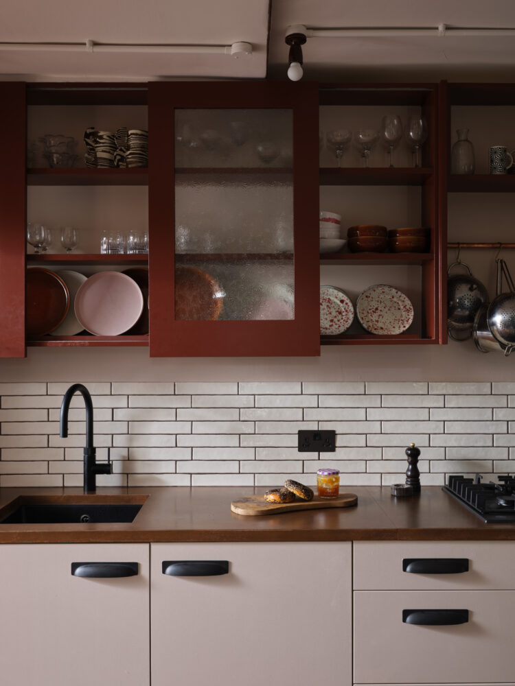
The wall tiles are also from Ca Pietra and we used the leftover chocolate grout from the bathroom upstairs which toned really well with the bronze and copper.
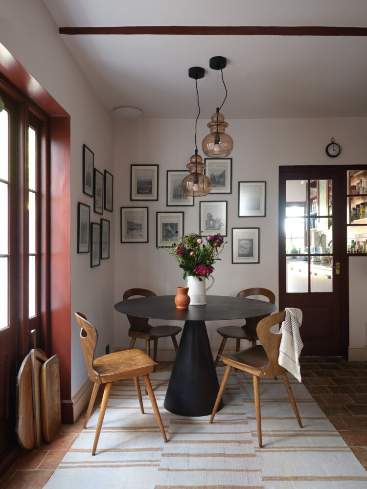
Next the lighting. Once again we didn’t want spotlights as we felt that would be too modern for the look we were creating. We decided to put the trunking on the ceiling and I bought ceramic bulb holders (which the builders called eggcups) from Dyke & Dean. The two lamps over the table are from H&M and the smoked glass goes perfectly. All the bulbs are the minisphere from Tala and they give beautiful light but are expensive so I’m hoping they last as long as they are supposed to.
Finally, before we moved in I spent ages planning a banquette to go round the corner as seating for the table but when it came to it we just didn’t like the inflexibility of it. I have now sold the table you see in the images above as I mentioned last week and replaced with a slightly smaller vintage black marble Gubi. My old mid-century Bauman chairs, which were an eBay find a couple of years ago, bring the necessary vintage wood to the space.
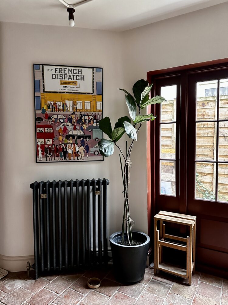
Now I just need to take remedial action on the fiddle leaf fig….
And that, I think is that. Do ask any questions below.
Before that many thanks to Odysseas of Art & Hue who has refurbished and decorated the site for me. He has looked after it for many years now and thanks to him it is running smoothly and looks so much cleaner after its wash and brush up. Do check out his lovely pop art prints as it will soon be the right time of year for shopping.
UPDATE:
Here is a picture of the fridge – it’s a Stoves Larder Integrated Fridge and there’s a cupboard on top. The light wasn’t very good this morning when I took it so I had to blow out the colour of the cupboards so you could see the darker fridge. (Paint & Paper Library Scarlet’n’Rust).
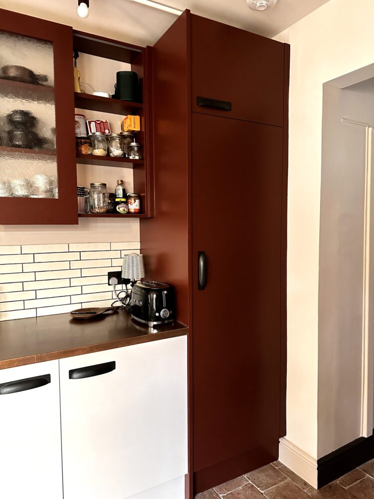
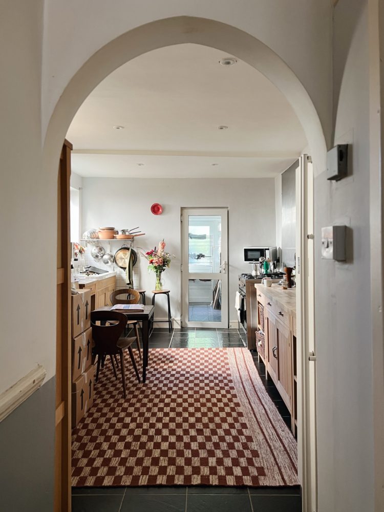
And this is a shot from the pantry so you can see the boiler cupboard on the other side of the door. We tried to match the cupboards. That slot was supposed to be bookshelves. We now plan to put bookshelves on the side of the cupboard so that we can get that storage back. That gives you a good shot of the lights tracking across the ceiling. And the cat!


I adore this. Can I ask which switches and sockets you went for? And are you being consistent with them throughout the house?
Yes we have been completely consistent and have used Corston Bronze throughout for sockets and switches and handles both on doors and cupboards.
I have to ask where you found that red checkered rug in the before photos?? It’s exactly what I’m looking for
Kate all I can say is WOW all your hard work paid off what a beautiful home
Hi Kate
Fascinating to see the results and to understand your thought process in how you got there – it looks great!
One quick question, how does the shower room fit into the new layout of the pantry area and where is the washing machine now?
Thanks
Julie
The shower room hasn’t moved – the extension was about 3m x 3m and the shower room takes up 1m of that leaving the pantry to be 2m wide by 3m long. Hope tht makes sense. The washing machine is in the pantry but is integrated. There is also an under-counter freezer in there too so we can have a tall larder fridge in the kitchen.
it’s really lovely; I recall that you wanted to sell that table and one of the bloggers has submitted an offer or am I wrong in that it is another round table? No matter what, your hard work shows thru and through!
Perfect!
It’s a triumph! I too am interested in the paint colour you used for the woodwork.
This is gorgeous. I have a long (24 feet) kitchen into utility room, but narrow. May I ask the dimensions of your kitchen and pantry. I love what you’ve achieved. Thank you very much.
The kitchen is 5.3m long and 3.23 wide and the pantry is about 3m long and 2m wide (the extension is about 3.2 wide but there is a shower room on the side that’s about 1m)
Hi Kate, it looks gorgeous. I’ll definitely be returning to this post when I eventually get round to doing my kitchen. I’m just wondering about the lack of cooker hood? I’d love to do away with ours as they’re usually ugly and take up so much wall space, but not sure my partner or building regs would let me get away with it. Do you have an extractor hiding somewhere or did you just go without, and if so, did that cause any issues? Thanks so much!
There is an extractor fan in the corner over the table. This is allowed within building regs as long as it’s a powerful one – this is about 72L per second and works perfectly well. We also have doors to open though.
That’s really helpful info thank you.
And sorry I accidentally posted my question twice!
Lovely space! But where is the refrigerator? I always find that appliance to be the most difficult to integrate into a kitchen remodel due to its size and generally obnoxious footprint. I’m always looking for ideas as to how to work it in — and when I don’t see it in an article like this, I feel thwarted! Can you add a photo?
I think in answer to your question Kate mentioned an integrated fridge in the kitchen itself.
Yes there’s an integrated fridge by the door. I will add an image to the bottom of the post.
It’s integrated and I will add a picture.
Just lovely – already has a wonderful atmosphere and that internal window into the pantry is a stroke of genius.
What colour have you used for woodwork and kitchen shelving ?
Hi Kate, it looks gorgeous and I’ll definitely be revisiting this post when I get round to doing my kitchen. Just wondering about the lack of cooker hood – I’d love to do away with ours as they’re usually ugly and take up a lot of wall space, but not sure my partner or building regs will let me get away with that. Do you have an extractor subtly hidden somewhere or did you just go without, and did that cause any issues? Thanks!
see above re fan
Really lovely. Nice to see something a bit different and also your thought process.
Totally fabulous – I wish I had your determination & patience to hold on to a vision! But what happened to the two gorgeous wishbone chairs that matched your paint scheme?!
It’s really interesting to hear all the work, problems and decisions involved along the way. It really looks a million times better than the before! I do have a few questions – is the paint on the upper cabinets the same as on the doors and windows? And how did you paint the cupboards so smoothly? Professional spraying? I notice from following a number of American blogs that the norm there is wooden cabinets which are painted, so different from our European already coated in colour cabinets which are harder wearing. However you get to choose whatever colour you like the painting way!
I love this blog. Thank you. Re the arch into the kitchen in the before photos. What was the thinking behind changing it to a conventional door/rectangular space? Many thanks Kate. And congratulations on a superb renovation.
Amanda Bringans
The arch felt a bit stuck on – it was a bit gothic and this isn’t a gothic house. It also made the doorway lower. We raised it and squared it so the entrance is much taller – and somehow it makes you draw yourself up before you enter the room! It also – from a practical point of view – means you can see more of the kitchen from the front door. Designers often talk about wanting to see a garden from the front door and given the steps down to the kitchen in this house that’s tricky but by raising the doorway we were able to increase the size of the view through the house.
Thanks Kate -makes total sense.