I have been dying to show you these images and tell you about this wonderful project I have been working on but I had to wait until the various press outlets had covered it. Now that they all have done that I’m free to share and I’m so excited to tell you all about it.
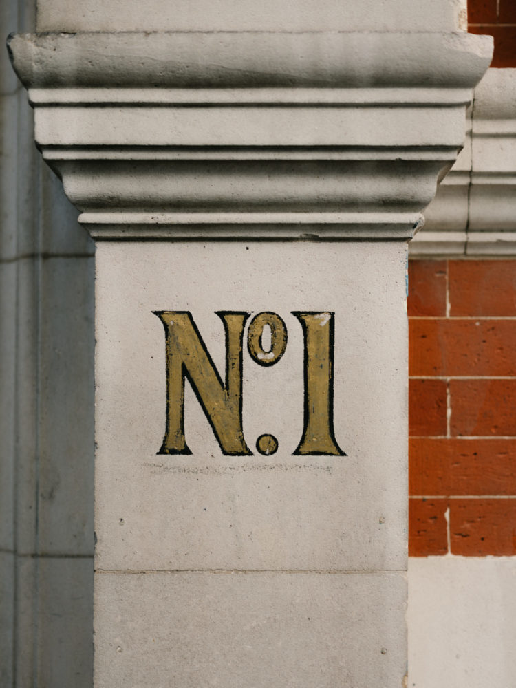
I was invited to work on this iconic (I don’t use that word lightly) London building a little over a year ago by Obbard who asked if I would consult on the concept, the colours and the look and feel of the apartments, which, at the time I first visited were run down and empty. Obbard had already redesigned the layouts to create five lateral apartments from what used to be a collection of small pieds a terre built for gentlemen to use when they came up to town to visit clubs or entertain women who possibly weren’t their wives. The Grade II listed building now belongs to the wine merchants Berry Bros & Rudd and we all immediately agreed that we wanted to develop the apartments in a high end, sustainable and eco-conscious way, as far as was possible, for what was to become a collection of rental flats.

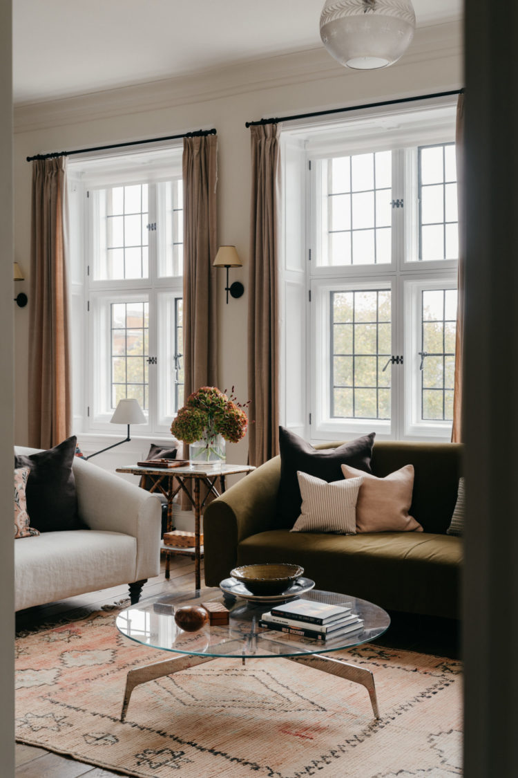
Obespoke, the in-house design team of Obbard, had already worked on the bathrooms, kitchens and flooring by the time I came on board and my first job was to come up with the look and feel for the bedrooms and living spaces. I put together a colour scheme and proposed that as far as possible the furniture should be eco-friendly and/or vintage.
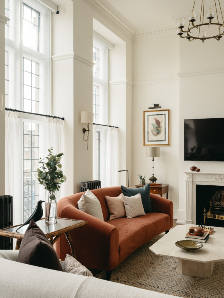
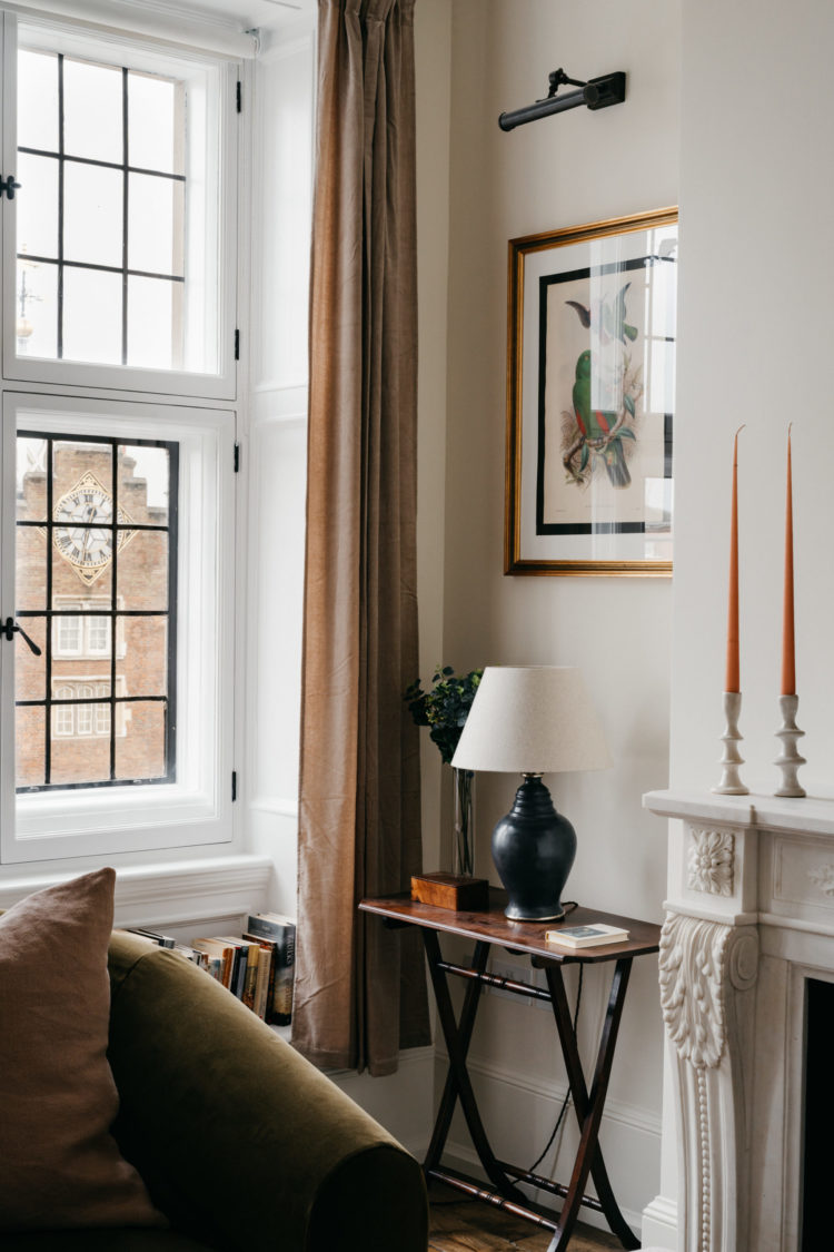
In addition to specifying Vita, the eco sofa I designed in collaboration with Love Your Home, we were also able to visit the Berry Bros & Rudd archive from where we were allowed to choose furniture and artwork from their vast collection. This includes a letter from The White Star Line (dated April 16th 1912) addressed to the company informing them of the loss of a shipment which was on the Titanic. In the bathroom of the penthouse we framed original, handwritten drinks recipes and we were also given permission to use an original hand-drawn plan of the tea clipper ship ‘Cutty Sark’: the inspiration behind the original ‘Cutty Sark’ whisky which was developed by Berry Bros. & Rudd in 1923.
Many of the pieces we found needed restoring and mending but using pieces like this not only meant that each apartment is different, it ties the history of the landlords into the building and allows the continuation of that story.
As well as the BBR archive we also spent hours scrolling websites and apps in search of the perfect pieces of furniture. We bought pieces from Narchie, which I have written about before, from Vinterior and eBay as well as using companies like The Haines Collection (listen out for Jules Haines on the podcast soon) for leftover fabric for cushions, paint from Graphenstone and beds from The Cornish Bed Company, with mattresses from Natural Mat.
For Obbard it was a very different experience as they are used to big developments where they can order 17 lights in one go and move onto the side tables. Here it was about snapping up three lamps when they saw them and then having to look for some more that would work with what we had already sourced. It meant we had to keep the design very fluid as we didn’t always manage to get what we wanted when we weren’t quick enough off the mark. Patti and Jane, from Obbard, also got used to me rushing in and screeching: “Where did that come from?” whenever I saw a new piece of furniture. We found tired chairs that needed reupholstering, tables we could respray in different colours and lamps that we were able to rewire and clean.
On the day of the photo shoot having decided we didn’t have the right lamps for a side table, Patti took a diversion to a charity shop and picked up the perfect pair for £40.
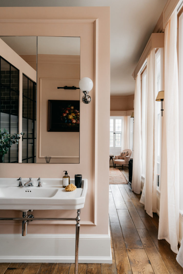
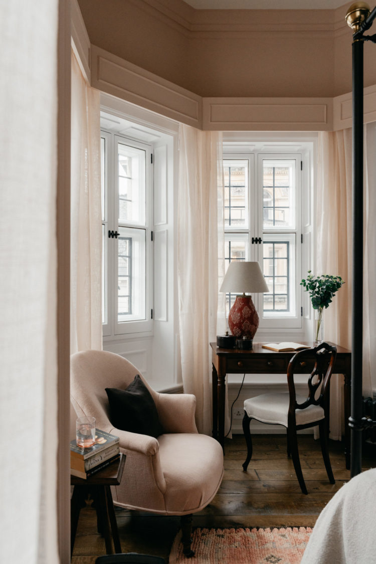
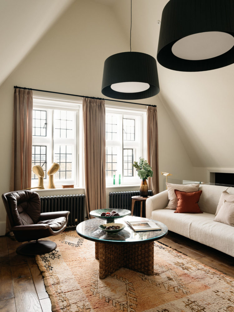
As befits rental flats we couldn’t go too extreme on the colours. The Italian made storage units for the dressing rooms had already been commissioned by the time I arrived, but I was able to choose the colours for the doors. In the first floor master suite I chose a pale pink for the walls running from bathroom through to bedroom with chocolate coloured storage and then used a Tori Murphy fabric for the headboards.
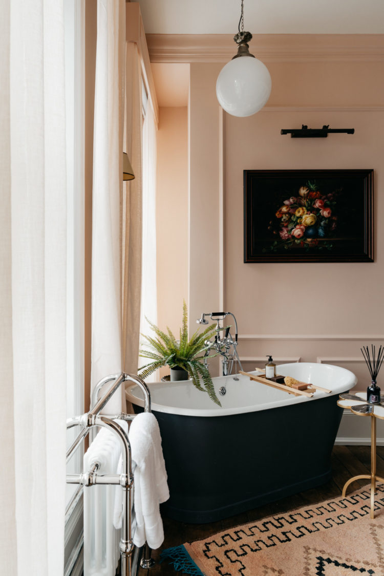
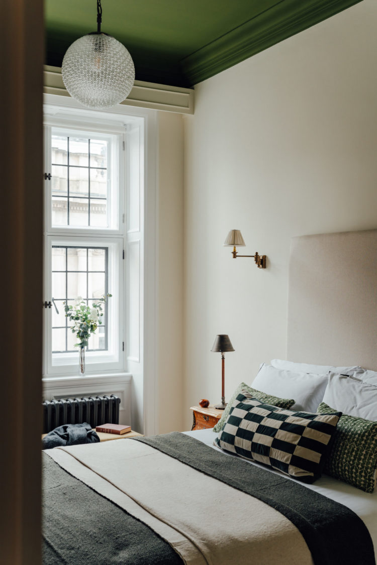
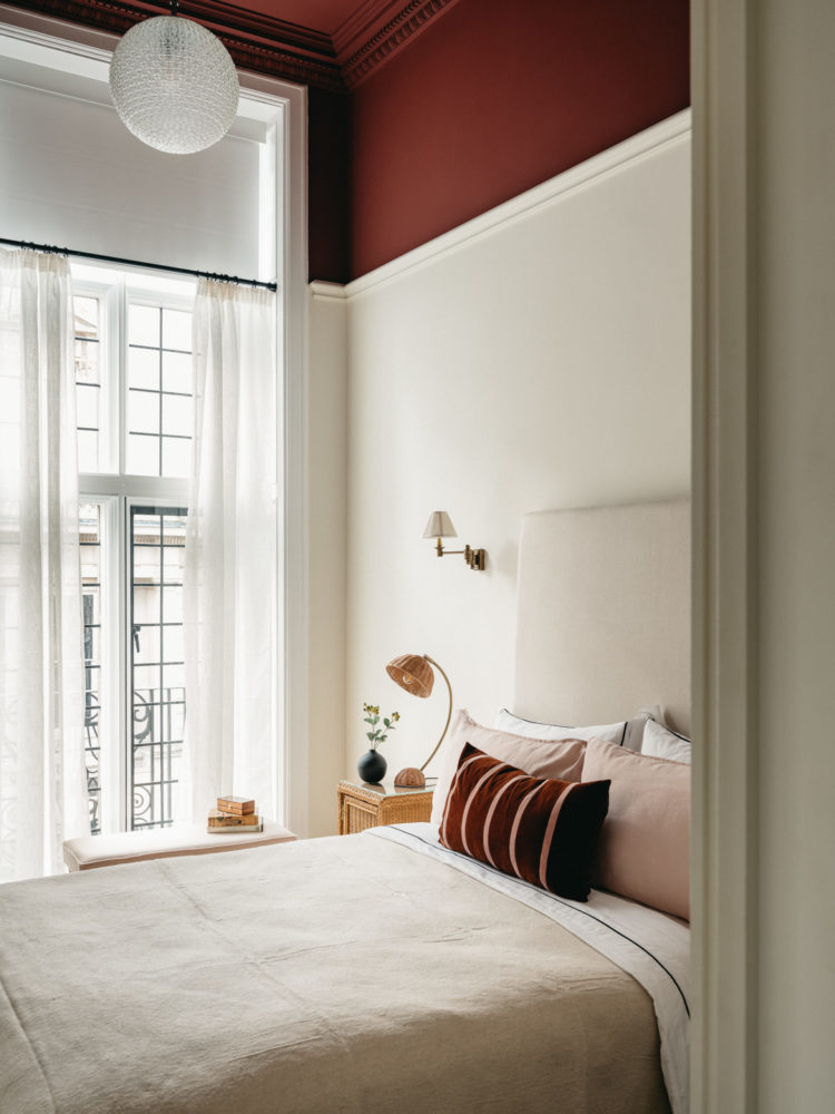
The chairs, picked up from a vintage site, were reupholstered to suit the colour scheme, alongside vintage lights and artwork from the Berry Bros collection. We decided to go with a classic black and white tile in the showers and bathrooms as a nod to the building’s Victorian roots and picked the tiles to go with the main colours of each apartment. So in the first floor there is a Barolo red ceiling in one bedroom, which is similar to the tiles in the master bedroom shower. This was one of the many red threads that run throughout the development.
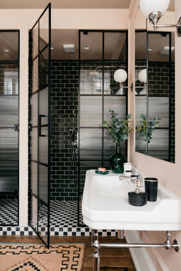
One clever design trick for which I can take no credit is in the bathroom below. Patti Patrick, head of design and development for Obbard, knew the bathroom would be at the end of a corridor from the bedroom and dressing room and have no door. She added a free-standing bath but created two cubicles – one for the loo and one for the shower. You can also see how the crittal-style glass doors are reeded in the middle for privacy but the panes top and bottom are clear. The loo is also wall-mounted so you see less of it when the door is closed. If you have a big bathroom, or an en-suite this is definitely one to steal.
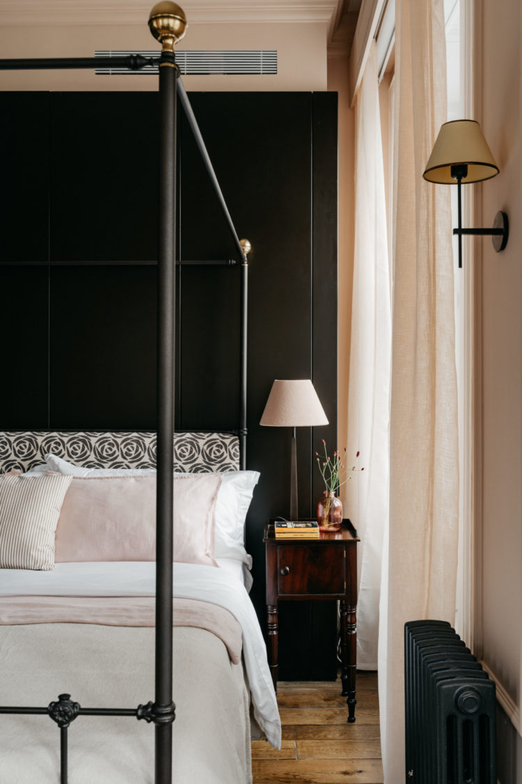
Above you can see the bedroom at the other end of the corridor. The building is listed but it also needed all the modern appliances such as air conditioning, which a high end renter expects as well as wine fridges for each apartment. Berry Bros are also offering renters a special wine concierge service so if you’re having a night in with scrambled eggs you can ask for suggestions as well as if you are hosting a fancy dinner party.
Below is the dressing table or small desk at the end of the bed. This apartment looks over St James Palace so it’s a cool spot for sitting during the day and watching the world, and its kings, go by. The windows, which could not be replaced but needed a layer of secondary glazing fitted inside, have electric blinds for privacy and we dressed them with organic linen curtains to soften the look.
I knew the decor would have to be broadly neutral as the flats are to be rented out, but since the ceilings are so high I managed to persuade Obbard that we could go for a dramatic ceiling in one of the three bedrooms of each apartment. So below is the green with its green accessories on the bed. I will tell you more about the exact colours in due course.
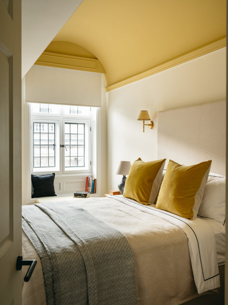
This room below has a gorgeous vaulted ceiling so I picked a lovely sunny yellow for in here while below I found a deep red wine colour which felt fitting given the landlords.
I felt it gave each room just enough personality without swamping the space and making prospective tenants feel it was too much. Anne Ashworth, the property and finance writer formerly of The Times, wrote: “”Seldom when visiting any type of upmarket housing scheme have I heard the words ‘retrieved or repurposed’ used quite so often. The rooms are carefully curated to ensure that each thing, whatever its source or age, seems destined to be together. Quiet luxe is difficult to pull off but the effort is worth it. ”
Anne understood exactly what we have tried to achieve and I’m delighted by her words in The London Magazine.
The top floor has been given over to the penthouse, which has a different feel. Unlike classic penthouses, which seem to be all glass and steel, this is under the eaves with access to a roof terrace overlooking St James Palace.
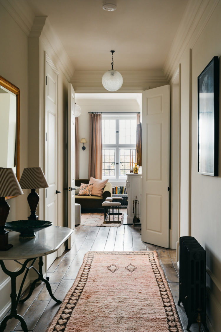
The lamps on the hall table below were sitting dusty and neglected on a window sill on my first visit. They had been used on desks during a period when the building was used for as offices. This became the starting point for the design. They were rescued, cleaned up, rewired and given new shades and now take pride of place on a vintage marble topped table in the entry of the first floor.
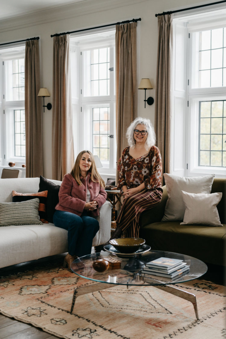
Here are Patti and I ready for our close-up, as the saying goes. Although the project took longer than Patti envisaged we have both really enjoyed it and plan to work together again. I will, of course, keep you posted. I will revisit the apartments in more detail as there’s much more to talk about (including the paint) and the hidden room we found in the turret which has been turned into a games room.
You can see it here – the triangle roof top – the builders fell through a wall when renovating that floor and discovered a space that makes the perfect late night games room.
As I write three of the five apartments have been rented so it will be a long time before I can get back in to visit but I hope you have enjoyed this tour. All the photographs were taken by the brilliant Mark Anthony Fox, who shot the original Mad House a couple of years ago.

For all paint colours see picture captions. All paint by Graphenstone: These are special colours and aren’t listed on the main website. You can email [email protected] to order samples and pots or ring 01379 772940.
Off white – Bougie
Yellow – Lamplight
Wine – Barolo
Green Aspidistra
Pink – Powder Jar
If you want to read more you can follow the links to The Evening Standard, Forbes, House & Garden, Prime Resi, Abode 2, and The Daily Telegraph.


Well i was looking for new designs for my room. Which perfectly match with these ideas, thanks alot for sharing such a great idea with us.
Brilliant choice of colors and use of furniture. I especially love the painted ceilings as an added surprise. You’ve succeeded in creating sophisticated, warm spaces that lucky renters get to call home. Congratulations!
What a beautiful job you’ve done. This is exactly how I’d like my flat to look.
kate, i have such respect for the decorating work you did on this renovation. it’s elegant, comfortable, sophisticated, understated…and the design throughout stays away from the recurrent trends that one regularly sees in magazines and on instagram. the materials, colors, and textures work so well together. you have done a great service for those who are privileged to be able to live in these spaces. congratulations !
So beautiful, with an air of understated elegance. I would happily move in tomorrow! Just love everything you have shown us and those rugs are gorgeous. Well done for renovating and repurposing. An absolute master class.
Where was the secondary glazing from please? Have been desperately searching for decent examples for our listed house. Many thanks in advance!
Don’t make me wait! I need to know the name of this green paint *immediately!*
What a glorious set of apartments. Huge congratulations on such a beautiful, beautiful result.
I could happily move into any one of these tomorrow but since that’s unlikely I’ll settle for how much inspiration there is here.
You did well, a great collaboration.
Gorgeous!
My goodness! Superb. I am not given to leaving comments on blogs but you should be immensely proud – this is exceptionally fine work. Not *just* for the fact that it’s really gorgeous but it has a unique style and elegance. No one will ever mistake those interior shots for any other high end rental property, it’s stand-out design. The fact that it’s been done with ethics, history and sustainability in mind as well; that is just so fantastic. A beautiful balance of colour, pattern, plains and textures. Bravo!
Bravo Kate, a complete triumph. I’ve been so looking forward to seeing your work here and it’s even more stunning than expected. What a dream project to have worked on (the archive alone…!). Love every detail, huge congratulations.
Beautiful.
I am going to join the chorus and ask where you sourced the rugs from?
Congratulations, you must be so pleased with a job so wonderfully done!
We travelled to Morocco for the rugs as the best place to source vintage rugs affordably. We needed about 27 in total.
What a fantastic feather in your cap! Congrats on an amazing project.
Understated, subtle, relaxed, luxurious…..love it all apart from the 2 grey stools on second picture and the peachy coloured walls. Just a bit too peachy?!?
The grey stools are actually classic mattress ticking stripe in black and ivory but they probably do read grey on the photos.
This was such a fascinating read and the rooms are just stunning. We’ll done on such a fabulous job 🙌🏽
Been waiting for this Kate. Stunning stunning work. Love the “feel” of everything and your Vita is just perfect in the spaces. You must be very proud of that project. It’s quietly stylish and sophisticated, I know it takes more time/energy/imagination and creativity but so worth it. Those rugs??????
Well done. 👏👏
Really beautiful interiors Kate. Classy as hell. Well done.
Been looking forward to seeing these, stunning work. You must be so pleased. Would love any information on where you sourced the rugs, they are beautiful and work so well together across various rooms.
Divine! And where are those rugs from!???
What gorgeous rooms! Can I ask where you sourced the rugs from?
Quietly stunning interior design Kate. So glad that antique & repurposed furniture & accessories were the main focus. It all takes more time & effort than buying new but definitely worth it.
Absolutely stunning! Classy classic with quirky twist.
May have missed it in the post, what shade is the pale pink from Graphenstone?
Looks like tuberose maybe? Gorgeous whatever it is.
Kate this is wonderful! I love the feel of it. Love all those old things given new life (as an upholsterer that’s my thing). I even love the yellow ceiling – and I’m a fellow yellow hater! I’m squirrelling away lots of ideas here. And your Vita sofas look really good. Well done – it’s wonderful.
Ooh I’ve been so looking forward to this! Kate they really are superb.
Congratulations on such a triumph.
Where I fall down is making all the vintage look like it’s supposed to be together and Anne is spot on, you’ve achieved that in spades. Congratulations once again.